All blocks
Product Category
Flexible product category layouts built with shadcn/ui, including grid, asymmetric, and hero-led variants. Designed to showcase collections, guide browsing, and highlight key categories at a glance.
In Pro Figma & Pro Figma + React
React
Figma
Pro
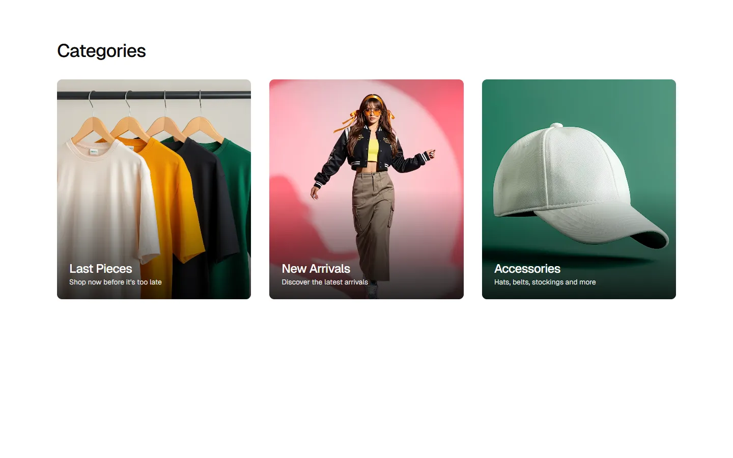
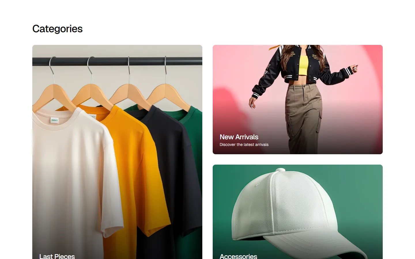
Product Category 1
Category navigation grid with immersive hero imagery
Pro
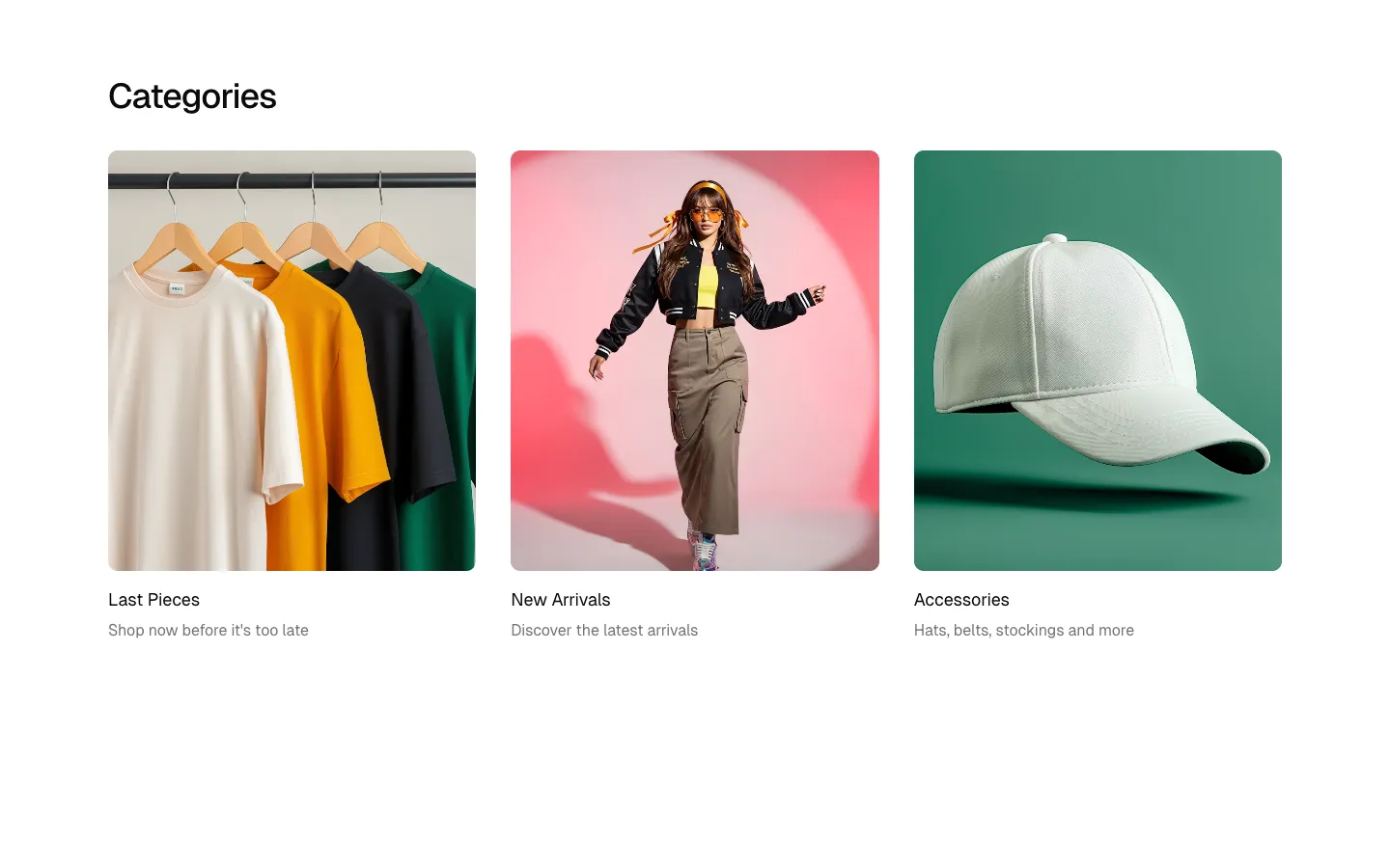
Product Category 2
Category grid with external labels
Pro
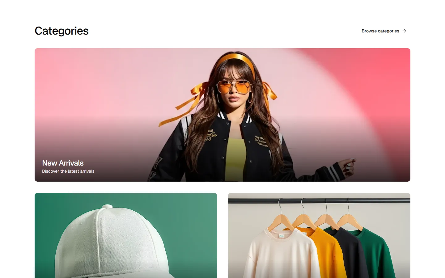
Product Category 3
Asymmetric category grid with mixed card orientations
Pro
Product Category 4
Inverted asymmetric grid with top-aligned hero card
Pro
Product Category 5
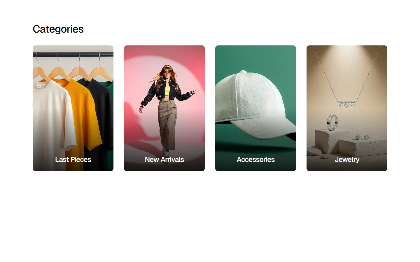
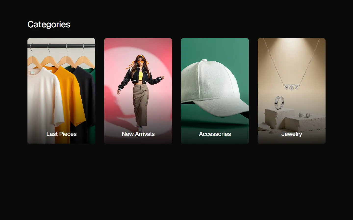
vertical category grid with labels
SBIOTJ
Join 9,000+ builders shipping with shadcncraft
Get access to these blocks and the full library
Production-ready blocks and components with matching Figma and React.


Benefits
Designed for your shadcn/ui project
Blocks built to work together across marketing pages and product interfaces.
Consistent layout system
Shared spacing, grids, and typography across all blocks.
Composable layouts
Combine blocks to build complete pages without layout conflicts.
Theme compatible
Works with shadcn/ui themes and token-based color systems.
Production-ready structure
Layouts designed with real content patterns and responsive behavior.
Explore all block categories
Built on official shadcn/ui components with real structure, spacing, and accessibility. No AI-generated layouts. Designed for real products in Figma and React.