All blocks
Steps
Lightweight step patterns for flows that live inside the product rather than on a page of their own. Includes a setup banner that shows progress and the step that is up next, a form card with a one-line stepper in its header, a vertical list that opens one step at a time, a dialog wizard, a timeline with skipped and failed steps, and a list that folds finished steps into editable recaps. Each moves with Back and Continue and ends on a finished state. Built for in-app onboarding, short setup tasks and quick-starts where a full multistep layout would be too much.
In all Pro bundles
React
Figma


SBIOTJ
Join 16,000+ builders shipping with shadcncraft
Get access to these blocks and the full library
Production-ready blocks and components with matching Figma and React.
Benefits
Designed for your shadcn/ui project
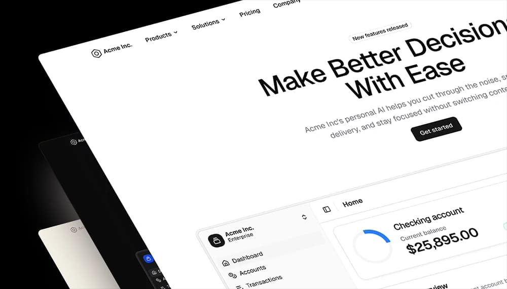
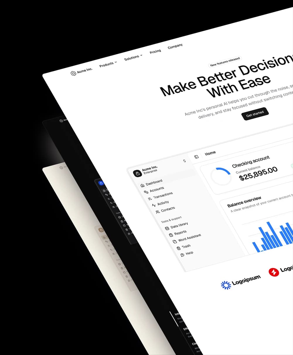
Blocks built to work together across marketing pages and product interfaces.
Consistent layout system
Shared spacing, grids, and typography across all blocks.
Composable layouts
Combine blocks to build complete pages without layout conflicts.
Theme compatible
Works with shadcn/ui themes and token-based color systems.
Production-ready structure
Layouts designed with real content patterns and responsive behavior.
Explore all block categories
Built on official shadcn/ui components with real structure, spacing, and accessibility. No AI-generated layouts. Designed for real products in Figma and React.