All blocks
Benefits
shadcn/ui Benefits blocks focus on outcomes, not Benefits. Help customers see exactly how your product improves their life or business. A proven section for driving conversions on marketing sites.
In Pro & Pro + React
React
Figma
Pro
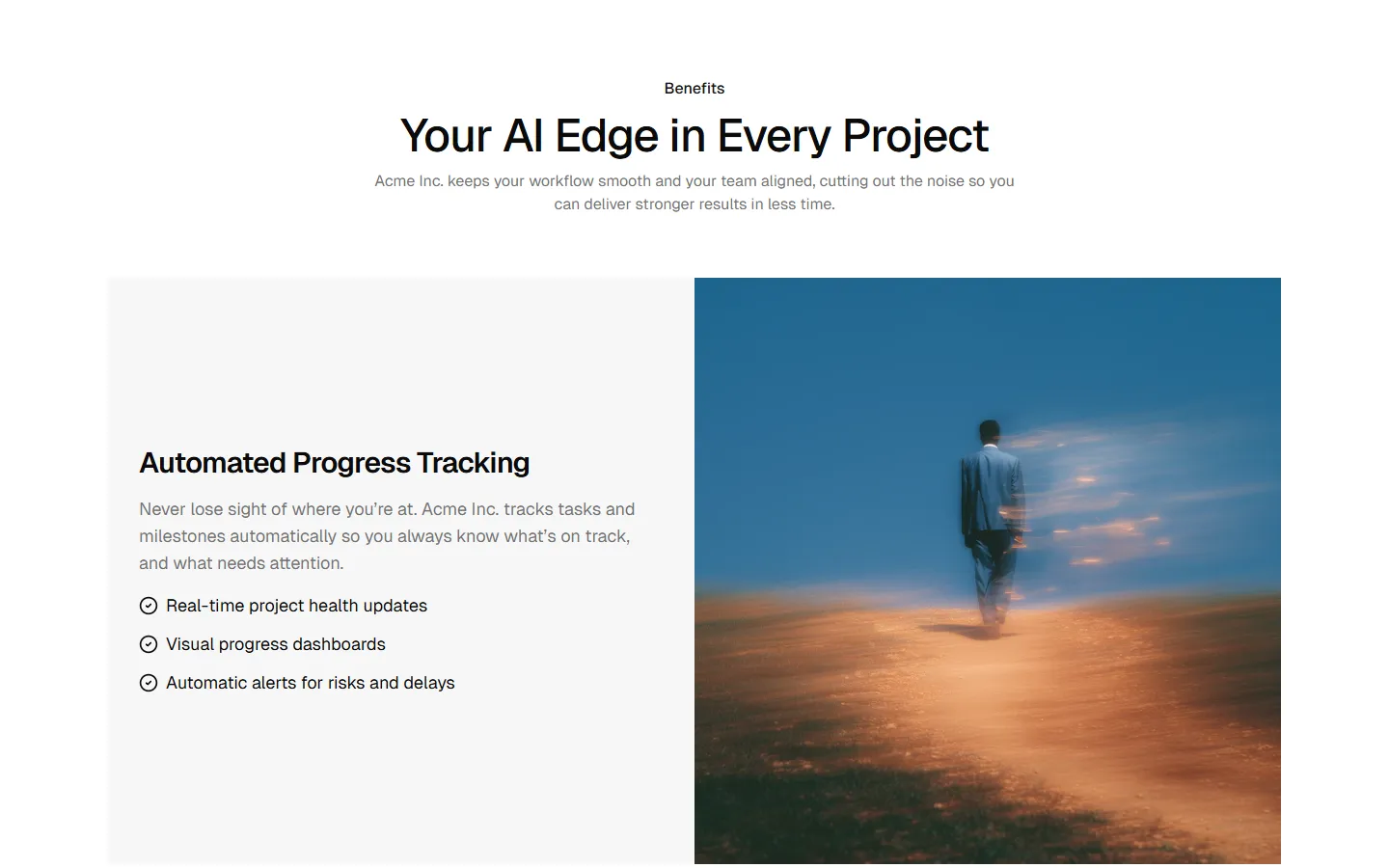
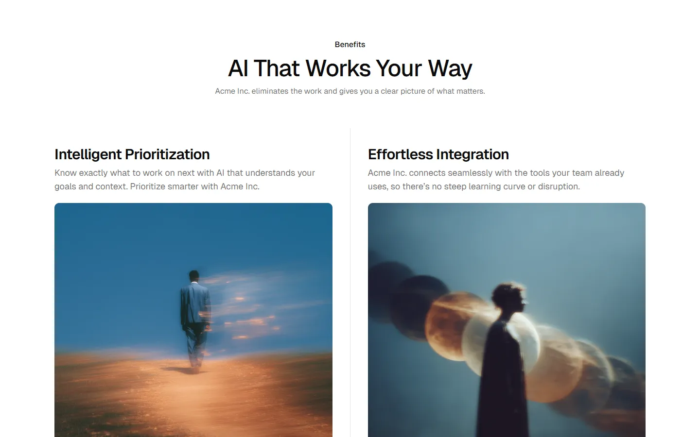
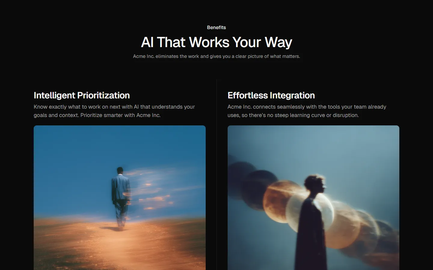
Benefits 1
Alternating rows with text and image
Pro
Benefits 2
Alternating rows with actions and image
Pro
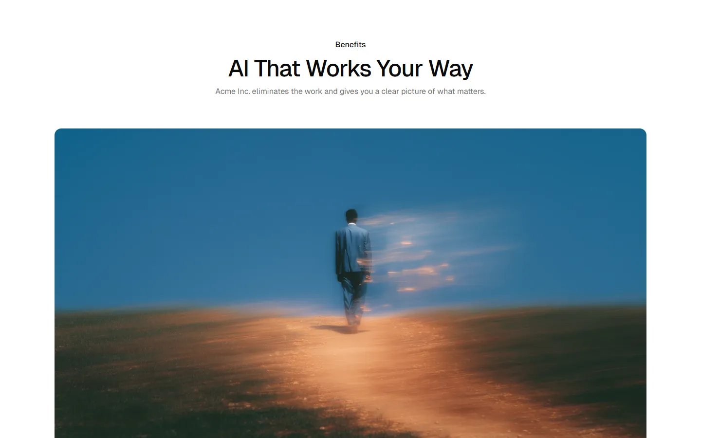
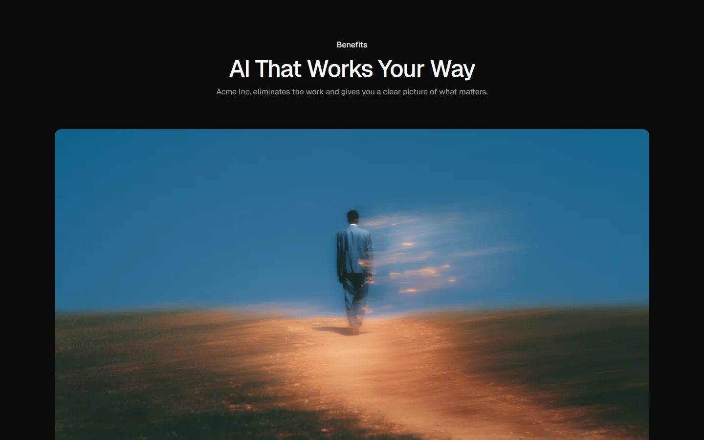
Benefits 3
Stacked sections with full-bleed media
Pro
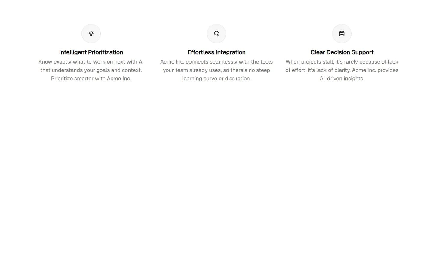
Benefits 4
Compact icon list
Pro
Benefits 5
Icon grid
Pro
Benefits 6
Image-led cards
Pro
Benefits 7
Split highlights with supporting list
Pro
Benefits 8
Hero media with supporting list
Pro
Benefits 9
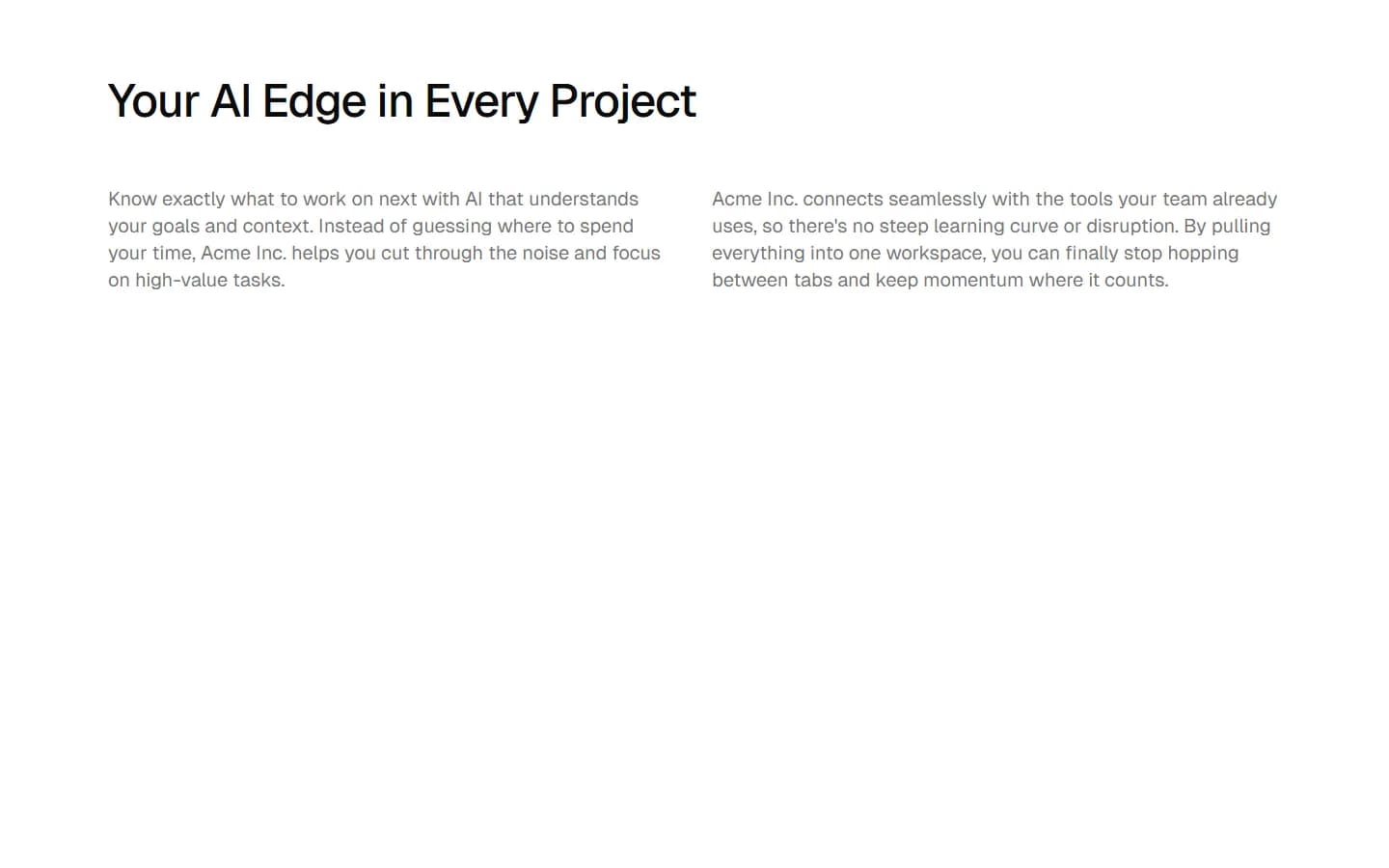
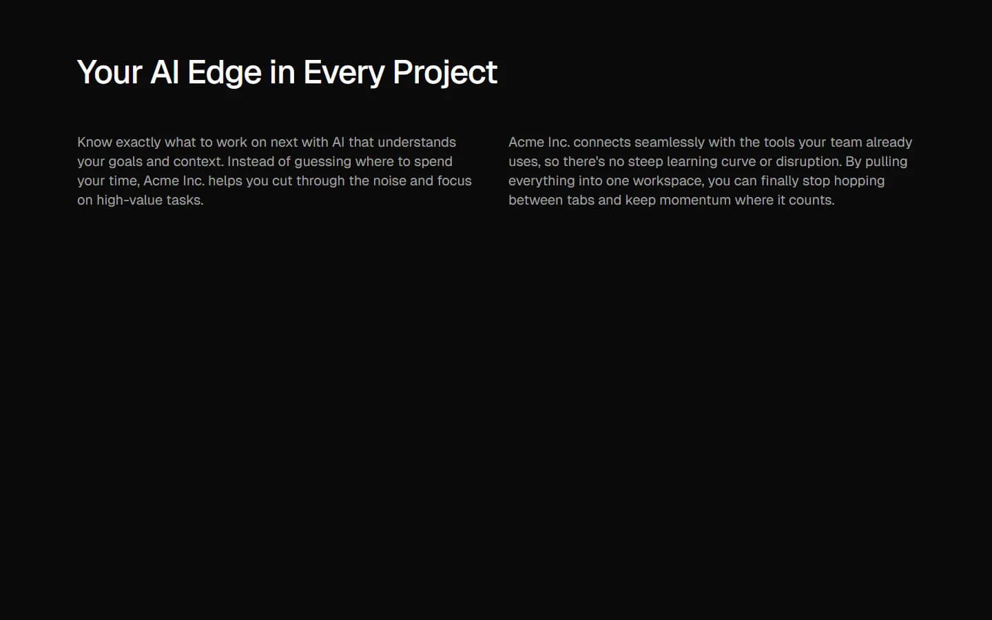
Two-column text layout
Pro
Benefits 10
Full-width media with overlay text


Pro
Benefits 11
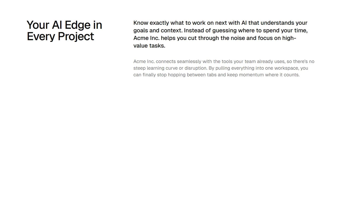
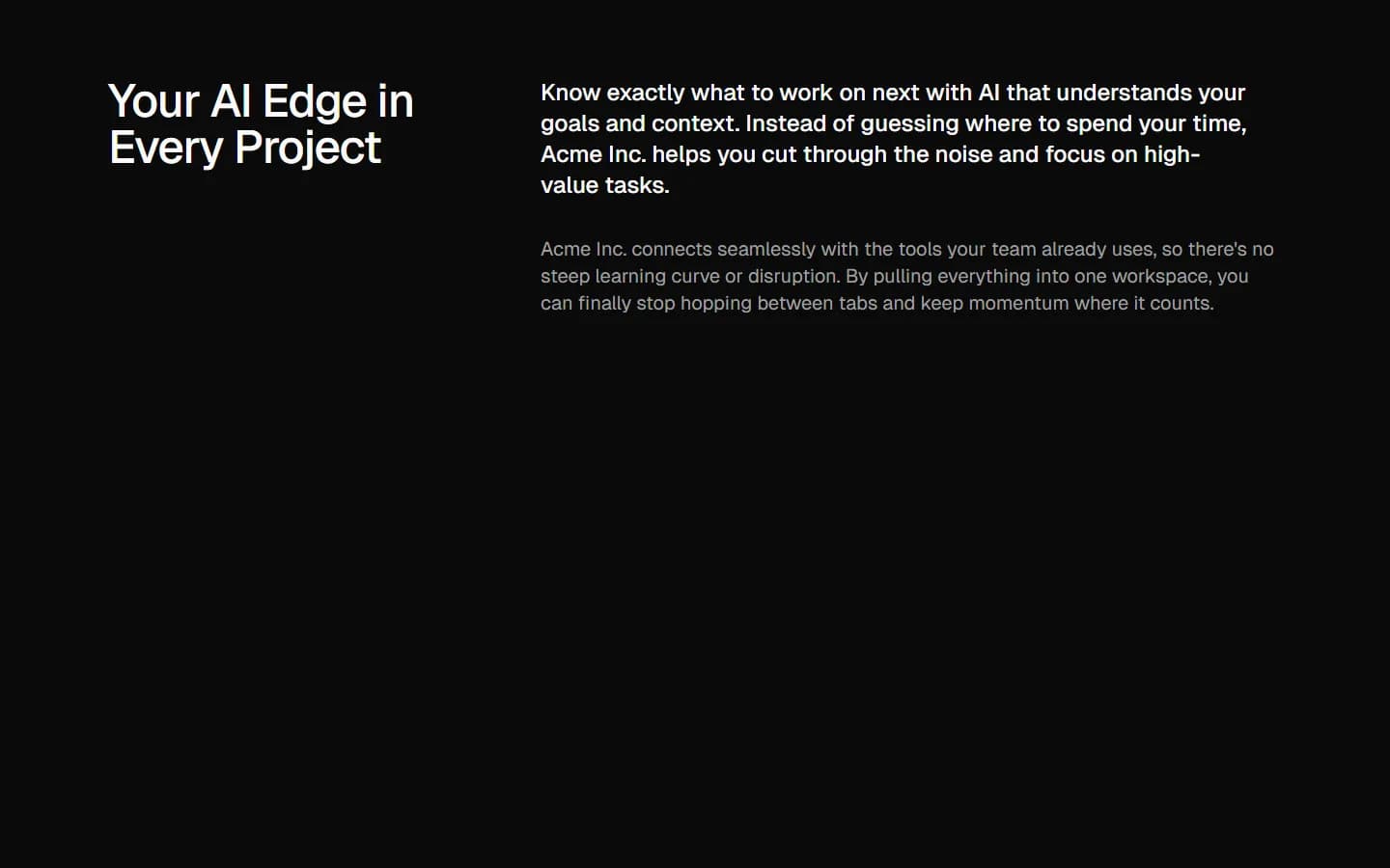
Emphasized lead with supporting column
Pro
Benefits 12
Two-column icon list
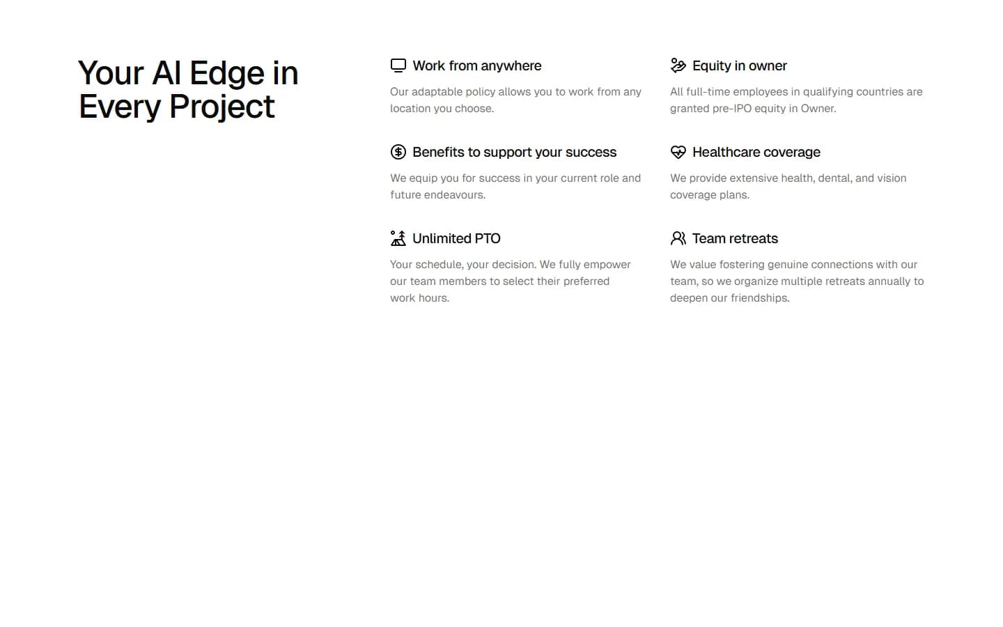
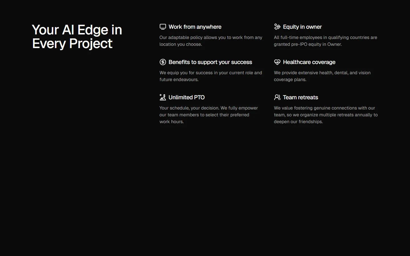
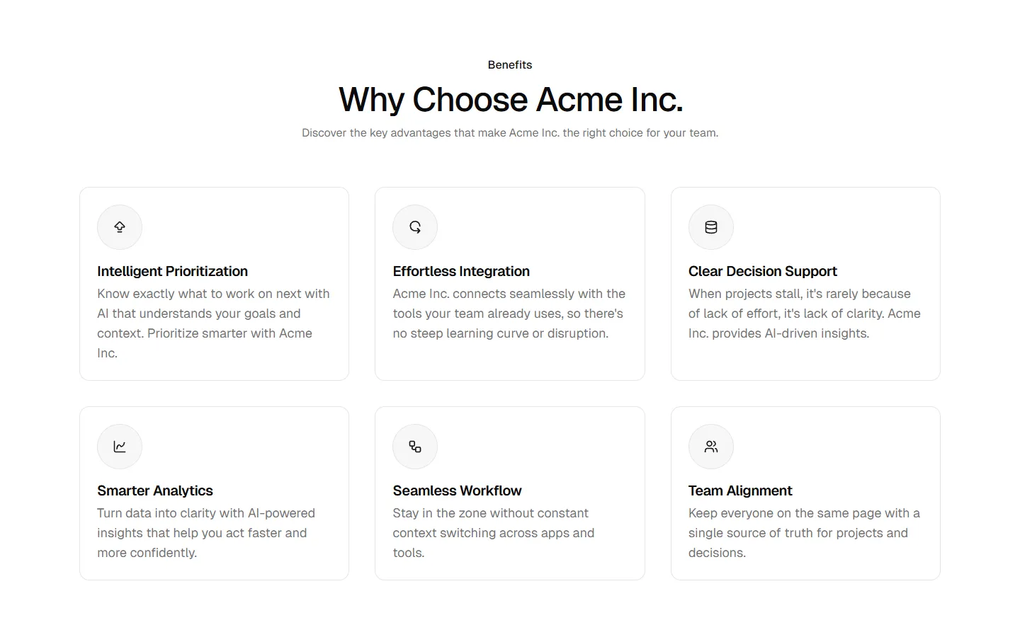
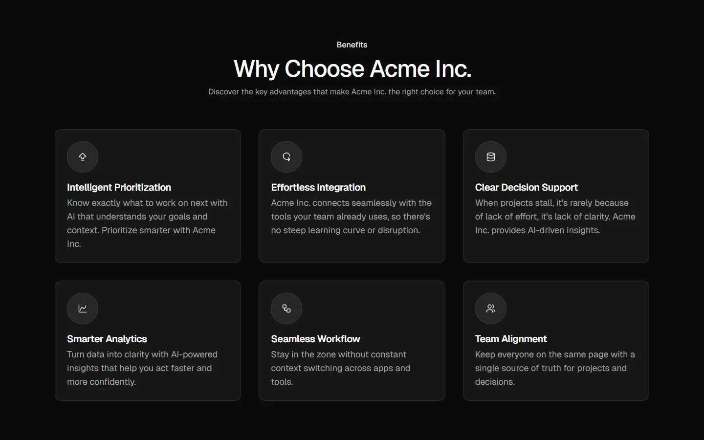
Free
Benefits 13
Card grid with section header
SBIOTJ
Join 9,000+ builders shipping with shadcncraft
Get access to these blocks and the full library
Production-ready blocks and components with matching Figma and React.


Benefits
Designed for your shadcn/ui project
Blocks built to work together across marketing pages and product interfaces.
Consistent layout system
Shared spacing, grids, and typography across all blocks.
Composable layouts
Combine blocks to build complete pages without layout conflicts.
Theme compatible
Works with shadcn/ui themes and token-based color systems.
Production-ready structure
Layouts designed with real content patterns and responsive behavior.
Explore all block categories
Built on official shadcn/ui components with real structure, spacing, and accessibility. No AI-generated layouts. Designed for real products in Figma and React.