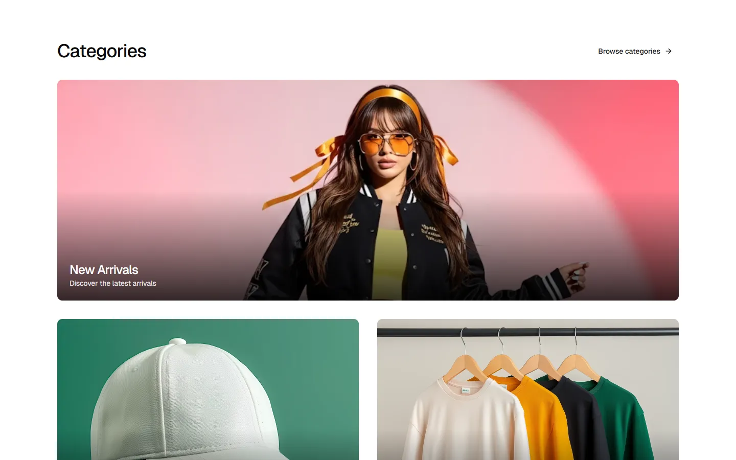
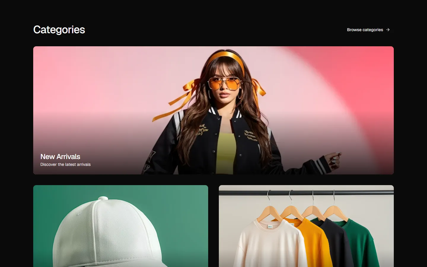
All Product Category blocks
Product Category 2
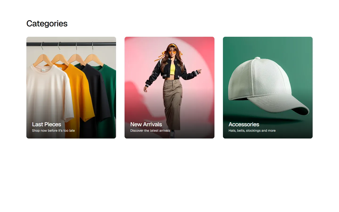
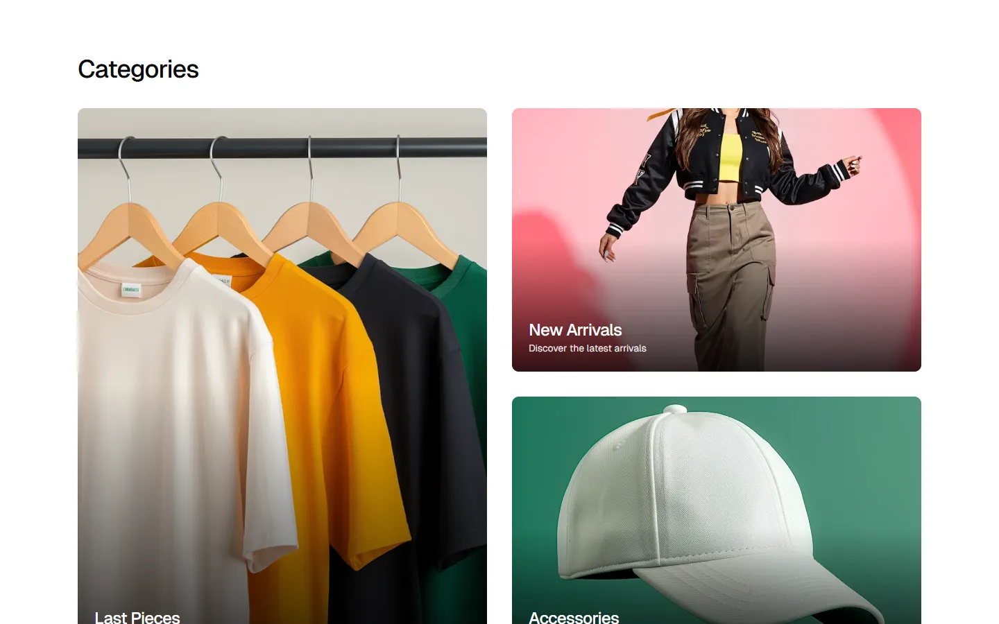
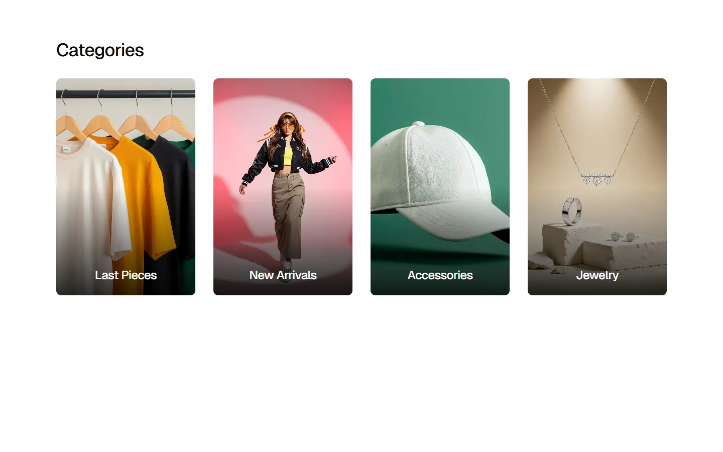
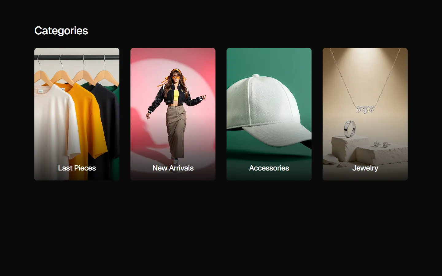
Category grid with external labels
A minimalist category navigation section featuring a balanced three-column grid. Unlike overlay styles, this layout places category titles and descriptive subtext directly below each image, ensuring maximum legibility. Using high-quality lifestyle and product photography, it provides a professional and airy entry point to specific store sections.
In Pro Figma & Pro Figma + React
Radix UI
Base UI
8 styles
5 icon sets
Not Allowed
Get access to the full source code by upgrading to Pro Figma + React.
SBIOTJ
Join 9,000+ builders shipping with shadcncraft
Get access to this block and the full library
Production-ready blocks and components with matching Figma and React.


Benefits
Production-ready by default
Built with shadcn/ui conventions and designed for real projects.
Built with shadcn/ui
Clean React components using Tailwind and modern shadcn patterns.
Install instantly
Add the block directly using the shadcn CLI.
Works with your theme
Compatible with shadcn themes and token-based color systems.
MCP server support
Use shadcn MCP server right from your favorite AI tools.
Frequently Asked Questions
Yes. They follow shadcn/ui structure and are built for real products.
All blocks