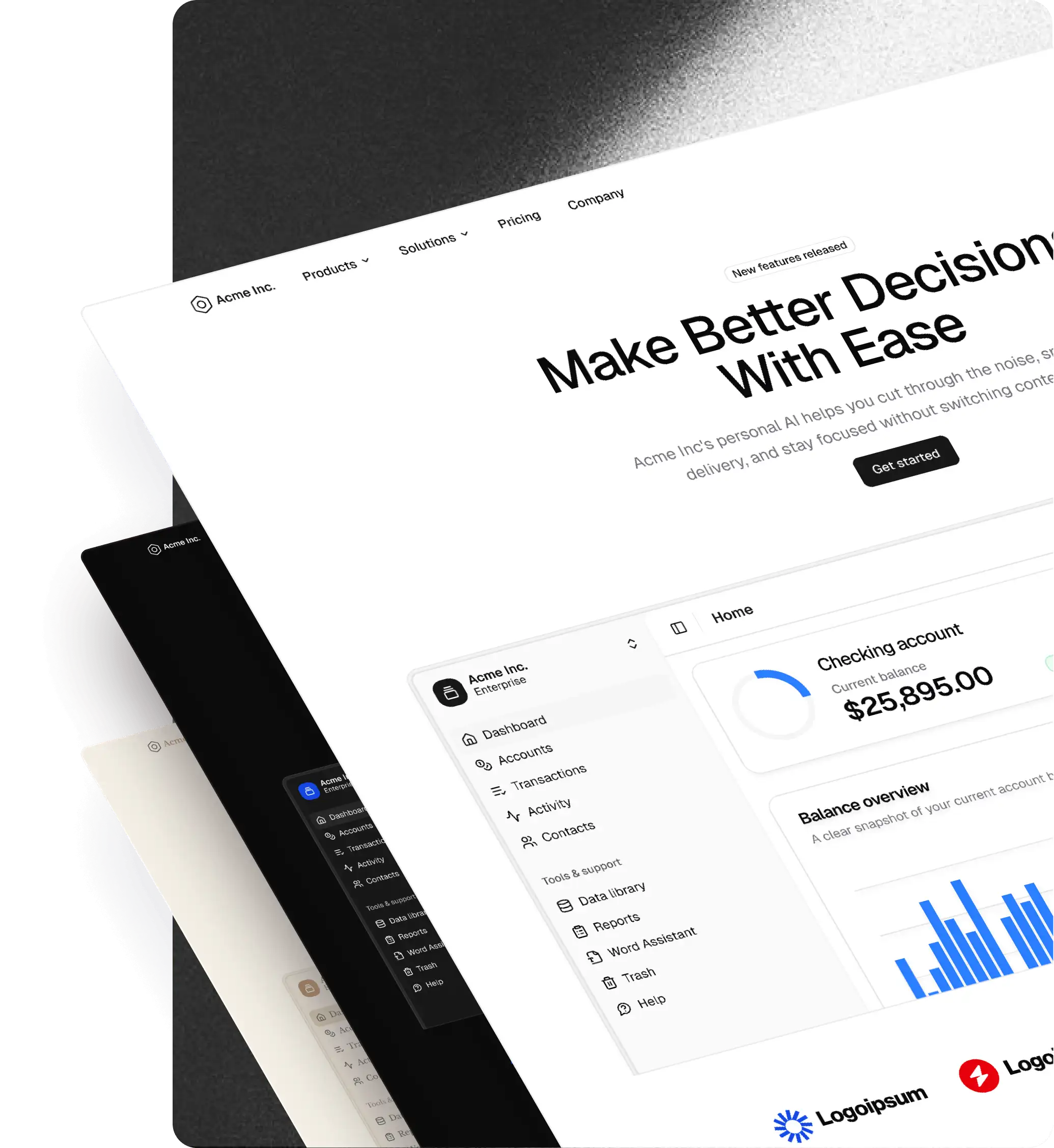
Free
Free shadcn/ui components, blocks, and Figma kit
The starter bundle includes a Figma UI kit and a curated set of React components and blocks. Explore the quality of the system before upgrading to the full kit.
What's included
What you get with Free
A small but complete starting point for working with shadcncraft.
A lightweight Figma UI kit with core components and a few example blocks to explore the structure and workflow.
Free React component registry
Access a growing registry of free React components built on shadcn/ui, ready to install and use in your projects.
Theme-ready components
All components follow the same structure used in the Pro kits, so upgrading later is seamless.
Beyond Free
What you unlock when you upgrade
The free kit is just the starting point. Upgrade to unlock the full shadcncraft design system.
Premium blocks
Hundreds of production-ready blocks for landing pages, dashboards, onboarding flows, pricing sections, and more. Structured layouts built on shadcn/ui to help teams ship faster.
Advanced components
Hundreds of additional UI components built on shadcn/ui patterns. More powerful building blocks for complex interfaces and scalable applications.
Pro Figma + React blocks
Production-ready React equivalents aligned with the Figma UI kit. Install components directly into your project and build faster with shadcn/ui.
Full design system
The complete shadcncraft Figma UI kit with advanced components, layouts, and themes. Built to scale from landing pages to complex products.
Designed to upgrade smoothly
Upgrade without rebuilding
The free kit uses the same structure as the full shadcncraft design system. When you upgrade, your projects continue to work exactly the same way.
Same component structure
Free components follow the same patterns used in the Pro library.
Compatible with Pro Blocks
Add premium blocks and components later without redesigning your layouts.
Works with the shadcncraft plugin
Import themes, generate React code, and keep your Figma and code aligned.
Why teams start with the Free kit
A simple way to evaluate the system
Use the free version to test the workflow before committing to the full kit.
Explore the Figma UI Kit
See how components are structured and themed in the Figma UI kit.
Test React components
Install components from the free registry and use them in real projects.
Evaluate the workflow
Try the Figma → React pipeline before upgrading.
Free blocks
Explore our starter blocks. Preview them live and install with the shadcn CLI.
Free
Banner 10
Inline announcement link
Free
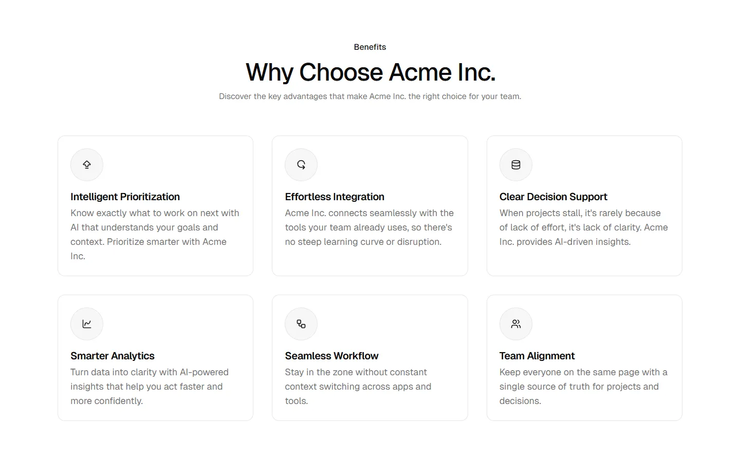
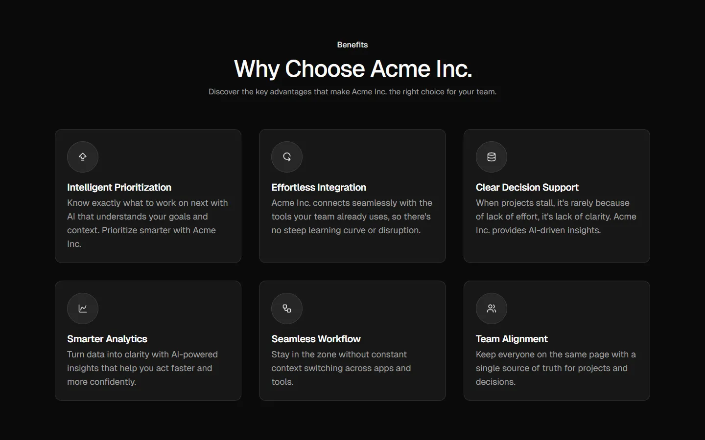
Benefits 13
Card grid with section header
Free
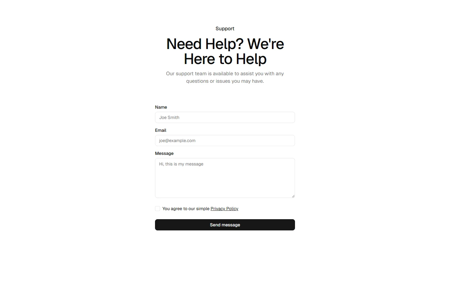
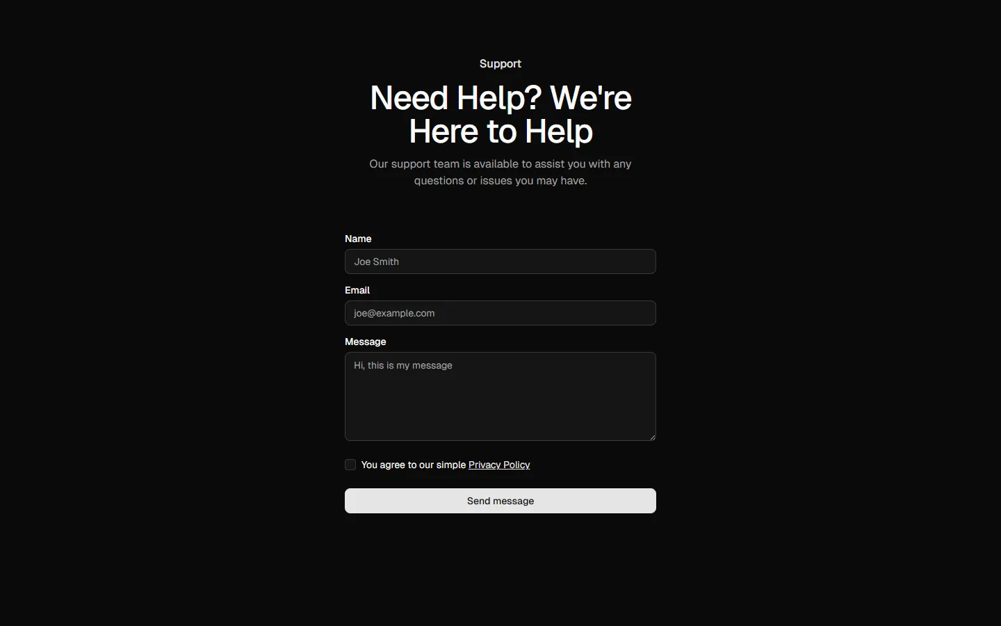
Contact 11
Centered form with supporting sidebar
Free
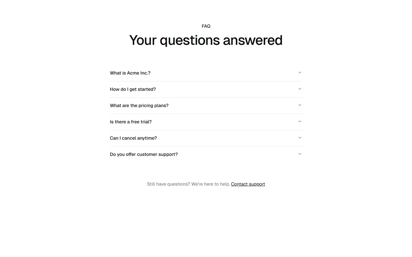
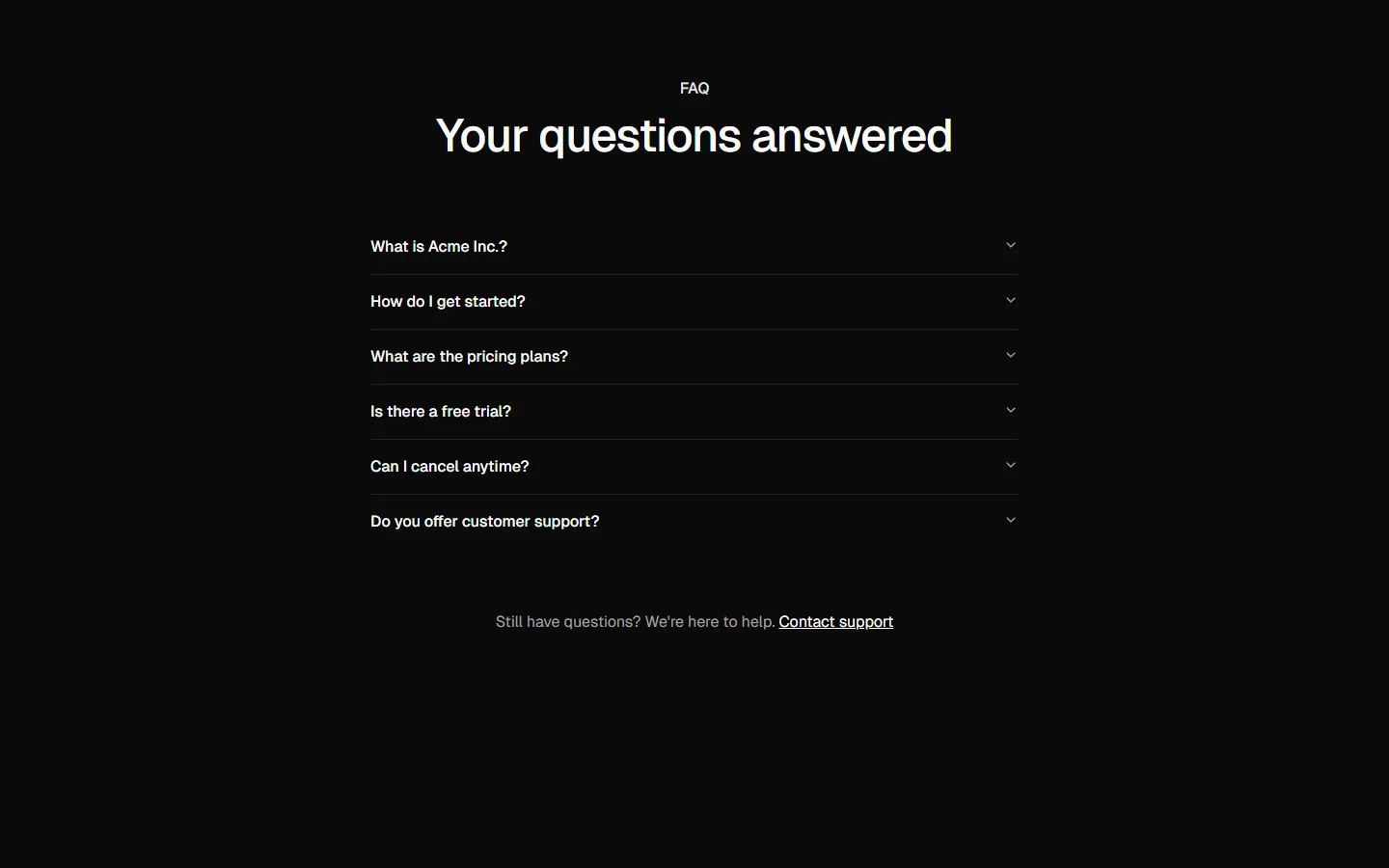
FAQ 4
Centered accordion with supporting panel
Free
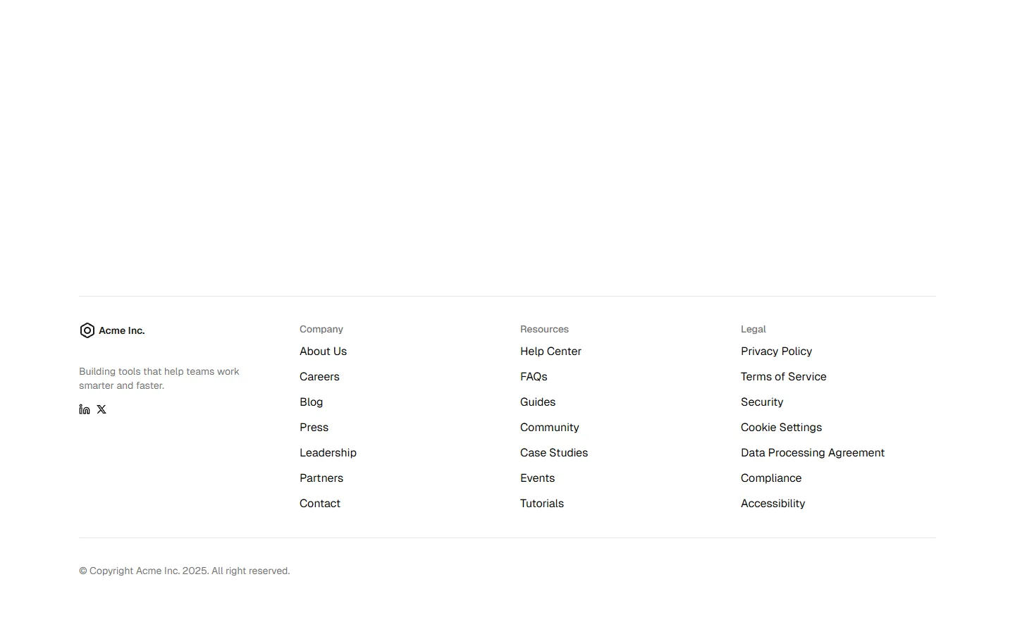
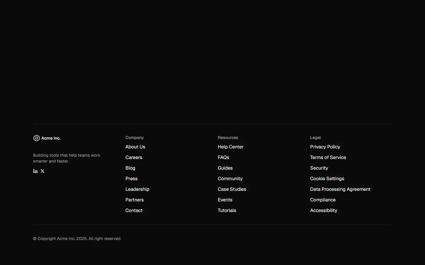
Footer 4
Brand-led sitemap footer
Free
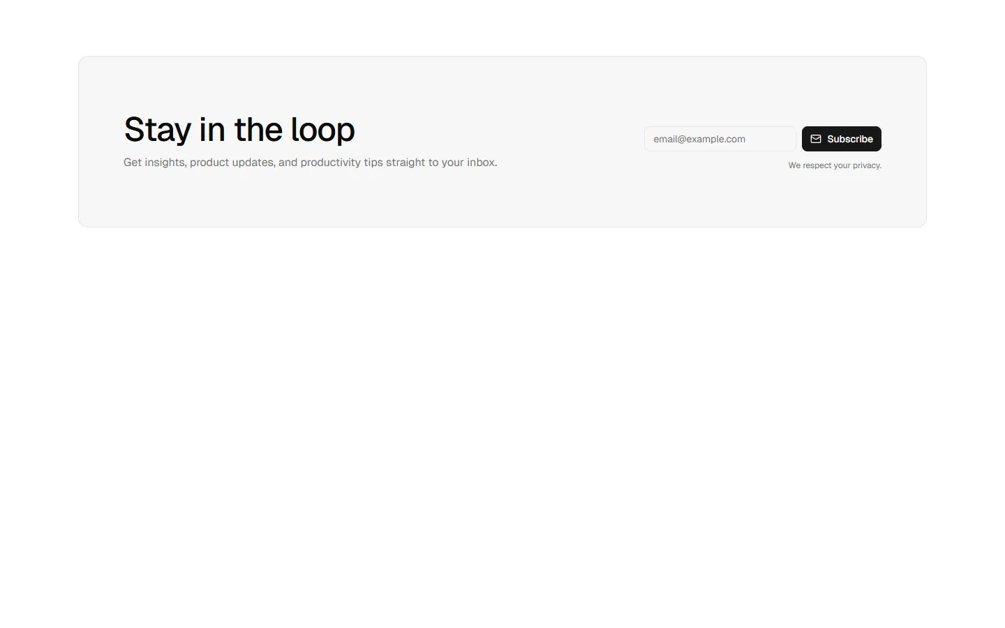
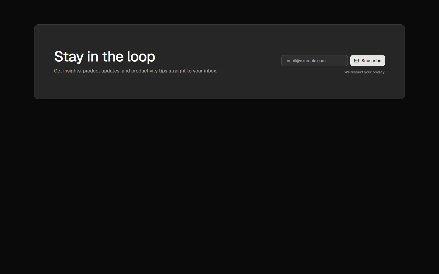
Newsletter Signup 5
Inline callout with contained form
Free
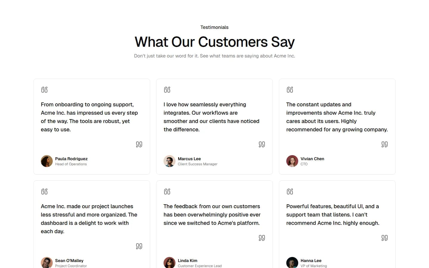
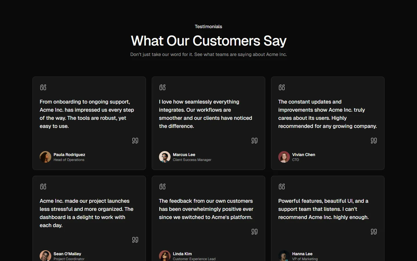
Testimonial 11
Editorial quote grid
Free
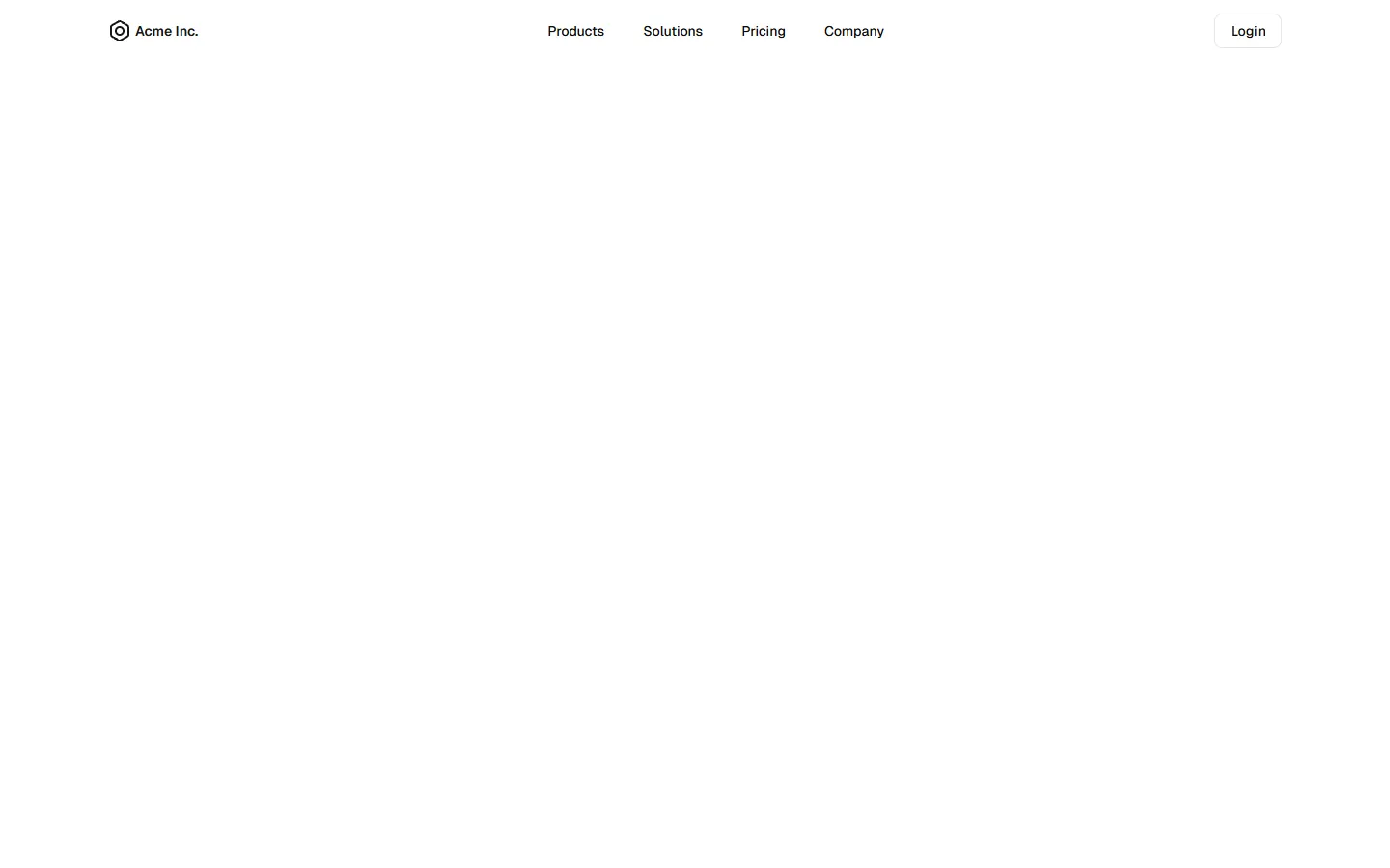
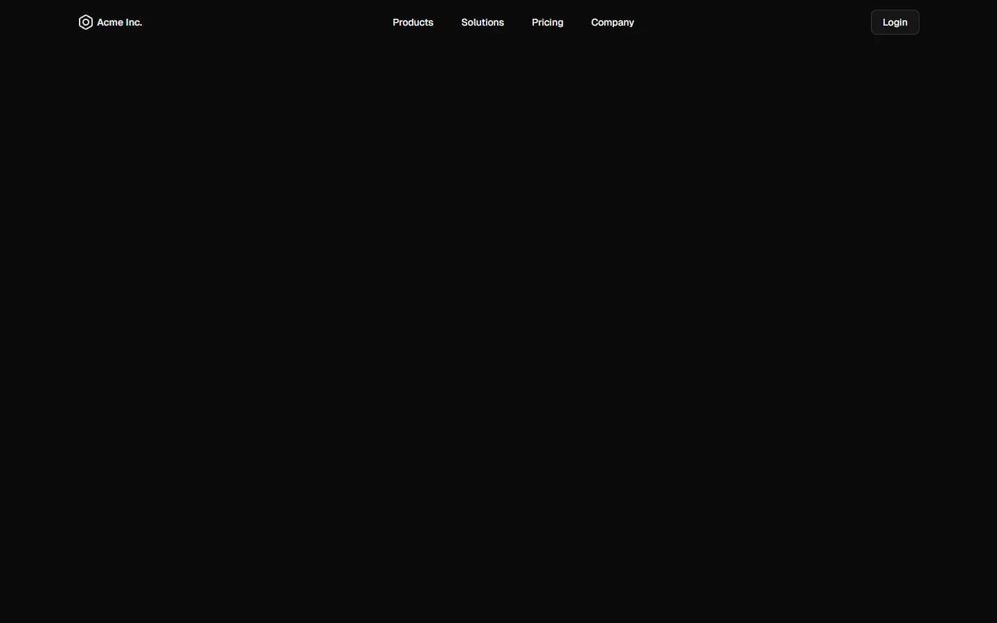
Top Navigation 5
Minimal center-aligned links with inline auth
Free components
Try our starter components. Preview them live and install with the shadcn CLI.
Frequently Asked Questions
Yes. The free kit is distributed under the Figma Community license.
Theme import, export, and icon switching are free to use. React export and CLI generation require a Pro Figma + React package.