shadcn/ui theming

Theme shadcn/ui across Figma and code

shadcncraft themes shadcn/ui end to end. Layer themes over any of seven shadcn styles in Figma, drive Pro components and blocks from the same tokens in code, and keep design and code in sync with shadcn Create preset codes.
The full surface

Theme the whole product, not just the colors

Most shadcn theme tools cover color and maybe a radius slider. shadcncraft styles the complete shadcn surface across Figma and code: the color palette, the radius scale, the spacing scale, typography, shadows, and paired light and dark.
Color
Background, foreground, primary, accent, destructive, muted, border, ring, plus chart and sidebar palettes. Light and dark tuned together.
Radius
The full shadcn radius scale, base radius and every derived step. Adjust the base and every component picks up the new shape.
Spacing
Component padding, gap, and density. Tuned per shadcn style so dense product UIs and airy marketing pages each feel right.
Typography
Sans, serif, and mono families. Scale and line heights move together so headings and body stay in proportion.
Shadows
A full shadow scale per style. Components that need depth get the right elevation without one-off CSS.
Light + Dark
Every shadcncraft theme ships with paired light and dark modes. Both stay in sync as you edit.
Theming in Figma

Native shadcn styles, real themes, and Dark mode in one file

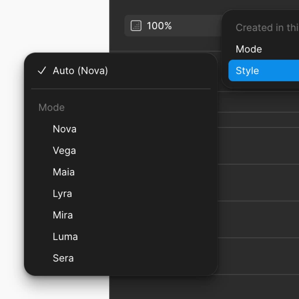
The shadcncraft Figma UI kit is the only shadcn/ui Figma library where every shadcn style lives as native variables. Switch styles, layer tweakcn themes on top, and flip between Light and Dark without redoing the styling by hand.
  • All seven shadcn styles native in Figma variable modes
  • Layer a tweakcn theme over any base style with the shadcncraft plugin
  • Light and Dark across every style and theme combination
  • Import a theme from a shadcn/ui globals.css, or export one back to CSS
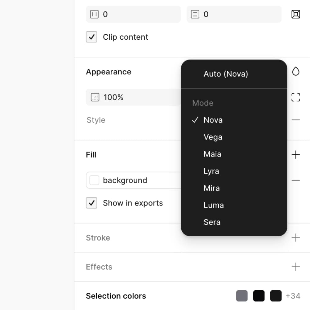
shadcncraft themes layered over shadcn styles in Figma
Theming in Pro + React

Styled by the shadcn tokens already in your project

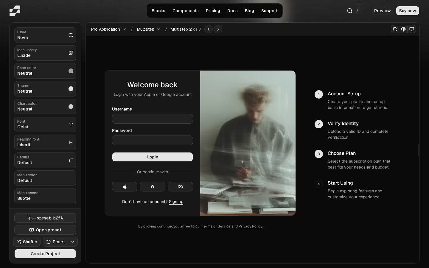
shadcncraft Pro Components, Blocks, and templates use the standard semantic shadcn theme tokens, the same ones shadcn writes into your project's globals.css. Whatever theme your project already has drives the whole library, light and dark. No separate theme system, no translation layer.
  • Pro components styled by the same semantic shadcn tokens
  • Pro marketing, application, and ecommerce blocks read the same tokens
  • Page templates and full layouts pick up your project's tokens by default
  • Change tokens in globals.css and every component reflects the new values, light and dark
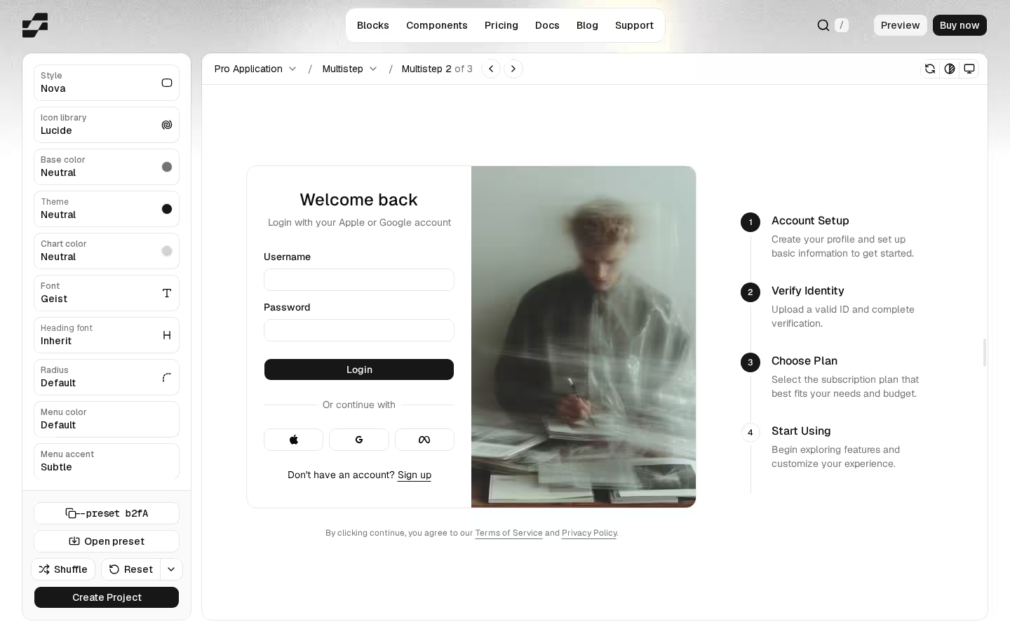
Pro React components and blocks styled by the same shadcn theme tokens
Styles vs themes

What's a style. What's a theme.

shadcn-land uses both words. They are not the same thing. A style is the full visual language of the system. A theme is a narrower layer of color, radius, and font values on top of a style.
Style

The complete visual language

shadcncraft ships seven complete styles, Nova, Vega, Maia, Lyra, Mira, Luma, and Sera. Each is a full configuration of every surface below.

  • Full color palette (background, foreground, primary, accent, destructive, muted, border, ring, plus chart and sidebar)
  • Radius scale (base radius and every derived step, sm through 4xl)
  • Typography (sans, serif, mono families, plus the type scale and line heights)
  • Spacing scale
  • Shadows
  • Icon set (Lucide, Tabler, HugeIcons, Phosphor, or Remix)
  • Per-component tokens (component-level radii, padding, hover states, surfaces)
Theme

The part you swap via globals.css

A theme is what fits in a standard shadcn/ui globals.css. tweakcn presets are themes. Custom brand palettes are themes. Layer one over any of the seven styles.

A theme covers

  • The color palette, light and dark
  • The base radius
  • Font families

A theme does not include

  • Shadows
  • The spacing scale
  • The icon set
  • Per-component tokens

Those stay with the underlying style. Layer a tweakcn theme over Nova or Maia and the style's spacing, shadow language, icons, and per-component shapes stay intact while colors, base radius, and fonts shift.

How it works

Build a theme once. Ship it everywhere.

shadcncraft is built around the same tokens that ship in a standard shadcn/ui project. That means one theme moves through Figma and code without translation. Here is the flow end to end.
  1. Start from a shadcn style
    Pick one of the seven shadcn styles, or paste a shadcn Create preset to start from your own. Each style is a complete set of tokens: colors, radii, type, spacing, shadows, icons, and per-component overrides.
  2. Adjust tokens or layer a theme
    Tweak colors, radius, fonts, and component-level tokens directly in shadcncraft Create. Or layer a tweakcn theme, a custom globals.css, or your brand colors over a base style.
  3. Preview live across Figma and code
    See your theme across buttons, forms, charts, dashboards, and full Pro blocks in real time. Light and dark together. No setup, no swapping files.
  4. Export to your stack
    Export a production-ready globals.css for shadcn/ui, copy the matching shadcn Create preset code, or open the theme as native variables in your Figma file via the shadcncraft plugin.
  5. Components pick up the new tokens
    Once the tokens are in your globals.css or your Figma file, every shadcncraft component, block, and template reflects them. No translation layer, no extra theming system.
The bridge

One theme, both sides, no drift

shadcncraft Create and the shadcncraft Figma plugin speak the same shadcn Create preset format. Paste a preset on either side and the same theme applies, so design and code never disagree about what the theme is.
Figma to code
Build a style in Figma, copy its shadcn Create preset code, and apply it in your shadcn/ui project with the shadcn CLI. The same theme drives both sides.
Code to Figma
Build a theme in shadcncraft Create, paste its preset code into the shadcncraft Figma plugin, and the same style appears as a new mode in your Figma file.
CSS at either end
Already have a globals.css? Import it into Figma to theme the kit. Export a Figma theme back to a production-ready globals.css to ship in code.

Frequently Asked Questions

Quick FAQs to get you started.
Still have questions? See all FAQs, or get support.

A shadcn/ui theme is a set of design tokens that controls how every shadcn component looks. It covers colors (background, foreground, primary, secondary, accent, destructive, muted, border, ring), radius, spacing, and typography.

A theme is layered on top of a base style. The style sets the foundation (palette, fonts, icon set, scale) and the theme adjusts specific tokens on top of it. The same theme can drive a Figma file and a shadcn/ui React project.
SBIOTJ

Join 3,000+ builders shipping with shadcncraft

Design and assemble full pages faster with production-ready blocks built for real products.
  • Production-ready blocks and components
  • Clean React and Tailwind parity
  • Built for SaaS, marketing, and ecommerce teams
Get the design system
Join Now CTA

Real support from the team behind shadcncraft

Get help within 24 hours from the people who build and maintain the system.
Email
Prefer a direct line? Send us a message and we'll get back to you as soon as possible.
Discord
Get quick support, share feedback, or connect with other builders.
Feedback
Got something to say about anything shadcncraft? We'd love to hear it.