All blocks
Testimonials
shadcn/ui Team blocks introduce the people behind your product or service. A humanising element for agencies and startups where relationships with customers are central.
In Pro & Pro + React
React
Figma
Pro
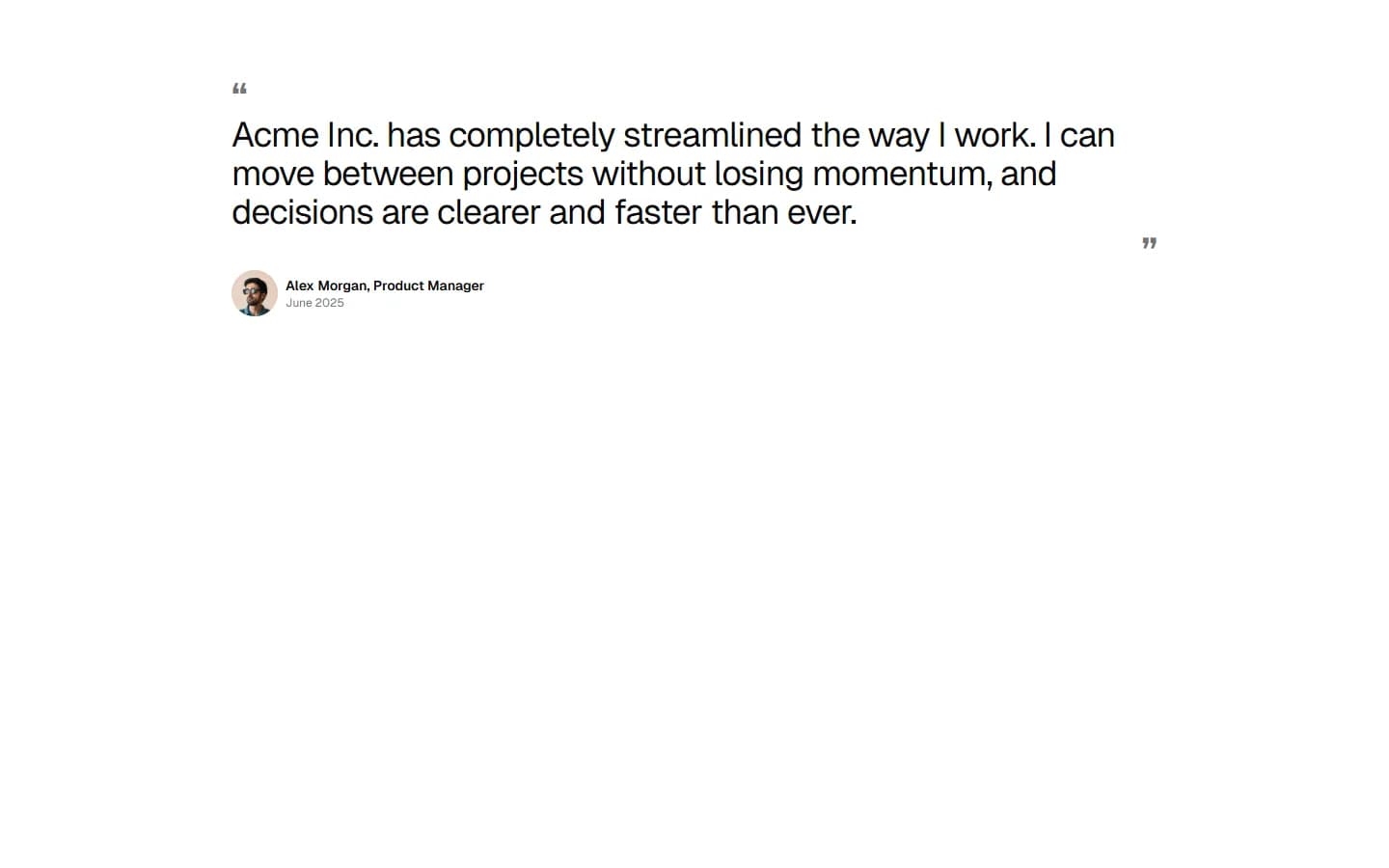
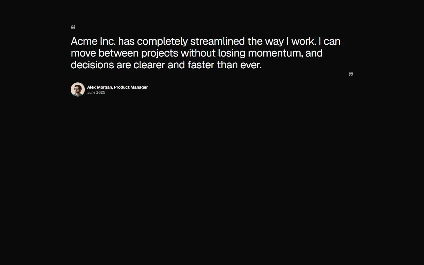
Testimonial 1
Single feature quote
Pro
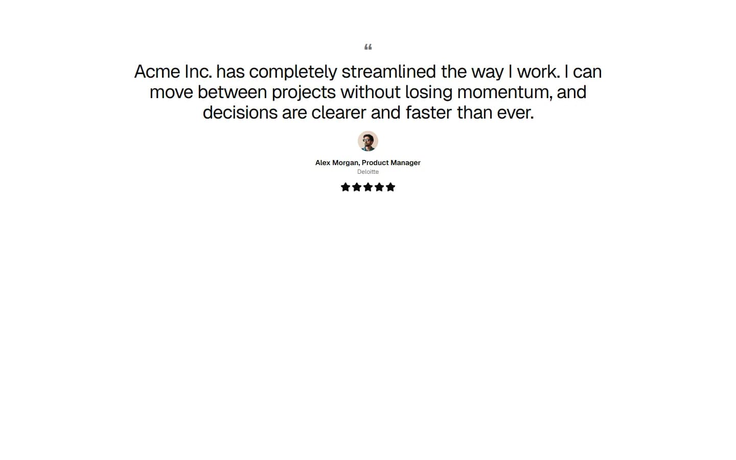
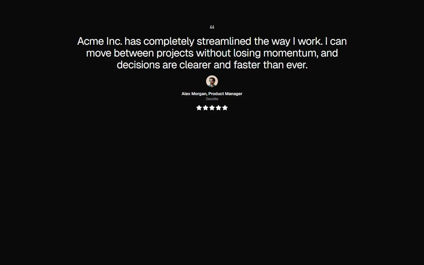
Testimonial 2
Centered quote with attribution focus
Pro
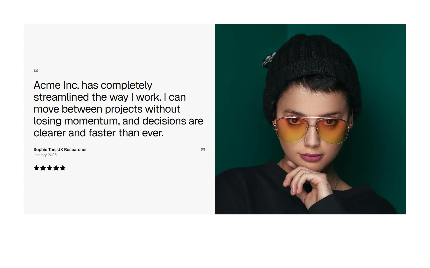
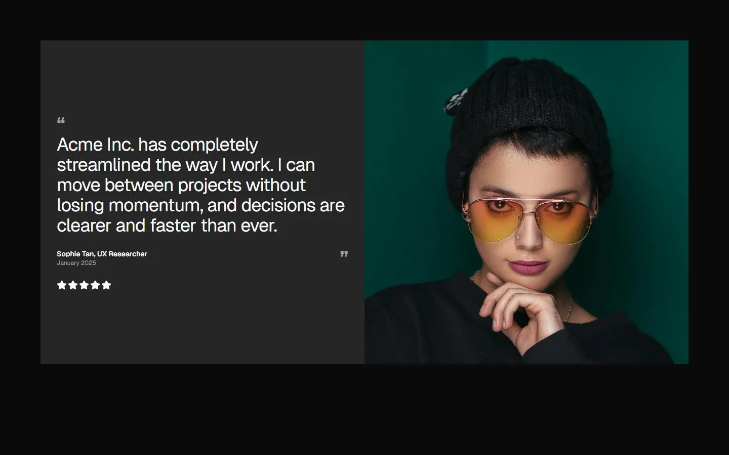
Testimonial 3
Split quote with featured profile
Pro
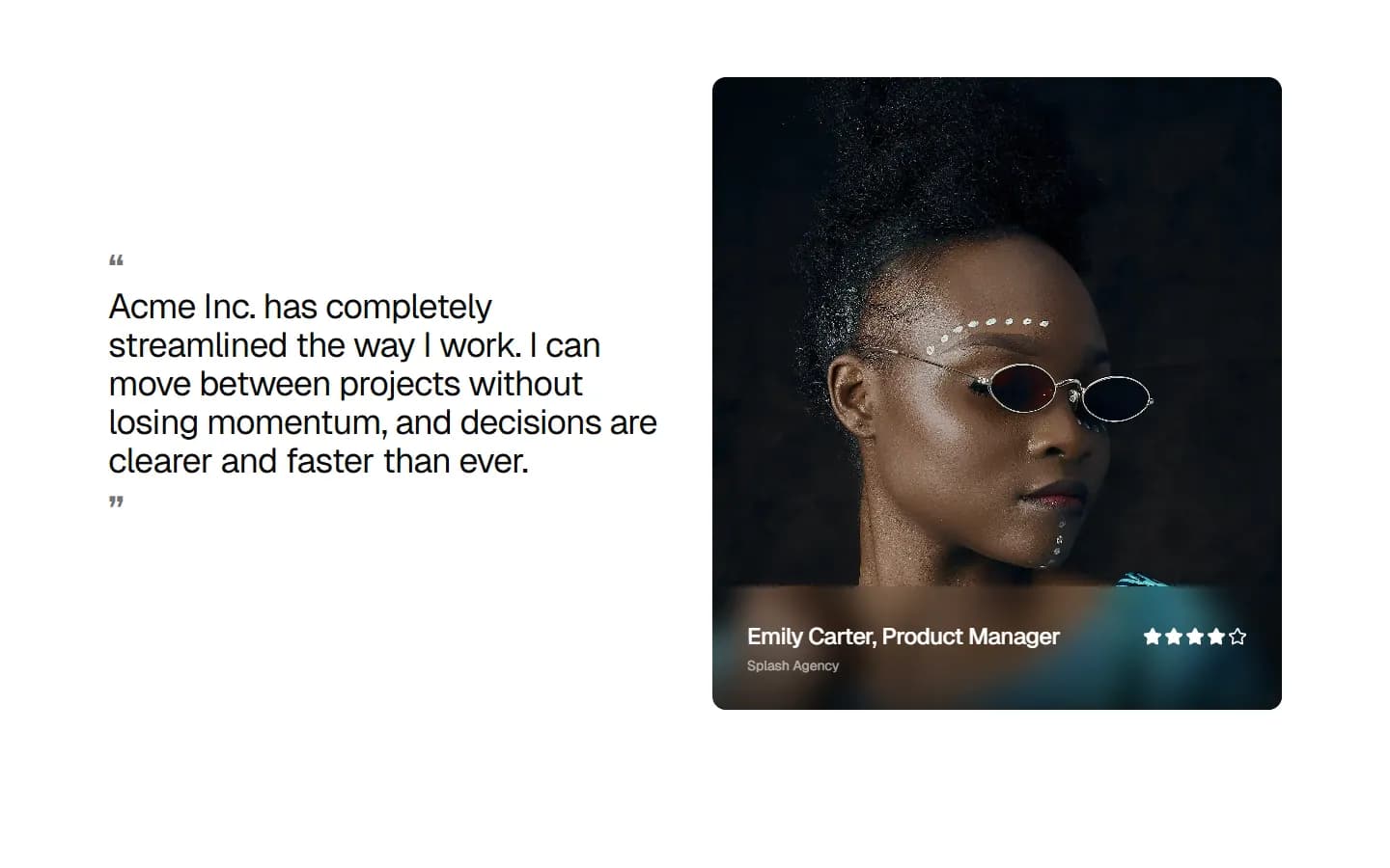
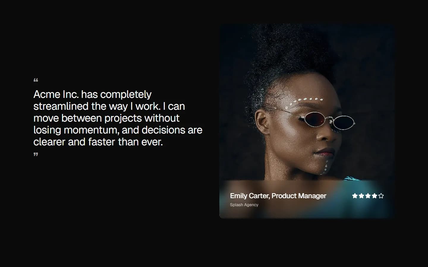
Testimonial 4
Image-led split with rating
Pro
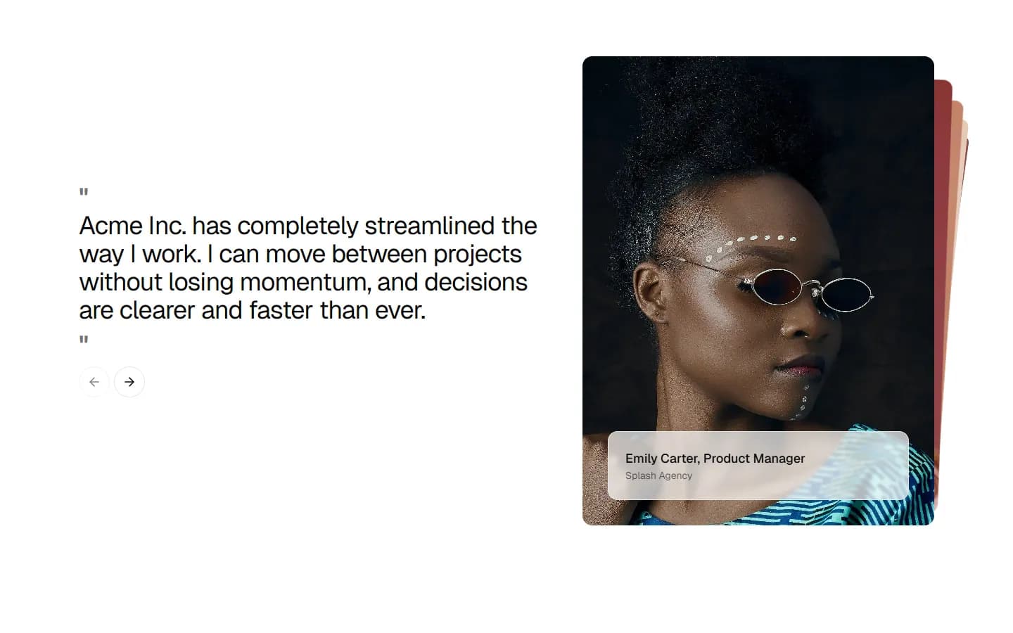
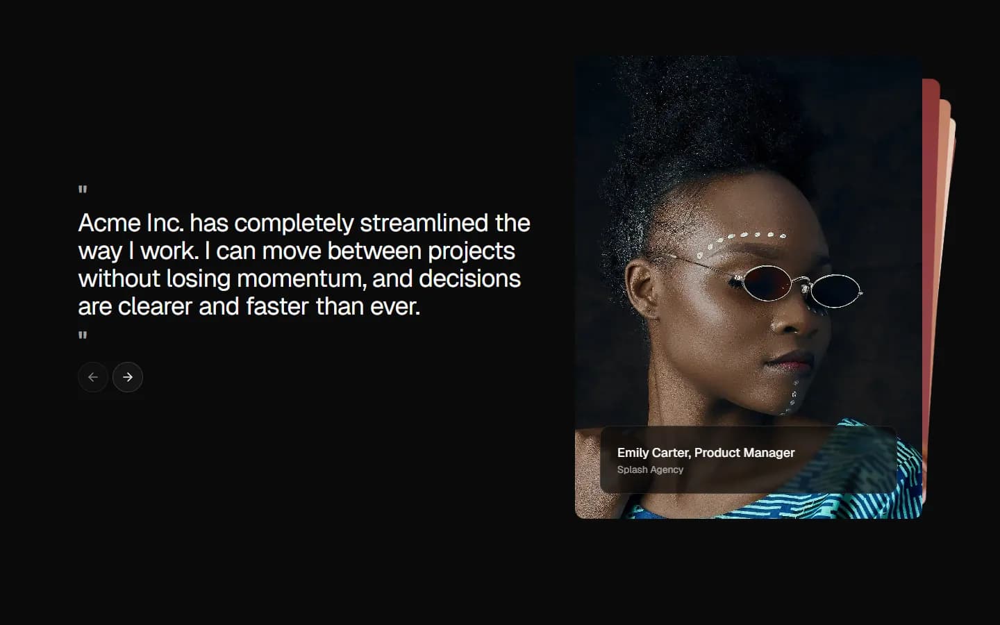
Testimonial 5
Card carousel with stacked media
Pro
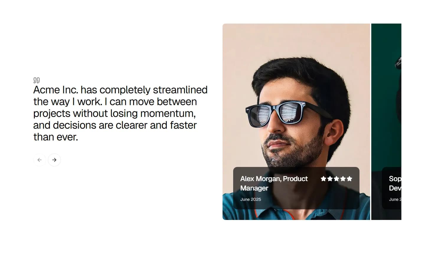
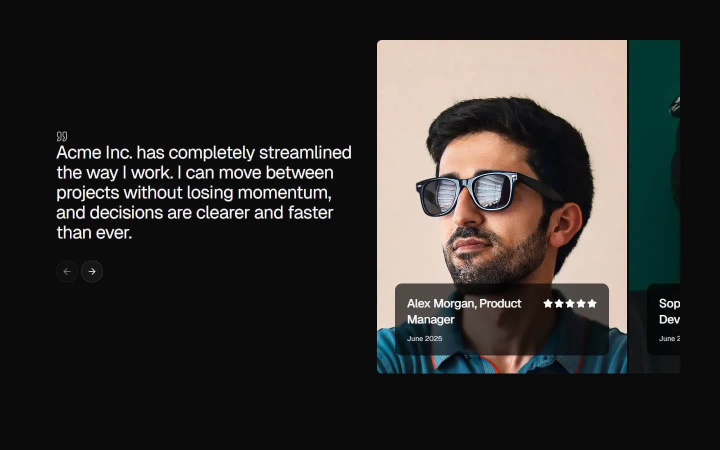
Testimonial 6
Split carousel with overlapping profile cards
Pro
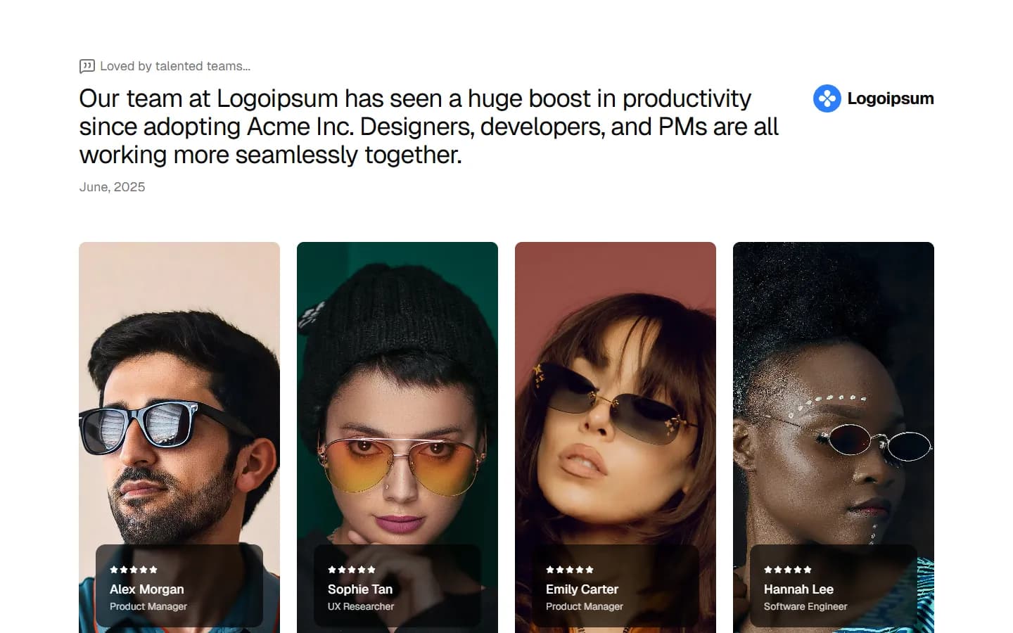
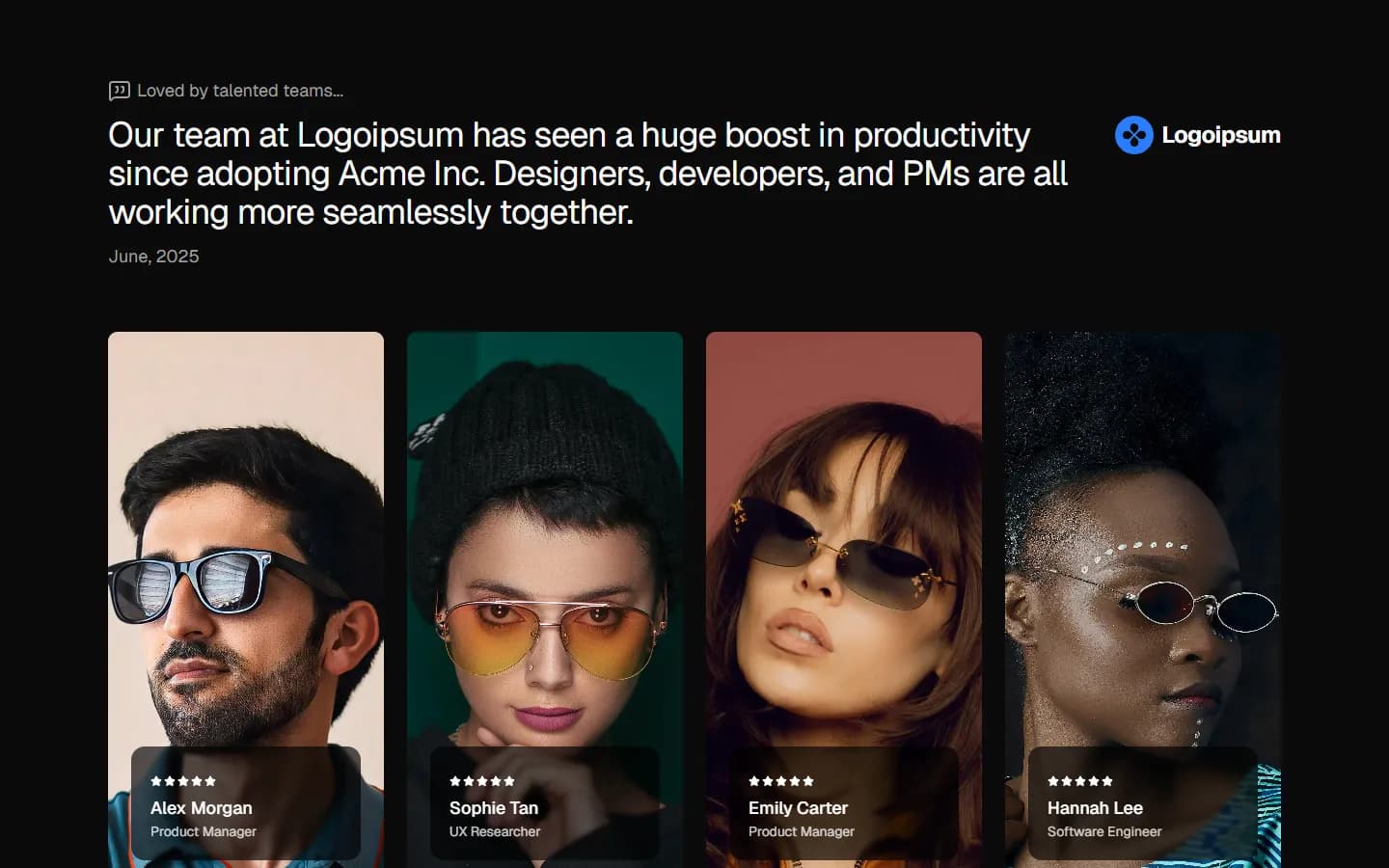
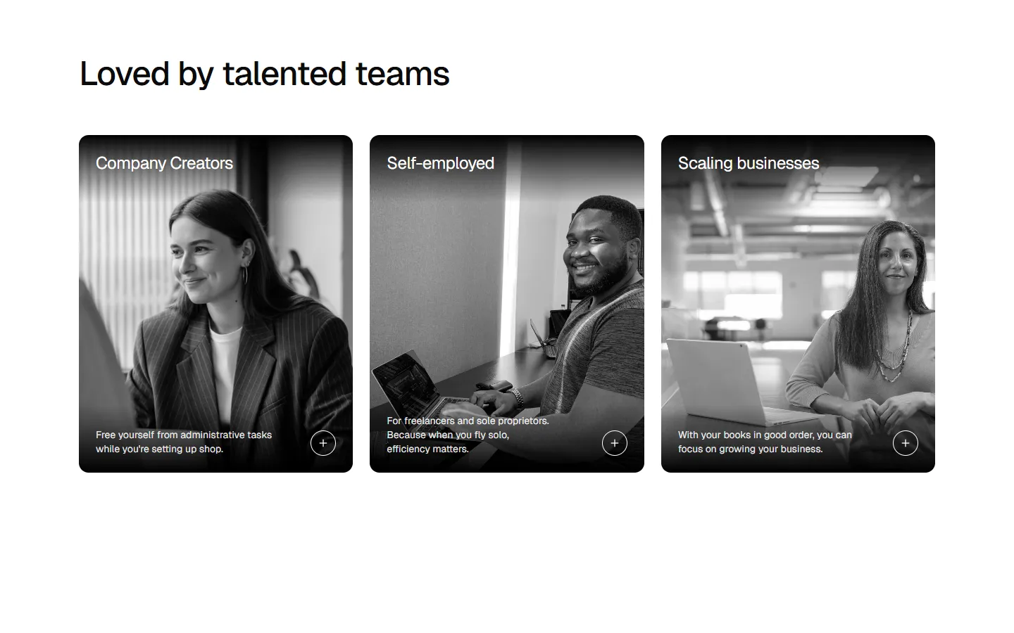
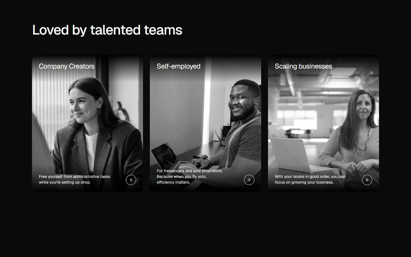
Testimonial 7
Multi-profile grid with headline lead
Pro
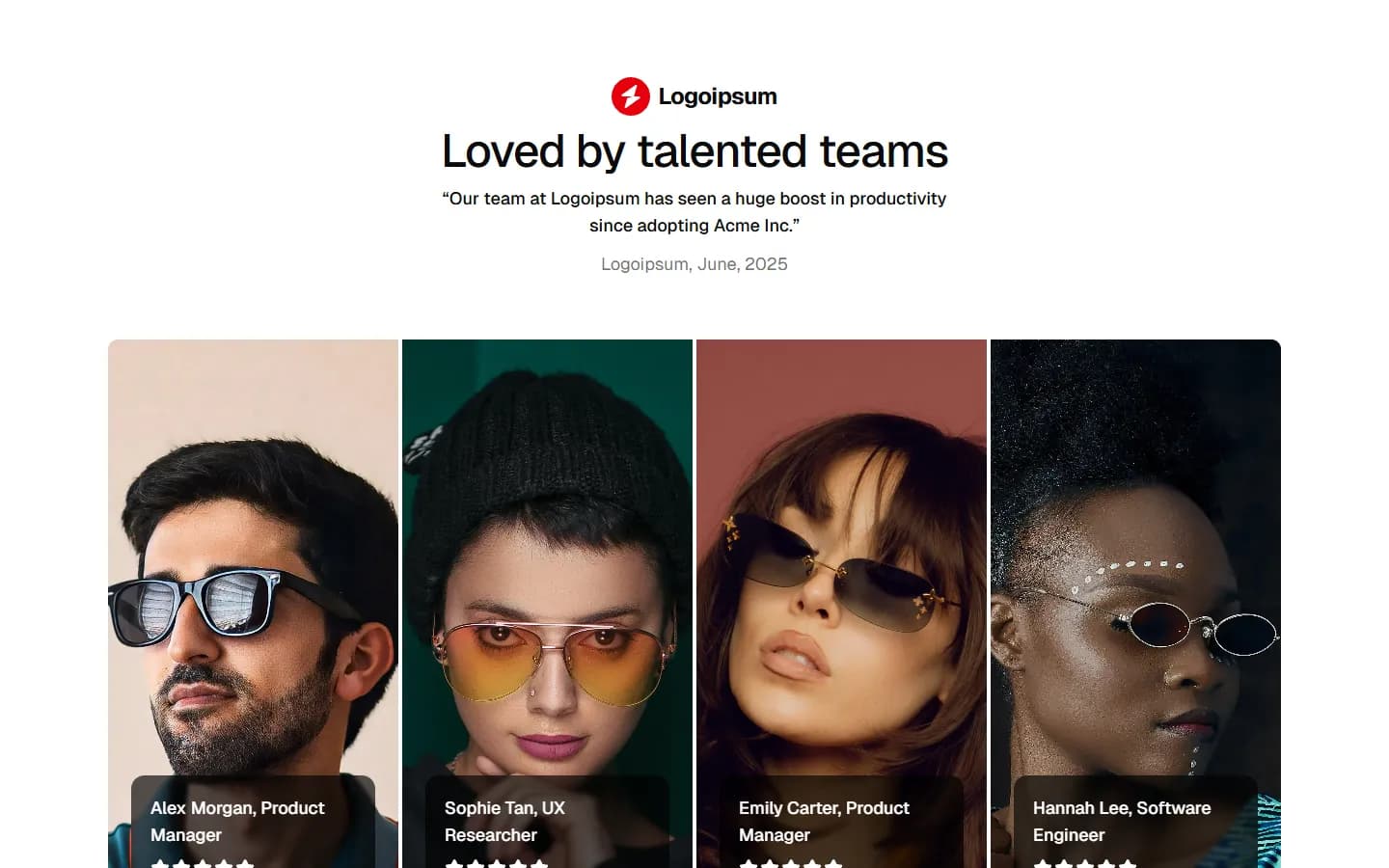
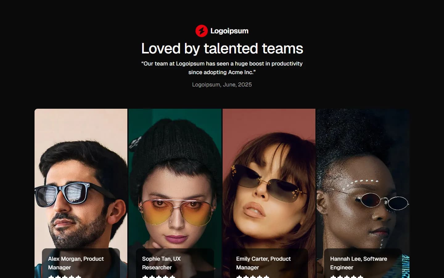
Testimonial 8
Branded quote with team strip
Pro
Testimonial 9
Multi-segment case cards
Pro
Testimonial 10
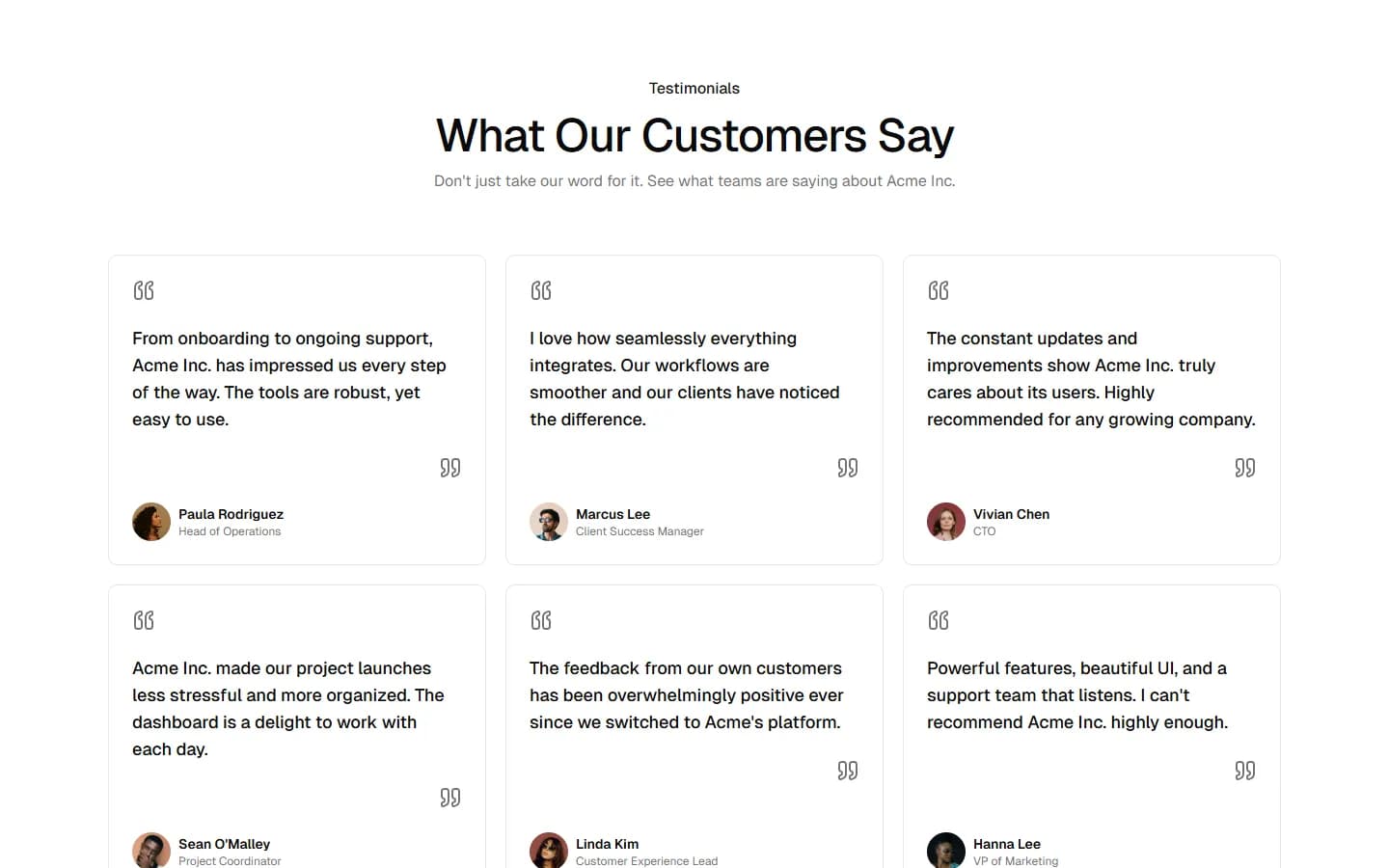
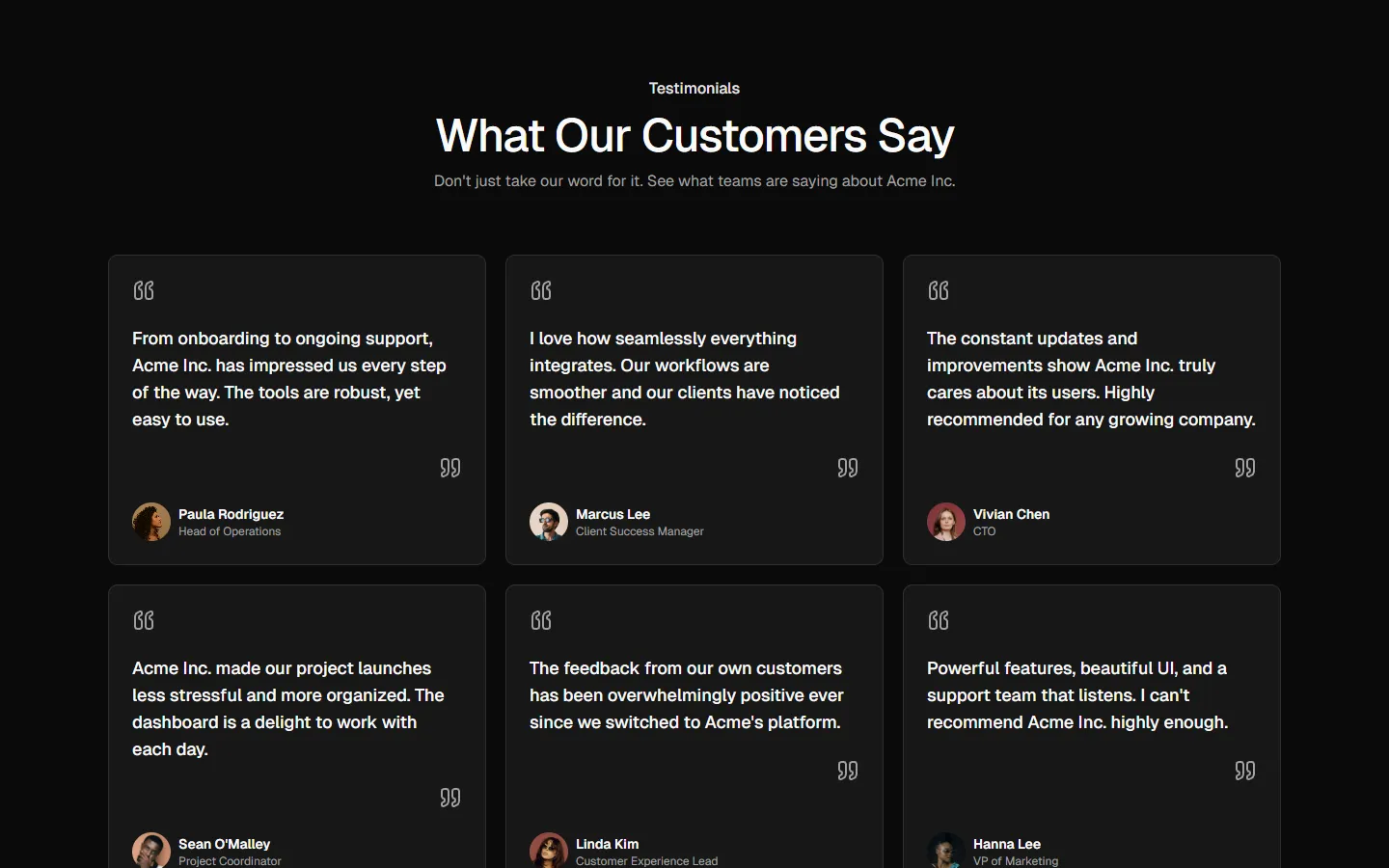
Dense quote grid
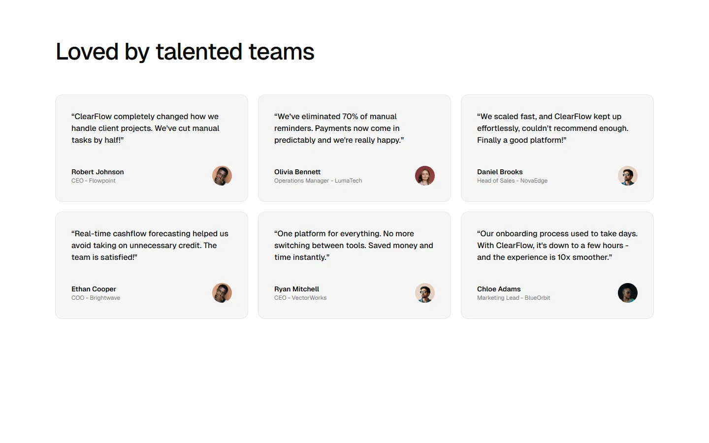
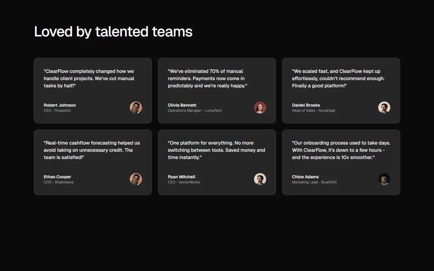
Free
Testimonial 11
Editorial quote grid
SBIOTJ
Join 9,000+ builders shipping with shadcncraft
Get access to these blocks and the full library
Production-ready blocks and components with matching Figma and React.


Benefits
Designed for your shadcn/ui project
Blocks built to work together across marketing pages and product interfaces.
Consistent layout system
Shared spacing, grids, and typography across all blocks.
Composable layouts
Combine blocks to build complete pages without layout conflicts.
Theme compatible
Works with shadcn/ui themes and token-based color systems.
Production-ready structure
Layouts designed with real content patterns and responsive behavior.
Explore all block categories
Built on official shadcn/ui components with real structure, spacing, and accessibility. No AI-generated layouts. Designed for real products in Figma and React.