What Is shadcn/ui? How It Works & Why Devs Choose It
shadcn/ui is a modern UI component approach for React applications that prioritizes ownership, flexibility, and composability over traditional component libraries.
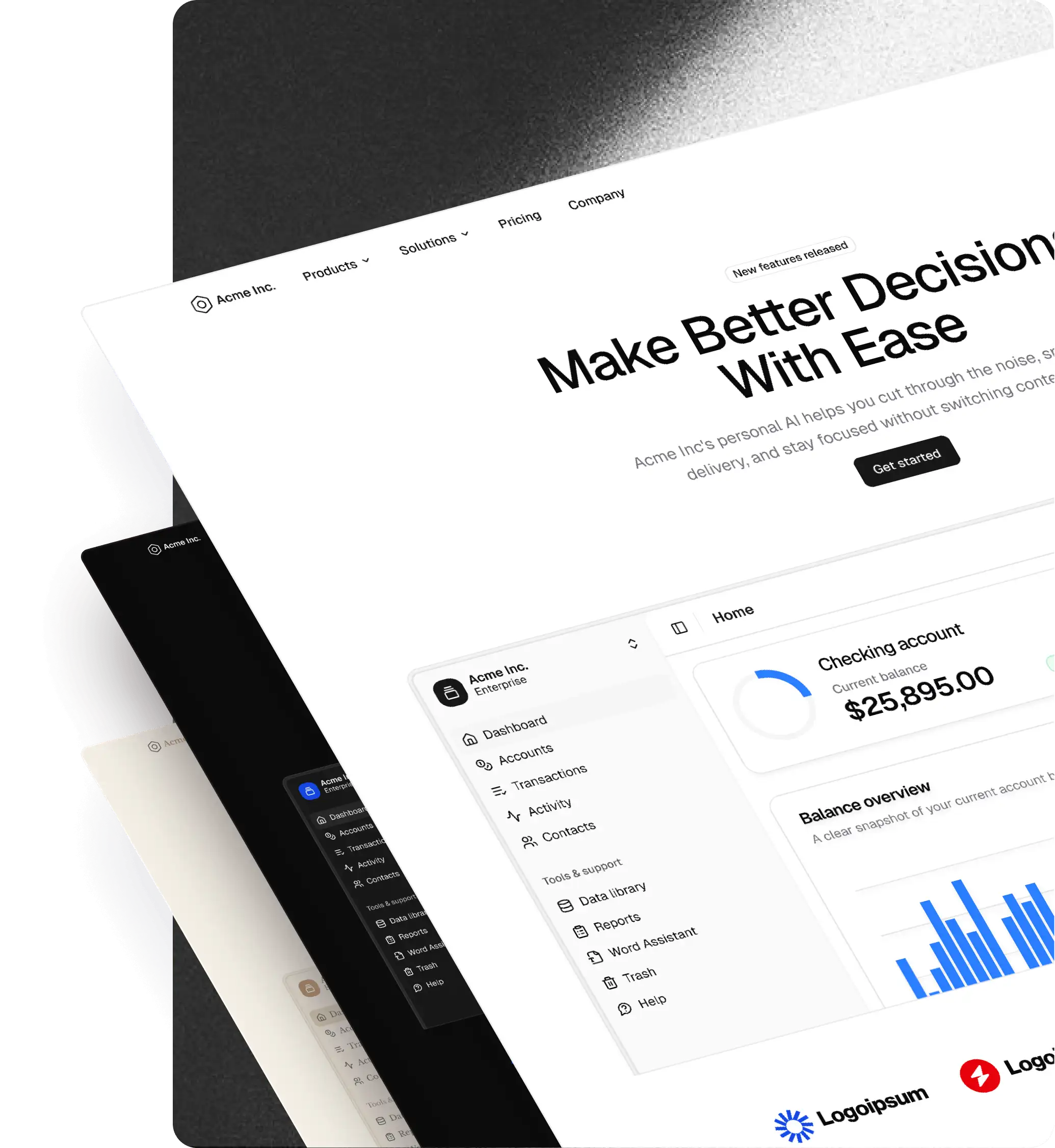
Instead of installing a precompiled UI package, shadcn gives you copy-pasteable, open-source components built with React, Tailwind CSS, and Radix UI. These components live directly inside your codebase, meaning you fully control styling, structure, and behavior.
This model has made shadcn one of the most popular choices for teams building modern product interfaces with long-term maintainability in mind.
Looking for production-ready shadcn/ui components and blocks? → Explore shadcncraft — the shadcn/ui design system
Why shadcn is different from traditional UI libraries
Most UI libraries work like black boxes. You install them, configure a theme, and accept their constraints.
shadcn flips that model.
With shadcn:
- Components are yours, not hidden behind a package
- Styles are written using Tailwind CSS, not custom abstractions
- Accessibility is handled via Radix UI primitives
- You can modify, extend, or delete any component at any time
This approach works especially well for:
- Product teams that expect their UI to evolve
- Design systems that require brand-level customization
- Developers who want clarity over magic
How shadcn works
shadcn components are installed directly into your project using a CLI. Once installed, they become part of your codebase.
Typical characteristics:
- No runtime dependency on a component library
- Components are plain React files
- Styling is done with Tailwind utility classes
- Design tokens live in your Tailwind and CSS variables
Because everything is local, shadcn scales from prototypes to production without a rewrite.
Common misconceptions about shadcn
“shadcn is a component library”
It is not. shadcn is a distribution pattern for components, not a packaged UI kit.
“You cannot theme shadcn”
You can. shadcn supports full theming via CSS variables and Tailwind configuration. Advanced setups support multi-brand and contextual theming.
“shadcn is only for developers”
While developer-first, shadcn works best when paired with a design system that mirrors its structure and tokens.
shadcn and design systems
shadcn is often misunderstood as a replacement for a design system. In reality, it is an implementation layer.
A strong shadcn setup usually includes:
- Design tokens for color, spacing, radius, and typography
- Clear component usage guidelines
- Consistency between design tools and code
- Guardrails for customization and extension
Without these, teams often drift into inconsistency despite shadcn’s flexibility.
Where shadcncraft fits
shadcn gives you the foundation — open source component primitives you own and control. shadcncraft builds on that foundation with production-ready components, pre-structured blocks and pages, and a complete Figma design system that mirrors the code.
shadcncraft does not replace shadcn. It is a layer on top of it.
If shadcn is the engine, shadcncraft is the car — assembled, tested, and ready to drive. You still have full access to the engine. You can modify anything. But you are not starting from a pile of parts.
Most teams reach for shadcncraft when they hit one of these moments:
- A deadline is approaching and assembling UI from scratch is too slow
- Designers and developers are working in different systems with no shared source of truth
- The team has chosen shadcn for development but needs a Figma UI kit that actually matches
- Building a new product or design system and wants a solid starting point rather than an empty canvas
shadcn vs shadcncraft: a detailed comparison
Summary table
| Topic | shadcn | shadcncraft |
|---|---|---|
| Figma | No official kit; teams often create/maintain their own. | Full Figma design system built to mirror the code (tokens, variants, states). |
| Components | Primitives (Button, Dialog, Input) you compose. | Production-ready components and composed patterns built on shadcn primitives. |
| Blocks and pages | You assemble layouts from scratch. | Pre-structured blocks and full page templates you can use or remix. |
| Setup effort | Configure + install + compose over time; can take days/weeks. | Pre-structured system; start designing/building day one with the same CLI workflow. |
| AI-assisted design to code | Code-first AI workflows via MCP. | Extends to design-first workflows: Figma UI kit structure → MCP → AI → accurate code. |
| Theming | Powerful, but multi-theme cohesion requires manual setup. | Tokens defined once across Figma + React; theme switching maps cleanly to CSS vars. |
Figma
shadcn
shadcn does not include an official Figma UI kit. Community files exist, but they vary in
quality and quickly fall out of sync with the codebase. Teams using shadcn in production
typically end up building their own Figma components, which is time-consuming and creates
ongoing maintenance overhead.
shadcncraft
shadcncraft includes a complete Figma design system built with variables, theming, and
component states. Components are structured to match the React implementation — same naming,
same variants, same hierarchy. When a designer builds a screen in the Figma UI kit, a developer
can implement it without guesswork because the components map directly to code.
The Figma UI kit supports:
- Color, spacing, and radius tokens via Figma variables
- One-click theme switching including light and dark mode
- Interactive states (hover, focus, disabled, error) on all components
- Block-level layouts for full page sections, not just individual components
Components
shadcn
shadcn provides component primitives — the building blocks. A Button, a Dialog, an Input.
They are well-built, accessible, and unstyled beyond Tailwind defaults. You compose them
into whatever your product needs.
shadcncraft
shadcncraft provides production-ready components that extend these
primitives. The same Button, Dialog, and Input — but also composed patterns like data
tables with sorting and filtering, multi-step forms, command palettes, and navigation
systems. These are built on top of the same shadcn primitives, so they are fully
compatible with your existing setup.
Blocks and pages
shadcn
With shadcn, you start from an empty canvas. You install components individually and
assemble them into layouts yourself. This gives you maximum flexibility but requires
significant design and engineering time to get from components to a working page.
shadcncraft
shadcncraft includes pre-structured blocks and full page templates.
Marketing heroes, pricing sections, dashboard shells, settings pages, authentication
flows — layouts that work together because they are built from the same component and
token system. You can use them as-is or break them apart and reassemble.
Setup effort
shadcn
A typical shadcn setup involves configuring Tailwind, setting up CSS variables, installing
components one by one via the CLI, choosing a color scheme, and composing everything into
a coherent layout. This process gives you deep understanding of your system but takes days
to weeks depending on the scope.
shadcncraft
shadcncraft is pre-structured. Components, tokens, and layouts are already assembled into
a working system. You can start designing or building from day one and customize as you go.
The React components install via CLI in the same way shadcn components do — the workflow is
identical, just with more available out of the box.
AI-assisted design to code
shadcn
shadcn supports integration with AI tools through MCP (Model Context Protocol). Developers
can connect AI assistants to their codebase and generate or modify shadcn components
programmatically.
shadcncraft
shadcncraft extends this workflow to the design side. Because the Figma UI kit uses consistent
naming, proper token structure, and a hierarchy that mirrors the code, AI tools connected
via Figma MCP can read a designer's work and generate accurate React components. The Figma
kit acts as a structured input layer — the design becomes the prompt.
Without a structured Figma UI kit, teams using shadcn alone have no design layer for AI to read. The workflow is code-only. With shadcncraft, the full loop — design in Figma, read via MCP, generate code — becomes possible.
Theming
shadcn
shadcn supports theming through CSS variables and Tailwind configuration. You can customize
colors, radius, spacing, and typography. But setting up a cohesive multi-theme system
requires manual configuration across your entire component set.
shadcncraft
shadcncraft provides a theme system that works across both Figma and React. Tokens are
defined once and apply everywhere. Switch themes in Figma with a single click. In React,
theme tokens map to CSS custom properties that update across all components simultaneously.
When to use shadcn alone vs shadcncraft
shadcn alone is a good fit if:
- You are a solo developer building a personal project or prototype
- You want to deeply understand every component in your system
- You have the time and interest to build your design system from scratch
- Your team does not use Figma, or designers build components independently
- You prefer maximum control and minimal abstraction
shadcncraft is a good fit if:
- You are shipping on a deadline and cannot afford to assemble everything from scratch
- Your team includes both designers and developers who need a shared system
- You want a Figma UI kit that directly maps to your React components
- You are building a SaaS product, internal tool, or marketing site and want real page templates, not just primitives
- You want to use AI-assisted workflows to go from design to code faster
Using both together
shadcncraft is built on shadcn. If you start with shadcncraft and later need a component that is not included, you can install any shadcn primitive alongside it. There is no lock-in and no conflict. The component system, tokens, and CLI workflow are fully compatible.
Who shadcn is best for
shadcn is a strong choice if you:
- Build React or Next.js applications
- Use Tailwind CSS
- Want long-term control over your UI
- Prefer composable primitives over rigid components
- Care about accessibility and performance
It may be less suitable if you:
- Want zero setup
- Prefer pre-styled components with limited customization
- Do not want to touch component code
Getting started with shadcn
To get started with shadcn, most teams:
- Set up Tailwind CSS and CSS variables
- Install the shadcn CLI
- Add components as needed
- Customize tokens and styles over time
From there, teams typically introduce:
- Shared theming
- Component usage guidelines
- Design parity between Figma and code
Learn more and go deeper
If you want to explore shadcn further:
- Read our beginner-friendly guides
- Explore component patterns and blocks
- See how teams use tokens for fast theming
- Learn how to align Figma and React using a shared system
shadcncraft is built for teams who want to take shadcn seriously, not just try it.
Ready to ship faster? Explore everything in shadcncraft, or get the design system.