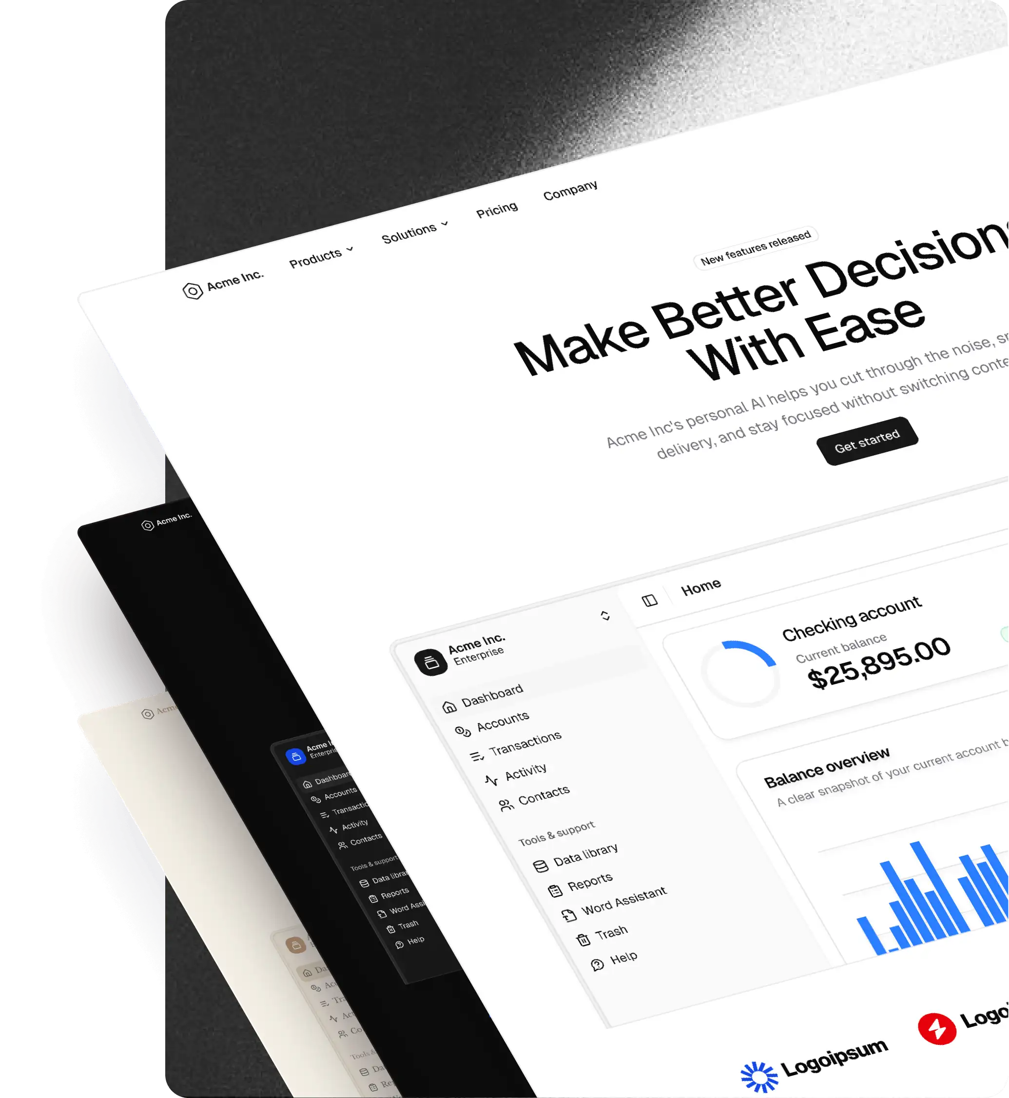
Figma
shadcn Figma UI Kit
The complete shadcn Figma UI kit. All eight styles native, preset and theme imports from shadcn Create and tweakcn, and icon switching across five sets. Every component matched 1:1 with shadcn in code.

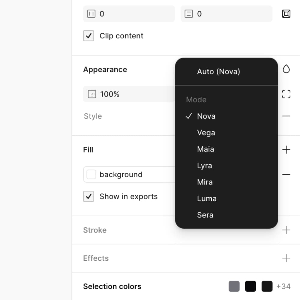
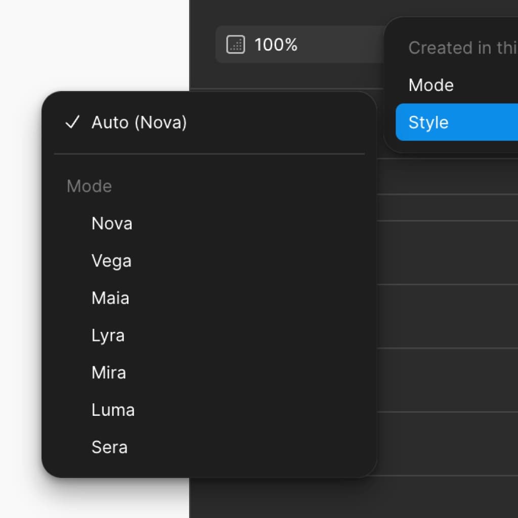
Native styles
All eight styles, native in Figma
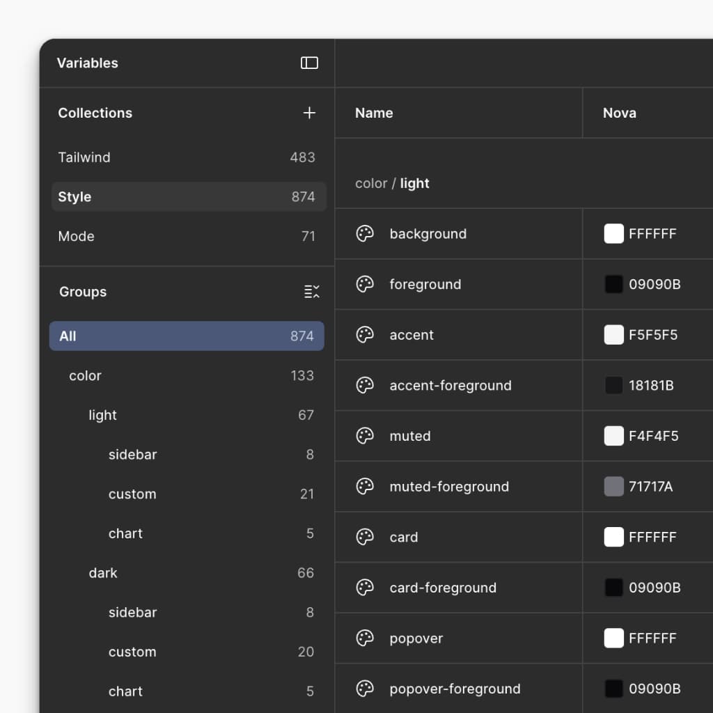
The first shadcn Figma UI kit where every style (Nova, Vega, Maia, Mira, Luma, Lyra, Sera, Rhea) lives natively in Figma variable modes. Switch between them from the variables panel. No plugin needed.
Multiple shadcn styles, one Figma file
Stop swapping files when the brand changes. Every shadcn style ships in the same Figma UI kit, ready to flip at any time.
Every detail captured per style
Per-component spacing, typography, color, corner radius, and icon set. All eight styles are recreated to the pixel and driven by Figma variables. Not approximated.
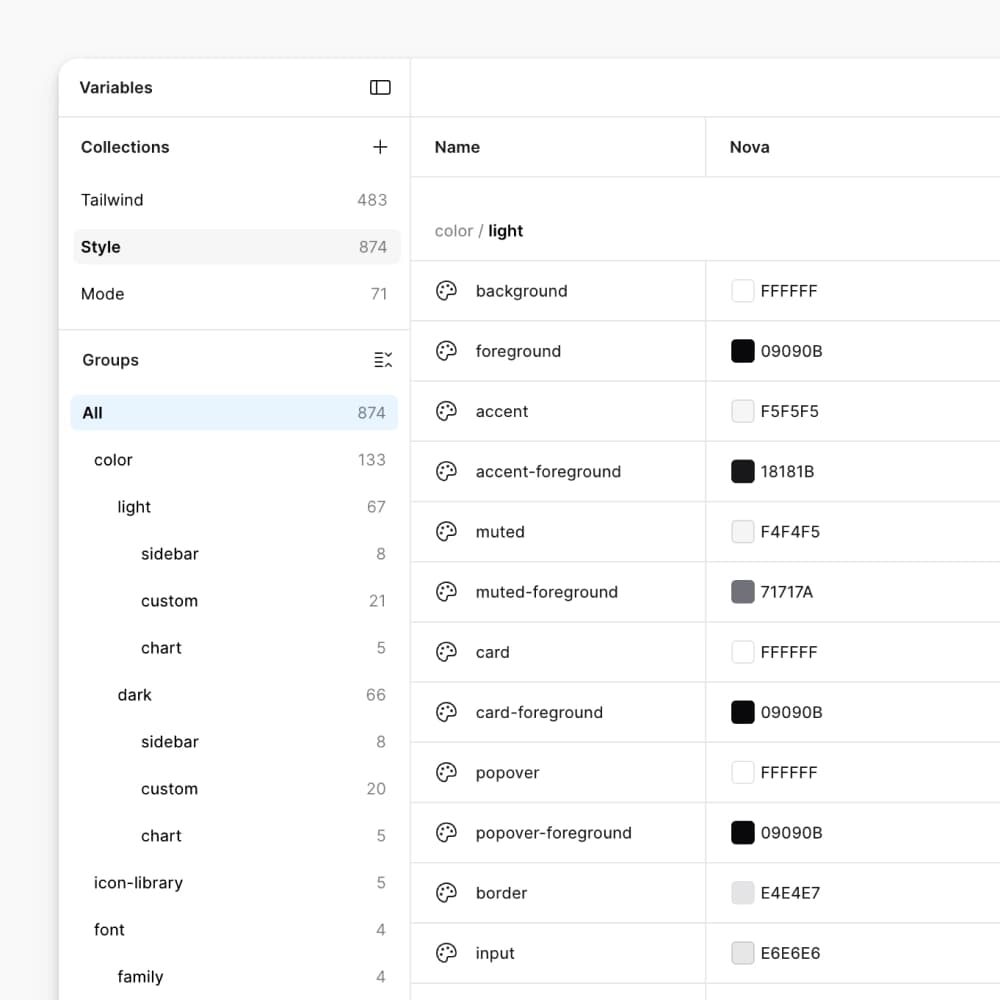
Add or edit shadcn styles, natively in Figma
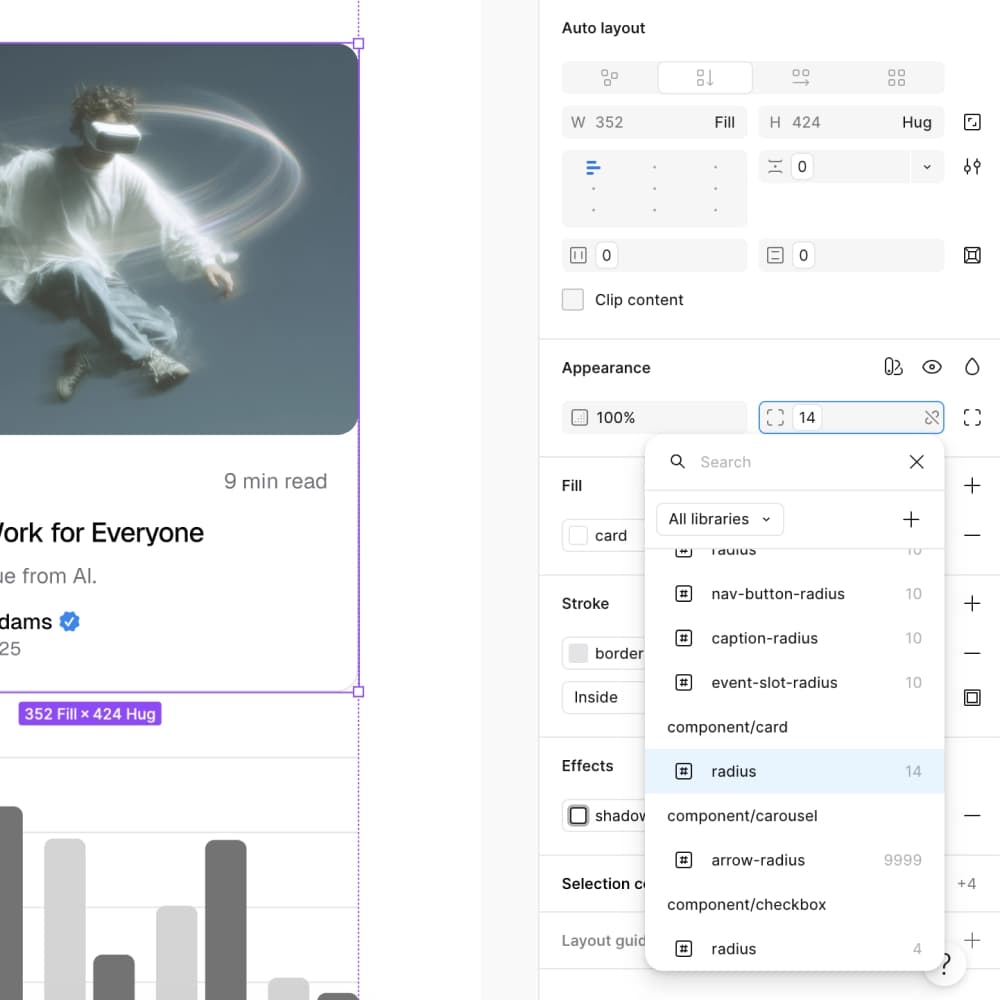
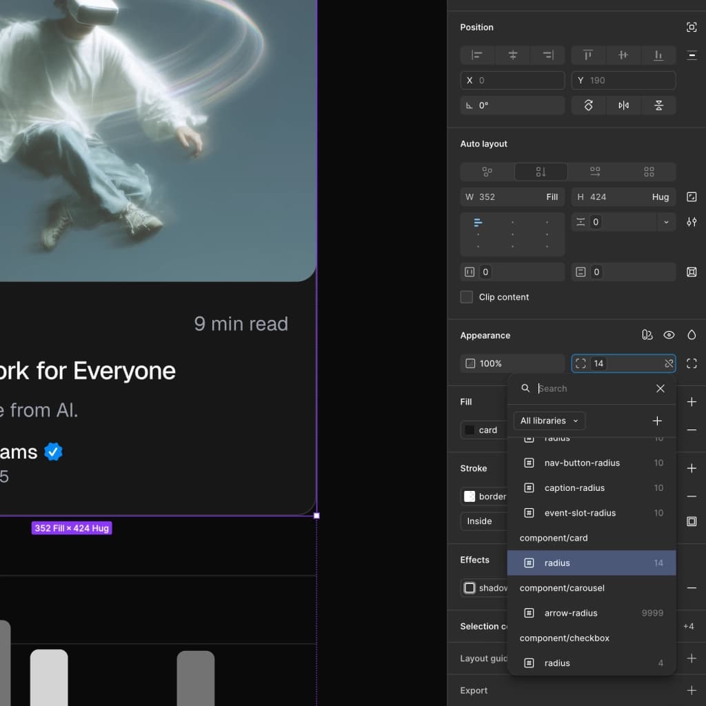
Create your own shadcn-aligned styles directly in Figma. Adjust radius, colors, fonts, and icons via the same variable system that powers the eight shipped styles.
shadcn Create import
Import any preset from shadcn Create
Build a theme on shadcn Create, paste the URL into the shadcncraft Figma plugin, and get an exact 1:1 recreation in your Figma file. Colors, radius, fonts, the lot. Then tweak it natively via component-level Figma variables. Control no other shadcn Figma UI kit offers.
Theming
Layer a tweakcn theme over any shadcn style
Already designing in tweakcn? Import your theme via the shadcncraft Figma plugin and layer it over any of the eight styles. Light and Dark across every combination.
Icons
Icons that switch with your shadcn style
Native icon switching, linked to your selected shadcn style, the same way shadcn handles icons in code.
- Lucide
- Tabler Icons
- Hugeicons
- Phosphor Icons
- Remix Icon
Change shadcn style, icons follow.
Bundles
Choose your shadcn Figma UI Kit
Three tiers. Same Figma file structure. Upgrade any time without rebuilding.
Feature comparison table
Curated sample of shadcn components and pro blocks
Free
Base Figma
Pro Figma
Pro Figma + React
All 8 styles, native in Figma
Free
Base Figma
Pro Figma
Pro Figma + React
Aligned with the free React component and block registry
Free
Base Figma
Pro Figma
Pro Figma + React
All official shadcn components and blocks
Free
Base Figma
Pro Figma
Pro Figma + React
Style preset import from shadcn Create
Free
Base Figma
Pro Figma
Pro Figma + React
Theme import from tweakcn
Free
Base Figma
Pro Figma
Pro Figma + React
Pro application, marketing, and ecommerce components
Free
Base Figma
Pro Figma
Pro Figma + React
Pro application, marketing, and ecommerce blocks
Free
Base Figma
Pro Figma
Pro Figma + React
React code export from Figma
Free
Base Figma
Pro Figma
Pro Figma + React
Component and block CLI install commands
Free
Base Figma
Pro Figma
Pro Figma + React
Feature comparison table
Feature
Free
Base Figma
Pro Figma
Pro Figma + React
Curated sample of shadcn components and pro blocks
Included in Free
Included in Base Figma
Included in Pro Figma
Included in Pro Figma + React
All 8 styles, native in Figma
Included in Free
Included in Base Figma
Included in Pro Figma
Included in Pro Figma + React
Aligned with the free React component and block registry
Included in Free
Included in Base Figma
Included in Pro Figma
Included in Pro Figma + React
All official shadcn components and blocks
Not included in Free
Included in Base Figma
Included in Pro Figma
Included in Pro Figma + React
Style preset import from shadcn Create
Included in Free
Included in Base Figma
Included in Pro Figma
Included in Pro Figma + React
Theme import from tweakcn
Included in Free
Included in Base Figma
Included in Pro Figma
Included in Pro Figma + React
Pro application, marketing, and ecommerce components
Not included in Free
Not included in Base Figma
Included in Pro Figma
Included in Pro Figma + React
Pro application, marketing, and ecommerce blocks
Not included in Free
Not included in Base Figma
Included in Pro Figma
Included in Pro Figma + React
React code export from Figma
Not included in Free
Not included in Base Figma
Not included in Pro Figma
Included in Pro Figma + React
Component and block CLI install commands
Not included in Free
Not included in Base Figma
Not included in Pro Figma
Included in Pro Figma + React
Frequently Asked Questions
The plugin connects Figma directly to shadcn/ui workflows. You can:
- Create complete shadcn styles, including color palette, radius, typography, and icon set
- Move styles between Figma and shadcn Create with preset codes
- Import themes from tweakcn, using presets, a custom URL, or your saved themes
- Import a theme straight from a shadcn/ui globals.css
- Export any style's theme as shadcn/ui-compatible CSS
- Export structured React code from selected frames
- Copy CLI commands for shadcncraft components and blocks