All blocks
App Cards
Single-purpose cards for mobile product screens, each making one point with one action. Includes step-through onboarding, a feed promo, goal progress and weekly activity, subscriptions with a trial-ending state, live delivery status with stages, a route map or a compact ETA, a KPI with a chart, a coupon, a boarding pass and an event ticket, badges and reward points, and quick actions. Designed at phone width with full-size touch targets, and they sit just as well in a grid on larger screens.
In all Pro bundles
React
Figma
Pro
App Card 20
Quick actions in a row


Pro
App Card 19
Quick actions in a two-by-two grid


Pro
App Card 18
Reward points with tier progress


Pro
App Card 17
Badge earned with next reward


Pro
App Card 16
Event ticket with artwork and code stub


Pro
App Card 15
Boarding pass with QR code


Pro
App Card 14
Coupon ticket with copy code


Pro
App Card 13
Mobile KPI with line chart


Pro
App Card 12
Compact live status with ETA ring


Pro
App Card 11
Live delivery with route map


Pro
App Card 10
Subscription plan with benefits


Pro
App Card 9
Weekly activity bars with streak


Pro
App Card 8
Centred onboarding steps with icon


Pro
App Card 7
Compact live delivery status


Pro
App Card 6
Live delivery status with stages


Pro
App Card 5
Trial ending with upgrade action


Pro
App Card 4
Subscription plan with renewal


Pro
App Card 3
Weekly goal ring with streak


Pro
App Card 2
Dismissible feed promo with media


Pro
App Card 1
Onboarding steps with illustration


SBIOTJ
Join 16,000+ builders shipping with shadcncraft
Get access to these blocks and the full library
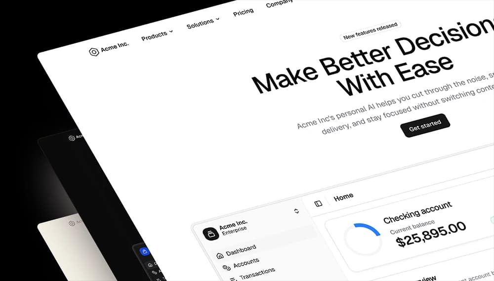
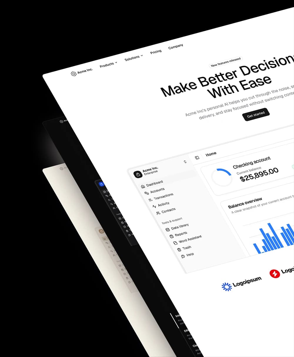
Production-ready blocks and components with matching Figma and React.
Benefits
Designed for your shadcn/ui project
Blocks built to work together across marketing pages and product interfaces.
Consistent layout system
Shared spacing, grids, and typography across all blocks.
Composable layouts
Combine blocks to build complete pages without layout conflicts.
Theme compatible
Works with shadcn/ui themes and token-based color systems.
Production-ready structure
Layouts designed with real content patterns and responsive behavior.
Explore all block categories
Built on official shadcn/ui components with real structure, spacing, and accessibility. No AI-generated layouts. Designed for real products in Figma and React.