All blocks
Auth
Full-page authentication screens for the first thing a customer sees in your app. Includes sign in as a split layout with a testimonial panel and as a minimal social-first layout, sign up as a centred card and as a split layout, plus verify code with a one-time code input and resend timer, forgot password, reset password, magic link, passkey, two-factor challenge, workspace invite, and enterprise SSO. Every form runs on react-hook-form and zod with real validation, loading, error and success states, and hands off to your auth provider through props. Textured full-page versions cover sign in with customer logos, verify code and a magic link sent screen, and a split sign-up pairs an animated panel with an email code.
In all Pro bundles
React
Figma
Pro
Auth 9
Split sign up with gradient panel and email code


Pro
Auth 6
Sign in on a textured page with customer logos


Pro
Auth 12
Verify code on a textured page


Pro
Auth 13
Magic link sent on a textured page


Pro
Auth 5
Enterprise SSO sign in


Pro
Auth 10
Accept workspace invite


Pro
Auth 14
Two-factor challenge card


Pro
Auth 4
Passkey sign in with password fallback


Pro
Auth 3
Magic link sign in


Pro
Auth 16
Reset password card


Pro
Auth 15
Forgot password card


Pro
Auth 11
Verify code card


Pro
Auth 8
Split sign up with testimonial panel


Pro
Auth 7
Sign up card


Pro
Auth 2
Minimal social-first sign in


Pro
Auth 1
Split sign in with testimonial panel


SBIOTJ
Join 16,000+ builders shipping with shadcncraft
Get access to these blocks and the full library
Production-ready blocks and components with matching Figma and React.
Benefits
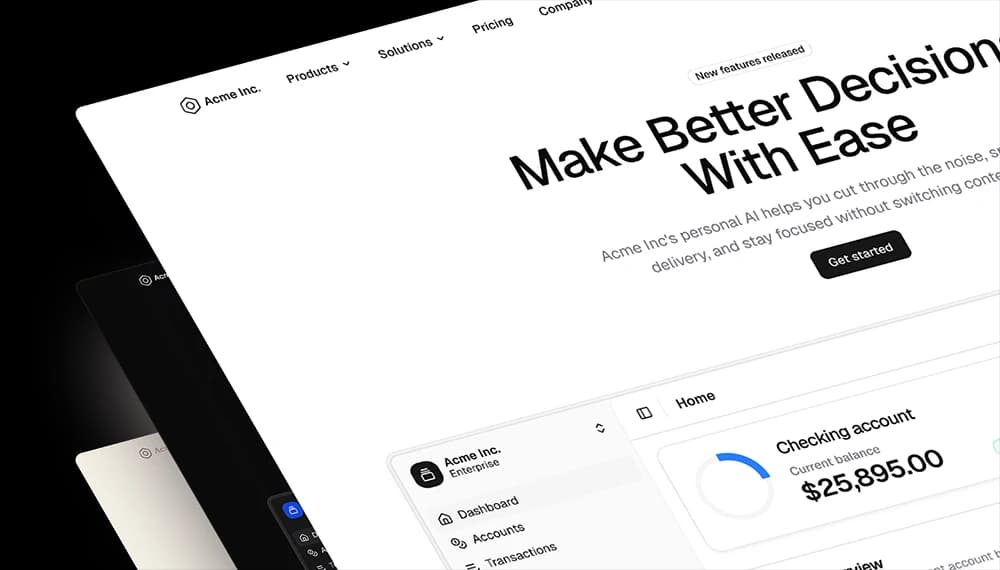
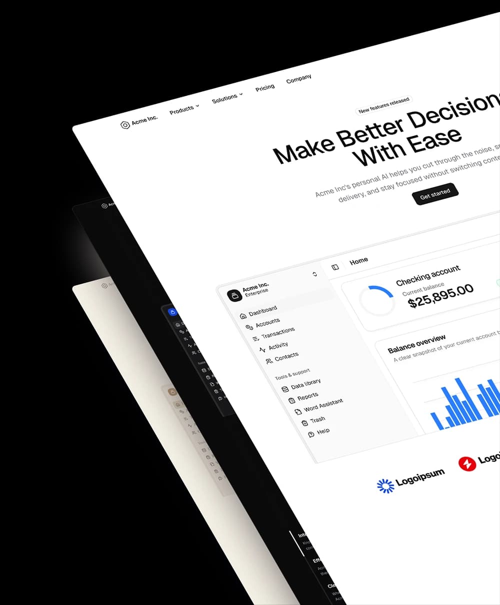
Designed for your shadcn/ui project
Blocks built to work together across marketing pages and product interfaces.
Consistent layout system
Shared spacing, grids, and typography across all blocks.
Composable layouts
Combine blocks to build complete pages without layout conflicts.
Theme compatible
Works with shadcn/ui themes and token-based color systems.
Production-ready structure
Layouts designed with real content patterns and responsive behavior.
Explore all block categories
Built on official shadcn/ui components with real structure, spacing, and accessibility. No AI-generated layouts. Designed for real products in Figma and React.