shadcncraft Overview
shadcncraft is a complete design system built on top of shadcn/ui. It combines Preview the Figma UI kits, production-ready React components and blocks, and a Figma plugin that connects design and code.
shadcn/ui is an open source component foundation. shadcncraft builds on top of it with a full Figma UI kit, advanced components and blocks, and tooling to keep design and production aligned.
shadcncraft is also built to work with modern AI coding tools. Through MCP and integrations with apps like Cursor and Claude, teams can generate UI that already follows shadcncraft structure, theming, and patterns by default.
shadcn/ui vs shadcncraft
| shadcn/ui | shadcncraft | |
|---|---|---|
| What it is | Open source component foundation | Complete design system built on top |
| Figma | Not included | Full 1:1 Figma UI kit |
| React components | Basic components | Production-ready components + advanced patterns |
| Blocks & layouts | Limited | Extensive library for marketing, apps, and e-commerce |
| Theming | Manual setup | Integrated with tweakcn and shadcn Create |
| Plugin | Not included | Figma plugin for theming, code export, and workflows |
| AI workflows | Has its own MCP | MCP support for tools like Cursor and Claude |
| Alignment | Design and code handled separately | Design and code stay fully aligned |
| License | Free and open source | Paid, with a free tier |
What's included
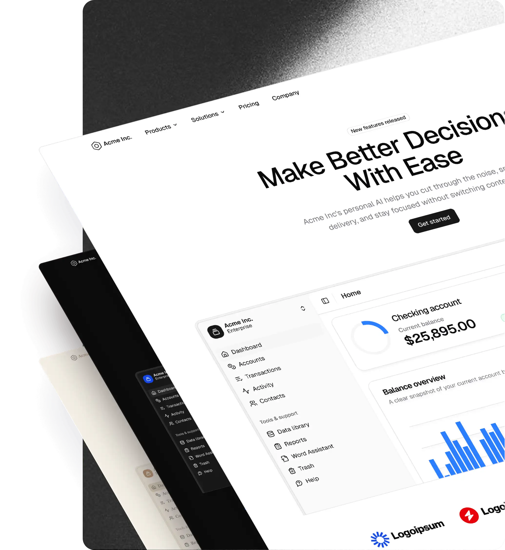
Figma UI Kit
- Full shadcn/ui component library rebuilt 1:1 in the Figma UI kit
- Flexible slot-based components for faster composition
- Production-ready structure, variants, and states
- Light and dark mode support
- Multi-brand theming with variables and tokens
- Layout-ready blocks for marketing, apps, and e-commerce
- Preview the Figma UI kits
React library (Pro + React)
- Production-ready React components built on shadcn/ui
- Matching 1:1 with the Figma UI kit
- Advanced components and patterns beyond core shadcn/ui
- Full-page blocks and layouts ready to drop into your app
- Install via CLI and use directly in your project
- Browse components and blocks
Figma plugin
- Create and apply themes using tweakcn and shadcn Create
- Export shadcn-compatible CSS variables from Figma
- Import existing themes into your workflow
- Switch between 5 icon libraries including Lucide, Remix, Huge, Phosphor, and Tabler
- Copy CLI install commands for components and blocks
- Export React code from selected frames (Pro + React)
- Designed to support AI-driven workflows through MCP and external tools like Cursor and Claude
- Learn more about the Figma plugin
How shadcncraft works
Design using the Figma UI kit with components and blocks that match real shadcn/ui structure.
Use the Figma plugin to apply themes, switch icons, and move between design and code.
Install components and blocks into your project using the CLI.
shadcncraft sits on top of shadcn/ui, so everything maps cleanly to production without translation.
When used with AI tools like Cursor or Claude, shadcncraft can be accessed through MCP so generated code follows the same components, blocks, and theming as your system.
Why teams use shadcncraft
- Clear separation between shadcn/ui (foundation) and shadcncraft (complete system)
- Works with AI tools like Cursor and Claude through MCP — see From Figma to production React, with AI in the loop
- No translation between design and code
- Faster builds with pre-structured components and blocks
- Consistent UI across design and production
- Built on an open and flexible foundation
Support
You can get help using shadcncraft on our support page.
Feature requests
Have an idea or need something specific? Visit our support page or make a feature request.
License
See our licence agreement.
Keep in the loop
Stay up to date with new features and releases:
- Follow shadcncraft on X