Introducing Banking: a shadcn/ui app in Figma and React
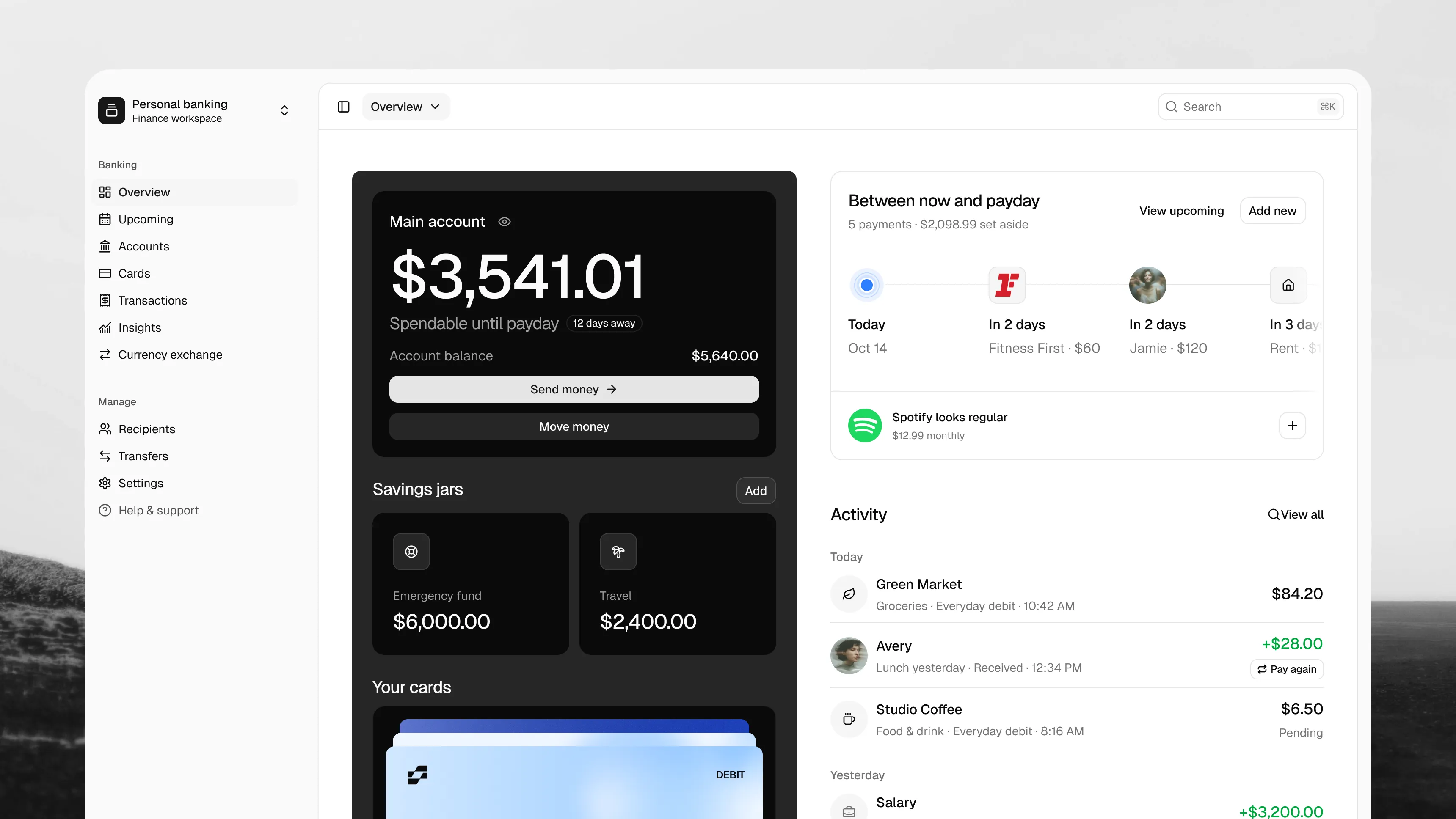
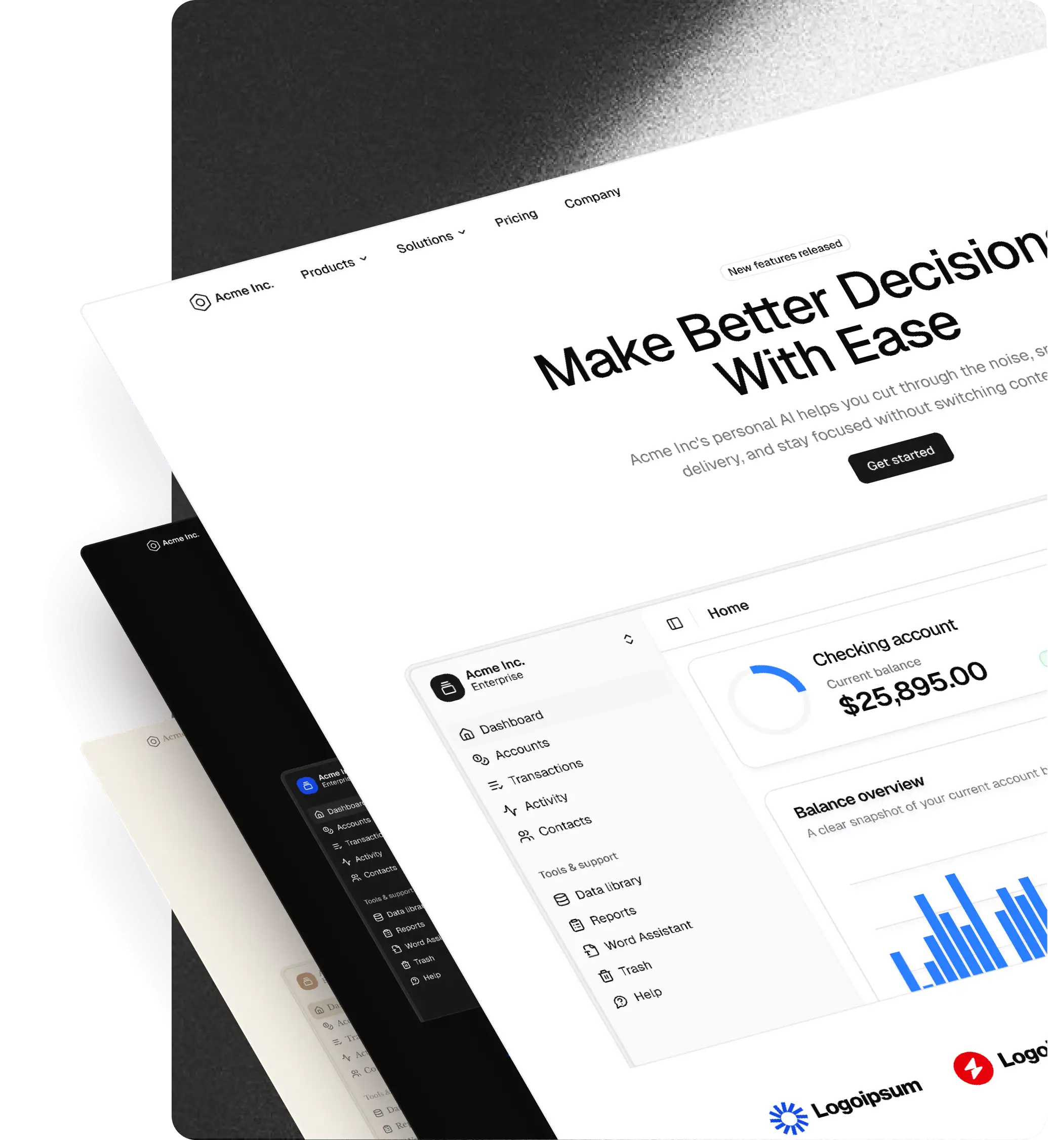
Banking is our new shadcn/ui app, with matching Figma designs and React code. It brings the everyday parts of personal banking into one UI: accounts, savings, cards, payments and a clearer view of spending.
Start with the app when you need a connected banking experience, or use its layouts as a starting point for your own finance product.
A useful overview of everyday money
The overview brings together an account balance, money available until payday, savings jars and payment cards. Upcoming payments sit beside recent activity, so you can see what is due alongside what has already happened.
Spending summaries, people you pay, account-security prompts and currency exchange round out the screen. The design gives each area a clear place without turning every piece of information into the same dashboard card.
Beyond the dashboard
The Banking designs cover eleven main areas, with detail views and supporting flows:
- Overview: balances, savings jars, cards, upcoming payments and activity.
- Upcoming: regular payments, recurring card payments and scheduled payments.
- Accounts: account details, savings and adding money.
- Cards: card details, frozen states and spending controls.
- Transactions: activity, transaction details and tags.
- Insights: spending summaries, trackers and tagged groups of transactions.
- Currency exchange: currency selection, an exchange review and confirmation.
- Recipients: saved people and recipient details.
- Transfers: sending money and moving it between accounts.
- Settings: account preferences and security screens.
- Help and support: a dedicated place to find assistance.
The supporting screens matter as much as the overview. Sending money takes you through recipient, amount, review and confirmation. A spending tracker has creation, detail and editing views. Card controls have a place alongside the card itself.
Matching Figma and React
Banking follows the same approach as the rest of shadcncraft: designers and developers work with matching UI in Figma and React. The Figma file includes desktop and mobile layouts, with reusable components and blocks behind the screens.
Use the designs to explore your product's flow, adjust the content and agree on the UI before connecting it to your own services. Banking is an app UI foundation; your product supplies the account data, authentication and financial integrations.
Explore Banking
Explore the Banking app for the preview, React blocks and installation details, or open the designs in Figma.
New to shadcncraft? Explore the Figma kit, browse our apps, or compare bundles.