All Testimonials blocks
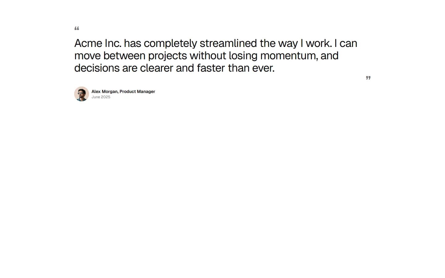
Testimonial 11
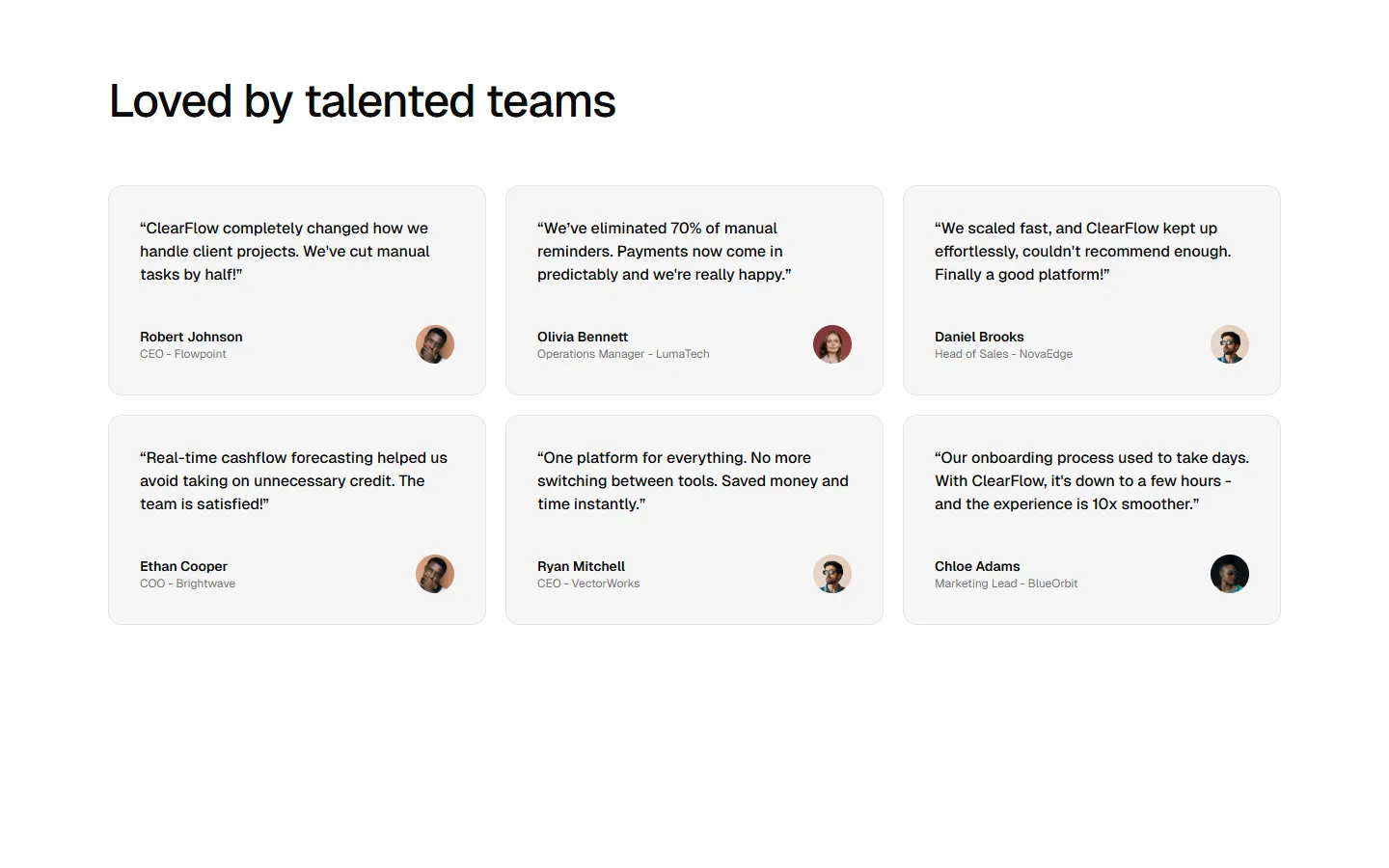
Editorial quote grid
A structured testimonial layout that combines a clear section header with a multi-column grid of short quotes. It balances scannability and depth by presenting many voices at once, using consistent cards and subtle hierarchy to reinforce trust without relying on a single standout story.
Radix UI
Base UI
8 styles
5 icon sets
SBIOTJ
Join 9,000+ builders shipping with shadcncraft
Get access to this block and the full library
Production-ready blocks and components with matching Figma and React.


Benefits
Production-ready by default
Built with shadcn/ui conventions and designed for real projects.
Built with shadcn/ui
Clean React components using Tailwind and modern shadcn patterns.
Install instantly
Add the block directly using the shadcn CLI.
Works with your theme
Compatible with shadcn themes and token-based color systems.
MCP server support
Use shadcn MCP server right from your favorite AI tools.
Frequently Asked Questions
Yes. They follow shadcn/ui structure and are built for real products.
All blocks
More Testimonials
Pro
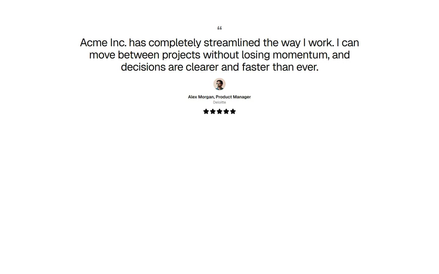
Testimonial 1
Single feature quote

Pro
Testimonial 2
Centered quote with attribution focus
Pro
Testimonial 3
Split quote with featured profile

Pro
Testimonial 4
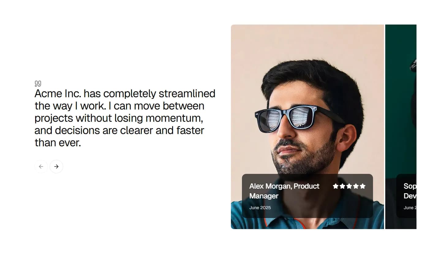
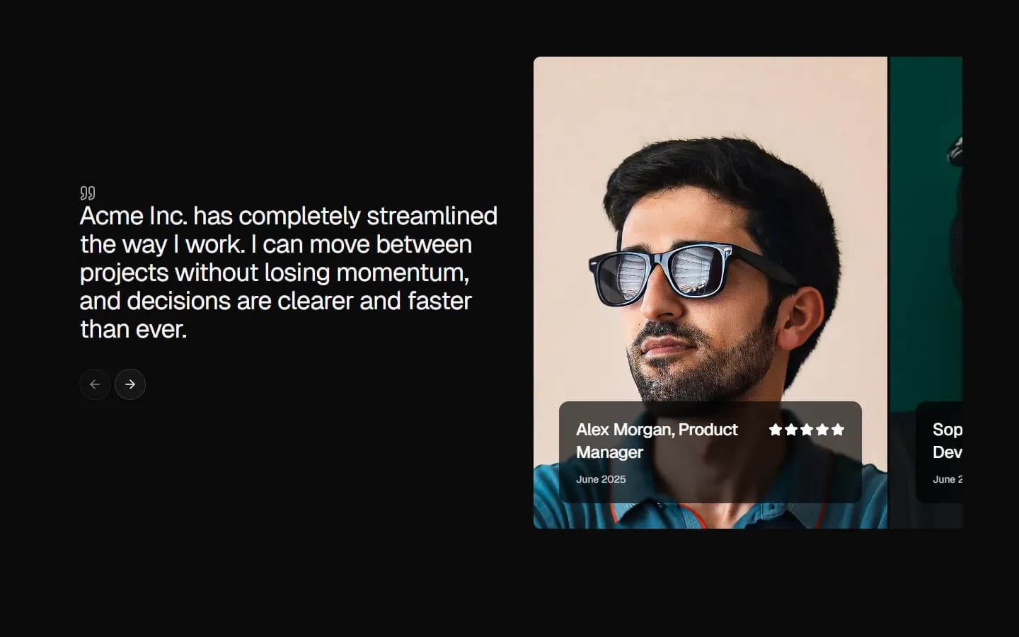
Image-led split with rating
Pro
Testimonial 5
Card carousel with stacked media


Pro
Testimonial 6
Split carousel with overlapping profile cards
Pro
Testimonial 7
Multi-profile grid with headline lead


Pro
Testimonial 8
Branded quote with team strip


Pro
Testimonial 9
Multi-segment case cards
Pro
Testimonial 10
Dense quote grid