All Top Navigation blocks
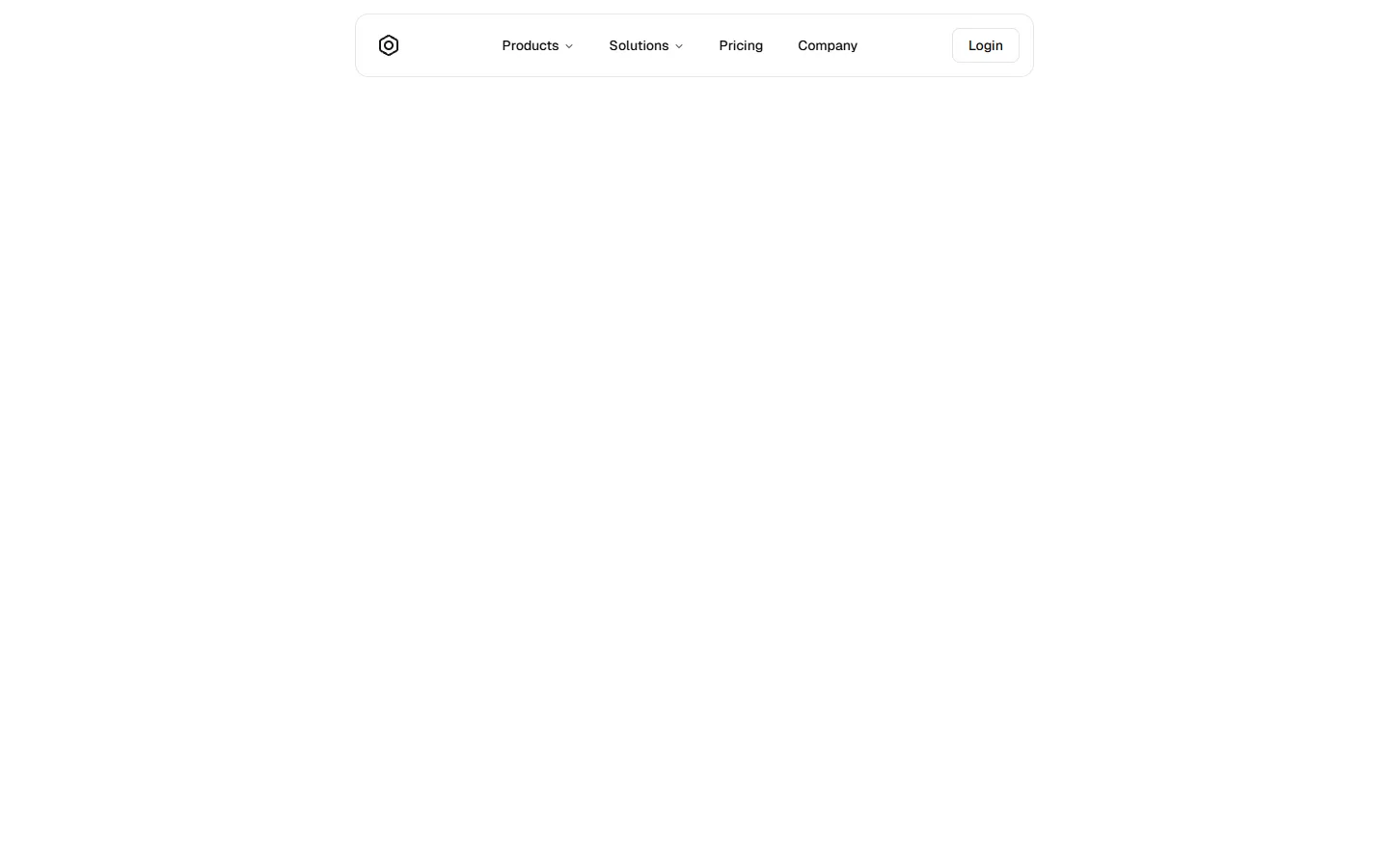
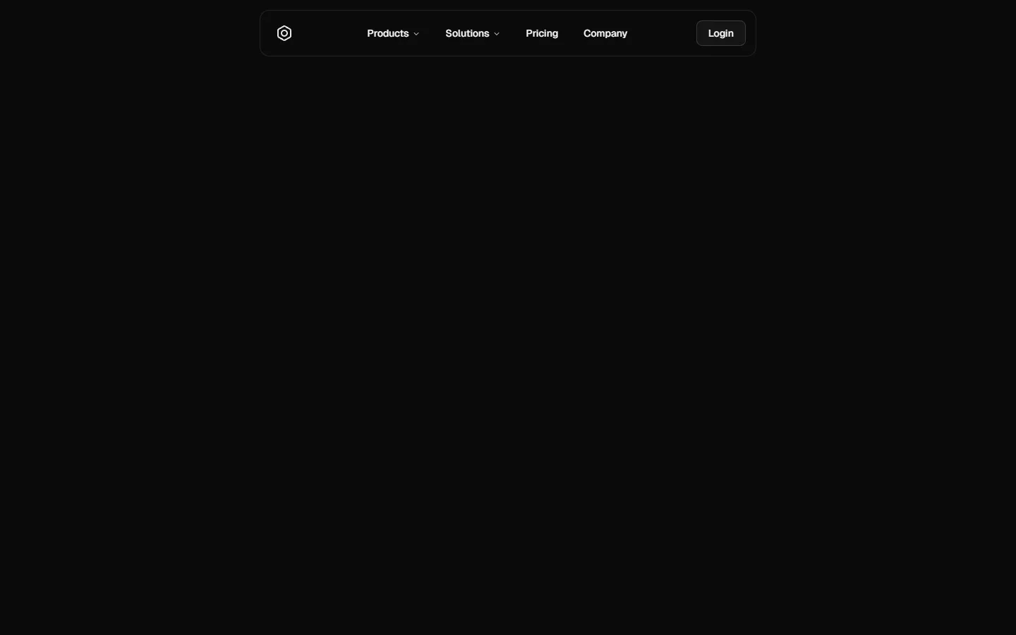
Top Navigation 5
Minimal center-aligned links with inline auth
A stripped-back, center-aligned top navigation that prioritizes clarity and whitespace. Primary links sit in a single horizontal row with the brand anchored to the left and a lightweight login action on the right. On small screens, the layout collapses into a simple slide-out menu with stacked links and a single secondary action, keeping the structure familiar while reducing visual noise.
Radix UI
Base UI
8 styles
5 icon sets
SBIOTJ
Join 9,000+ builders shipping with shadcncraft
Get access to this block and the full library
Production-ready blocks and components with matching Figma and React.


Benefits
Production-ready by default
Built with shadcn/ui conventions and designed for real projects.
Built with shadcn/ui
Clean React components using Tailwind and modern shadcn patterns.
Install instantly
Add the block directly using the shadcn CLI.
Works with your theme
Compatible with shadcn themes and token-based color systems.
MCP server support
Use shadcn MCP server right from your favorite AI tools.
Frequently Asked Questions
Yes. They follow shadcn/ui structure and are built for real products.