All components

Badge

Displays a badge or a component that looks like a badge.
Radix UI
Base UI
8 styles
5 icon sets
components/shadcncraft/pro-application/badge.tsx
import * as React from "react";
import { cva, type VariantProps } from "class-variance-authority";
import { Slot } from "radix-ui";

import { cn } from "@/lib/utils";

const badgeVariants = cva(
  "group/badge inline-flex h-5 w-fit shrink-0 items-center justify-center gap-1 overflow-hidden rounded-4xl border border-transparent px-2 py-0.5 text-xs font-medium whitespace-nowrap transition-all focus-visible:border-ring focus-visible:ring-[3px] focus-visible:ring-ring/50 has-data-[icon=inline-end]:pr-1.5 has-data-[icon=inline-start]:pl-1.5 aria-invalid:border-destructive aria-invalid:ring-destructive/20 dark:aria-invalid:ring-destructive/40 [&>svg]:pointer-events-none [&>svg]:size-3!",
  {
    variants: {
      variant: {
        default: "bg-primary text-primary-foreground [a]:hover:bg-primary/80",
        secondary: "bg-secondary text-secondary-foreground [a]:hover:bg-secondary/80",
        destructive:
          "bg-destructive/10 text-destructive focus-visible:ring-destructive/20 dark:bg-destructive/20 dark:focus-visible:ring-destructive/40 [a]:hover:bg-destructive/20",
        outline:
          "border-border text-foreground [a]:hover:bg-muted [a]:hover:text-muted-foreground",
        ghost: "hover:bg-muted hover:text-muted-foreground dark:hover:bg-muted/50",
        link: "text-primary underline-offset-4 hover:underline",
        // Custom variants
        success:
          "bg-green-100 text-green-700 hover:bg-green-100/60 dark:bg-green-950 dark:text-green-400 dark:hover:bg-green-950/60",
        warning:
          "bg-yellow-100 text-yellow-700 hover:bg-yellow-100/60 dark:bg-yellow-950 dark:text-yellow-500 dark:hover:bg-yellow-950/60",
      },
    },
    defaultVariants: {
      variant: "default",
    },
  }
);

function Badge({
  className,
  variant = "default",
  asChild = false,
  ...props
}: React.ComponentProps<"span"> &
  VariantProps<typeof badgeVariants> & { asChild?: boolean }) {
  const Comp = asChild ? Slot.Root : "span";

  return (
    <Comp
      data-slot="badge"
      data-variant={variant}
      className={cn(badgeVariants({ variant }), className)}
      {...props}
    />
  );
}

export { Badge, badgeVariants };
SBIOTJ

Join 9,000+ builders shipping with shadcncraft

Get access to this component and the full library

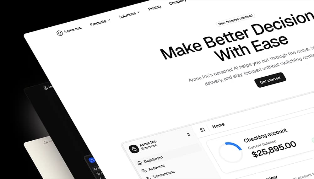
Production-ready blocks and components with matching Figma and React.
Get this componentFree
Benefits

Built for real interfaces

Each block is designed to work as part of a complete page, not just as a visual fragment.
Structured Layouts
Clear grids, consistent spacing, and predictable hierarchy.
Marketing + App Coverage
Landing pages, dashboards, onboarding, pricing, e-commerce, and more.
Theme Compatible
Works seamlessly with semantic tokens and theming.
Production-Ready States
Designed with real content, tokenized spacing, and real interaction patterns.
Figma + React Parity (Pro Figma + React)
Design in Figma and ship with aligned React components.
Composable by Design
Mix blocks together to create complete pages without layout conflicts.

Frequently Asked Questions

Quick FAQs to get you started.
Still have questions? See all FAQs, or get support.

Yes. They follow shadcn/ui structure and are built for real products.

Real support from the team behind shadcncraft

Get help within 24 hours from the people who build and maintain the system.
Email
Prefer a direct line? Send us a message and we'll get back to you as soon as possible.
Discord
Get quick support, share feedback, or connect with other builders.
Feedback
Got something to say about anything shadcncraft? We'd love to hear it.