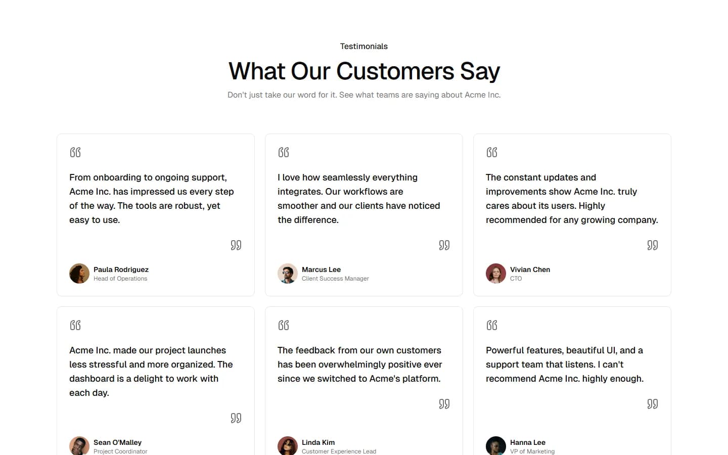
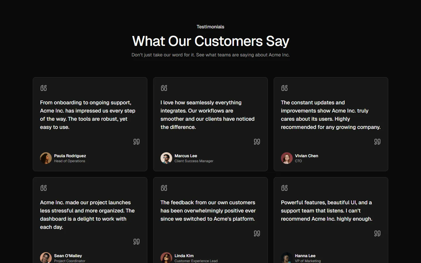
All Testimonials blocks
Testimonial 5
Card carousel with stacked media
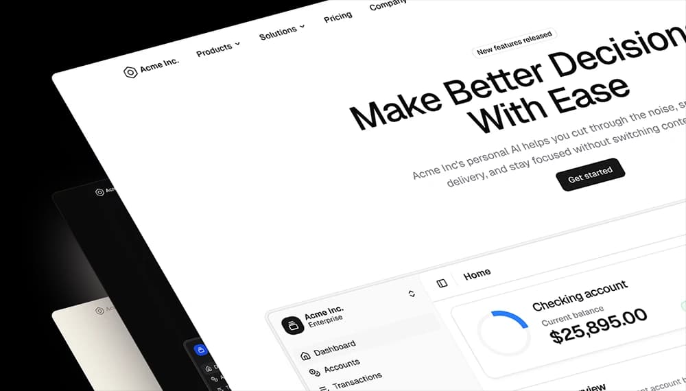
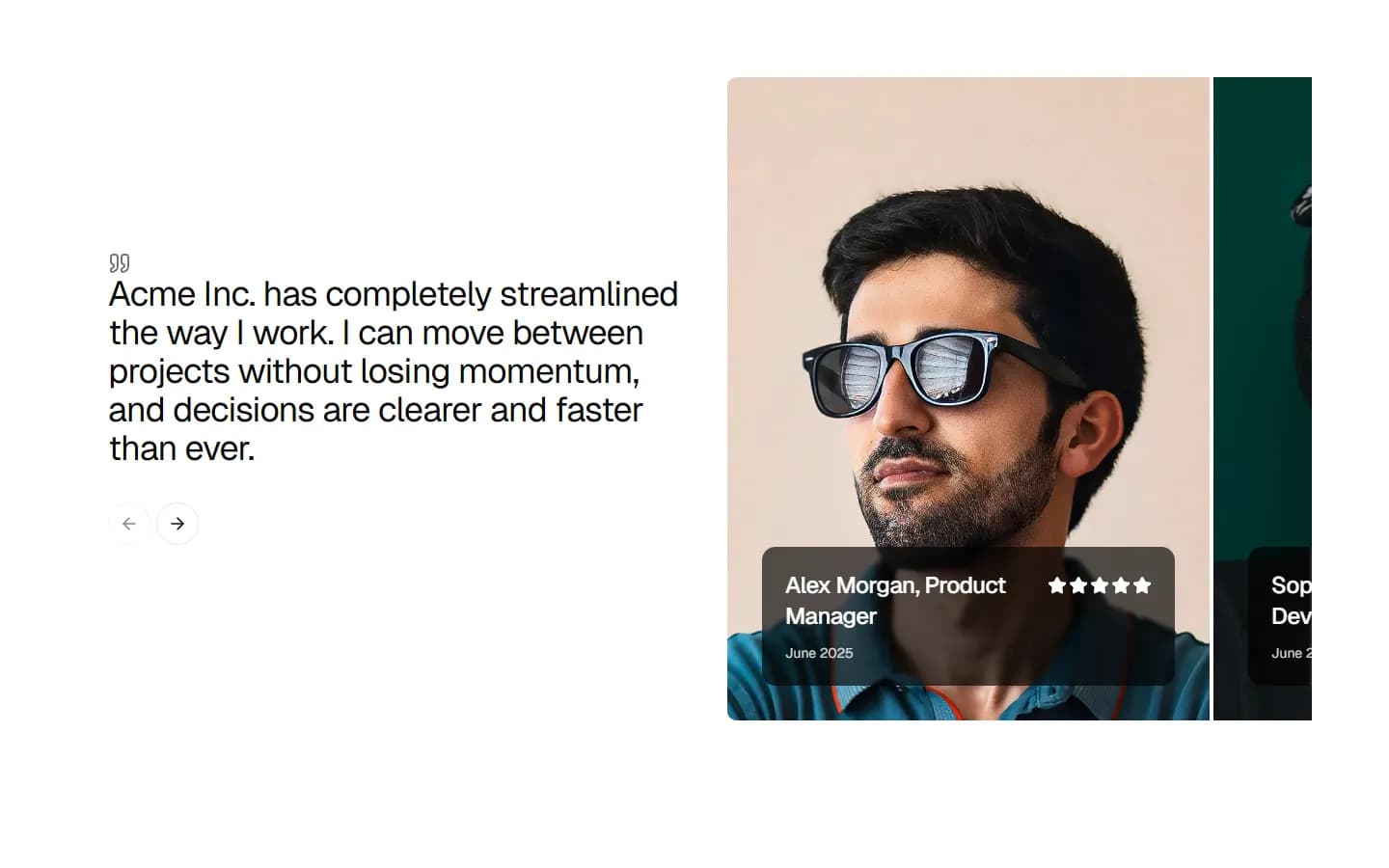
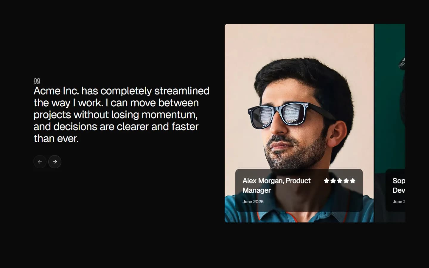
A carousel-style testimonial where the quote and controls sit in a fixed text column, paired with layered image cards that suggest depth and progression. The stacked visuals reinforce momentum and make the pattern feel interactive, while the layout keeps the testimonial readable and anchored. Best used when you want testimonials to feel dynamic without turning into a full slider section.
In all Pro bundles
Radix UI
Base UI
8 styles
5 icon sets
Not Allowed
Get access to the full source code by upgrading to Pro Figma + React.
SBIOTJ
Join 16,000+ builders shipping with shadcncraft
Get access to this block and the full library
Production-ready blocks and components with matching Figma and React.

Benefits
Production-ready by default
Built with shadcn/ui conventions and designed for real projects.
Built with shadcn/ui
Clean React components using Tailwind and modern shadcn patterns.
Install instantly
Add the block directly using the shadcn CLI.
Works with your theme
Compatible with shadcn themes and token-based color systems.
MCP server support
Use shadcn MCP server right from your favorite AI tools.
Frequently Asked Questions
Yes. They follow shadcn/ui structure and are built for real products.
All blocks
More Testimonials
Pro
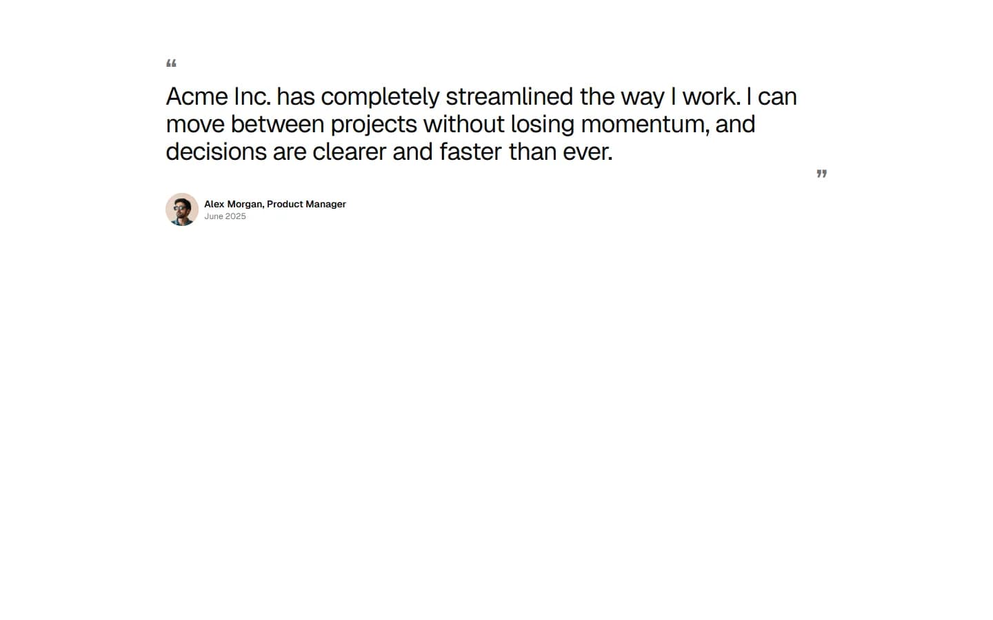
Testimonial 1
Single feature quote
Pro
Testimonial 2
Centered quote with attribution focus
Pro
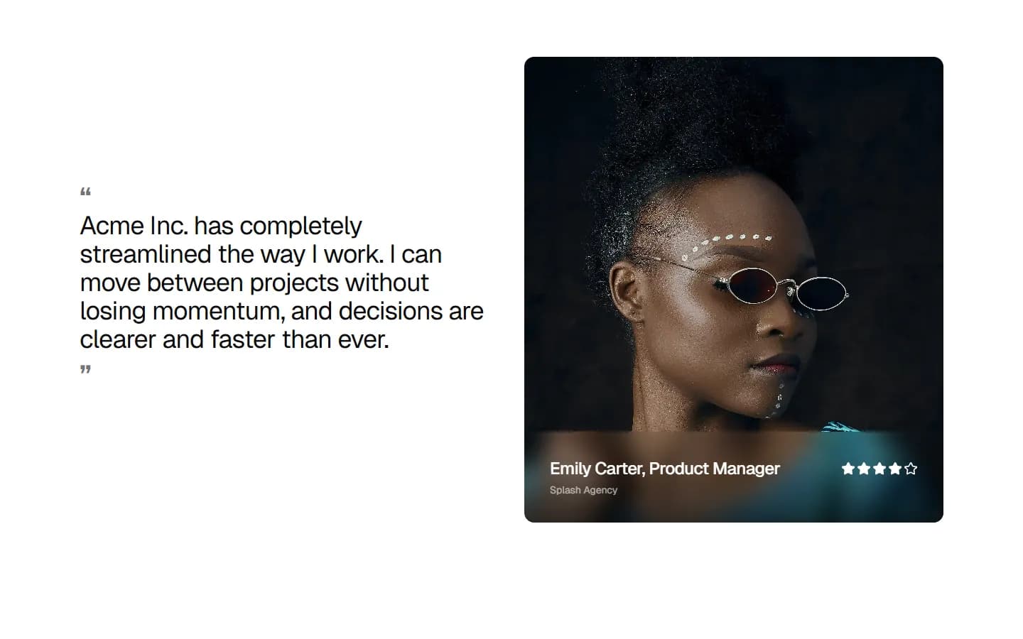
Testimonial 3
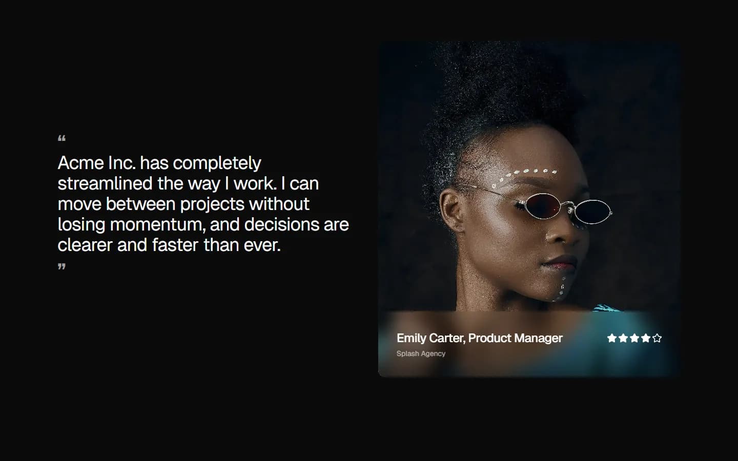
Split quote with featured profile
Pro
Testimonial 4
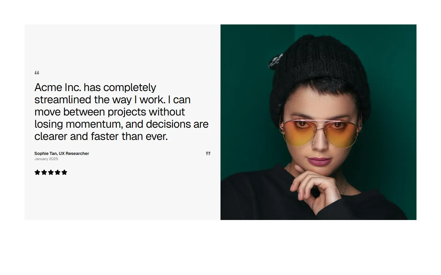
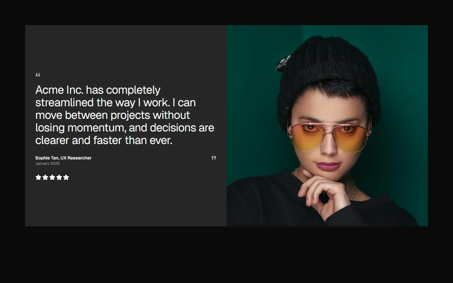
Image-led split with rating
Pro
Testimonial 6
Split carousel with overlapping profile cards
Pro
Testimonial 7
Multi-profile grid with headline lead


Pro
Testimonial 8
Branded quote with team strip


Pro
Testimonial 9
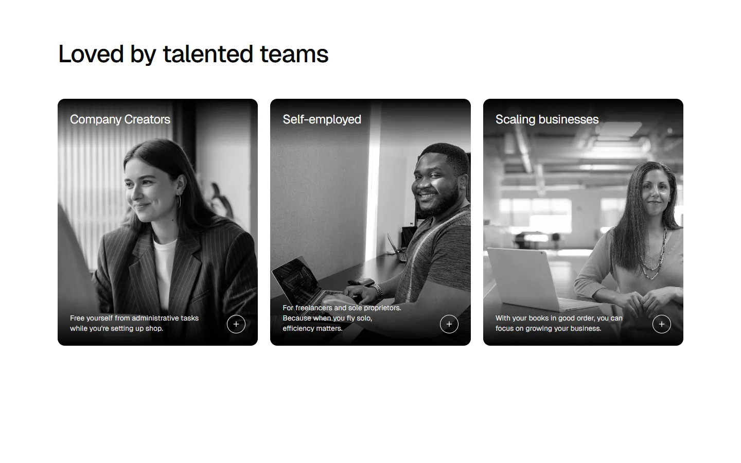
Multi-segment case cards

Pro
Testimonial 10
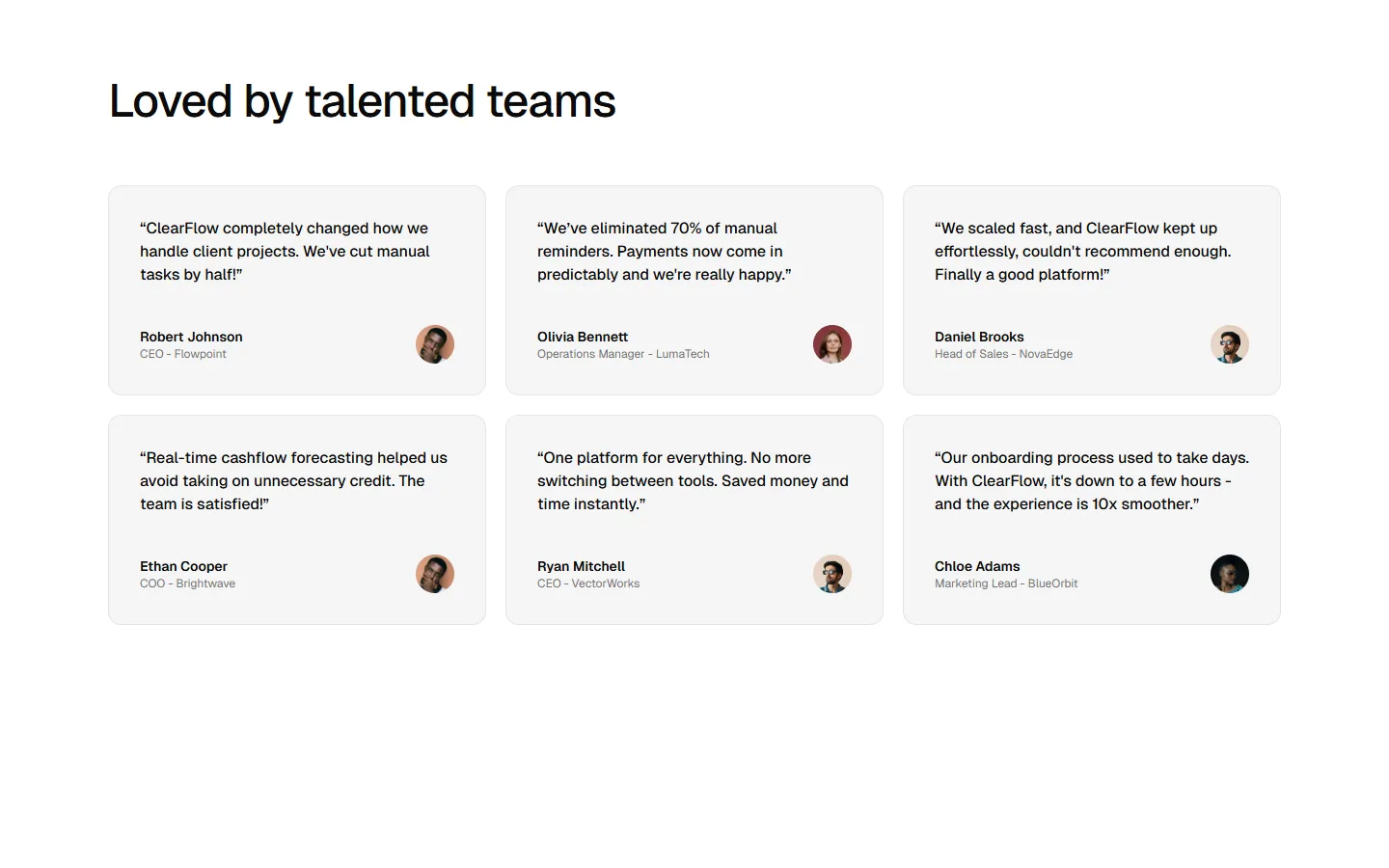
Dense quote grid
Free
Testimonial 11
Editorial quote grid