All components
Shader Background
An animated WebGL background with nineteen built-in shaders (aurora, dot grid, line screen, frosted dots, contour lines, fluted glass, mesh gradient, radiance, glass panes, halo, caustics, the blocks and rows scenes, three stippled forms: glass slats, ribbon and melting half-disc, and three full-bleed textures: stepped pastel bands, soft orbs and grainy petals), coloured from theme tokens and finished with fine, adjustable film grain. Reacts to the pointer, pauses offscreen and in hidden tabs, draws a still frame for reduced motion and falls back to a CSS gradient without WebGL.
In all Pro bundles
Radix UI
Base UI
8 styles
5 icon sets
Own this code forever
Build with your AI agents or bring the code into your own codebase.
Already have a license key?
SBIOTJ
Join 16,000+ builders shipping with shadcncraft
Get access to this component and the full library
Production-ready blocks and components with matching Figma and React.
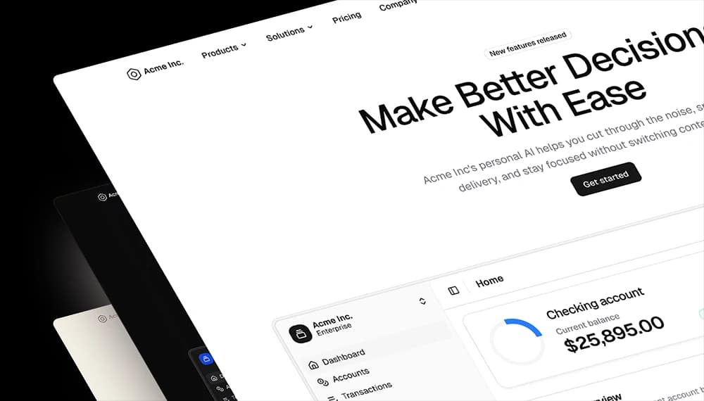

Benefits
Built for real interfaces
Each block is designed to work as part of a complete page, not just as a visual fragment.
Structured Layouts
Clear grids, consistent spacing, and predictable hierarchy.
Marketing + App Coverage
Landing pages, dashboards, onboarding, pricing, e-commerce, and more.
Theme Compatible
Works seamlessly with semantic tokens and theming.
Production-Ready States
Designed with real content, tokenized spacing, and real interaction patterns.
Figma + React Parity (Pro Figma + React)
Design in Figma and ship with aligned React components.
Composable by Design
Mix blocks together to create complete pages without layout conflicts.
Frequently Asked Questions
Yes. They follow shadcn/ui structure and are built for real products.
All components
More Components
Chat7