Base v3.1: current with shadcn/ui, organized like Pro
Base Figma is the official shadcn/ui set of the shadcncraft Figma kit: every official component and block, in all eight styles, without the Pro material. Base v3.1 does two things. It catches up with shadcn/ui, and it takes on the organization that Pro v3.5 introduced.
Current with shadcn/ui
Base v3.1 adds the components shadcn/ui has shipped since v3.0: Attachment, Bubble, Marker, Message, Message Scroller and Questionnaire. Questionnaire is the big one: five components mirroring the code parts one to one, 20 choice variants covering radio and checkbox types in every state, and the examples from the docs. The Questionnaire breakdown covers the anatomy; it is the same build as Pro.
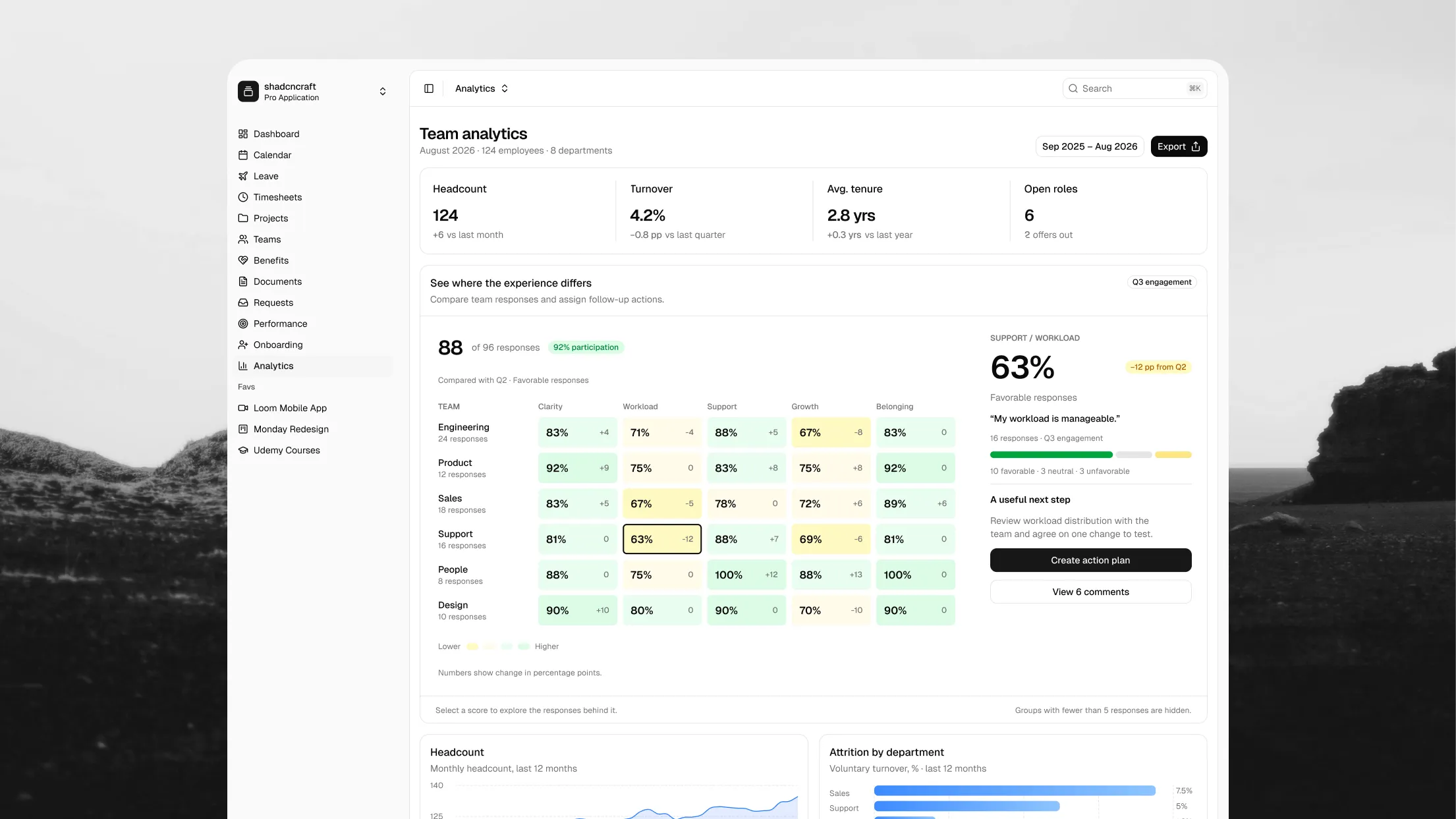
That brings Base to 61 component pages, Accordion to Questionnaire, plus the official Dashboard, Login and Sidebar blocks. Every one of them follows the Style and Theme variable modes, so switching your file from Nova to Vega restyles it the way swapping the style would restyle your code.
Organized like Pro
Base v3.1 is cut from the Pro v3.5 file rather than maintained by hand, so it inherits every name and every fix. In practice:
- Pages sit under
COMPONENTS · shadcn/ui official,BLOCKS · shadcn/ui official,ICONSandUTILITYsections, one page per component or block group, in the same order as the site. The↳prefixes are gone. - Names inside a page match the React exports. The Card page holds
Card,CardHeaderandCardFooter; the Tooltip page holdsTooltipContent. Swapping a component is page, then item, the same two steps as finding it on the site. - Variant properties are React props: names are the prop (
variant,size,state) and values are the React values verbatim (default,sm,lg,destructive). A variant in the properties panel reads straight into JSX. - Icons are one page per library, Lucide, Tabler, Hugeicons, Phosphor and Remix, plus the Icon Placeholder, so Figma loads only the library you open.
- Nothing is hidden from publishing, so your copy of the library receives updates for every component.
Because Base is a subset of Pro, moving from one to the other costs nothing. Every component you use in Base is on the same page, with the same name, the same variant properties and the same layers in Pro. The only difference is what else is in the file.
How to update
The download link in your receipt email always points at the latest file, and your Polar portal has it too. Download Base v3.1, publish it as a library, and point your files at it. Instances track the component, not the name, so a file built on Base v3.0 picks up the new names and every fix when you accept the library update, with your overrides intact.
If you built a custom library on top of the kit, the Updates guide walks through bringing the new components into it without losing your theming.
Get it
Base v3.1 is available now for Base Figma customers and is included with every Pro bundle. Existing customers already have it; see how to update above. New here? Compare bundles, or start with the free kit.