shadcn/ui Questionnaire comes to the shadcncraft Figma kit
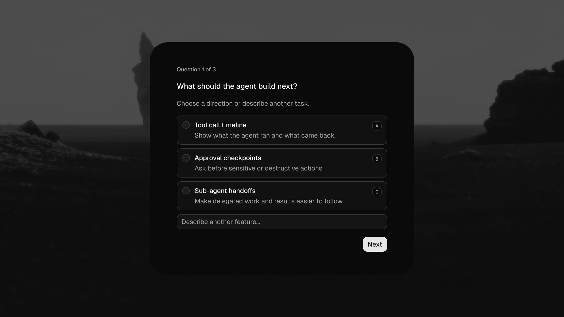
shadcn/ui shipped Questionnaire, a multi-step form primitive for single-choice, multiple-choice, freeform, and skippable questions. It is one of the more composable components in the library, with thirteen parts covering everything from progress indicators to keyboard shortcuts.
The Figma version landed in the shadcncraft Pro kit the same day. Like every component in the kit, it is not a picture of the code. It is the code's design twin: same anatomy, same tokens, same states.
What you get
Five components that mirror the code parts one to one:
- Questionnaire: the composed root with progress, current question, and actions, at the same
max-w-mdwidth as the docs - QuestionnaireItem: title, optional description, a swappable choices slot, and a validation error message
- QuestionnaireChoice: the workhorse, in 20 variants. Radio and checkbox types, checked and unchecked, hover, focus, disabled, and error states, with optional descriptions and the keyboard shortcut badge from shadcn's
shortcutsconfig - QuestionnaireProgress: the "Question 1 of 3" indicator
- QuestionnaireActions: Previous, Skip, and Next/Submit, wired to the kit's Button component
Every layer name and component description carries the matching data-slot, so AI tools reading your file through Figma MCP can map straight back to the React parts.
Built for all eight styles
Questionnaire ships with per-style values in shadcn's CSS: Nova is compact with 10px radii, Vega adds breathing room and control shadows, Maia goes fully rounded, Lyra is square and mono, Sera flattens everything. We pulled the questionnaire values from each style's actual stylesheet and wired them into the kit's Style modes, so switching your file from Nova to Rhea restyles the questionnaire the same way swapping the style would restyle your code.
Light and dark mode work the same way they do everywhere else in the kit: flip the mode, done. No detached copies, no overrides.
Validation and focus states
Validation is part of the component, not an afterthought. Choices have a real error state with destructive borders, items show the error message with correct spacing, and the focus state renders the same 3px ring the browser draws (1px in Lyra, 2px in Mira and Sera, because that is what the CSS says).
Keyboard shortcut badges are a boolean away on every choice, matching shadcn's letters and numbers modes.
Thirteen examples, straight from the docs
The Examples section reproduces every usage example on the shadcn docs page, in order, with the real content: the default demo with descriptions and a freeform input, multiple selection, explicit skip, shortcuts, custom validation inside a Card, controlled and resumed flows, disabled navigation, a segmented custom progress bar, and Card and Dialog compositions. Each one exists in light and dark.
If you have ever needed to mock a real onboarding survey or an agent-configuration flow, these are ready to drop in.
The parity work you do not see
We measure the live component, not screenshots of it. Paddings, gaps, min-heights, and even the indicator-to-text alignment were checked against the rendered DOM. Everything in the component is bound to variables; there is not a raw hex value anywhere in it. That is what keeps the Figma file honest when you hand it to a developer or an AI agent and say "build this."
Get it
Questionnaire is included in the shadcncraft Pro kit now. Existing customers: re-download the latest file from your portal. New here? Compare bundles, or start with the free kit.