Create v2: from preset customizer to visual builder
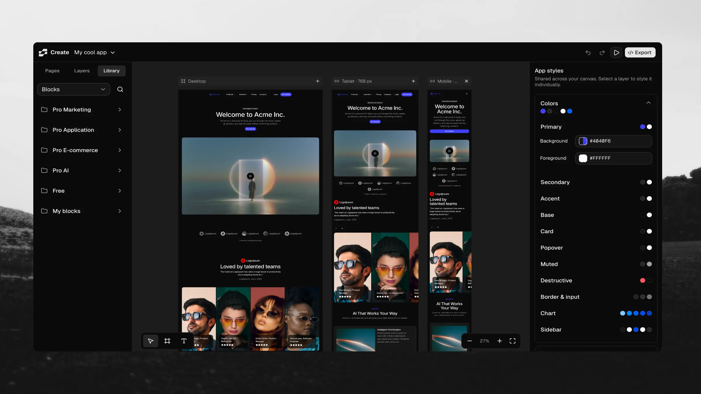
Create v2 is here. The original Create let you choose a shadcn preset and preview it on our blocks. This update keeps those controls and adds an editable canvas, so you can build the page around your theme.
Start with a blank canvas or a ready-made page, add real components and blocks, and make the design your own. Change the content, replace images, adjust layouts, and take the result into your codebase.
The workflow brings the library, canvas, and editing controls into one place. Assemble a landing page from Pro blocks, build a contact form from individual components, or start with a dashboard and adapt it to your product. When you're ready, export React code or a prompt for your AI coding agent.
Customize Pro blocks on the canvas
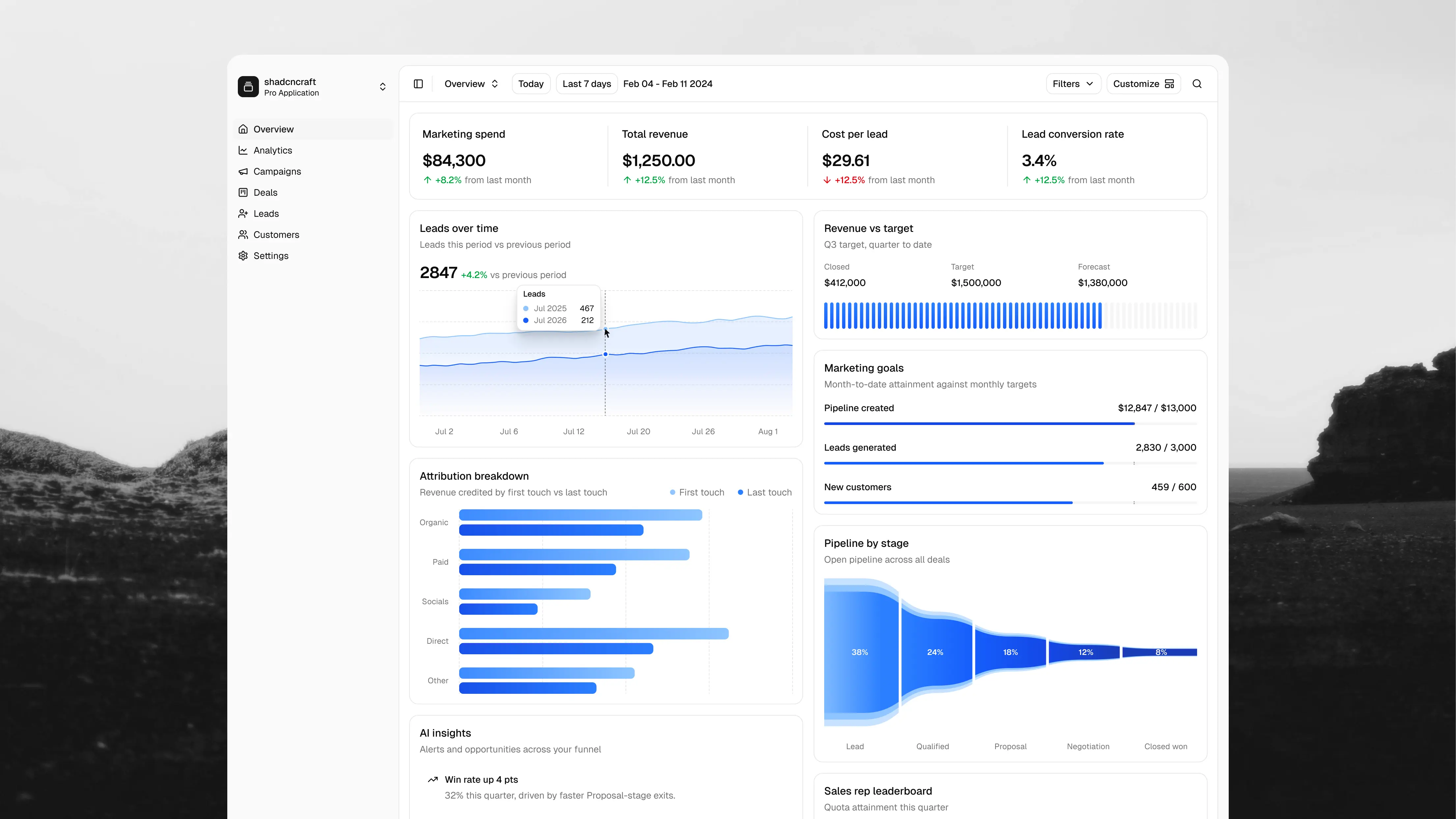
Browse blocks and components in the Library, search for what you need, and add them to your page. Marketing pages and dashboard starters give you a composition to work from, including Sales overview, Deals, and Campaigns.
Pro blocks are editable. Change a heading, rewrite a button label, replace a photo with an uploaded image, or adjust the spacing around a section. Drill into a block to select its individual elements and edit them in place or through the right panel.
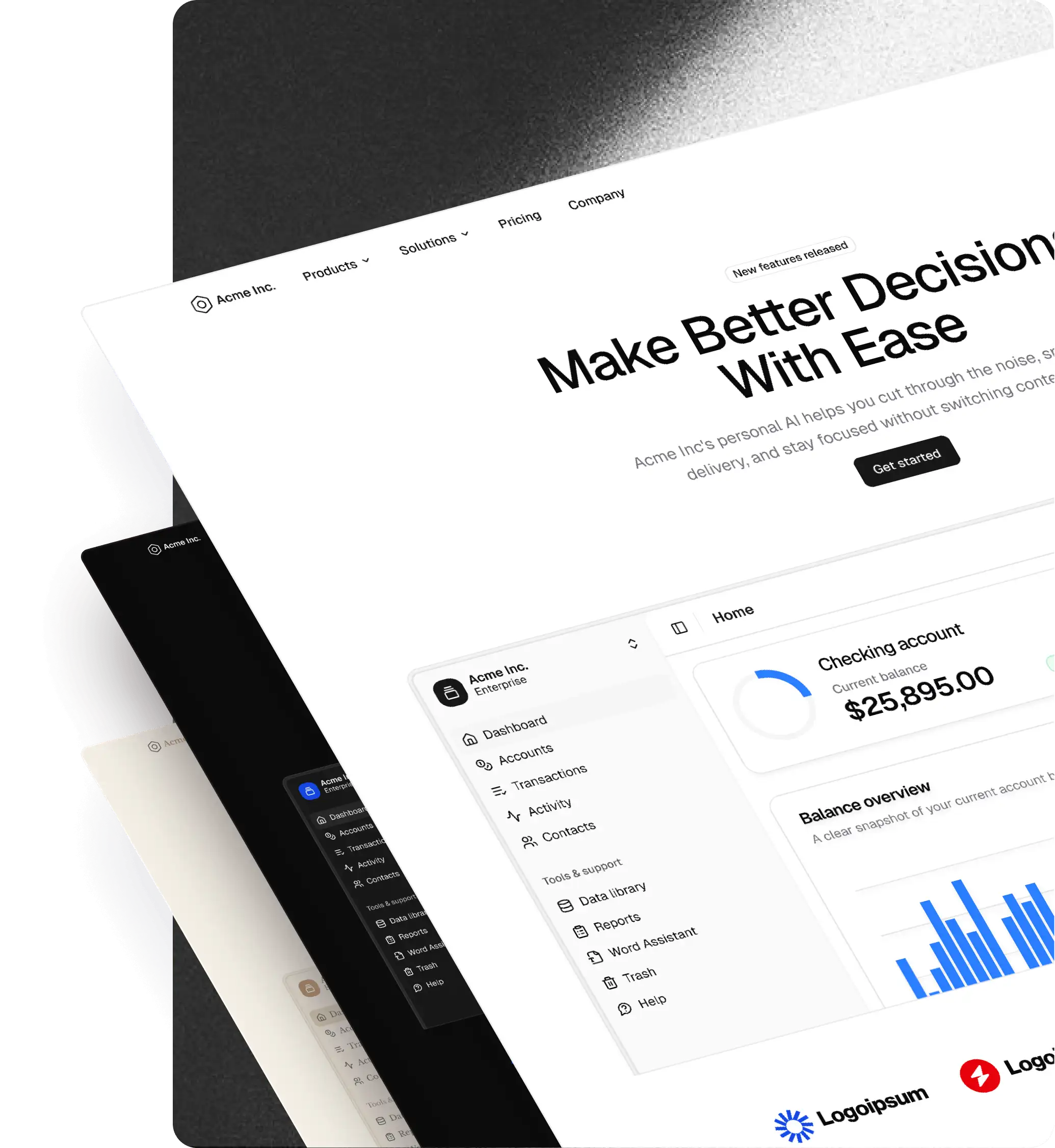
For a landing page, you might start with a hero, benefits, pricing, and a footer. Replace the sample copy and images, adjust the layout, then preview the page as a whole. You can make those decisions while looking at the actual components together.
Build your own blocks from shadcn components
You can also start smaller. Add a heading, fields, and a button, then arrange them in a frame to make your own contact form. Combine cards, text, images, and other components into something specific to your product.
The layout controls support stacks and grids, with direction, alignment, wrapping, gaps, and padding. Set dimensions to fit their content, fill available space, or use a fixed size. Add minimum and maximum sizes where the layout needs a boundary.
With Pro, select the finished block and choose Save to My blocks at the bottom of the right panel. Give it a name, then find it under Library → Blocks → My blocks to reuse across pages and apps in the same browser. Edited library blocks can be saved there too.
Design across desktop, tablet, and mobile
Add linked tablet and mobile frames beside your desktop design to see the same page at different widths. Adjust responsive properties and check how text, spacing, and layouts behave as the available space changes.
Use Preview to step away from the editing controls and interact with the page. Keep related screens together using Pages, and switch between apps from the menu when you're working on a different project.
The theme controls apply across the design. Change colors, typography, radius, icons, and the shadcn style, then see how those choices look across the components you've assembled. You can also import an existing preset to start from a setup you already use.
Take the design into your project
Open Export and choose how to continue:
- AI prompt gives your coding agent the component references, content edits, layout specification, theme, and project setup instructions.
- Code lets you inspect and copy source files or download the code bundle.
Export the current page, all pages in the app, or a selected layer. Choose a new or existing project, your framework, and your package manager. Uploaded images are included in the download when they're part of the exported design.
The prompt gives your agent a concrete design to implement. You can then connect the interface to your data, add application logic, and continue development in your editor.
Open Create and start building
The editor is free to use. You can explore and customize Pro blocks on the canvas; exporting a design that includes Pro items requires a React license. Saving and reusing My blocks also requires Pro. Designs made entirely with free items can be exported without a Pro license.
Your apps, saved blocks, and image library are stored in your browser. Return in the same browser to continue working, and download your exports when you're ready to move into a project.
Open Create, choose a starter or a blank canvas, and build your first page.