Pick your base, your style, your icons
shadcncraft now adapts to your setup.
Choose your base, style, and icon library, and everything follows. A new customizer lets you preview combinations live.
Until now, every component shipped with fixed defaults: Radix UI, the standard shadcn look, and Lucide icons. If your project used something else, you had to adjust it after install.
That is no longer the case. shadcncraft now respects your project config from the start.
Your project defines the defaults
Your setup is the source of truth. The registry reads what you've chosen and installs components to match:
- Base: Radix UI and Base UI, both fully supported.
- Style: all seven shadcn presets.
- Icons: Lucide, Tabler Icons, Hugeicons, Phosphor Icons, and Remix Icon.
Tokens, fonts, radius, and themes remain unchanged. Nothing gets overridden.
Built on shadcn styles
These styles come directly from shadcn. Same presets, same output.
- Vega: classic shadcn look.
- Nova: tighter spacing, more compact.
- Maia: softer and more rounded.
- Lyra: sharp and structured.
- Mira: dense and product-focused.
- Luma: softer and more fluid.
- Sera: editorial and typographic.
If your project already uses one of these, shadcncraft follows it. If not, you can try them across the library.
Custom styles from shadcn Create also work.
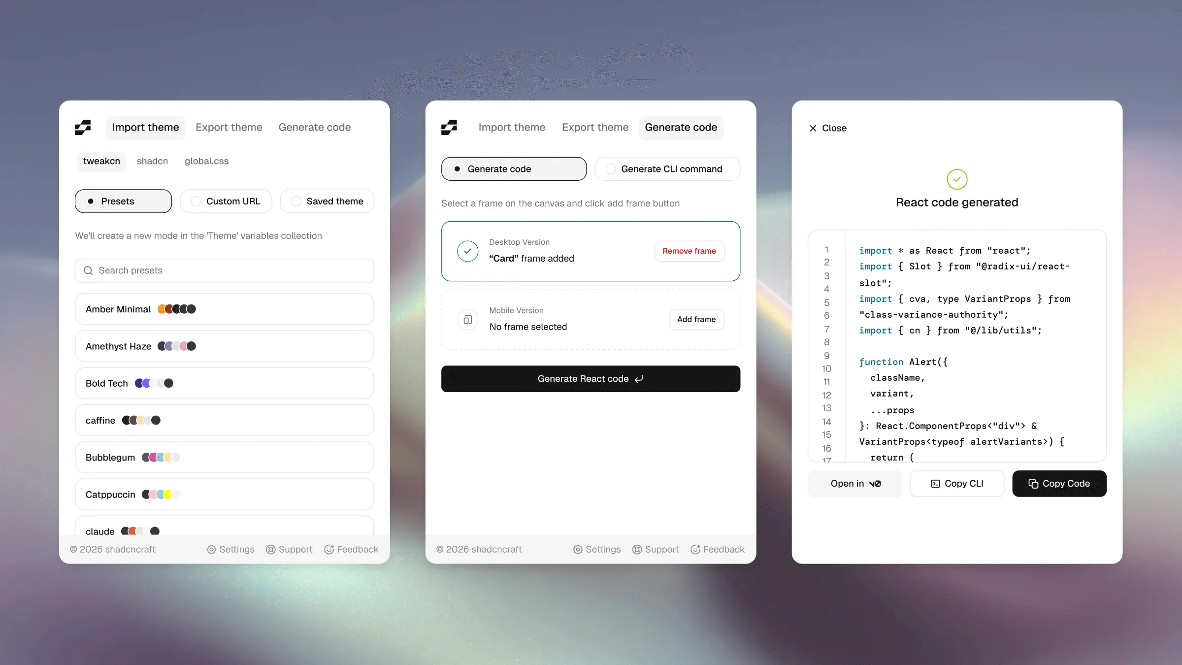
Preview every combination
Each component and block page now includes a live customizer.
You can:
- Switch between Radix and Base UI
- Change styles
- Swap icon libraries
- Adjust fonts and radius
- Apply shadcn or tweakcn themes (see the full shadcn/ui theming overview)
This is the same model as shadcn Create, applied to every component and block.
You can see exactly what you'll get before installing anything.
Works across the library
Support is library-wide. Components and blocks are built to follow your config.
Some older blocks may not support every option yet. We're updating those over time and will surface support more clearly on each component and block page.
One-line migration
Nothing breaks if you're already using shadcncraft.
To enable style-aware install, change one line in components.json:
{
  "registries": {
    "@shadcncraft": {
-     "url": "https://shadcncraft.com/r/{name}",
+     "url": "https://shadcncraft.com/r/{style}/{name}",
      "headers": {
        // ... your existing headers ...
      }
    }
  }
}
That's it.
Try it
Try the customizer on a live pro block. You can test different bases, styles, icons, and themes in our pro components and blocks before installing.
Where this is going
This brings shadcncraft closer to how shadcn Create works.
Same styles. Same structure. Same expectations.
The goal is simple: your design system behaves the same in Figma and in code.
More updates coming soon.