All Pricing blocks
Pricing 1
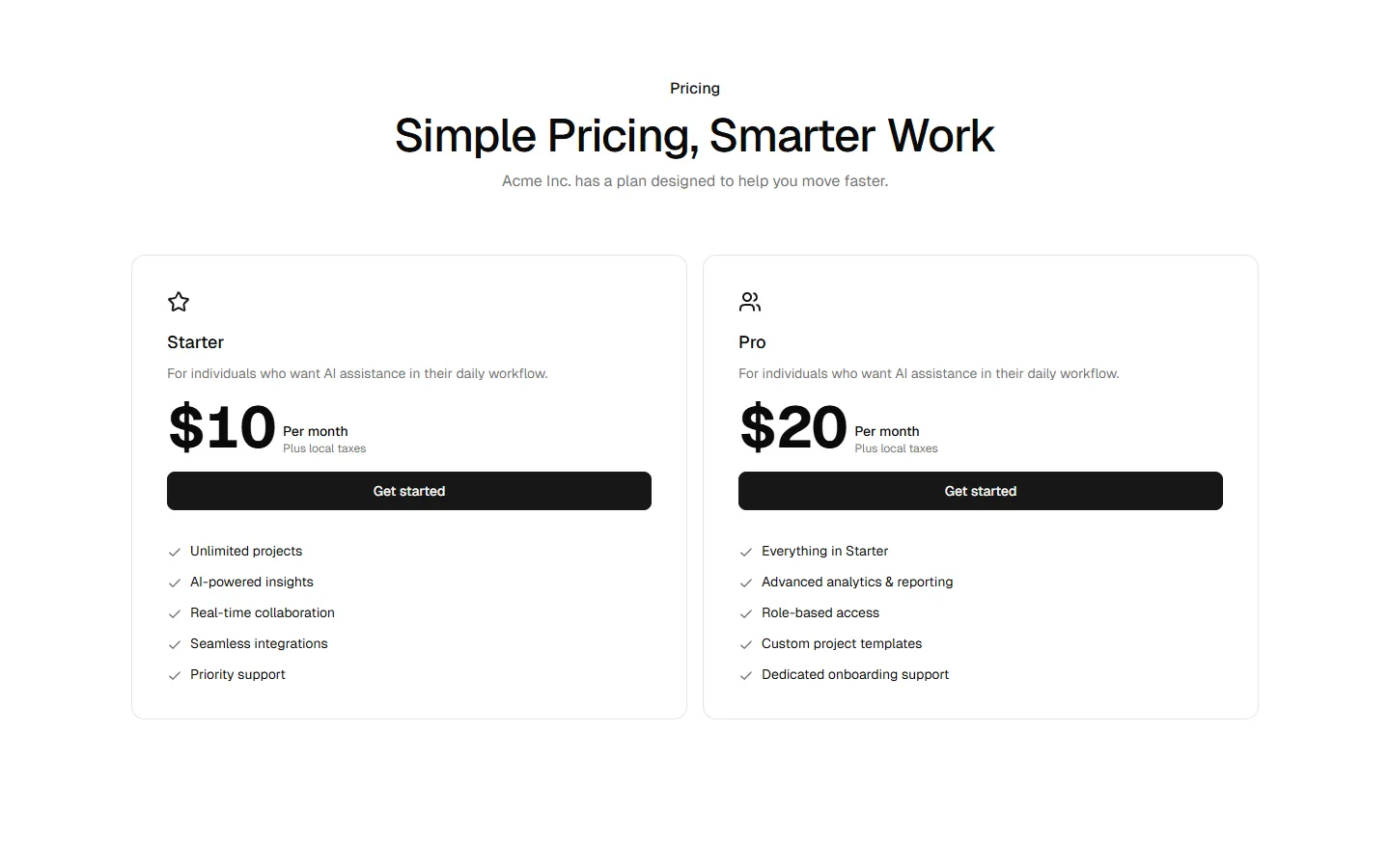
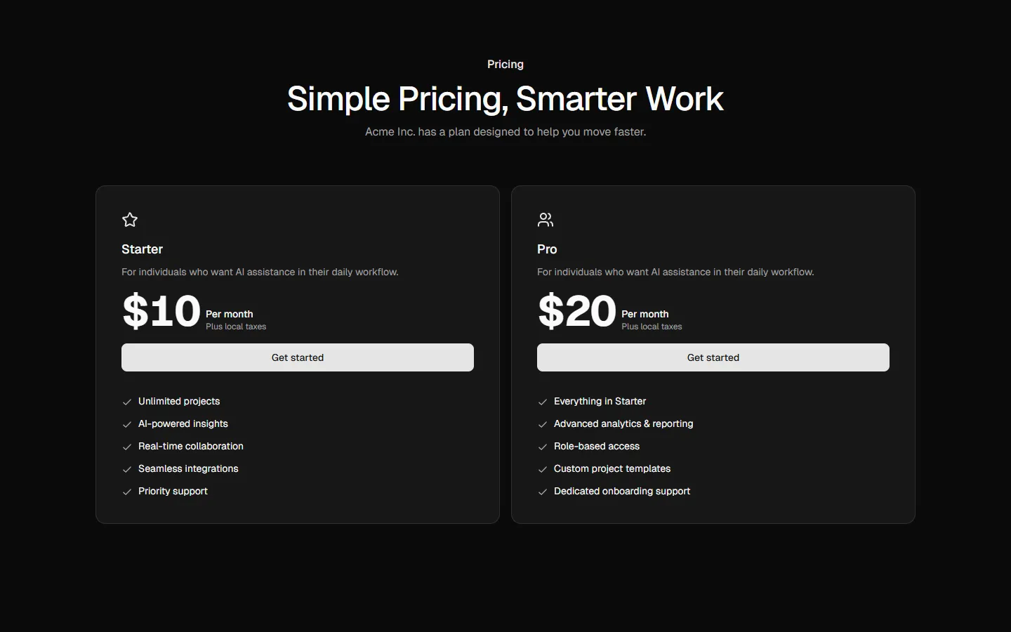
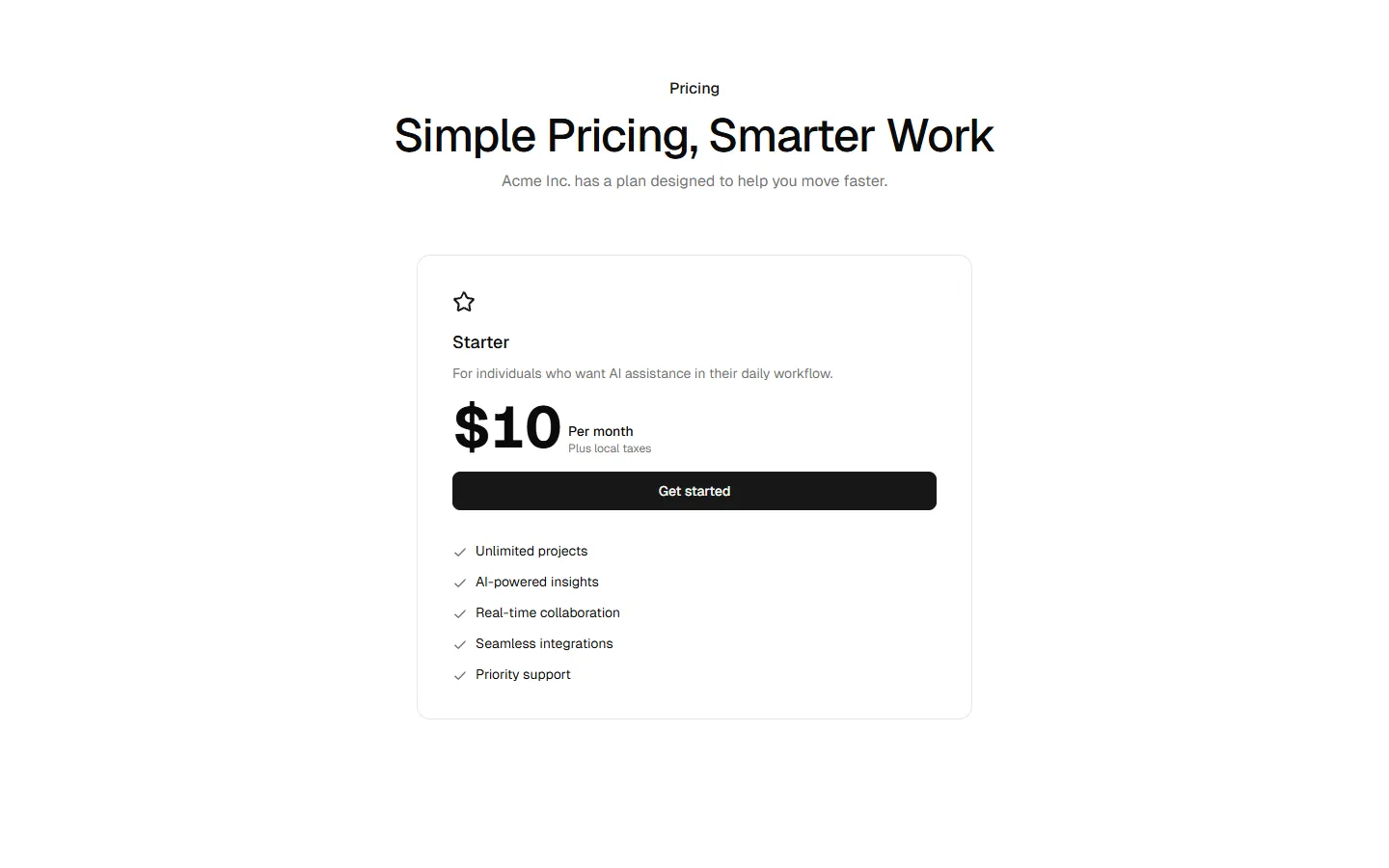
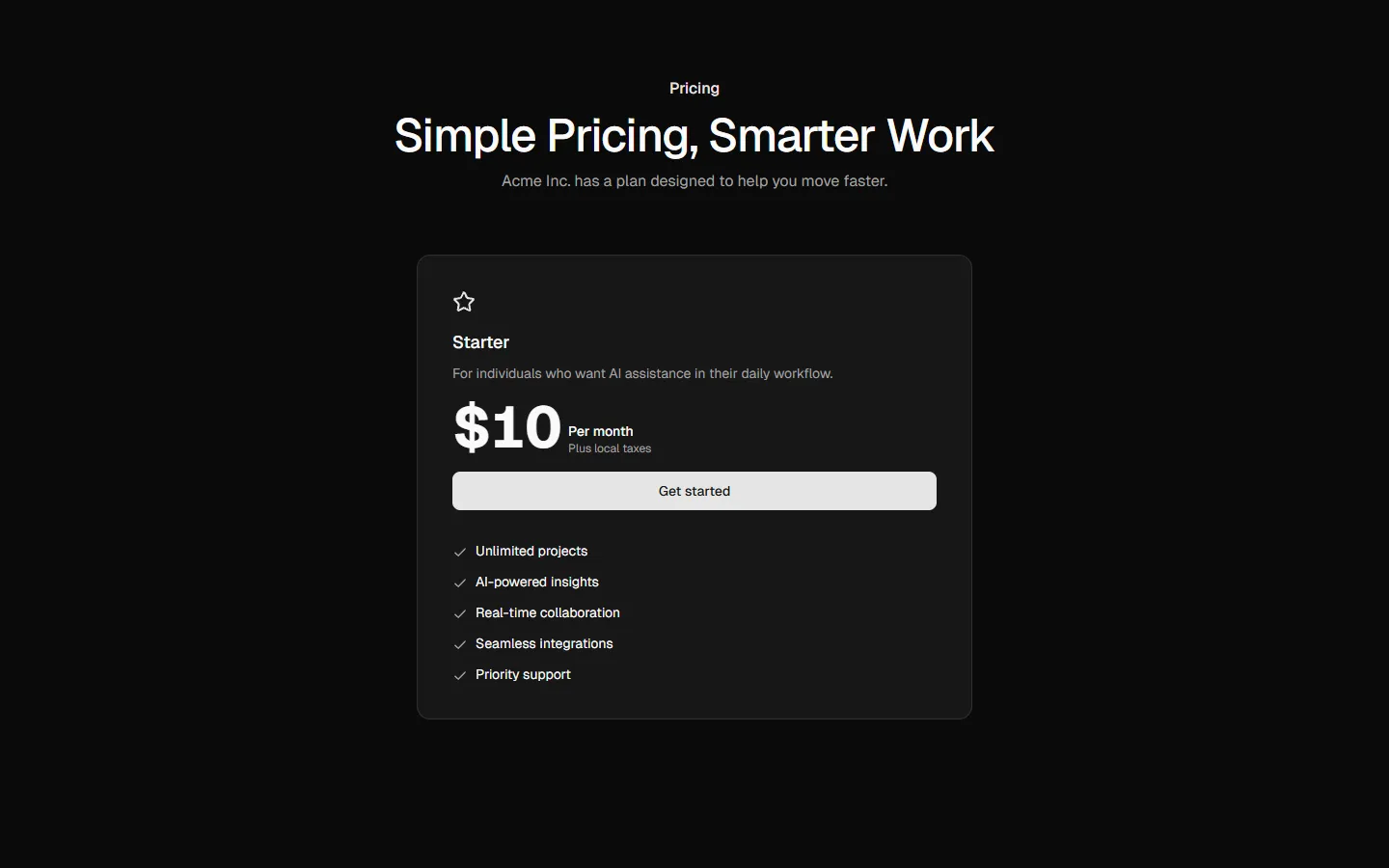
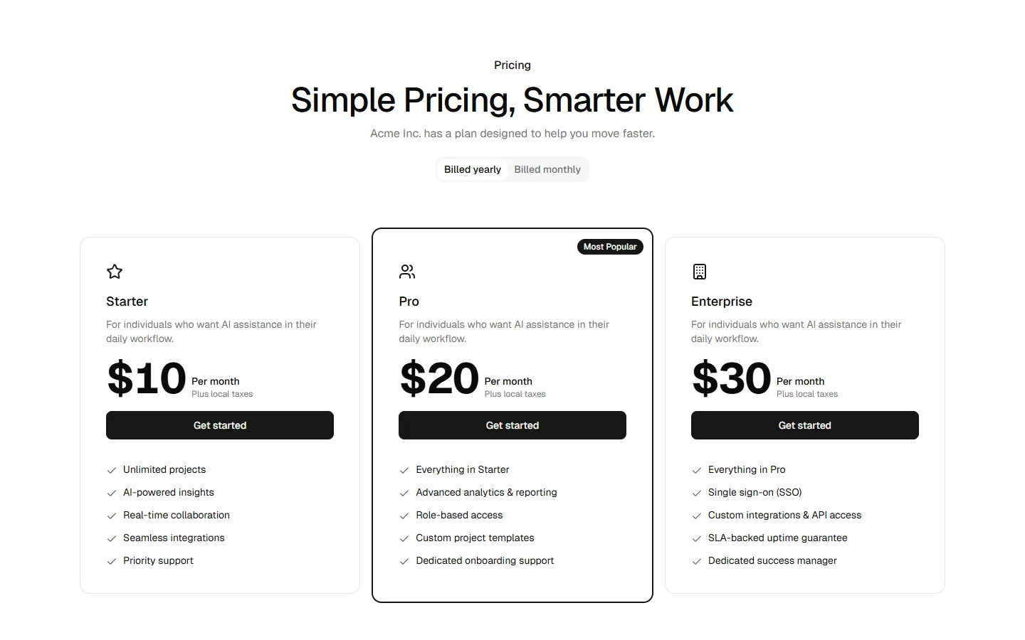
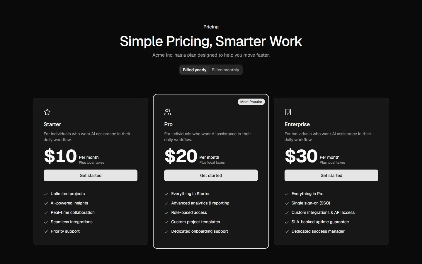
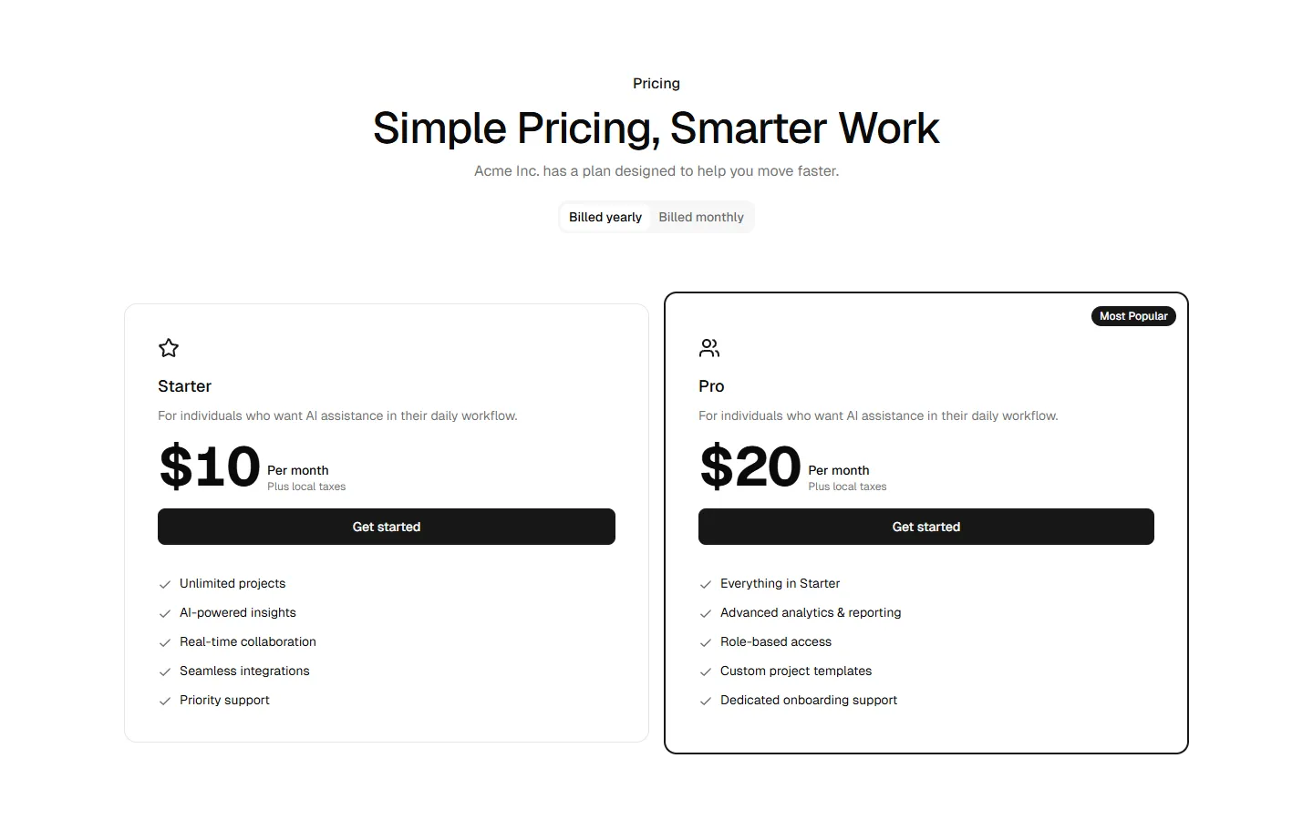
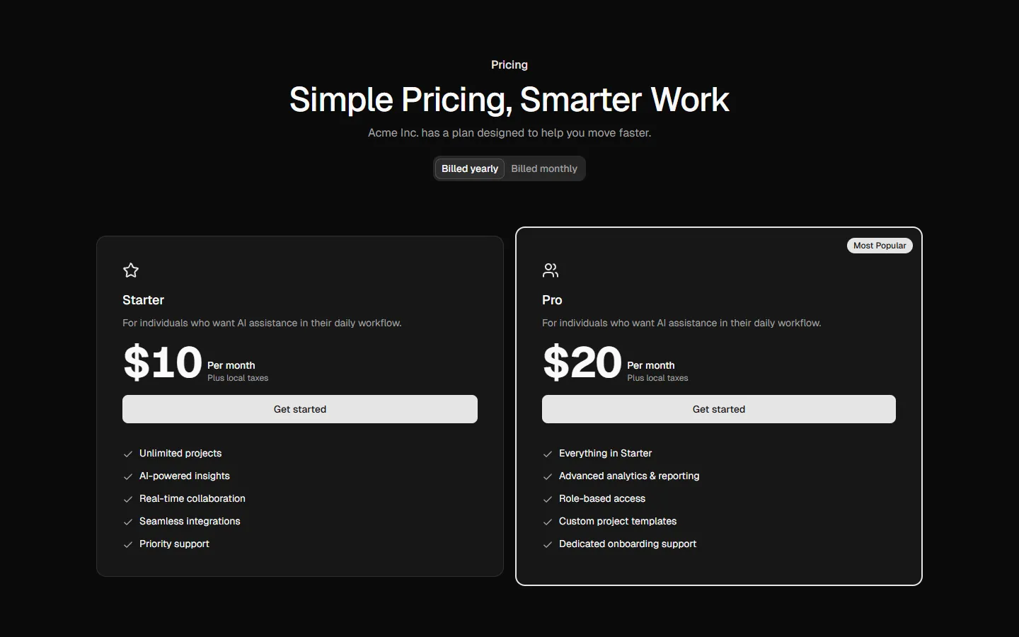
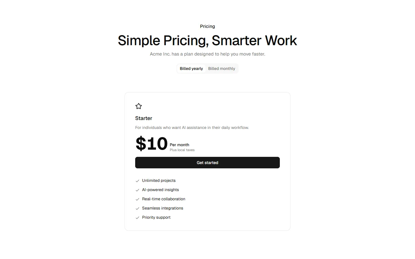
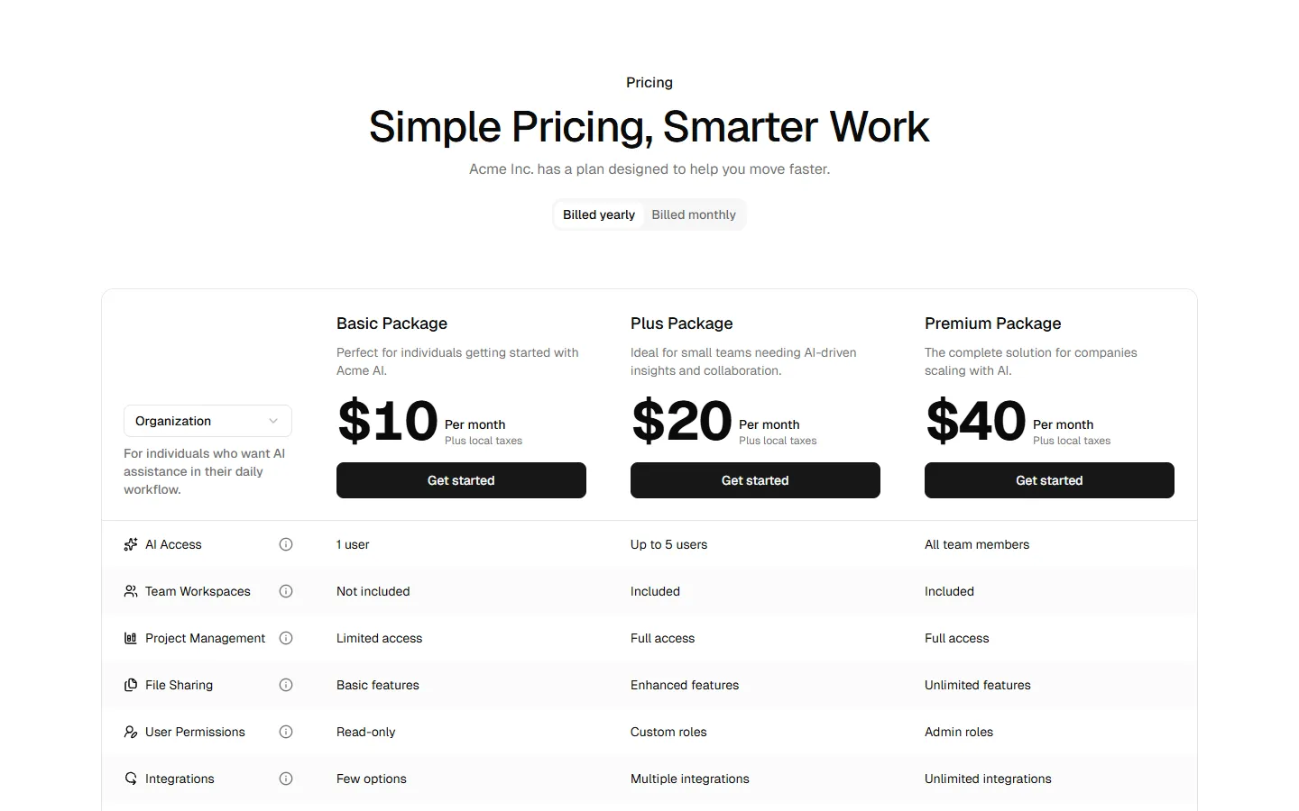
Three-tier card pricing grid
A classic three-column pricing layout with equal-weight plan cards for easy comparison. Each card follows the same vertical rhythm with plan name, price, primary action, and feature list, making differences scannable at a glance. The pattern scales cleanly to mobile as a horizontal carousel or stacked cards, keeping one plan in focus at a time.
In Pro & Pro + React
Radix UI
Base UI
8 styles
5 icon sets
Not Allowed
Get access to the full source code by upgrading to Pro + React.
SBIOTJ
Join 9,000+ builders shipping with shadcncraft
Get access to this block and the full library
Production-ready blocks and components with matching Figma and React.


Benefits
Production-ready by default
Built with shadcn/ui conventions and designed for real projects.
Built with shadcn/ui
Clean React components using Tailwind and modern shadcn patterns.
Install instantly
Add the block directly using the shadcn CLI.
Works with your theme
Compatible with shadcn themes and token-based color systems.
MCP server support
Use shadcn MCP server right from your favorite AI tools.
Frequently Asked Questions
Yes. They follow shadcn/ui structure and are built for real products.