Trace and Code Block are now in the shadcncraft Figma kit
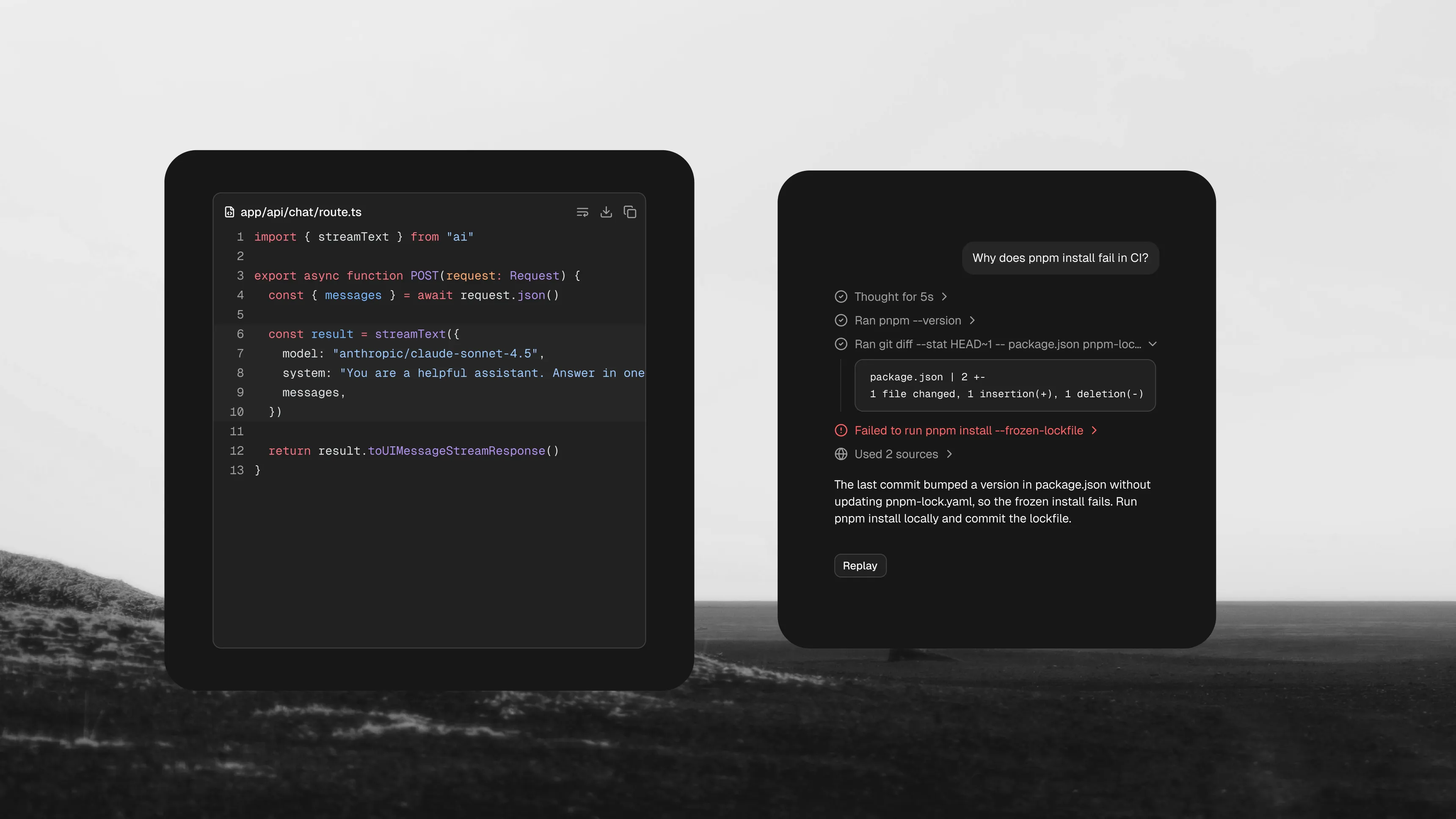
Trace and Code Block are now available in the shadcncraft Pro Figma kit. The two new shadcn/ui components give you a shared starting point for designing what an AI agent is doing and the output it produces.
Use Trace for a tool call, a plan or a list of sources. Use Code Block for code, a terminal response or a diff. Put them together when a step needs to expand into its output.
Trace: show the work behind a response
Trace organizes activity into rows with an icon, title and optional description. A row can stand alone or expand to reveal more detail.
The Figma kit includes four reusable components: Trace, TraceLine, TraceCollapsibleTrigger and TraceCollapsible. Change the title and description, toggle the icons, and drop your own content into an expanded row.
TraceLine includes default, running, error and pending statuses, plus hover and focus states. The collapsible components include open and closed variants, so you can design both a compact activity summary and the detail someone sees when they open it.
The examples cover individual lines, status lists, descriptions, links, dialogs, sheets, grouped activity, sources, reasoning and tool output. Each is available in light and dark.
Code Block: code, logs and diffs
Code Block provides a consistent surface for source code and text output, with optional titles, actions and line numbers.
In Figma, it is built from six components: CodeBlock, CodeBlockHeader, CodeBlockContent, CodeBlockLine, CodeBlockFooter and CodeBlockCopyButton. Slots let you compose the header, content, footer and actions for the context you need.
The kit includes:
- Default and small sizes, including compact output inside a Trace.
- Default and destructive variants for ordinary output and errors.
- Added, removed and highlighted lines, with editable code and line numbers.
- Copy and copied states, with header or floating action placement.
- Examples for diffs, wrapping, tabs, messages and syntax-highlighted code, in light and dark.
Designed to map back to the code
Component descriptions document the corresponding React data-slot names, and styling is wired into the kit's style variables. Designers and developers can refer to the same parts when discussing a trace row, an expanded result or a code block header.
These are editable Figma representations of the UI states. Streaming, the running shimmer, clipboard actions and scrolling are runtime behaviors in React; the Figma examples show their visual states.
Get the update
Existing Pro Figma customers can download the latest kit from their customer portal. Open the Trace and Code Block pages to find the components and examples.
For the React components, use the official Trace and Code Block installation guides.