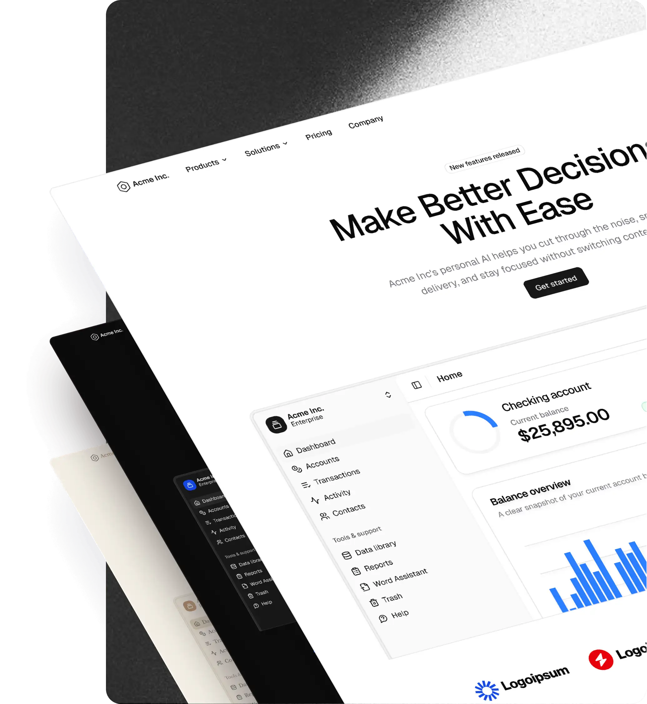
shadcncraft Figma Components
The shadcncraft Figma UI kit offers a comprehensive set of components that align with the official shadcn/ui framework. This section walks you through how to work with components in Figma, from basic editing to documenting changes for developer handoff.
Editing components
Each component in the kit is styled using Tailwind CSS utility classes. In Figma, we replicate this structure by using variables from the Primitive, Theme, and Mode collections, along with shared styles. This setup ensures visual consistency and allows for easy updates across your design system.
Example: Editing the tooltip component
Let's say we want to modify the Tooltip component to have a slightly larger font size.
- Navigate to the Tooltip page, under the
COMPONENTS · shadcn/ui officialsection of your main library file - Locate the component set named
TooltipContent - Select all the Tooltip component variants
- Change the label text from
text-xstotext-base
Implementation in code
Developers can now update the component in code based on the design edits:
- Open the
ui/tooltip.tsxfile - Replace the
text-smclass withtext-base - Save the file and verify the changes in the UI
Because the Figma variables map directly to Tailwind classes, the design-to-code handoff is fast and accurate.
Creating new components
If you're designing a brand-new component, follow these guidelines to maintain consistency with the shadcncraft system:
- Start with a Frame using the correct constraints and resizing behaviours
- Add text using predefined Text Styles
- Apply colors from the Mode collection (to support light/dark themes)
- Use Primitive variables for spacing, sizing, borders, and
radius - Use auto-layout wherever possible
- Hit
Option + Cmd + Kto convert the frame to a component - Add variants for different states where needed (e.g. default, hover, focus, disabled)
- Use Figma properties to organise toggles, slots, or variants cleanly. Name variant properties after the React props (
variant,size,state) and use the React values (sm,lg,destructive) - Name the component after its React export, and give it its own page. Sub-parts that need their own component sit on the same page, named after their export (
Card,CardHeader). See Figma to React mapping - Add usage documentation within the Figma file to help developers understand the intent and flexibility