Two new upgrade modals in Figma and React
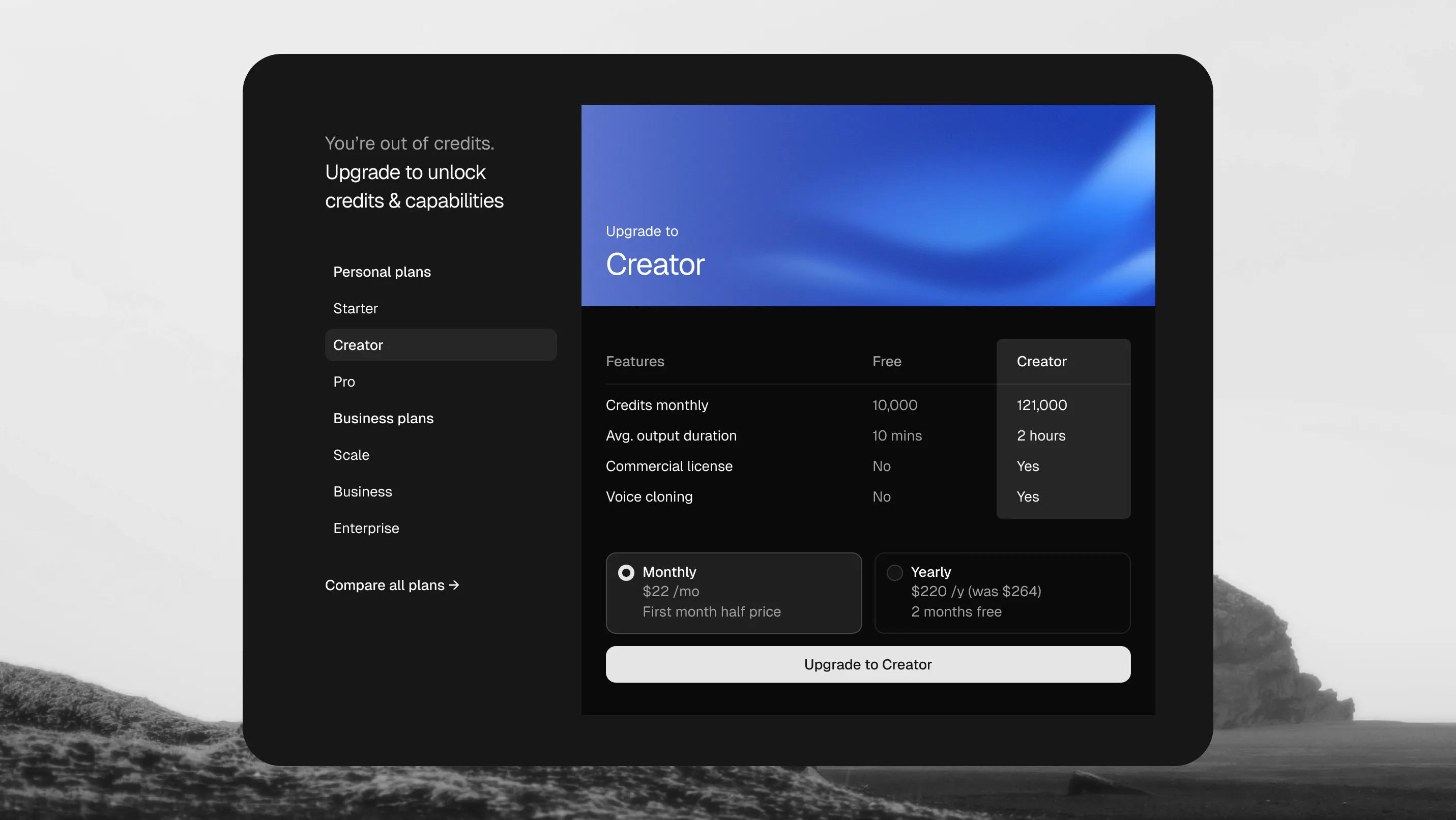
Two new upgrade modals are now available in shadcncraft, with matching Figma designs and React blocks. They bring plan selection, feature comparison and monthly or yearly billing into a dialog you can open from your app.
Use them when someone reaches a usage limit, explores a paid feature or wants to compare plans without leaving their current screen. Each gives you a starting layout to adapt to your own product, pricing and checkout.
A sidebar for choosing a plan
Upgrade Modal 1 puts plan navigation beside a feature comparison. Customers can move between plans, review what is included and choose a billing period in the same dialog.
On smaller screens, the dialog fills the screen and the plan menu replaces the content while it is open. That gives plan selection its own space without stacking another overlay on top.

A visual layout for your offer
Upgrade Modal 2 pairs a product visual with plan tabs, a compact feature comparison and billing controls. Use this layout when you want to show what customers can create or unlock alongside the details of the offer.
The split desktop layout stacks into a full-screen dialog on mobile. Replace the example image and copy with a visual that makes sense for your product.

Shared billing controls
Both layouts use the new Upgrade Modal Billing component for monthly and yearly selection and pricing. The shared component gives you a consistent billing area across the two layouts, alongside each modal’s upgrade action.
The upgrade modals also handle shorter windows, allowing the content and billing controls to scroll together when vertical space is limited. Customers can reach the upgrade action even when the dialog has less room.
The included plans and prices are examples. Connect the selected plan and billing period to your own checkout through the upgrade callback, and replace the sample features with your offer.
Start in Figma or React
Explore the matching designs in Figma, then use the React blocks as the foundation for your implementation. Both layouts include light and dark previews in the registry.
With your registry access configured, install the blocks using the shadcn CLI:
pnpm dlx shadcn@latest add @shadcncraft/upgrade-modal-1 @shadcncraft/upgrade-modal-2Choose the sidebar layout for a plan-led comparison, or the visual layout when the product example deserves more room. The source lands in your project, ready for your content and integrations.
Browse the upgrade modals, or follow the registry installation guide to get started.