AI Chat comes to the shadcncraft Figma kit
AI Chat shipped React first in August: a complete chat application built on Next.js, shadcn/ui and the Vercel AI SDK, with the Figma version promised next. Pro v3.6 of the Figma kit delivers it, and adds reorderable rows to the Table blocks.
Every chat surface, in Figma
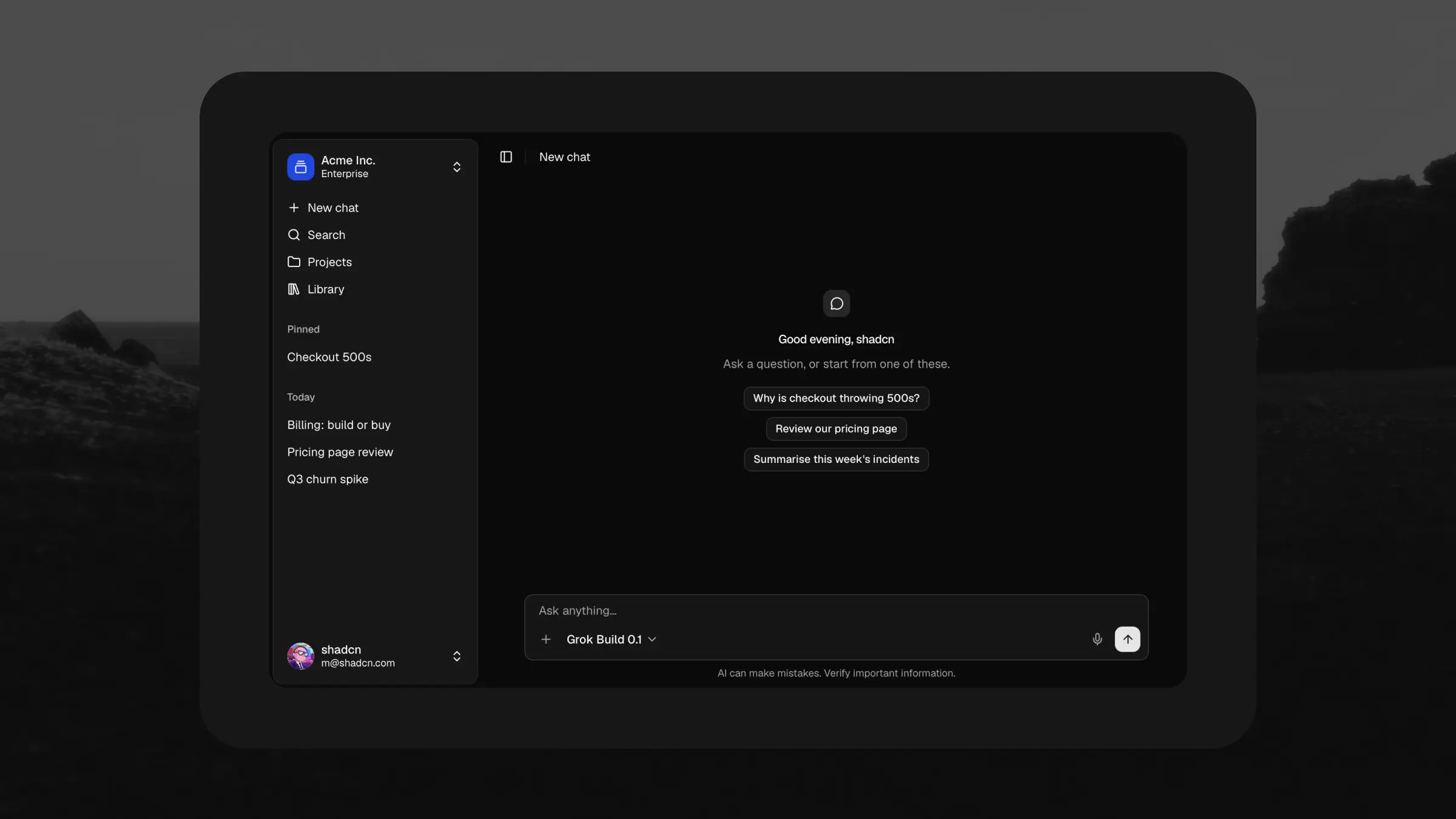
The five surfaces of the app are blocks, matched 1:1 with their React counterparts: Chat Shell, Assistant Panel, Chat, Composer and Share Dialog, each in Large and Small. Design a conversation in Figma, install the same block from the registry with the shadcn CLI, and what the developer builds is what you drew.
Every kind of reply, designed
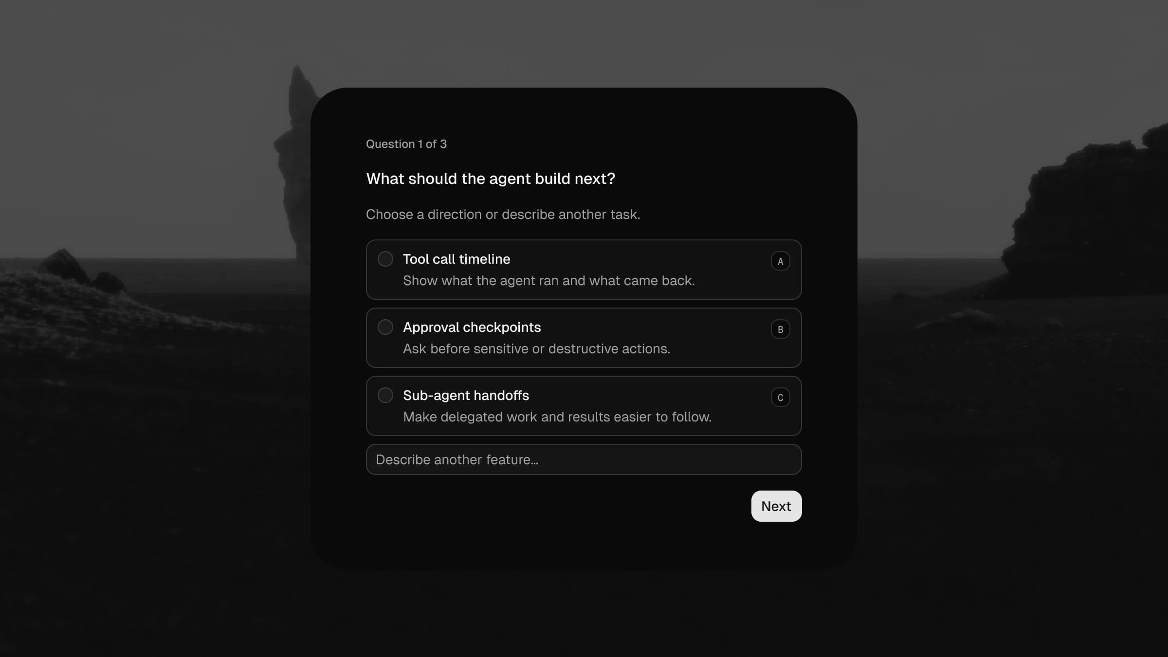
Each thing a model streams back has its own component, with the same states the React renderer has: streaming markdown, reasoning that collapses when it is done, tool calls in running, done, failed and denied, web search results, a merged sources list, file attachments with inline previews, and questionnaire forms inside the chat. Seven message parts, and they compose into any thread you need to mock.
More than a chat box
The screens around the conversation are designed too. Chat covers a new chat, a thread, its loading and not-found states, and the assistant panel docked beside your own product. Library comes in grid, list and preview views. Projects has the list and the project detail. The dialogs and menus, new project, rename, add source, delete, sit beside the screens as compositions you detach and edit.
Like the rest of the kit, everything responds to the Style and Theme variable modes, so the whole app works across all eight styles in light and dark. Flip the mode, done.
Tables you can reorder
The Table blocks gain row drag and drop, in Figma and React. 15 of the 21 blocks get a grip handle column in both Large and Small; the record and analytics views (transactions, audit logs, leaderboards) deliberately keep their fixed order. Sortable headers now show their direction.
In React the reordering is wired with dnd-kit. It works with the pointer or the keyboard, and the handle disables itself while a sort is active so the two never fight. If you already own the tables, reinstall a block and the update is yours.
App Shells
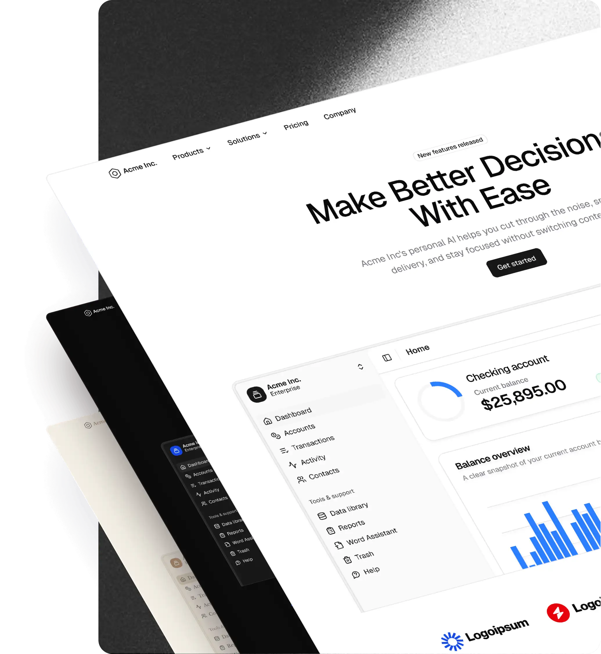
Pro Application gains a block group for the frame around a screen. Three App Shells pair a sidebar with a header bar and leave the content area empty, so a dashboard, a table or a settings form drops straight in. Each comes with the sidebar expanded and collapsed, at Large and Small, and every shell is built from the kit's own Sidebar and header components, so nothing is detached.
Five App Shell Headers ship alongside them: the header bar on its own, with the sidebar toggle, a workspace switcher, a date range, filters, settings and search. Swap one into a shell, or put it on top of a layout you already have.
The file now mirrors the site
A smaller change you will notice the first time you open Assets. Pages are grouped under COMPONENTS, BLOCKS, APPS and ICONS sections in the same order as shadcncraft.com, and the names inside a page are the ones you see on the site: the Card page holds Card, CardHeader and CardFooter; the Footers page holds Footer 1 to Footer 4, and Footer 4 is the block you install as footer-4. That gives you three things:
- Swap is page, then item. Figma groups Assets and the swap popover by page, so finding a block is the same two steps as finding it on the site.
- Variants read as code. Properties are the React props (
variant,size,state) with the React values (sm,lg,destructive), so a designer, a developer and an agent reading your file all see the same thing. - Nothing is hidden. Support components used to be dot-prefixed and unpublished. They now sit in a
Partsfolder on the page that uses them and publish like everything else, so your copy of the library gets every update.
Your existing files are fine. Instances track the component, not the name, so a file built on v3.5 shows the new names the moment you accept the library update, with every override intact. How the names map to React is on the Figma to React mapping page, checked against the file.
How to update
The download link in your receipt email always points at the latest file, and your Polar portal has it too. Download Pro v3.6, publish it as a library, and point your files at it. Instances track the component, not the name, so a file built on v3.5 picks up the new names and every fix when you accept the library update, with your overrides intact.
If you built a custom library on top of the kit, the Updates guide walks through bringing the new components into it without losing your theming.
Get it
Pro v3.6 is available now in the Pro Figma and Pro Figma + React bundles. Existing customers already have it; see how to update above. New here? Compare bundles, or start with the free kit. Base Figma is updated alongside it in Base v3.1.