All blocks
Pricing
shadcn/ui Pricing blocks that clearly communicate your plans and costs. Choose from simple single-tier layouts or detailed multi-tier options that highlight features side by side to support buying decisions.
In Pro & Pro + React
React
Figma
Pro
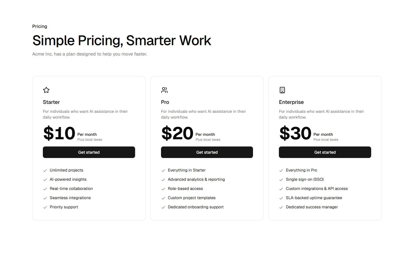
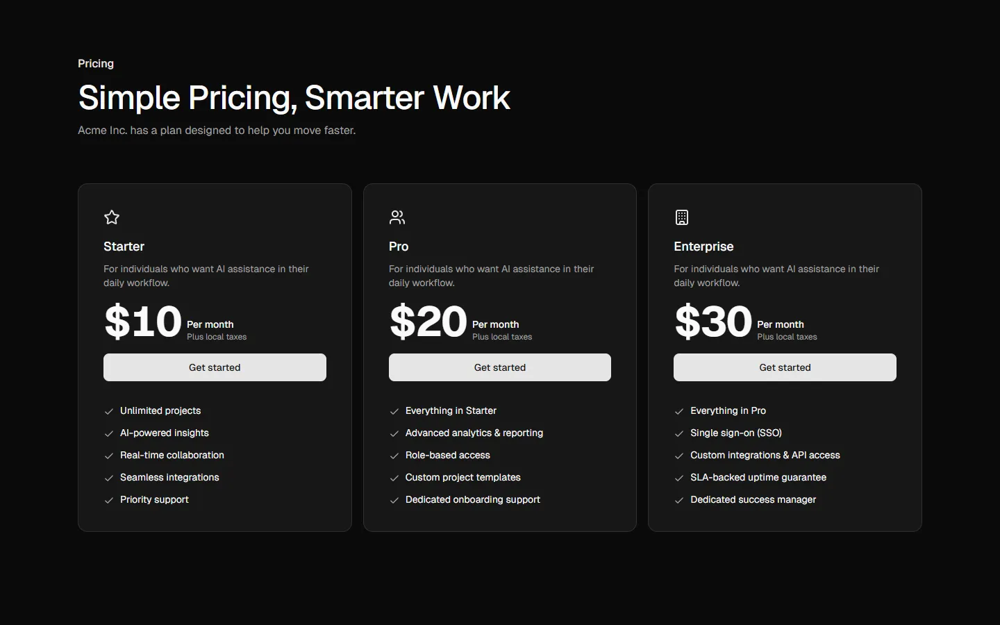
Pricing 1
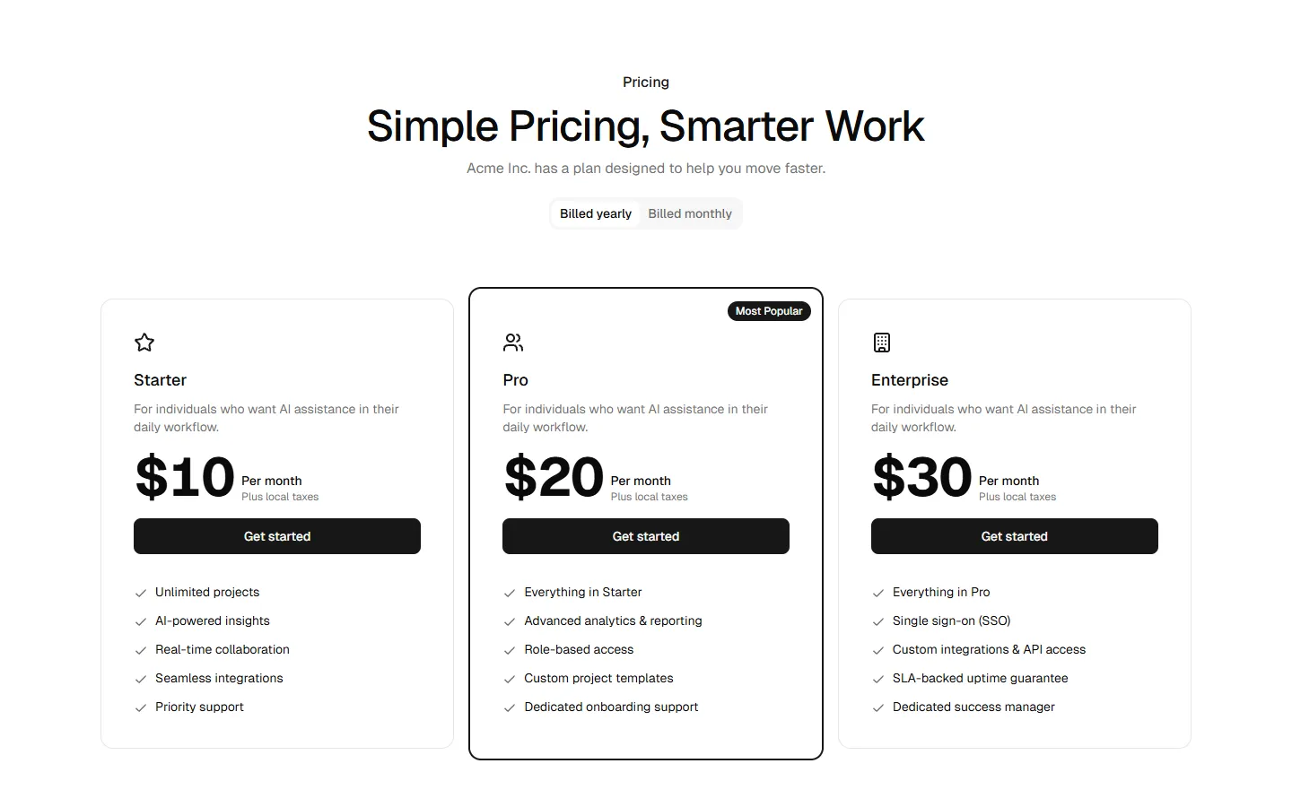
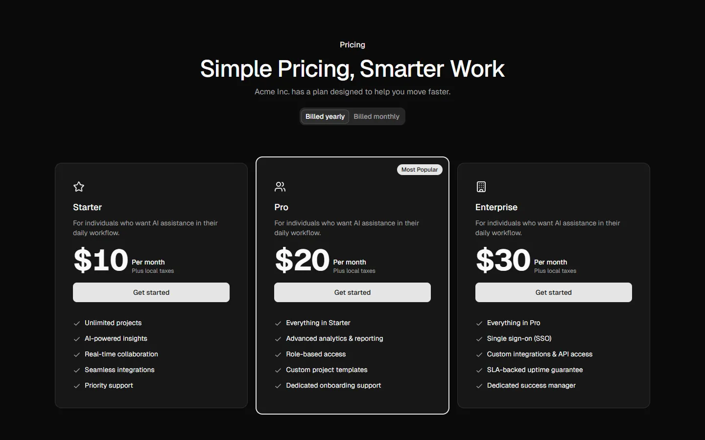
Three-tier card pricing grid
Pro
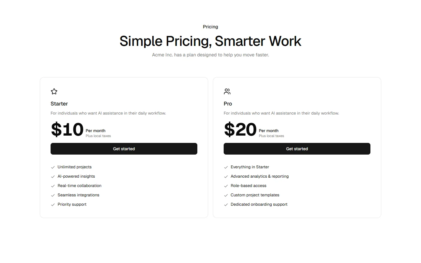
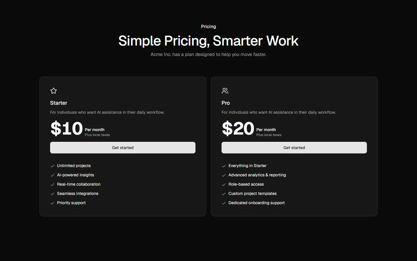
Pricing 2
Focused two-plan comparison
Pro
Pricing 3
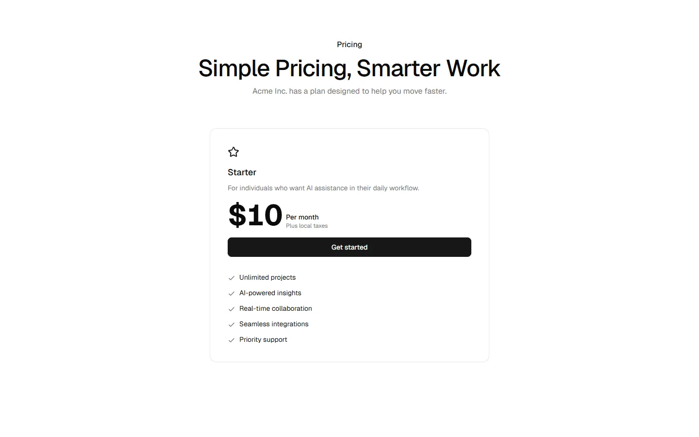
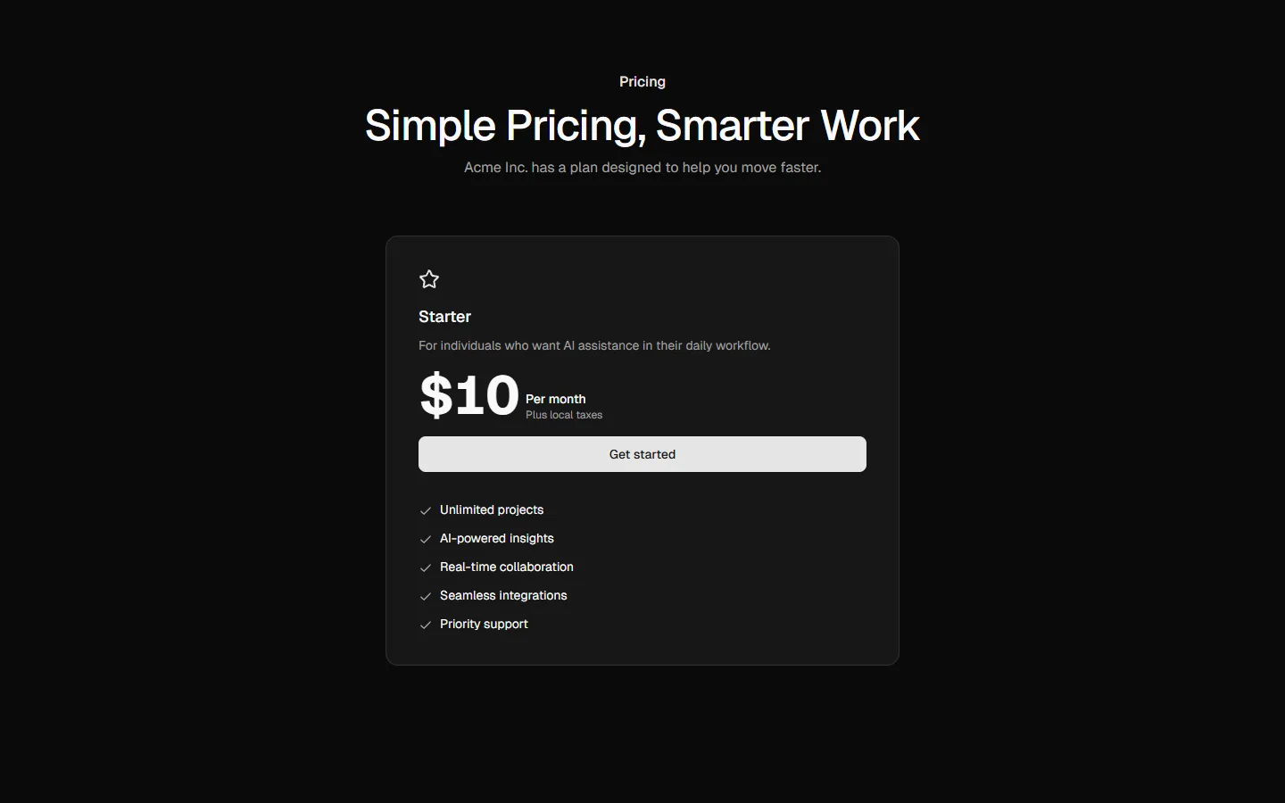
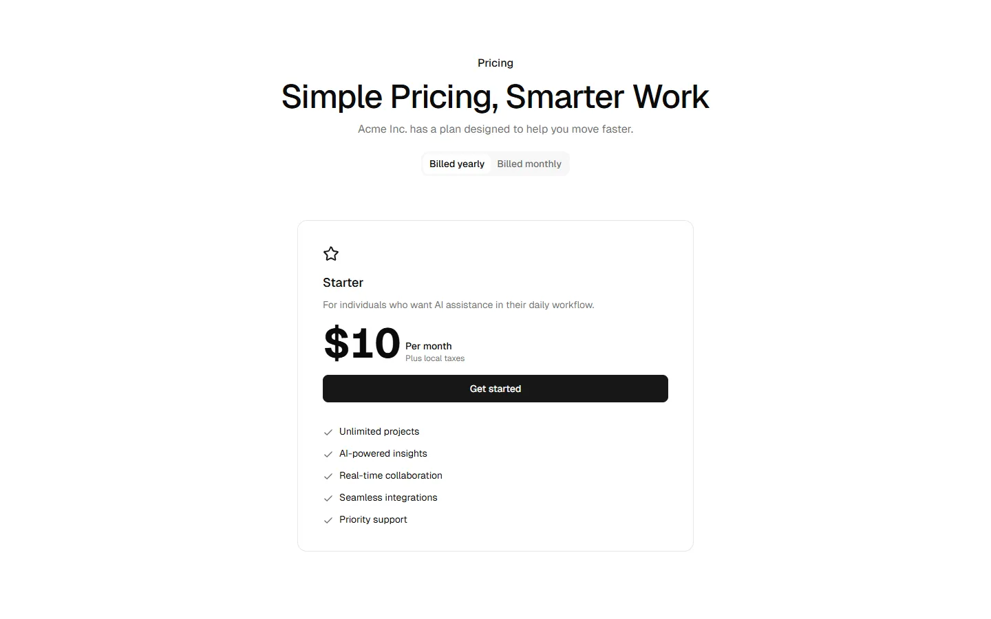
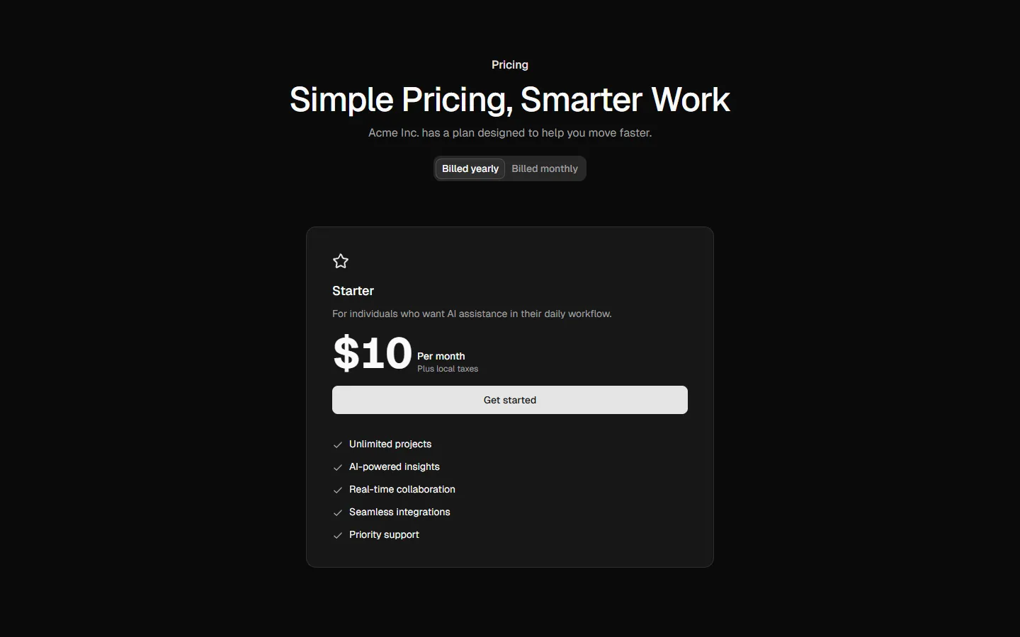
Single plan spotlight
Pro
Pricing 4
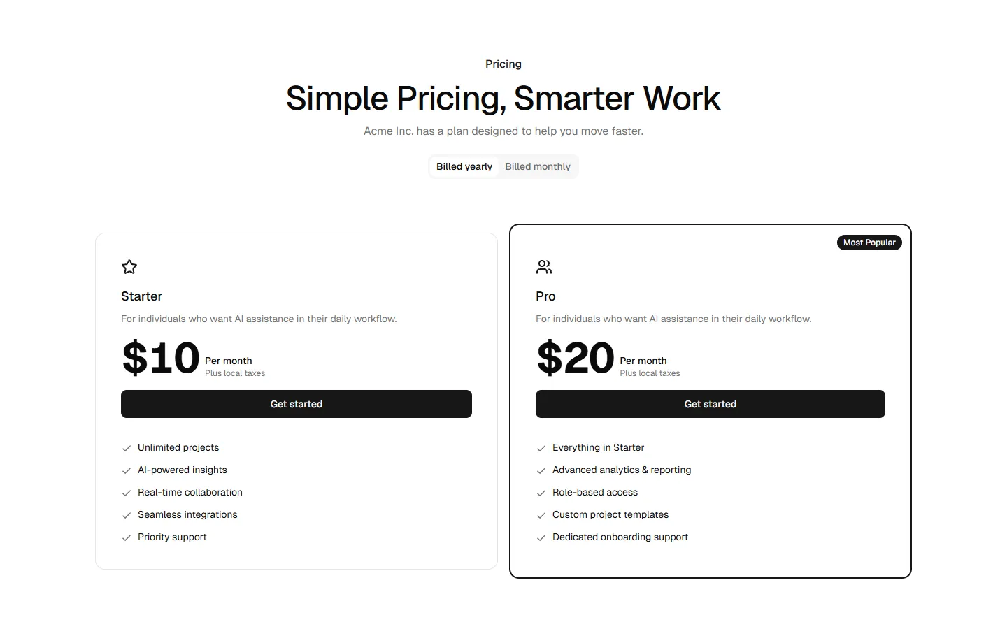
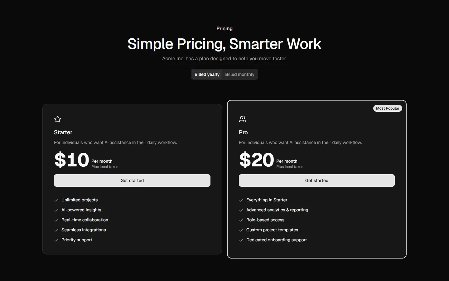
Three-plan comparison with highlighted default
Pro
Pricing 5
Side-by-side plans with duplicated emphasis
Pro
Pricing 6
Single-plan focused pricing
Pro
Pricing 7
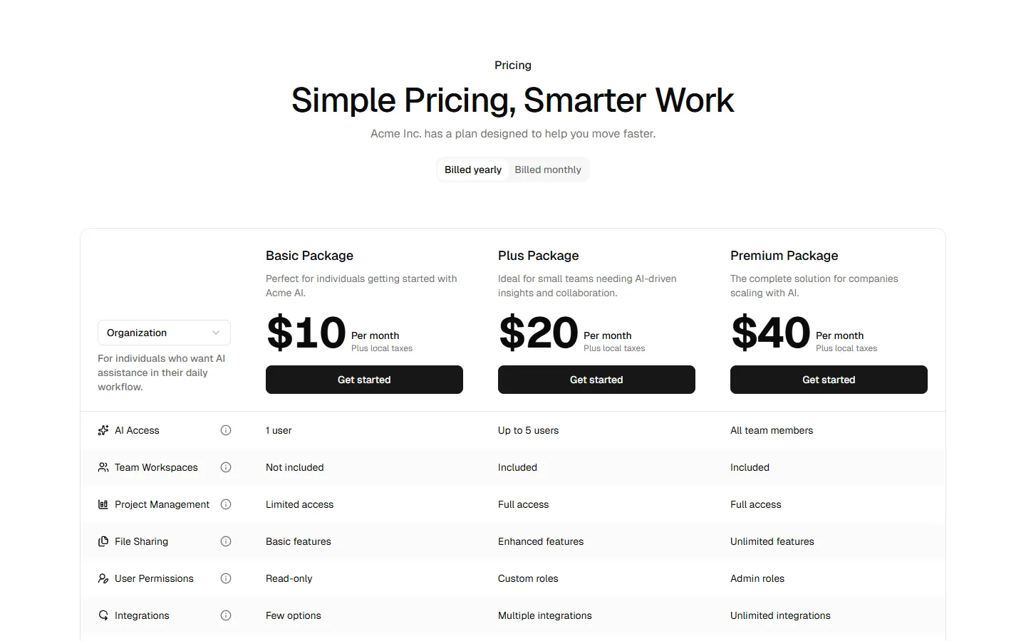
Feature-comparison table pricing
SBIOTJ
Join 3,000+ builders shipping with shadcncraft
Get access to these blocks and the full library
Production-ready blocks and components with matching Figma and React.


Benefits
Designed for your shadcn/ui project
Blocks built to work together across marketing pages and product interfaces.
Consistent layout system
Shared spacing, grids, and typography across all blocks.
Composable layouts
Combine blocks to build complete pages without layout conflicts.
Theme compatible
Works with shadcn/ui themes and token-based color systems.
Production-ready structure
Layouts designed with real content patterns and responsive behavior.
Explore all block categories
Built on official shadcn/ui components with real structure, spacing, and accessibility. No AI-generated layouts. Designed for real products in Figma and React.