All blocks
CTA
shadcn/ui CTA blocks designed to drive interaction. Pair strong copy with visuals to encourage signups, trials, or purchases at key points on your site.
In Pro & Pro + React
React
Figma
Pro
CTA 1
Centered headline with stacked actions
Pro
CTA 2
Left-aligned headline with inline actions

Pro
CTA 3
High-contrast panel with stacked actions
Pro
CTA 4
High-contrast panel with left-aligned actions
Pro
CTA 5
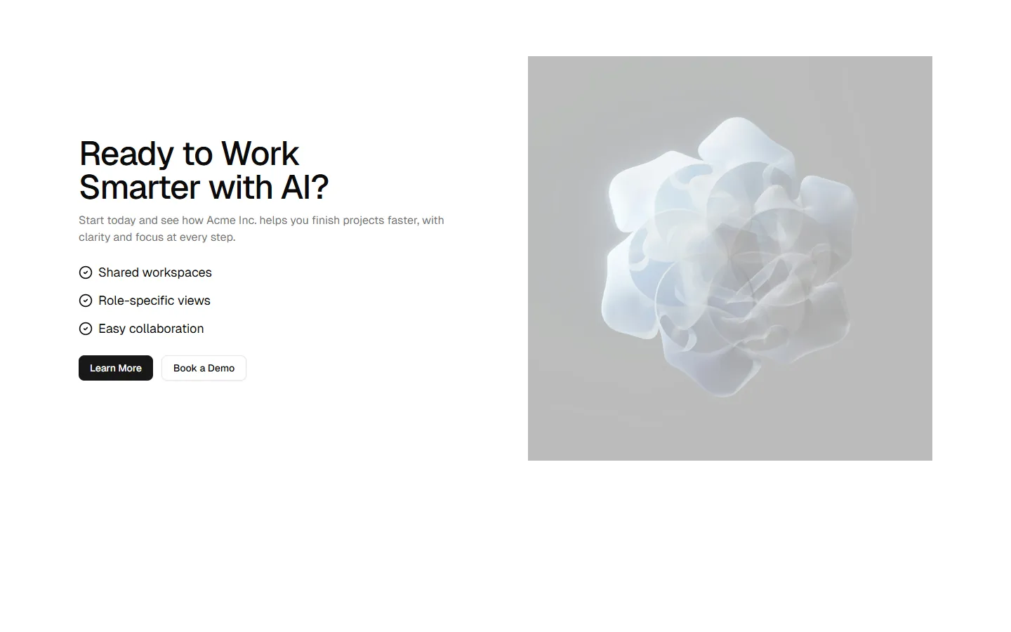
Split content with feature list and media
Pro
CTA 6
Feature-led split with primary visual
Pro
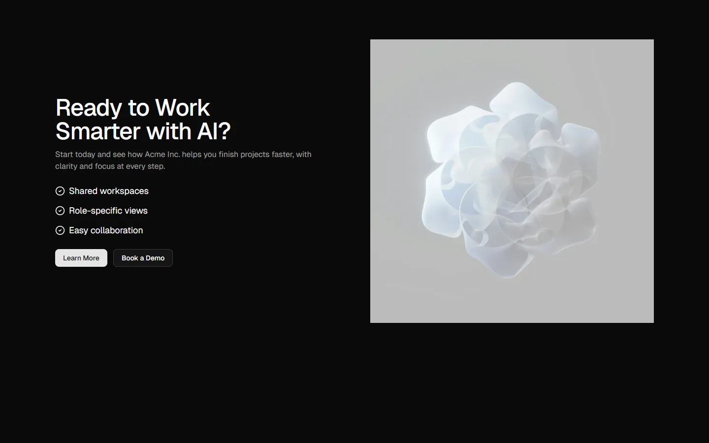
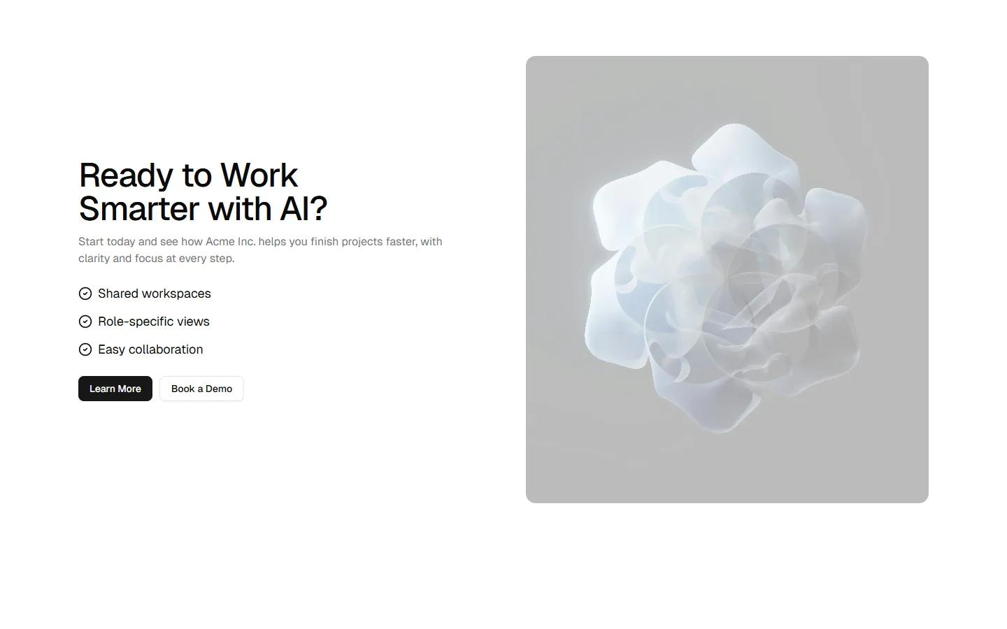
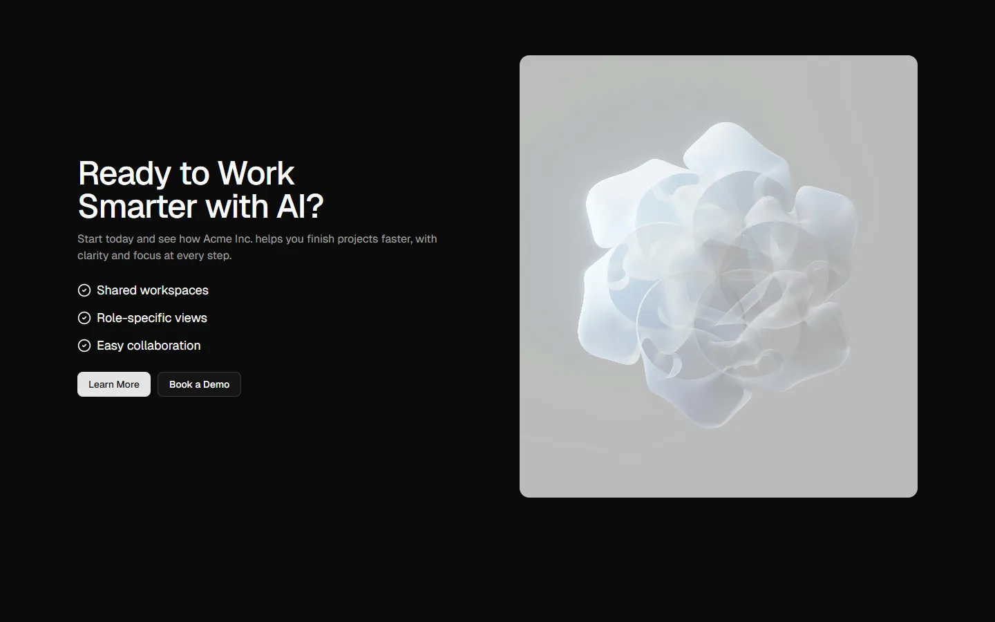
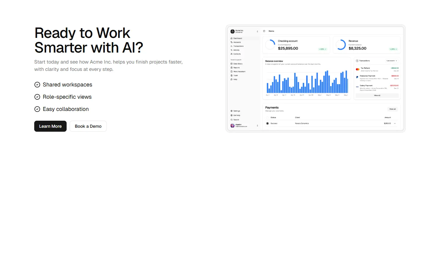
CTA 7
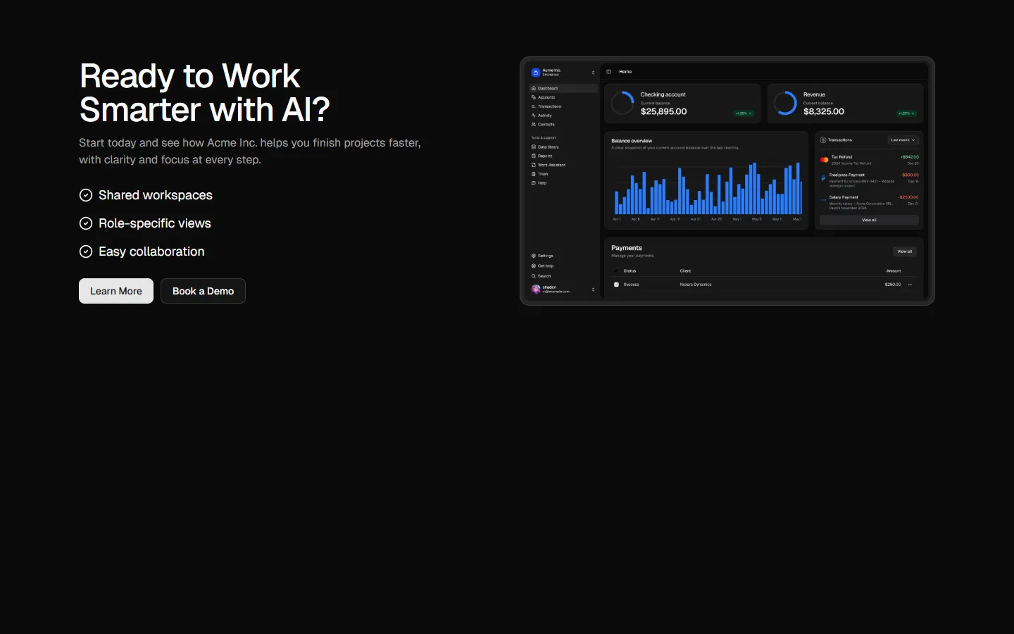
Product preview split with feature checklist
Pro
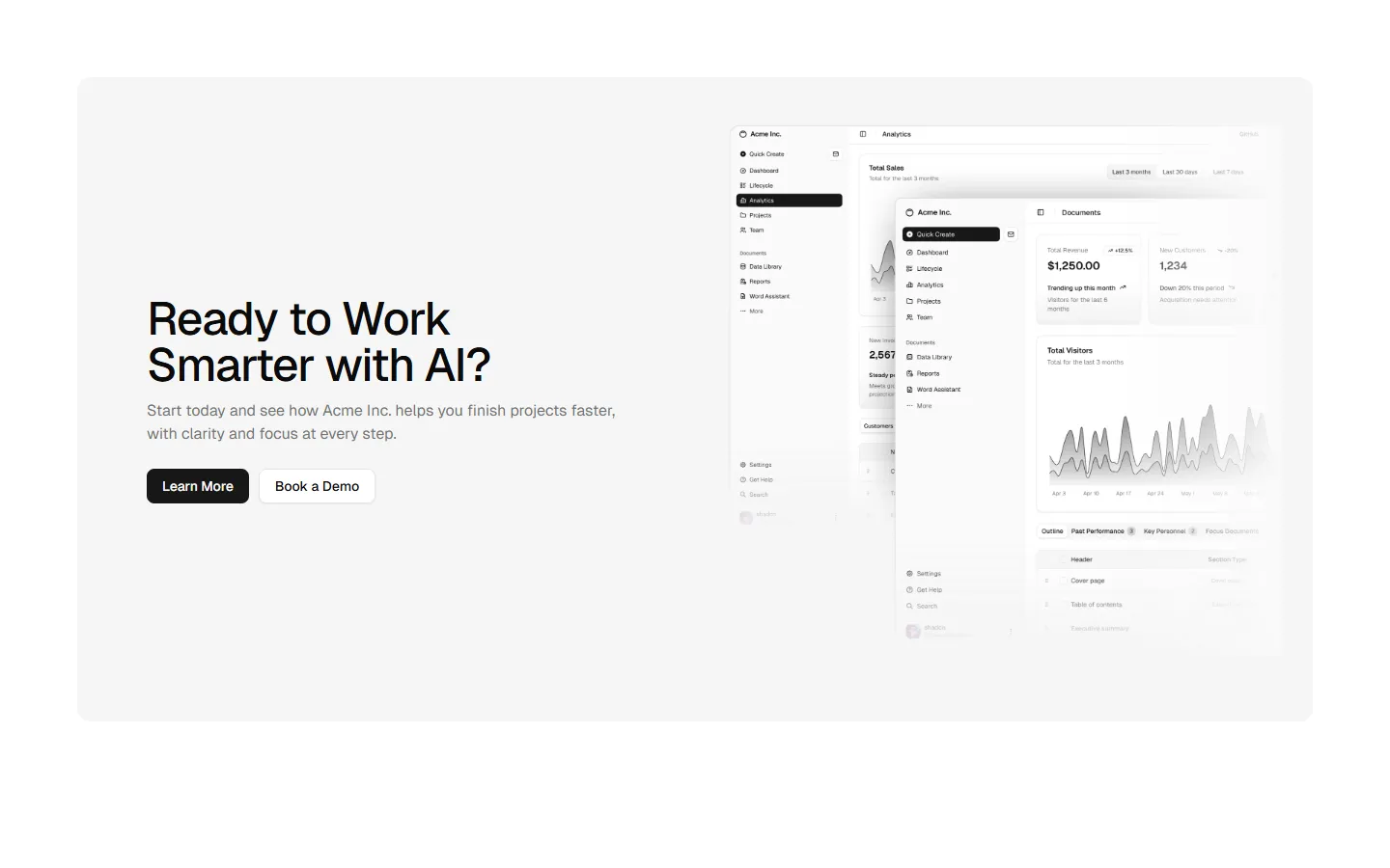
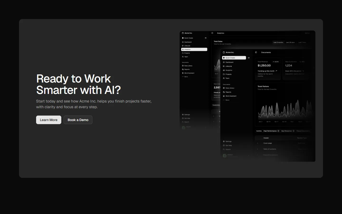
CTA 8
Wide product panel with offset preview
SBIOTJ
Join 3,000+ builders shipping with shadcncraft
Get access to these blocks and the full library
Production-ready blocks and components with matching Figma and React.


Benefits
Designed for your shadcn/ui project
Blocks built to work together across marketing pages and product interfaces.
Consistent layout system
Shared spacing, grids, and typography across all blocks.
Composable layouts
Combine blocks to build complete pages without layout conflicts.
Theme compatible
Works with shadcn/ui themes and token-based color systems.
Production-ready structure
Layouts designed with real content patterns and responsive behavior.
Explore all block categories
Built on official shadcn/ui components with real structure, spacing, and accessibility. No AI-generated layouts. Designed for real products in Figma and React.