All CTA blocks
CTA 3
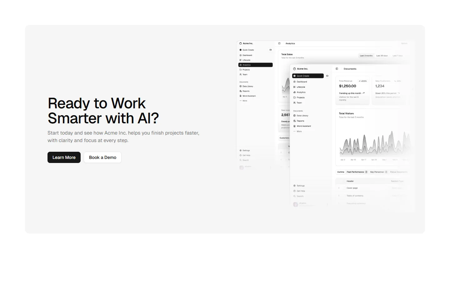
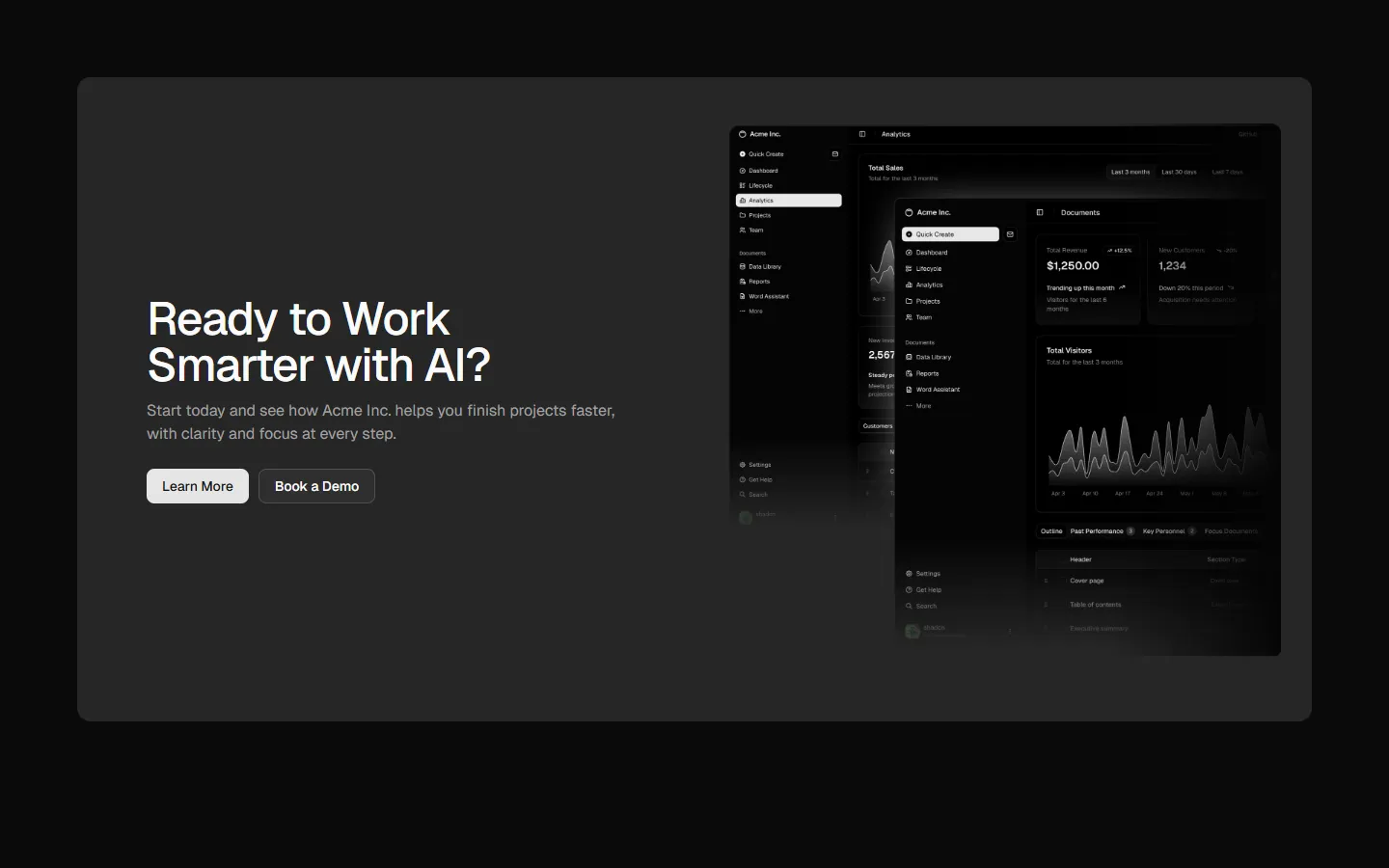
High-contrast panel with stacked actions
A bold, high-contrast CTA presented inside a contained panel, with a centered headline and stacked primary and secondary actions. The strong visual separation makes this ideal for end-of-page moments where the CTA should clearly stand apart from surrounding content.
In all Pro bundles
Radix UI
Base UI
8 styles
5 icon sets
Not Allowed
Get access to the full source code by upgrading to Pro Figma + React.
SBIOTJ
Join 16,000+ builders shipping with shadcncraft
Get access to this block and the full library
Production-ready blocks and components with matching Figma and React.

Benefits
Production-ready by default
Built with shadcn/ui conventions and designed for real projects.
Built with shadcn/ui
Clean React components using Tailwind and modern shadcn patterns.
Install instantly
Add the block directly using the shadcn CLI.
Works with your theme
Compatible with shadcn themes and token-based color systems.
MCP server support
Use shadcn MCP server right from your favorite AI tools.
Frequently Asked Questions
Yes. They follow shadcn/ui structure and are built for real products.
All blocks
More CTA
Pro
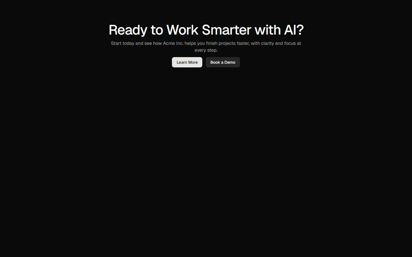
CTA 1
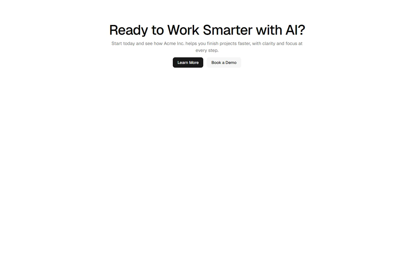
Centered headline with stacked actions
Pro
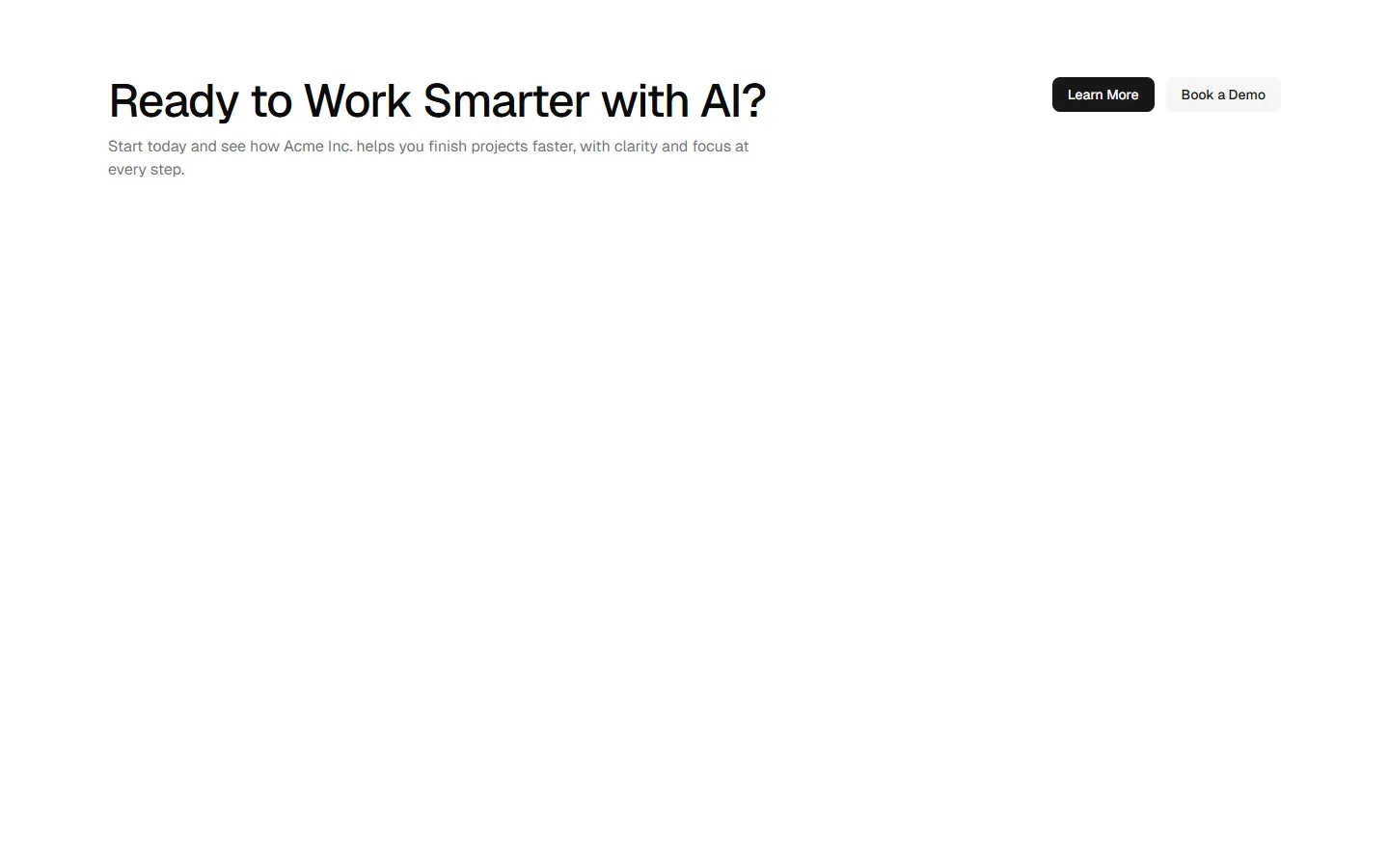
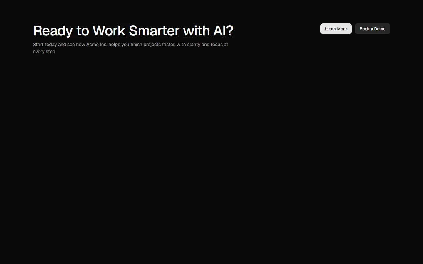
CTA 2
Left-aligned headline with inline actions
Pro
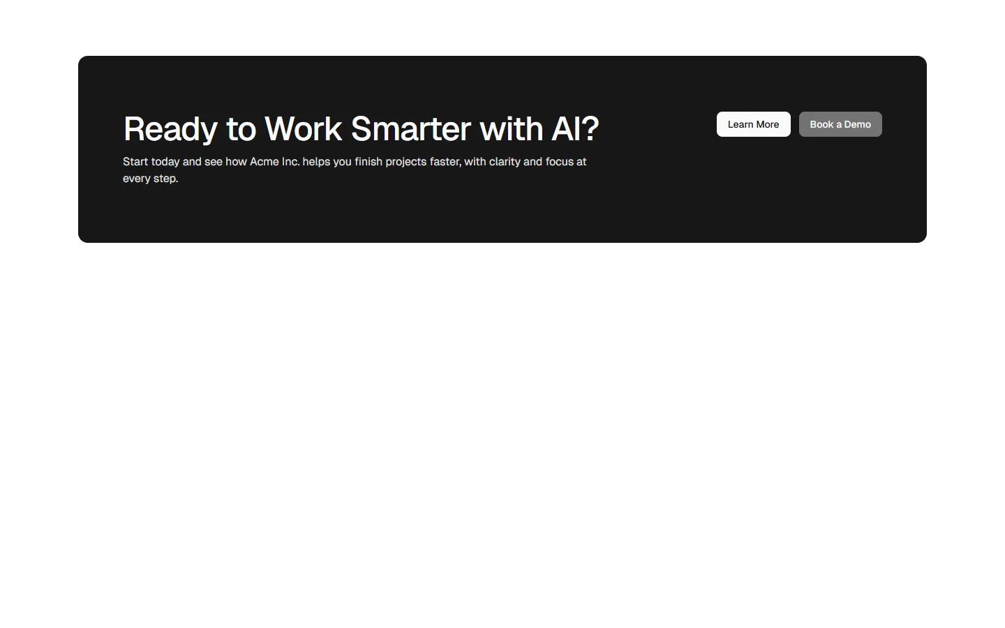
CTA 4
High-contrast panel with left-aligned actions
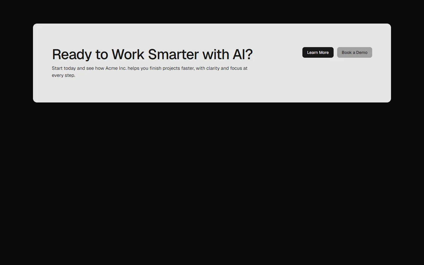
Pro
CTA 5
Split content with feature list and media
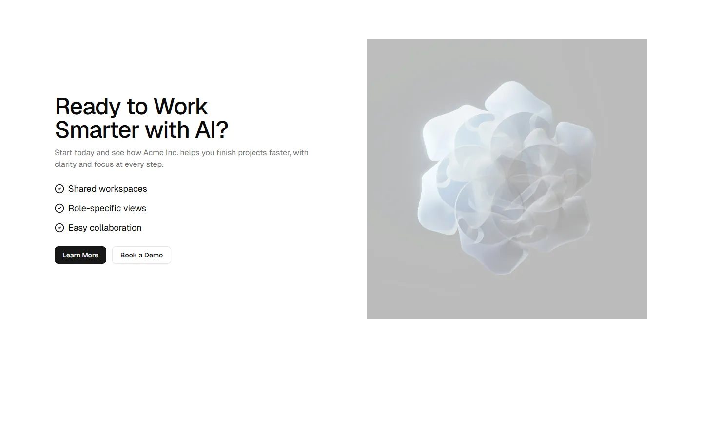
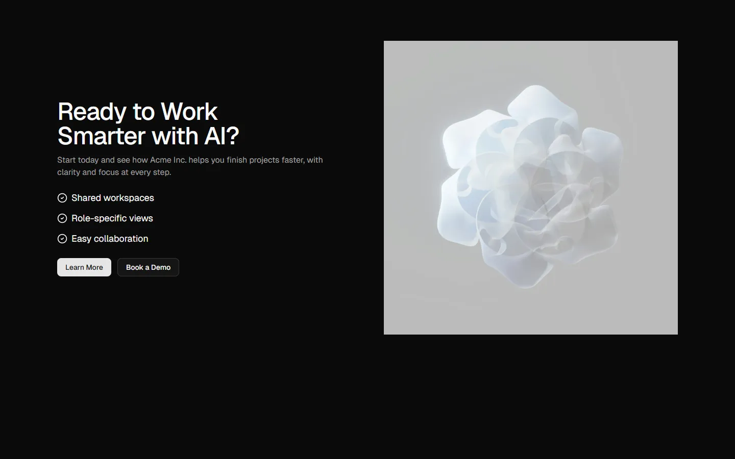
Pro
CTA 6
Feature-led split with primary visual
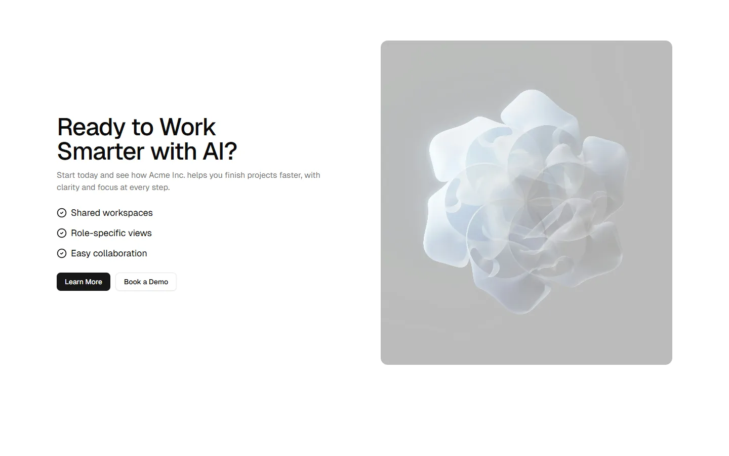
Pro
CTA 7
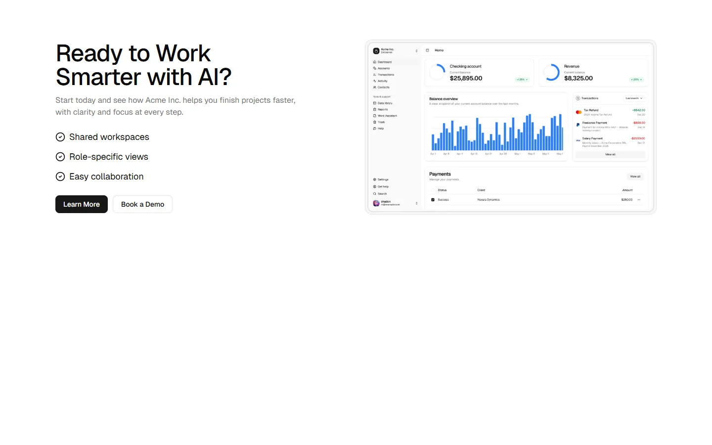
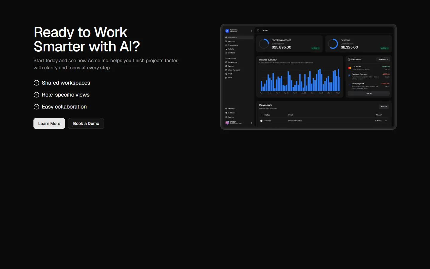
Product preview split with feature checklist
Pro
CTA 8
Wide product panel with offset preview