All blocks
Contact
shadcn/ui Contact blocks featuring forms and maps. Perfect for helping customers get in touch, with support for multiple office locations to make your business feel approachable and easy to reach.
In Pro & Pro + React
React
Figma
Pro
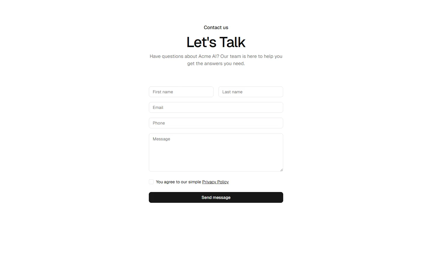
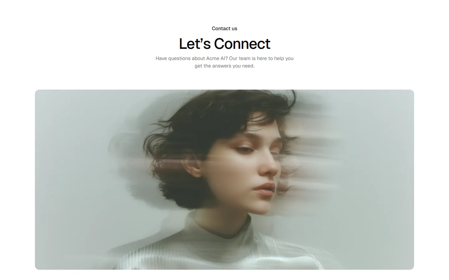
Contact 1
Centered form, single-column
Pro
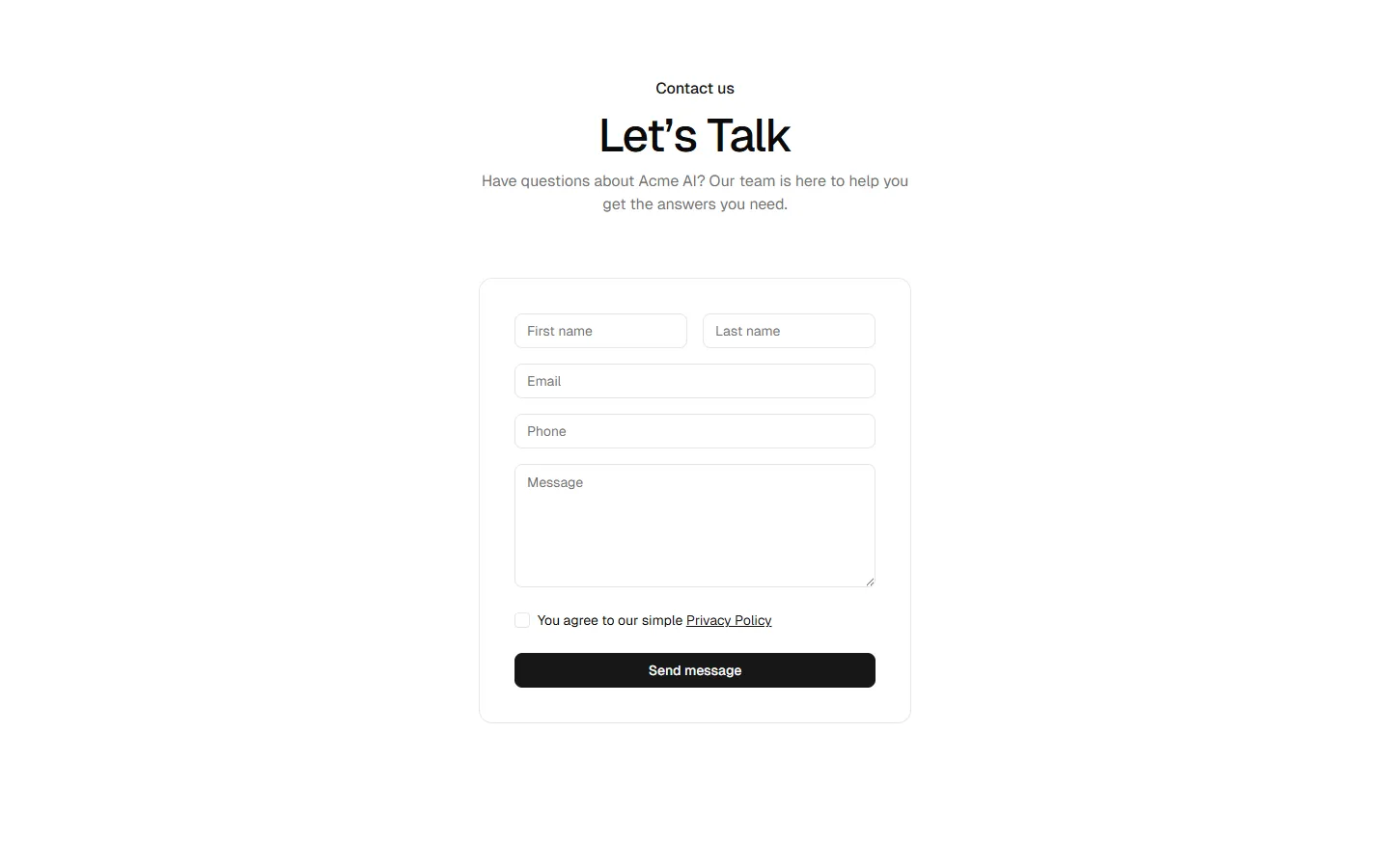
Contact 2
Centered form in card
Pro
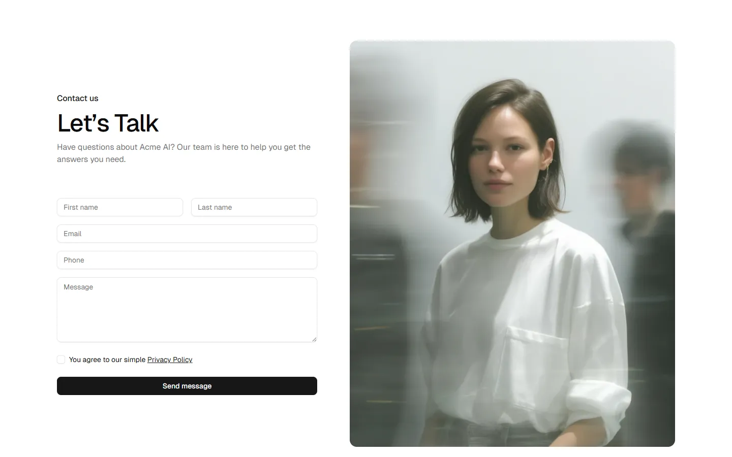
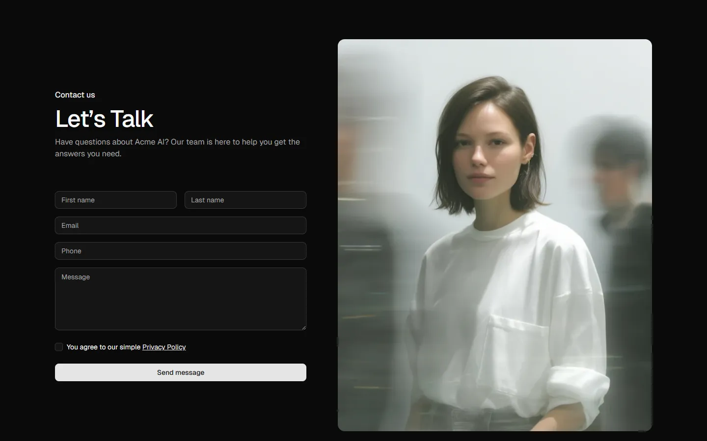
Contact 3
Split form with image
Pro
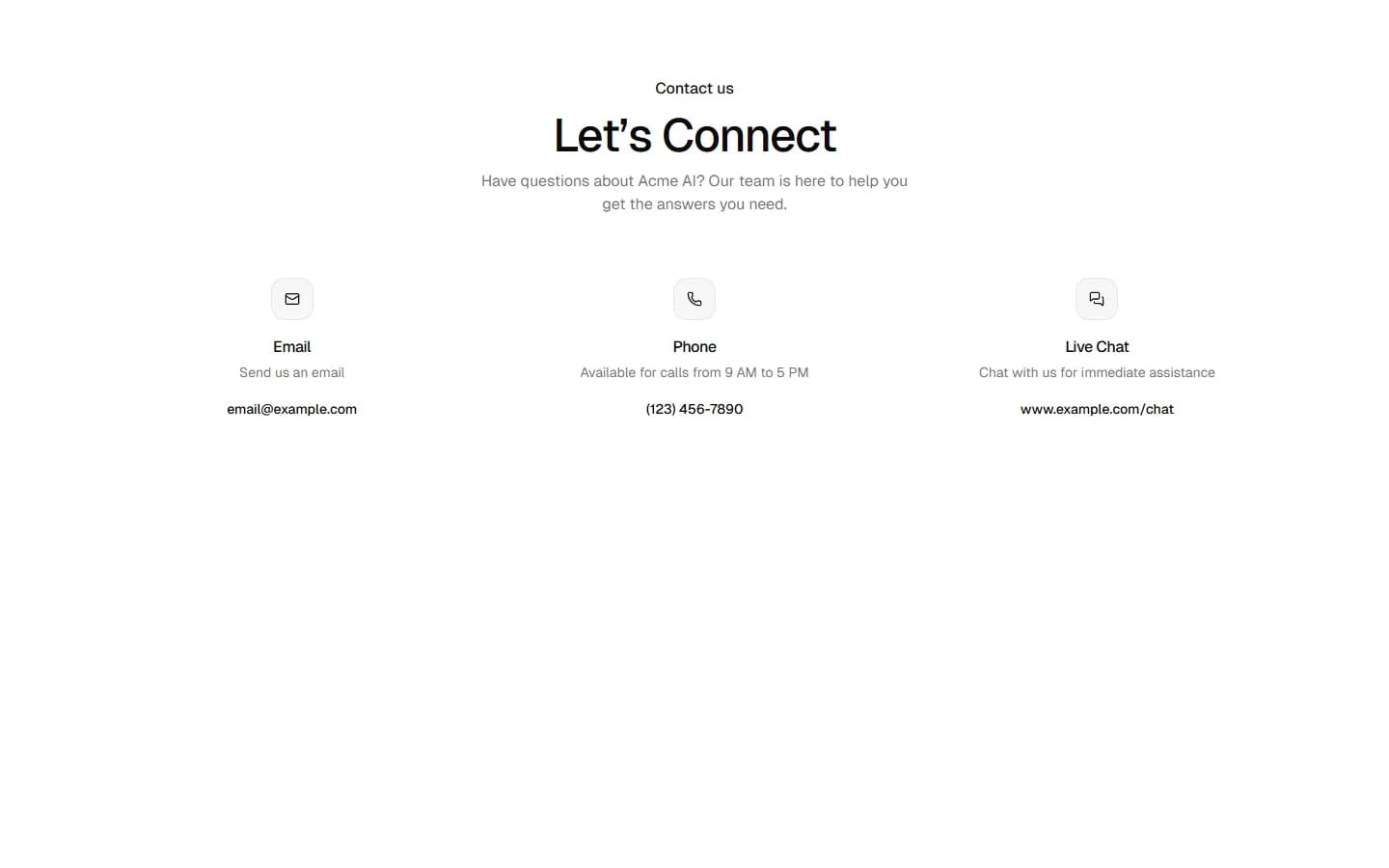
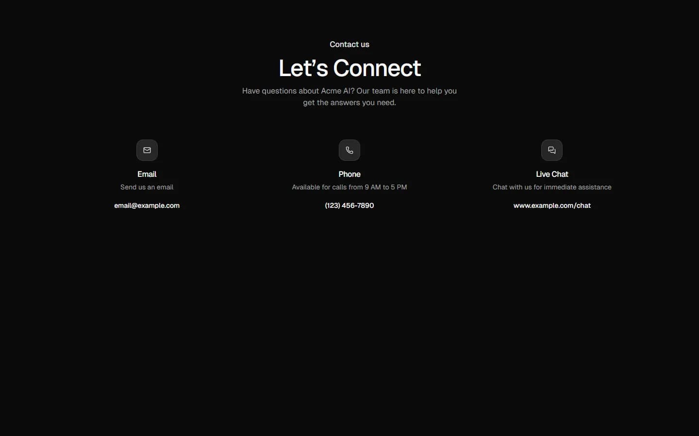
Contact 4
Multi-channel contact options
Pro
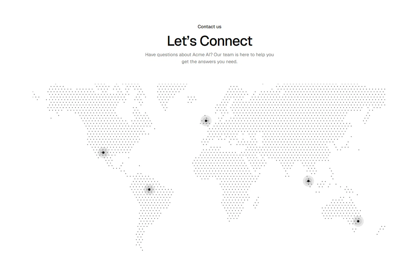
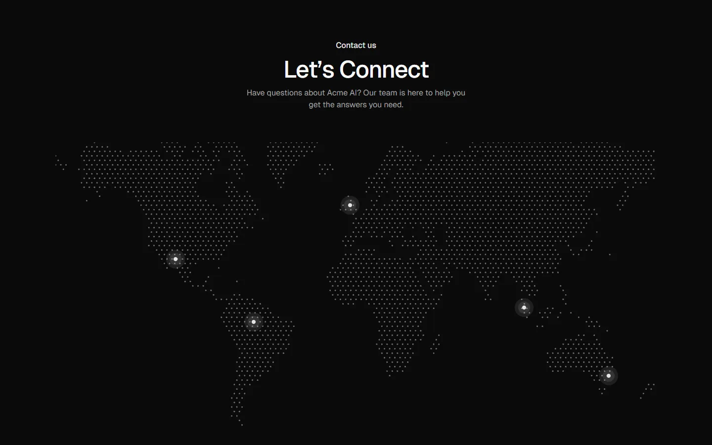
Contact 5
Global presence with contact methods
Pro
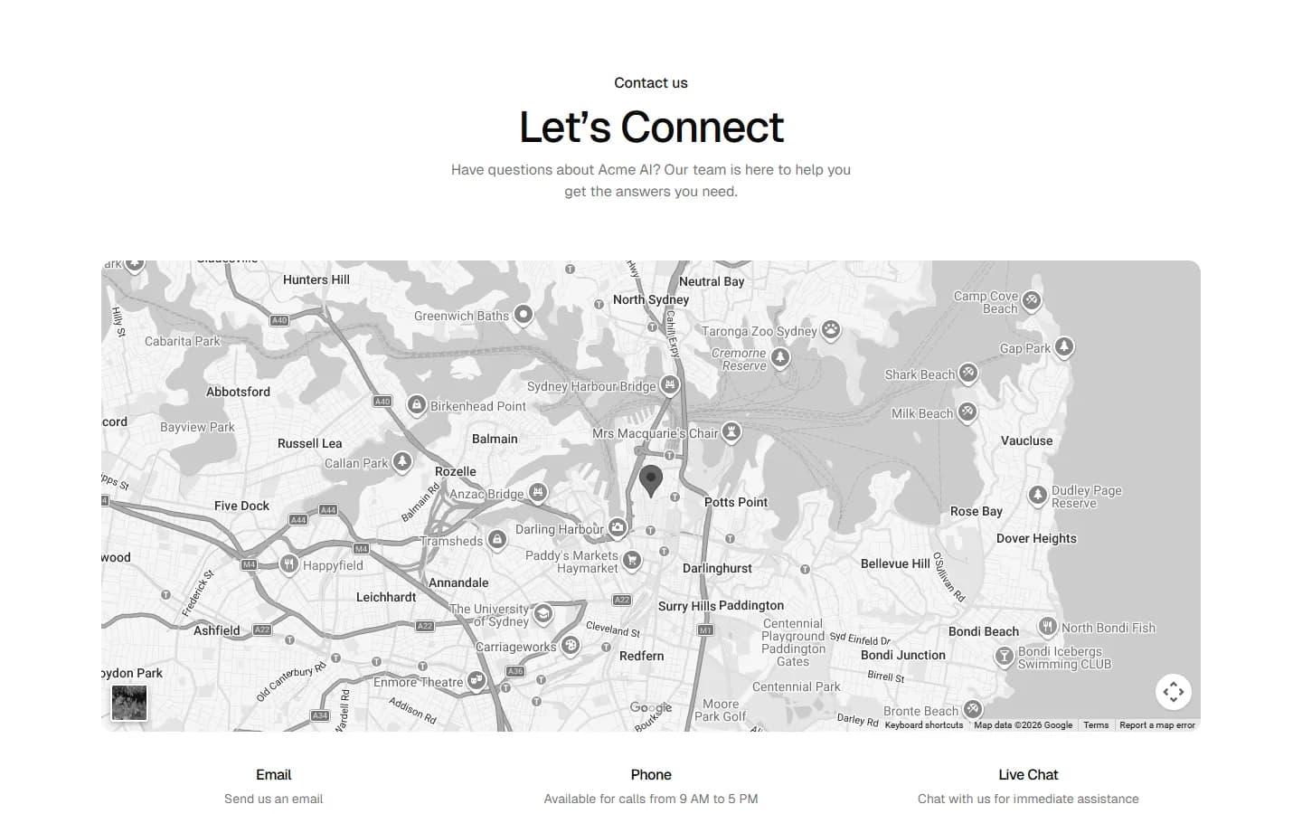
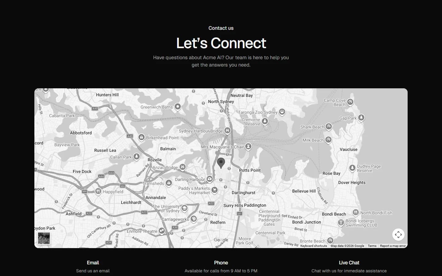
Contact 6
Map-first contact
Pro
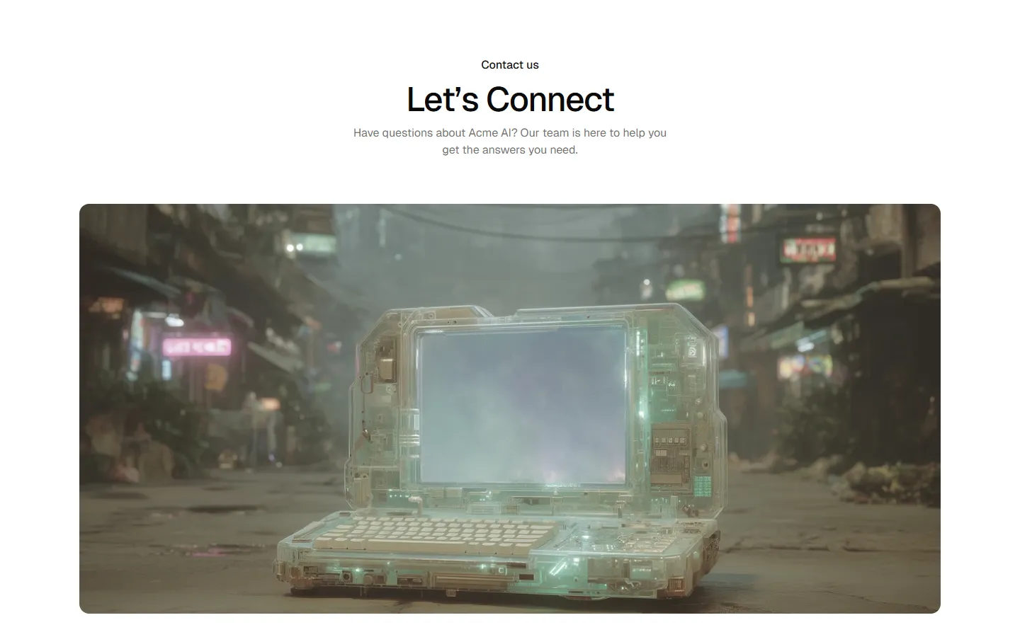
Contact 7
Image-led contact

Pro
Contact 8
Hero image with channel cards

Pro
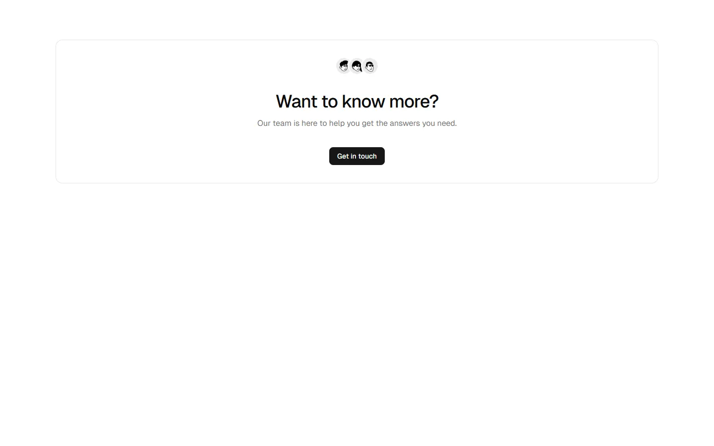
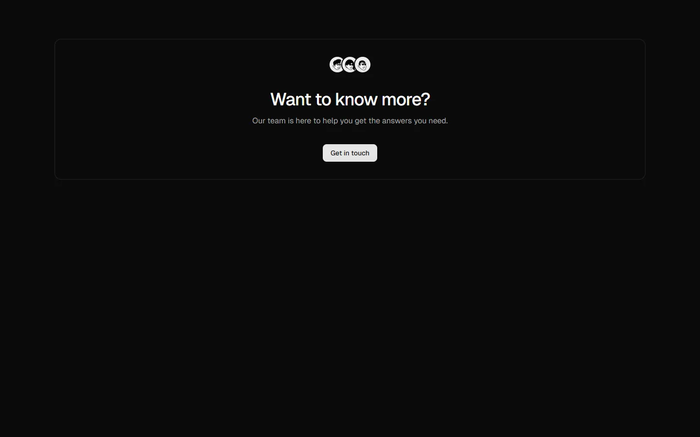
Contact 9
Centered CTA panel
Pro
Contact 10
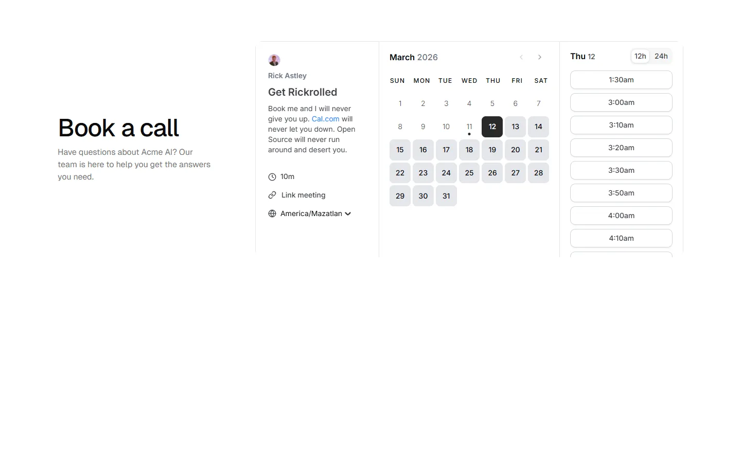
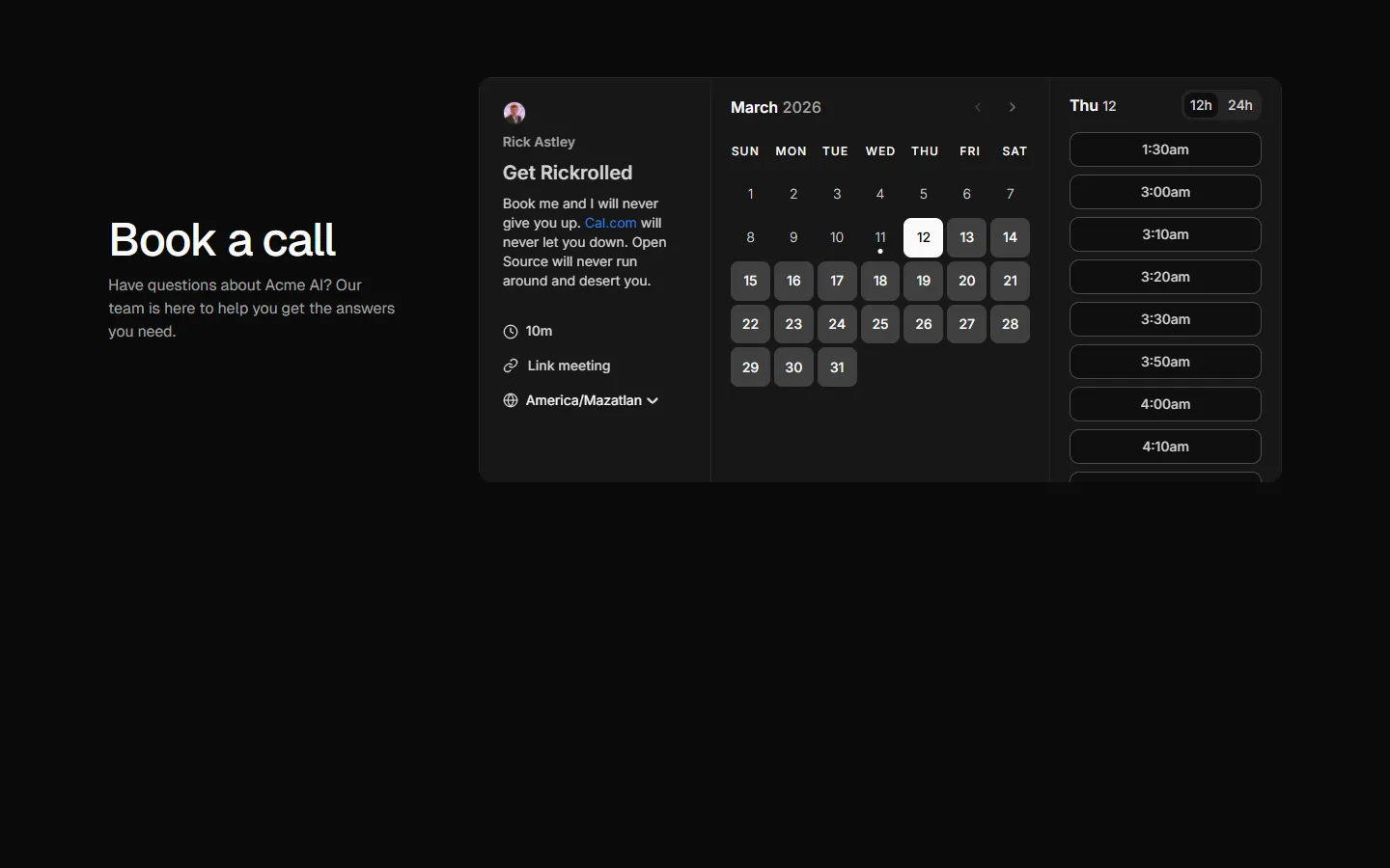
Split layout with embedded scheduler
Free
Contact 11
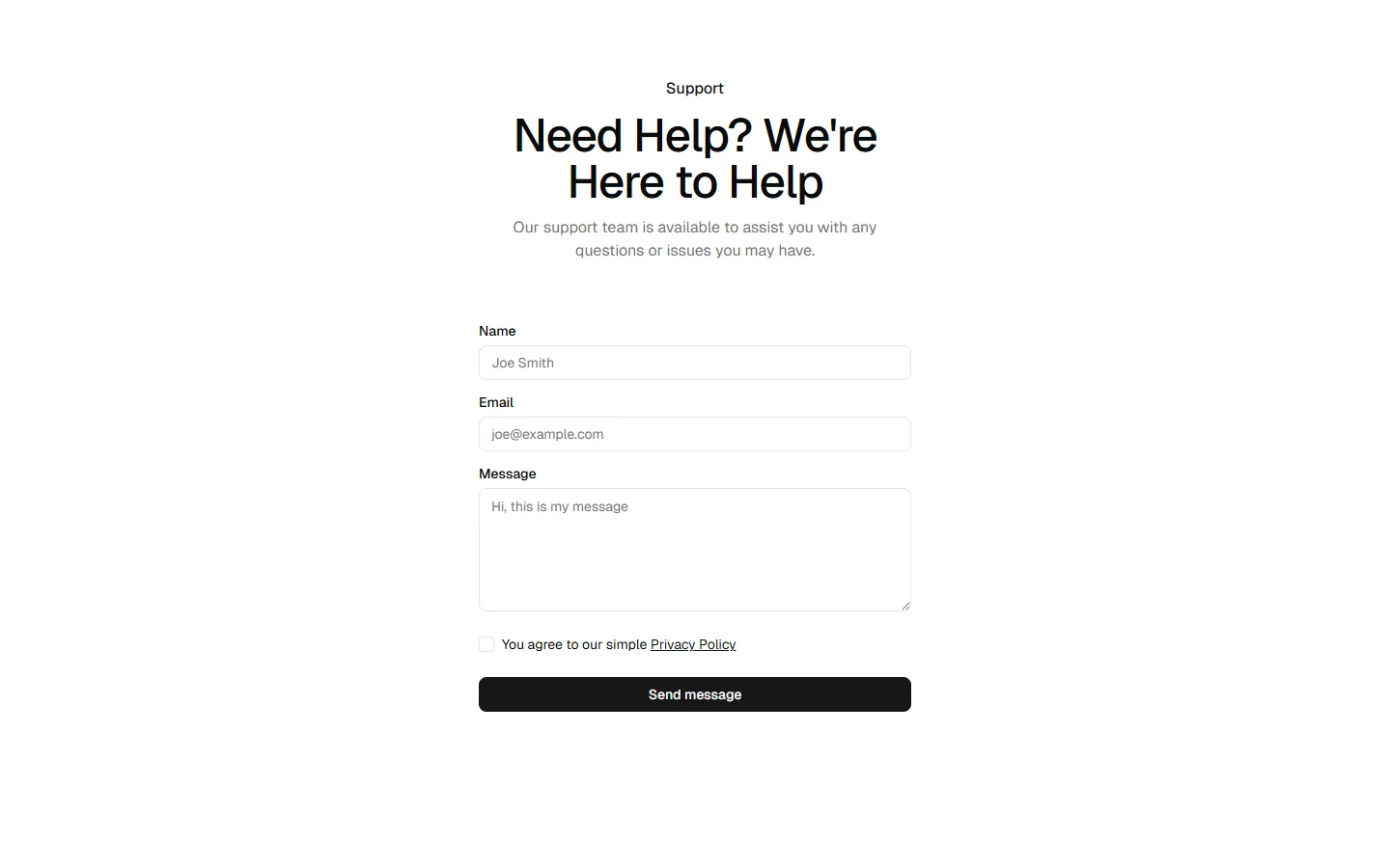
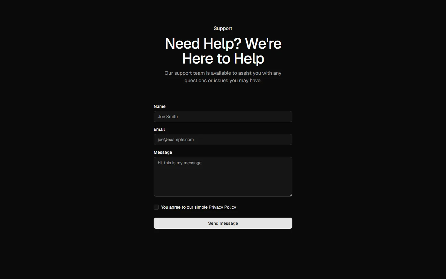
Centered form with supporting sidebar
SBIOTJ
Join 3,000+ builders shipping with shadcncraft
Get access to these blocks and the full library
Production-ready blocks and components with matching Figma and React.


Benefits
Designed for your shadcn/ui project
Blocks built to work together across marketing pages and product interfaces.
Consistent layout system
Shared spacing, grids, and typography across all blocks.
Composable layouts
Combine blocks to build complete pages without layout conflicts.
Theme compatible
Works with shadcn/ui themes and token-based color systems.
Production-ready structure
Layouts designed with real content patterns and responsive behavior.
Explore all block categories
Built on official shadcn/ui components with real structure, spacing, and accessibility. No AI-generated layouts. Designed for real products in Figma and React.