Native shadcn styles and presets now in Figma
Update (June 2026): v3 is now out of beta. With the addition of Rhea, the kit ships eight styles. See the v3.1 changelog for everything new.
This is the biggest update we've made to the shadcncraft Figma UI kit yet.
Every official shadcn style now exists directly inside Figma's variable system. Switch styles from Figma's Variables panel and the whole file updates instantly. No plugin step required.
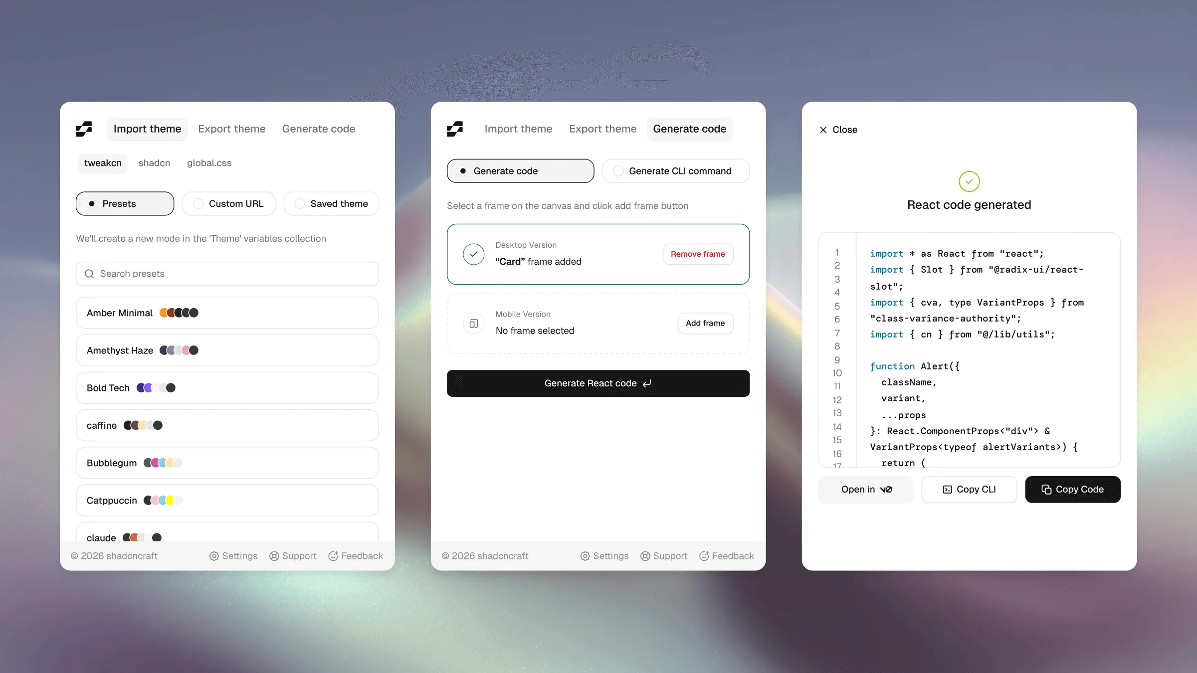
And if you've created your own setup in shadcn Create, the shadcncraft plugin can now import it directly into Figma. Paste the URL and get a matching setup recreated inside the file, including colors, radius, fonts, and themes.
Until now, Figma UI kits have mostly approximated the shadcn ecosystem. v3 brings the actual system structure into Figma itself.
Eight styles, native in Figma
Eight styles now ship as modes inside Figma's Style variable collection. These are the seven official shadcn styles, plus Rhea, a shadcncraft style:
- Vega: classic shadcn look.
- Nova: tighter spacing, more compact.
- Maia: softer and more rounded.
- Mira: dense and product-focused.
- Lyra: sharp and structured.
- Luma: softer and more fluid.
- Sera: editorial and typographic.
- Rhea: rounded and contemporary.
Each style carries its own corner radius character, color treatment, spacing feel, and icon pairing.
Switch styles directly from Figma's variables panel and the entire file updates instantly.
Or import your own from shadcn Create
The shadcncraft plugin now imports presets directly from shadcn Create or shadcncraft Create.
Paste a preset URL and the plugin recreates it inside your Figma file 1:1. Colors, typography, radius, themes, and styling all come across automatically.
Once imported, everything stays editable through native Figma variables and component properties.
This is also the first Figma UI kit to support official shadcn styles directly through variable modes.
Themes layer on top
Themes now work independently from styles.
Pick any theme from Figma's Mode collection and layer it over your selected style. Every combination supports both Light and Dark modes. See the full shadcn/ui theming overview for how this flows through to Pro components and blocks in code.
Icons follow your style
Icon switching is now built directly into the Figma file and linked to your selected style, matching how shadcn handles icons in code.
Supported sets:
- Lucide
- Hugeicons
- Remix
- Phosphor
- Tabler
Change the style and the icon system updates with it automatically.
Pro components and blocks inherit too
The new Style and theme system isn't limited to the base components.
Pro components, blocks, and layout templates now inherit the same variables and modes automatically. One system across the entire library.
Names now match shadcn 1:1
Component names, variants, and props throughout the Figma file now align directly with shadcn.
Designers and developers, finally speaking the same language.
Components updated and enhanced
v3 also includes broad improvements across the library:
- tightened prototype states
- improved visual polish across themes
- refined spacing and surfaces
- expanded icon coverage
- cleaner component organisation
A lot of smaller inconsistencies from v2 were cleaned up along the way too.
v2 stays in your purchase
v3 is now out of beta as of v3.1.
The v2 Figma UI kit also remains included in your purchase alongside v3.
Try it
Where this is going
The goal hasn't changed.
Your design system should behave the same in Figma and in code.
With official shadcn styles now living directly inside Figma's variable system, and shadcn Create presets only a paste away, v3 gets us much closer.
Launch note
The v3 release is out of beta as of v3.1, starting with Pro. If you're on Pro + React, you're covered too. That bundle includes Pro. Base support is coming soon.
For the launch of native shadcn styles for Figma and React, we're running 15% off Pro and Pro + React. The discount applies automatically at checkout while the promotion is active. Compare bundles and checkout on pricing.