All blocks
Banners
shadcn/ui Banner blocks for promotions, updates, and cookie preferences. Choose from floating dialog banners that sit over content or full-bleed styles that span the page. Designed to capture attention without disrupting the flow of your site.
In Pro & Pro + React
React
Figma
Pro
Banner 1
Inline signup banner


Pro
Banner 2
Dismissible signup card


Pro
Banner 3
Inline announcement banner with actions


Pro
Banner 4
Announcement banner with primary and secondary actions


Pro
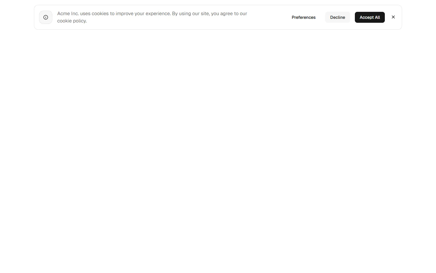
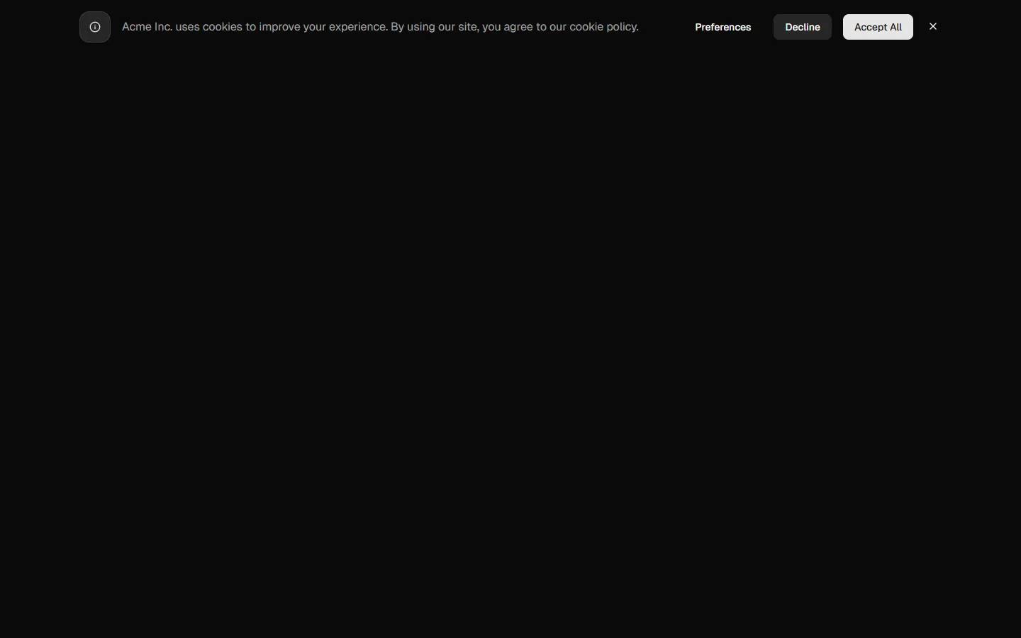
Banner 5
Consent banner with action group

Pro
Banner 6
Consent banner with stacked actions

Pro
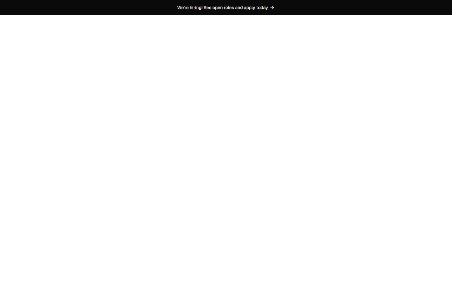
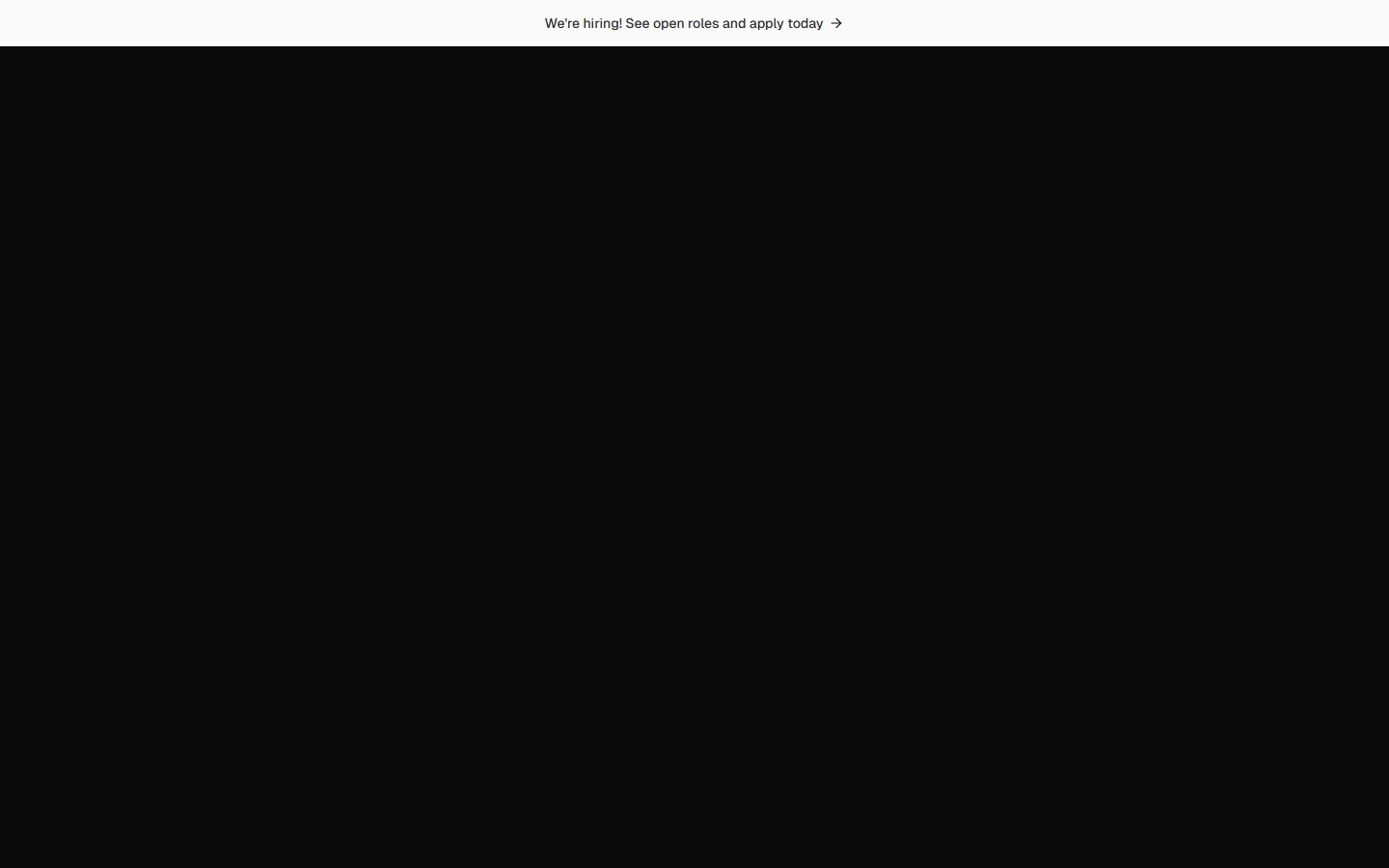
Banner 7
Minimal announcement strip
Pro
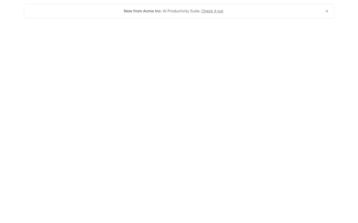
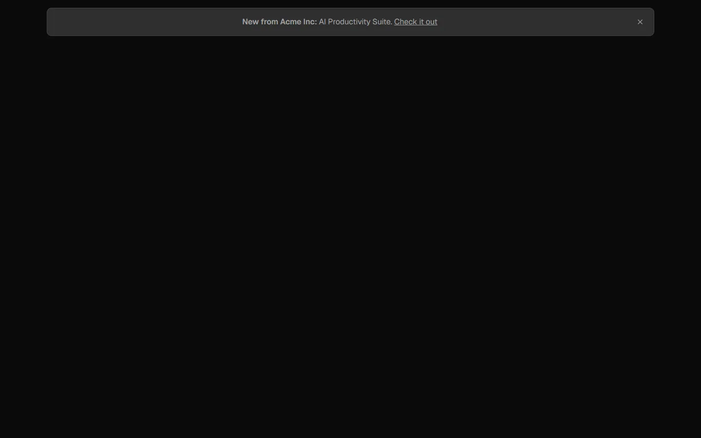
Banner 8
Inline announcement link


Pro
Banner 9
Full-width callout bar
Free
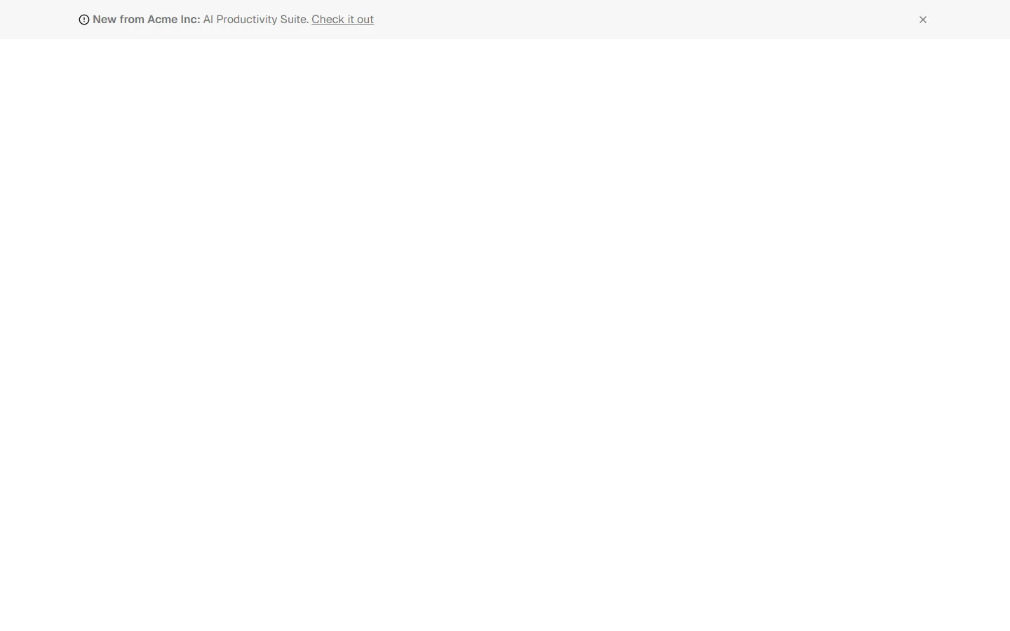
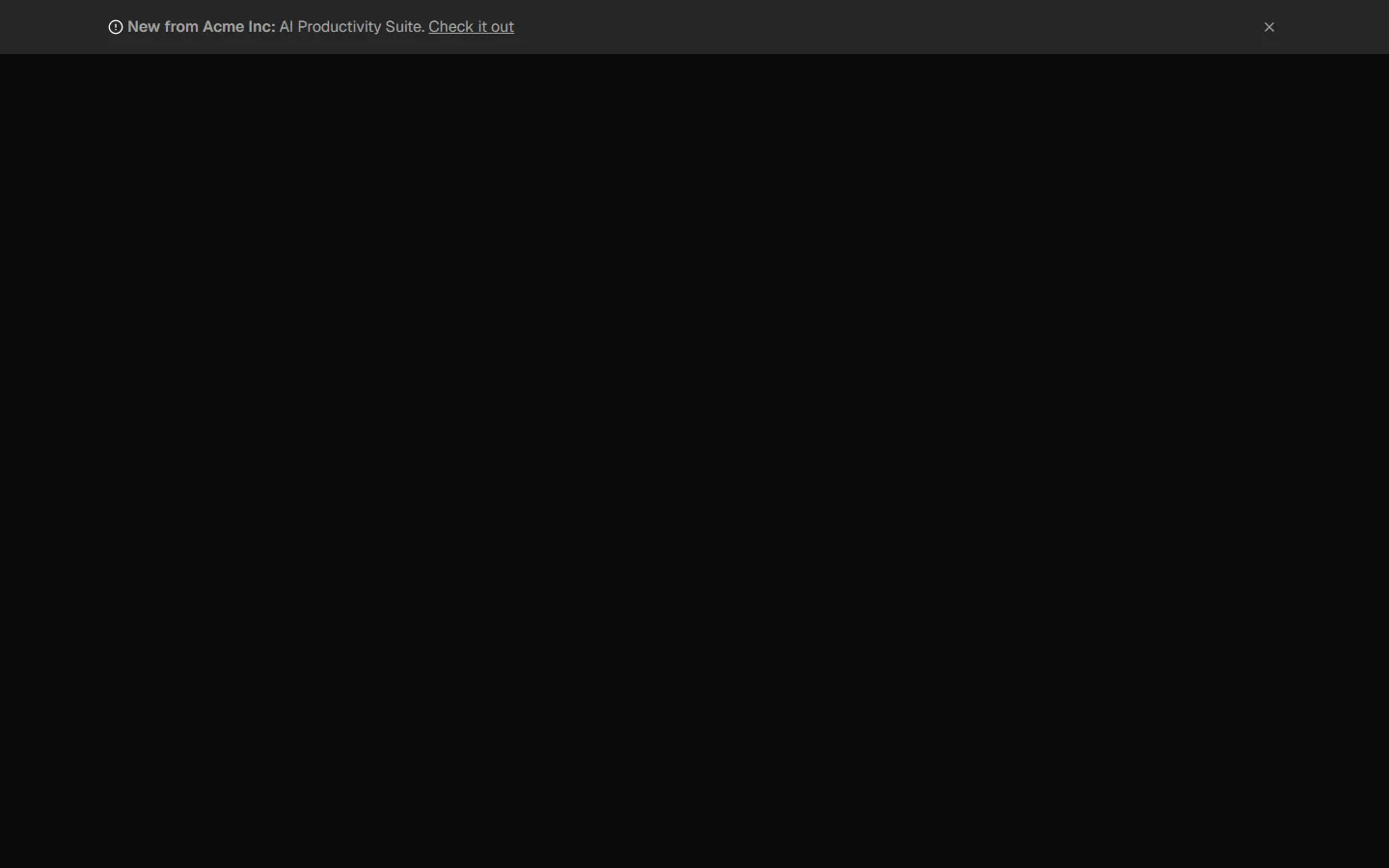
Banner 10
Inline announcement link
SBIOTJ
Join 3,000+ builders shipping with shadcncraft
Get access to these blocks and the full library
Production-ready blocks and components with matching Figma and React.


Benefits
Designed for your shadcn/ui project
Blocks built to work together across marketing pages and product interfaces.
Consistent layout system
Shared spacing, grids, and typography across all blocks.
Composable layouts
Combine blocks to build complete pages without layout conflicts.
Theme compatible
Works with shadcn/ui themes and token-based color systems.
Production-ready structure
Layouts designed with real content patterns and responsive behavior.
Explore all block categories
Built on official shadcn/ui components with real structure, spacing, and accessibility. No AI-generated layouts. Designed for real products in Figma and React.