All Banners blocks
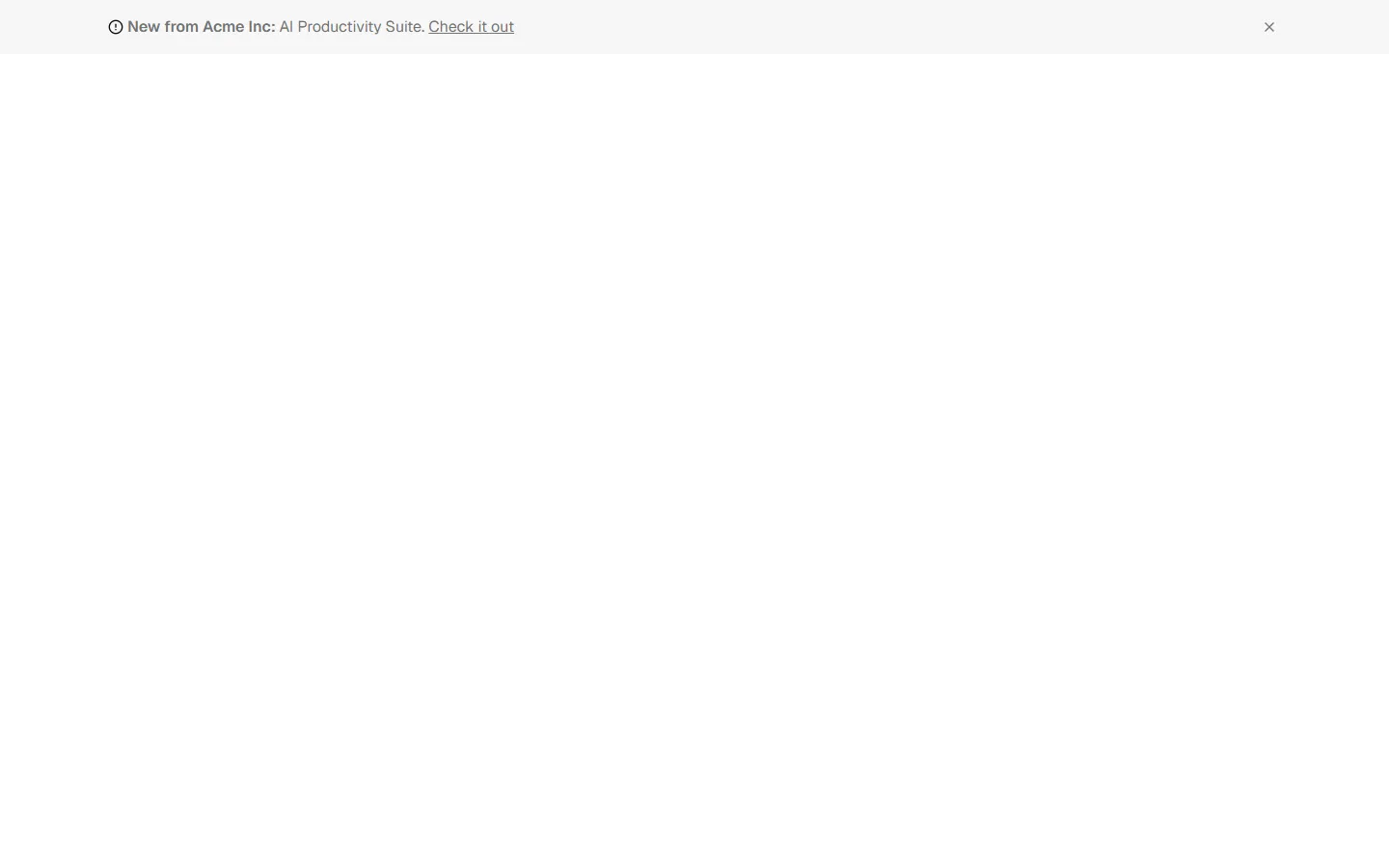
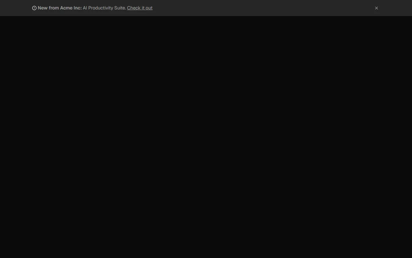
Banner 2
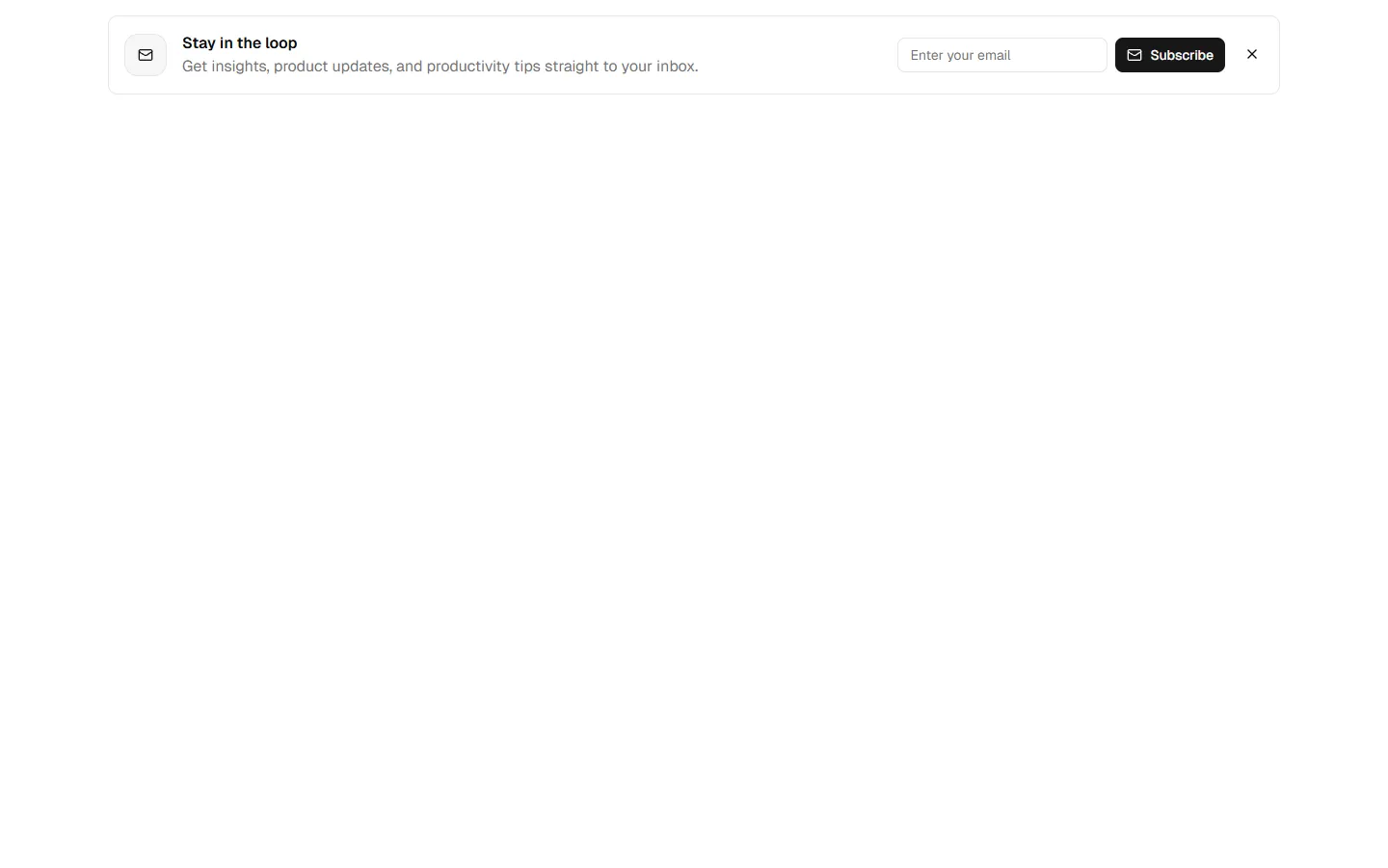
Dismissible signup card
A compact banner presented as a card with icon, short message, input field, and primary action, plus a close control. Designed to float within a layout or sit near content without spanning full width. Use when you want a more prominent call to action than an inline banner, but still lightweight and dismissible.
In all Pro bundles
Radix UI
Base UI
8 styles
5 icon sets
SBIOTJ
Join 16,000+ builders shipping with shadcncraft
Get access to this block and the full library
Production-ready blocks and components with matching Figma and React.

Benefits
Production-ready by default
Built with shadcn/ui conventions and designed for real projects.
Built with shadcn/ui
Clean React components using Tailwind and modern shadcn patterns.
Install instantly
Add the block directly using the shadcn CLI.
Works with your theme
Compatible with shadcn themes and token-based color systems.
MCP server support
Use shadcn MCP server right from your favorite AI tools.
Frequently Asked Questions
Yes. They follow shadcn/ui structure and are built for real products.
All blocks
More Banners
Pro
Banner 1
Inline signup banner
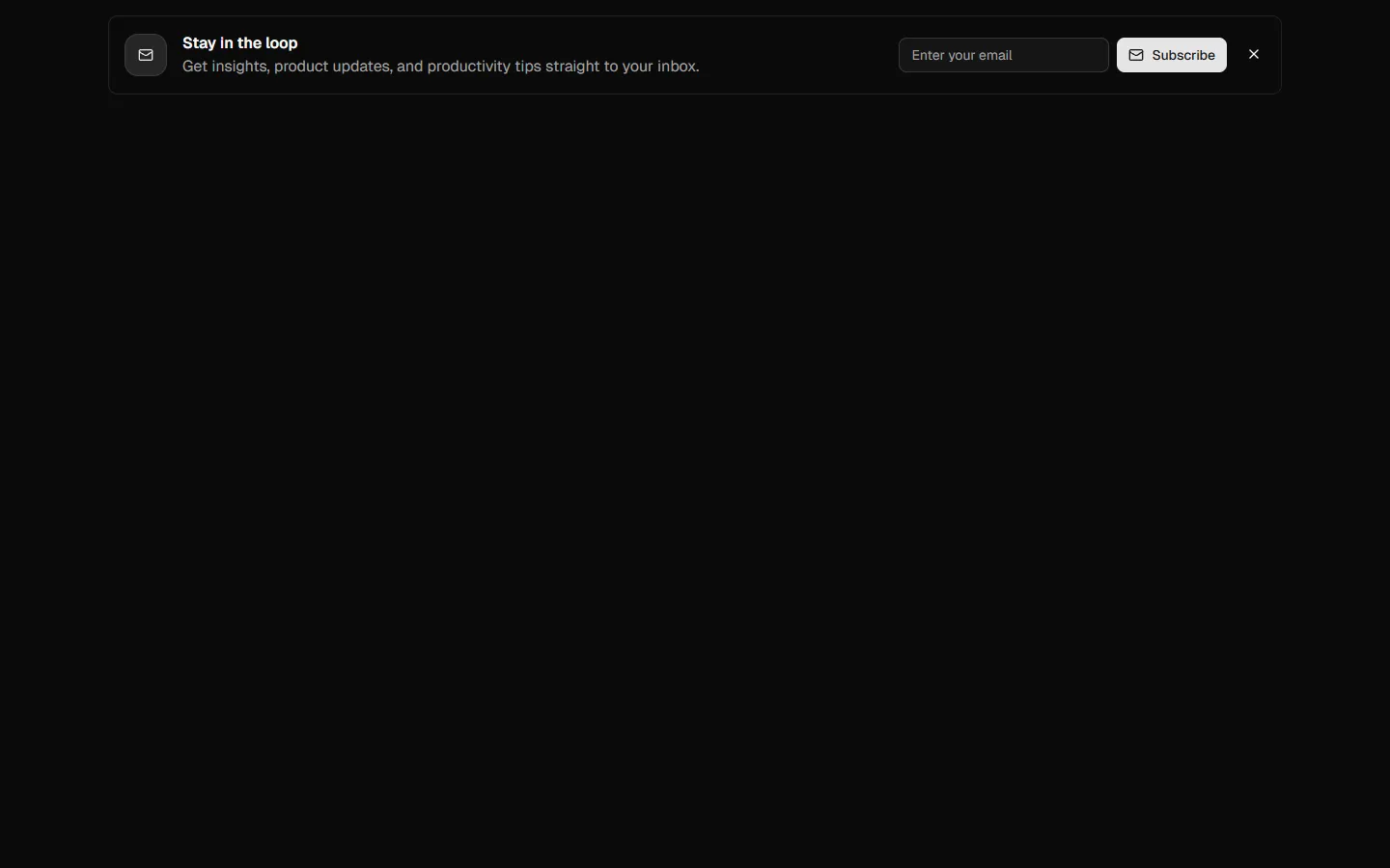
Pro
Banner 3
Inline announcement banner with actions
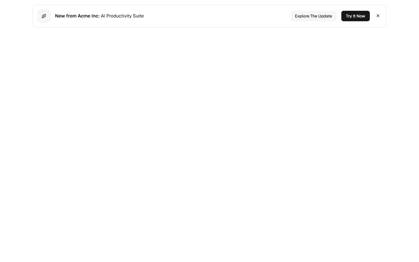

Pro
Banner 4
Announcement banner with primary and secondary actions
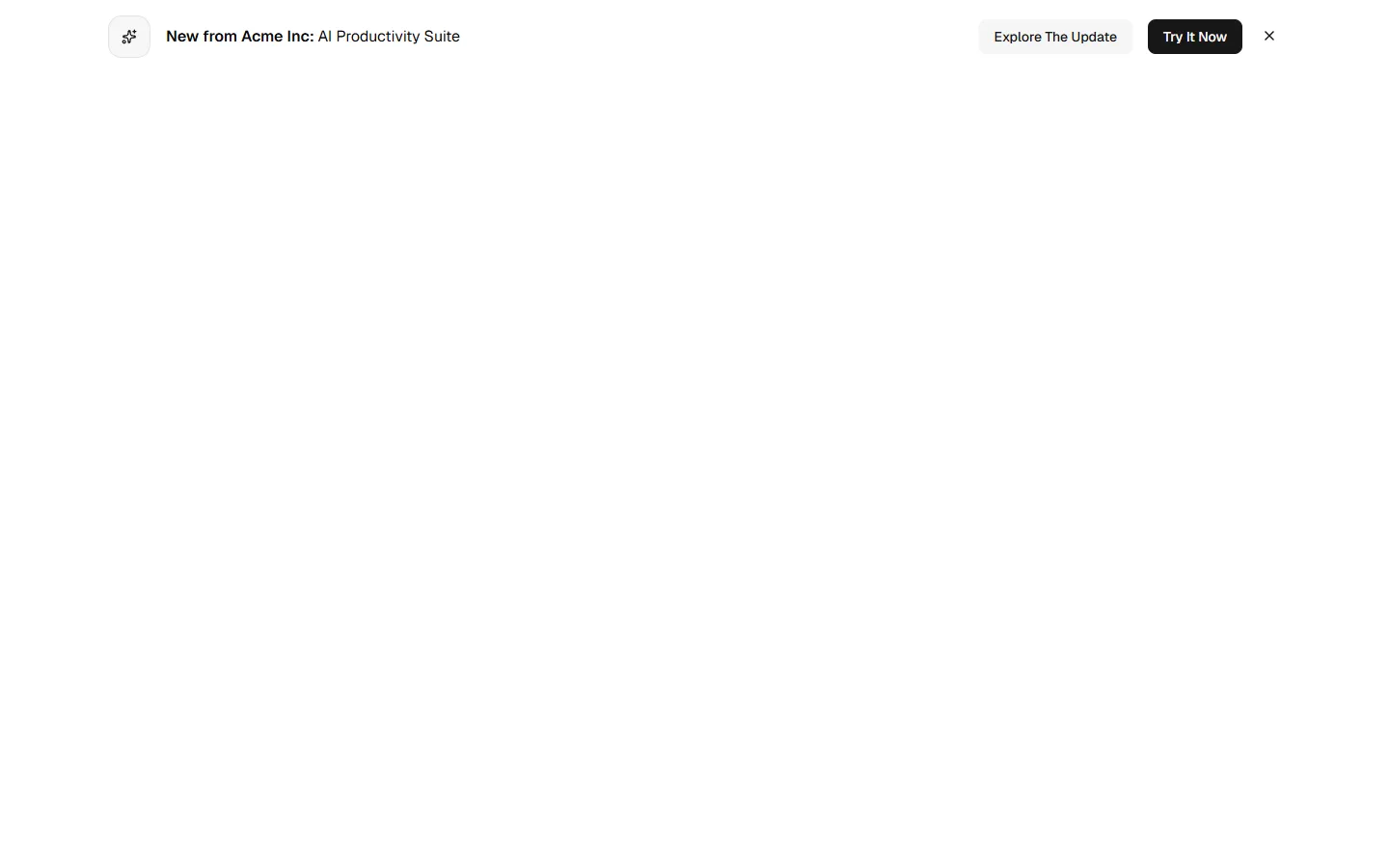
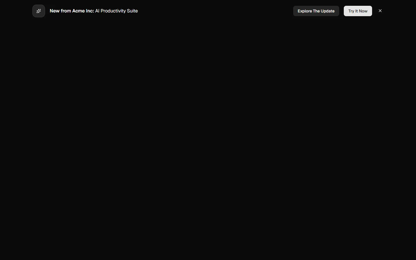
Pro
Banner 5
Consent banner with action group
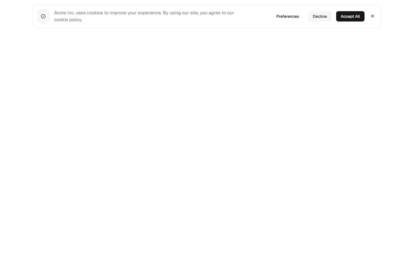
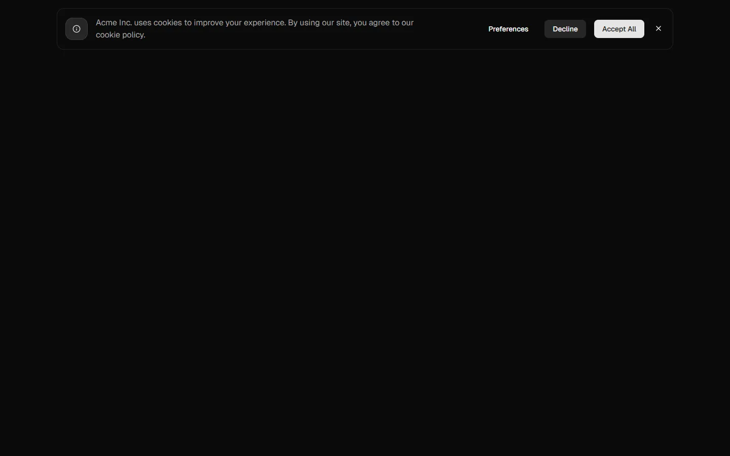
Pro
Banner 6
Consent banner with stacked actions
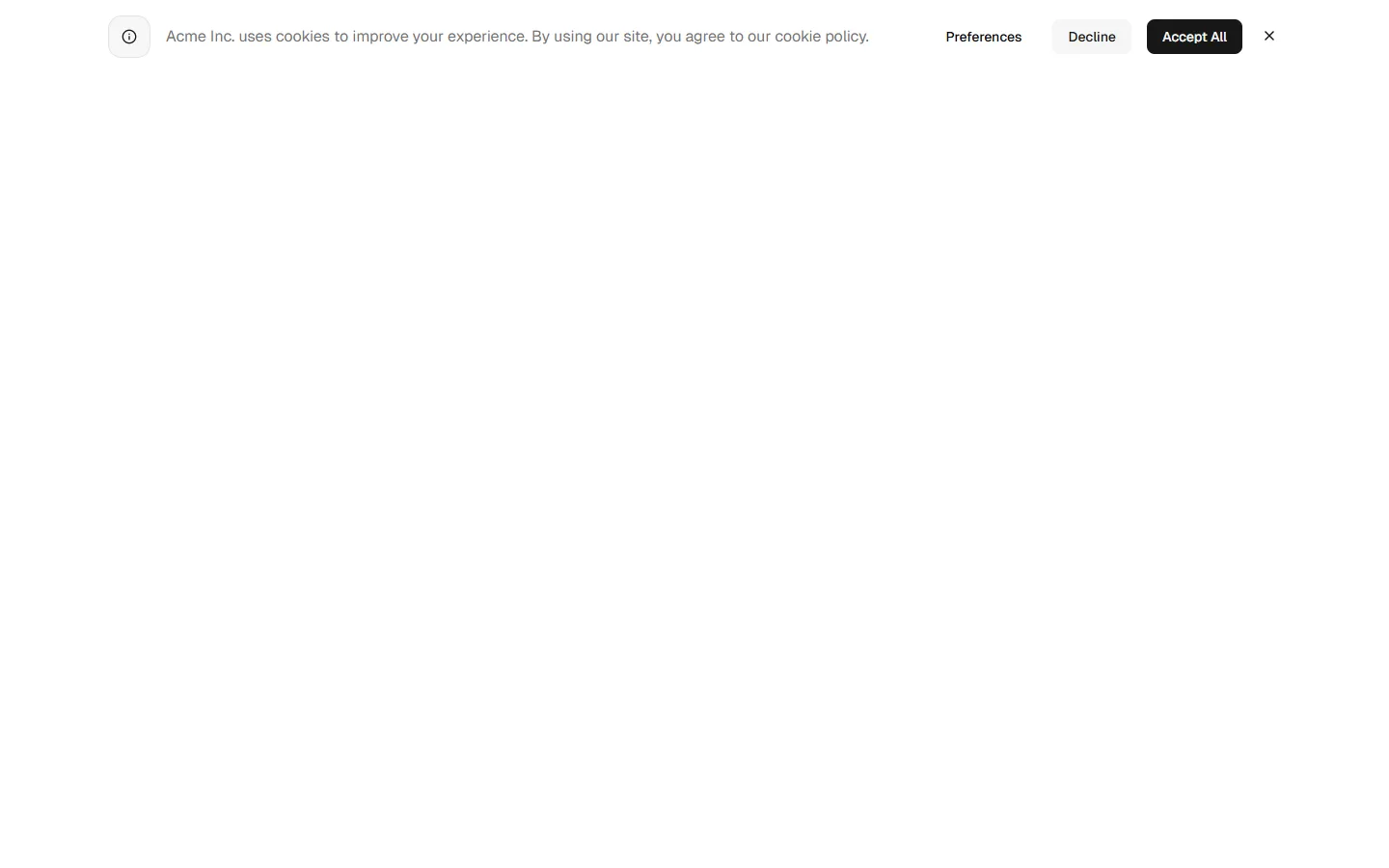
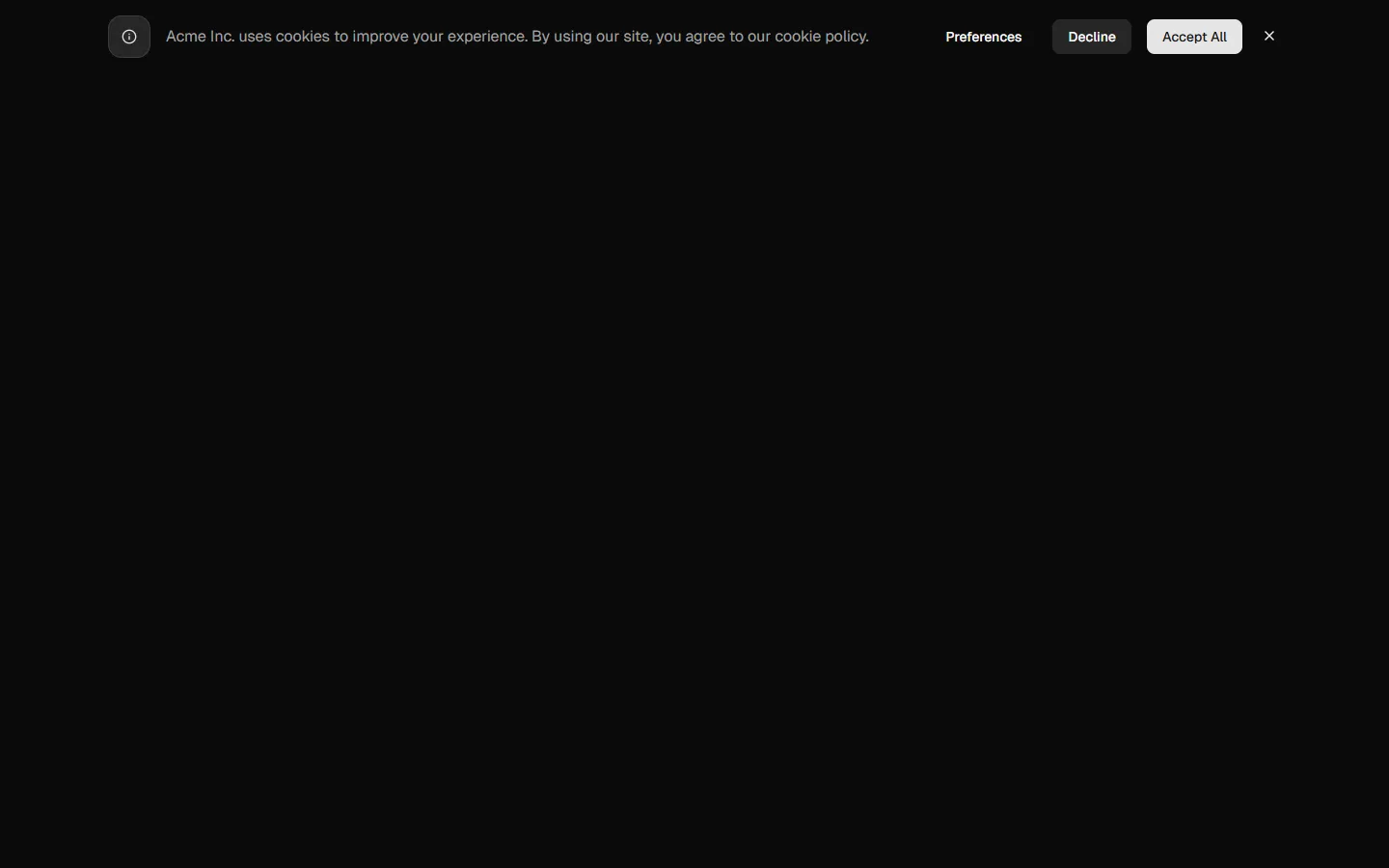
Pro
Banner 7
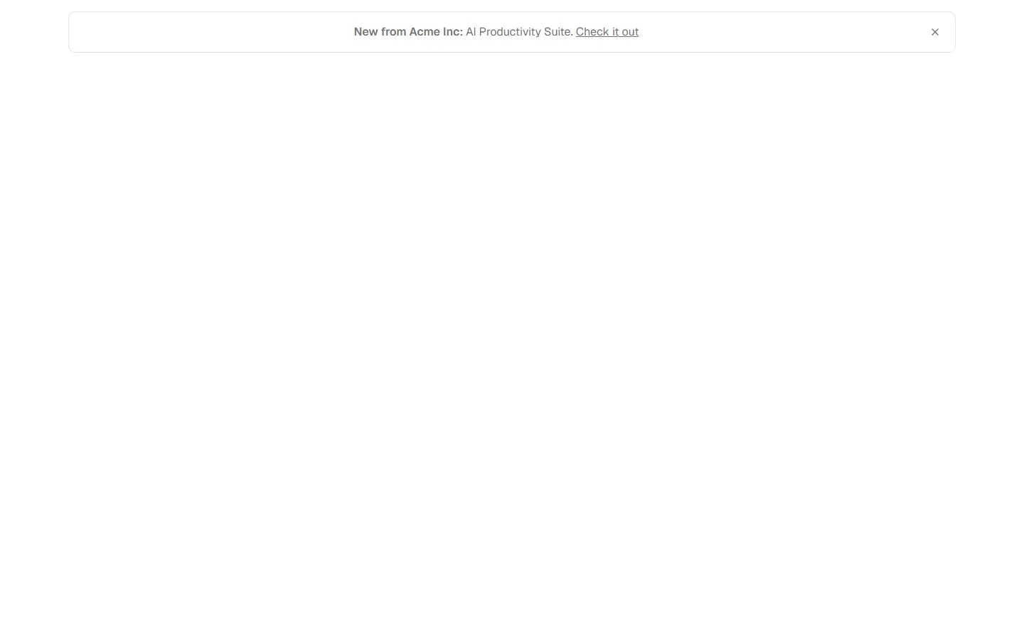
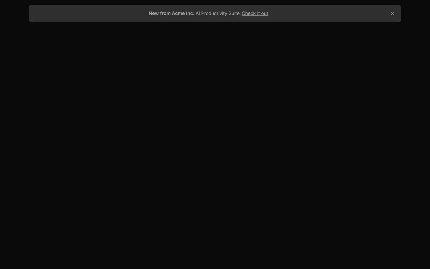
Minimal announcement strip
Pro
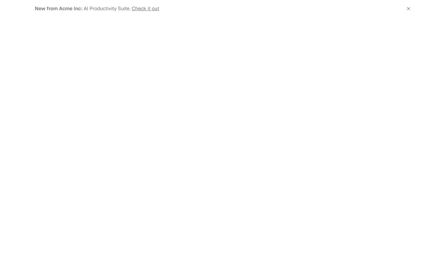
Banner 8
Inline announcement link

Pro
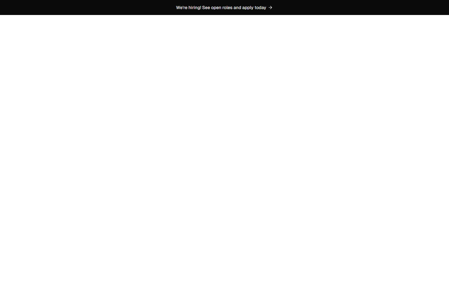
Banner 9
Full-width callout bar

Free
Banner 10
Inline announcement link