Native shadcn styles in Figma + shadcn Create import
The biggest update to the [Figma UI kit](/figma) yet. All seven shadcn styles now live natively in Figma variable modes, and the [plugin](/figma/plugin) can import any preset from shadcn Create.
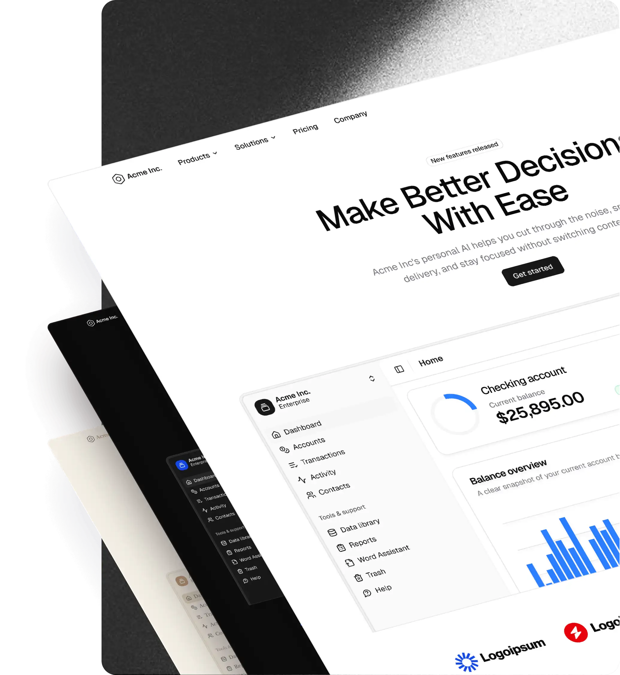
The biggest update to the Figma UI kit yet. All seven shadcn styles now live natively in Figma variable modes, and the plugin can import any preset from shadcn Create.
Styles, native in Figma
- All seven shadcn styles ship as modes inside the Figma file's Style variable collection:
- Vega
- Nova
- Maia
- Mira
- Lyra
- Luma
- Sera
- Switch between them from Figma's variables panel, no plugin needed.
- Every component, block, and pro page in the file updates instantly when the Style mode changes.
shadcn Create preset import
- The shadcncraft plugin now imports presets directly from shadcn Create.
- Paste a preset URL into the plugin → a new Style mode is created in Figma, matching the preset's colors, radius, and fonts 1:1.
- After import, the new style is editable via Figma's component-level variables.
Themes layer on top
- Light and Dark themes live in Figma's Mode variable collection.
- Every Style + Theme combination is valid: Light Nova, Dark Sera, etc.
- Switch from the same variables panel.
Native icon switching
- Icon set is now driven by a Figma variable and linked to the active Style, the same way shadcn handles icons in code.
- Supported sets: Lucide, Hugeicons, Remix, Phosphor, Tabler.
- Switching Style automatically swaps the icon set.
Pro components and blocks inherit Styles
- Pro components, blocks, and layout templates now respond to the same Style
Availability
- Initial support for Pro and Pro + React.
- Base support is coming soon.