All Top Navigation blocks
Top Navigation 1
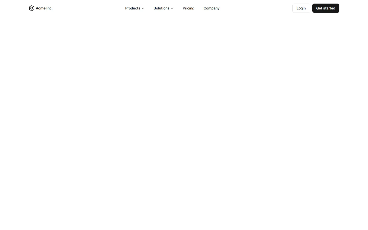
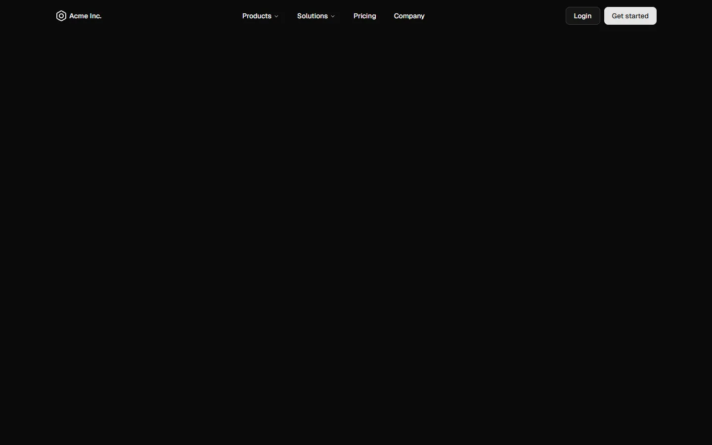
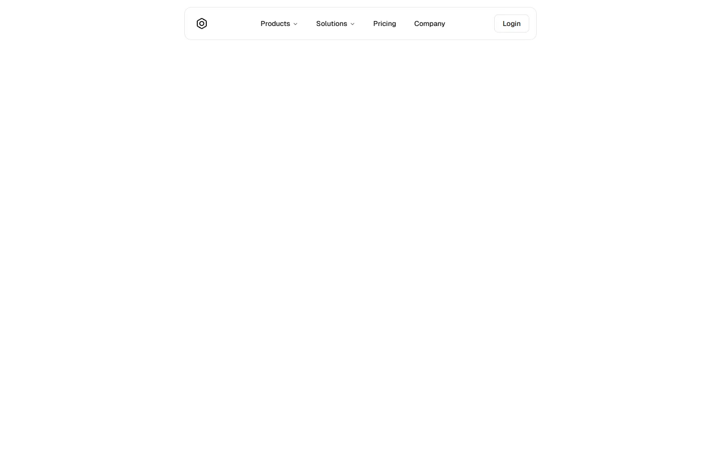
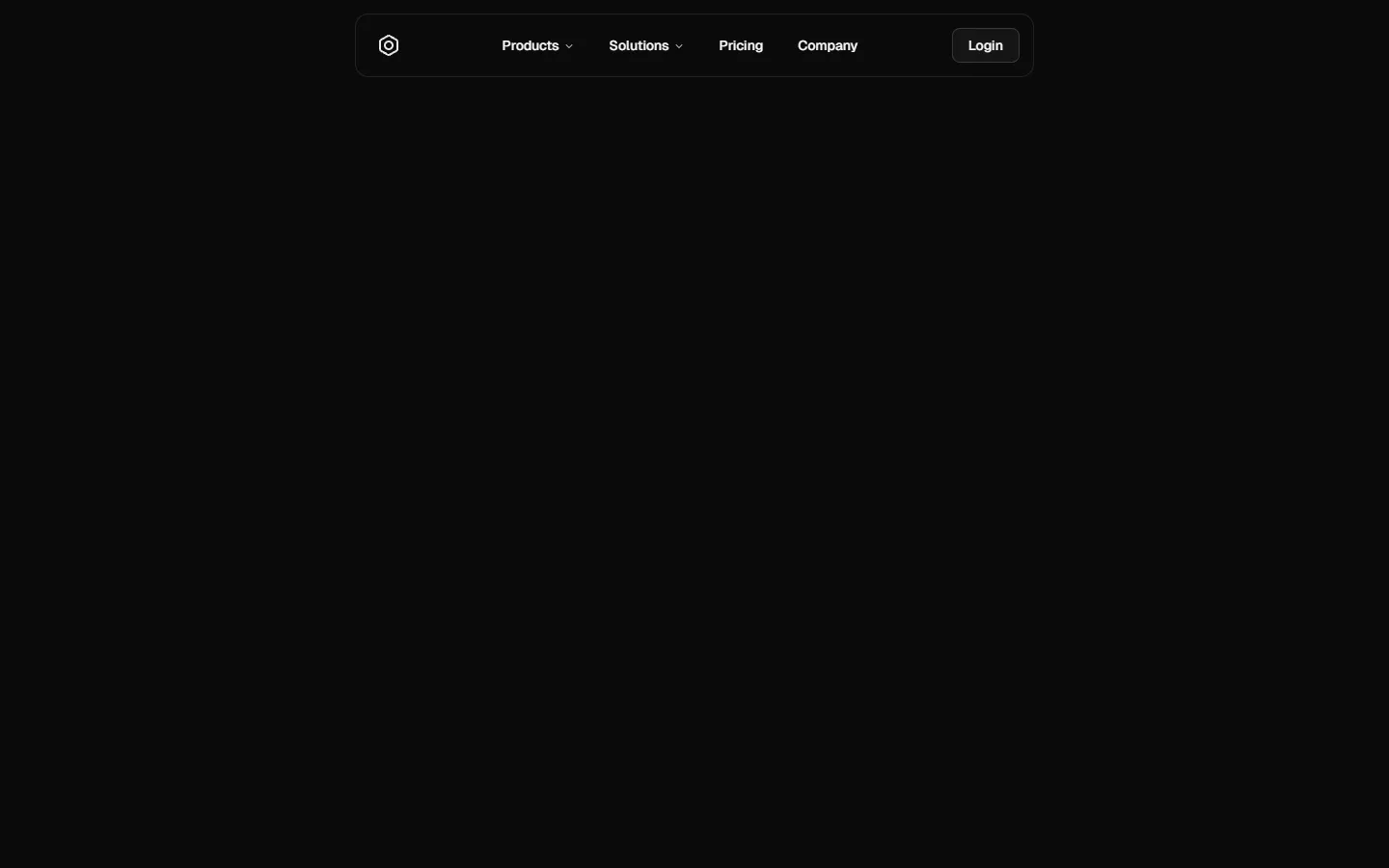
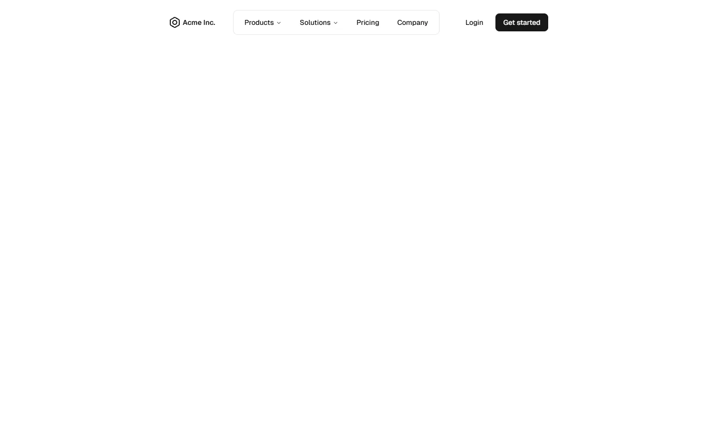
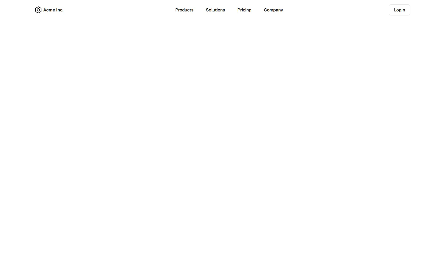
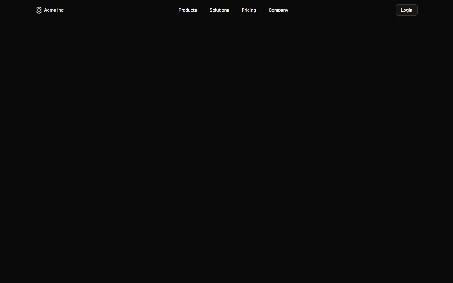
Left-aligned dropdown navigation
A classic left-aligned top navigation with horizontal links and inline dropdown menus for larger screens. Primary actions are grouped on the right for clear visual separation. On smaller screens, the layout collapses into a full-height mobile menu with expandable sections, preserving hierarchy while keeping the interaction simple and familiar.
In Pro & Pro + React
Radix UI
Base UI
8 styles
5 icon sets
SBIOTJ
Join 9,000+ builders shipping with shadcncraft
Get access to this block and the full library
Production-ready blocks and components with matching Figma and React.


Benefits
Production-ready by default
Built with shadcn/ui conventions and designed for real projects.
Built with shadcn/ui
Clean React components using Tailwind and modern shadcn patterns.
Install instantly
Add the block directly using the shadcn CLI.
Works with your theme
Compatible with shadcn themes and token-based color systems.
MCP server support
Use shadcn MCP server right from your favorite AI tools.
Frequently Asked Questions
Yes. They follow shadcn/ui structure and are built for real products.