All Pricing blocks
Pricing 9
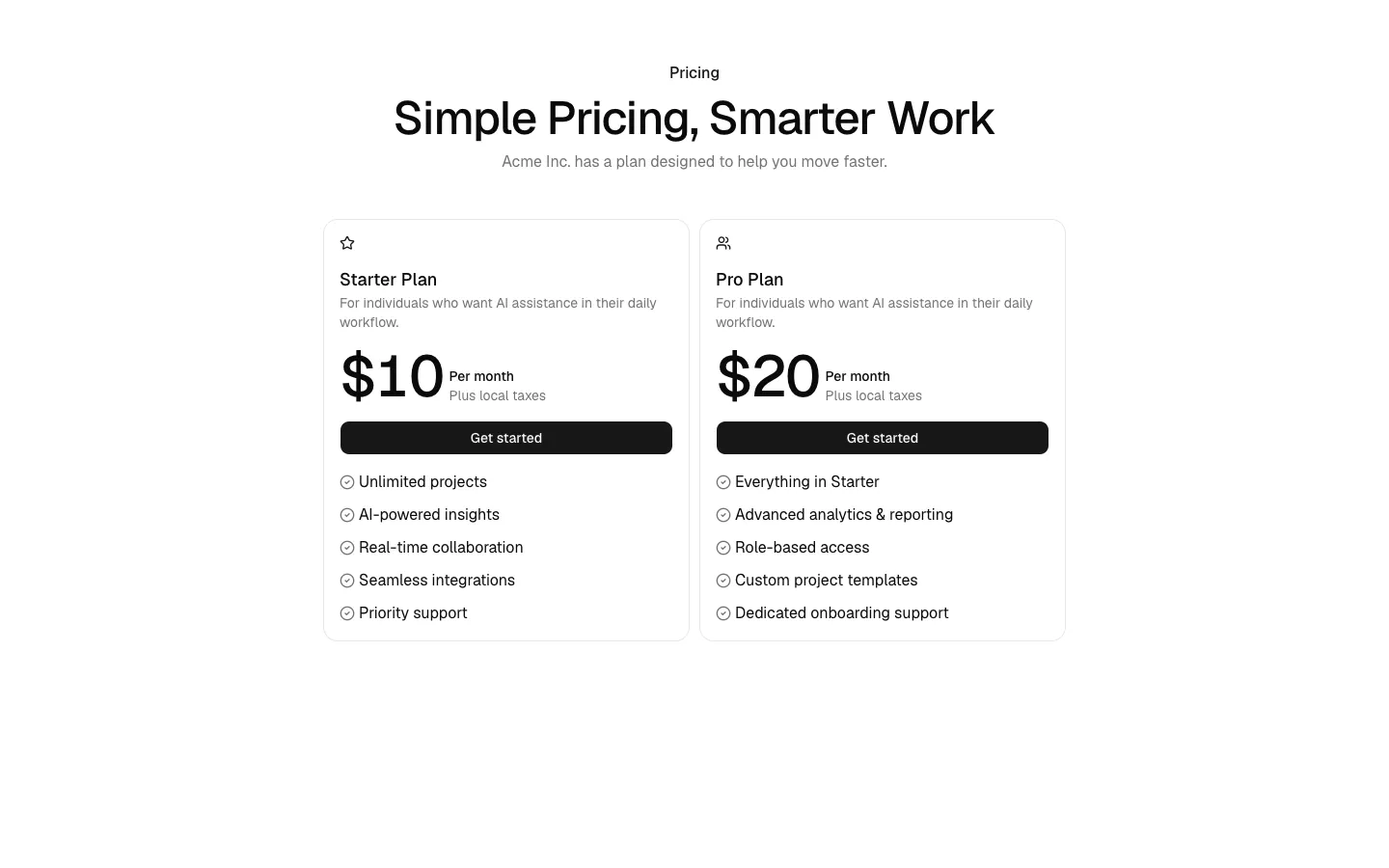
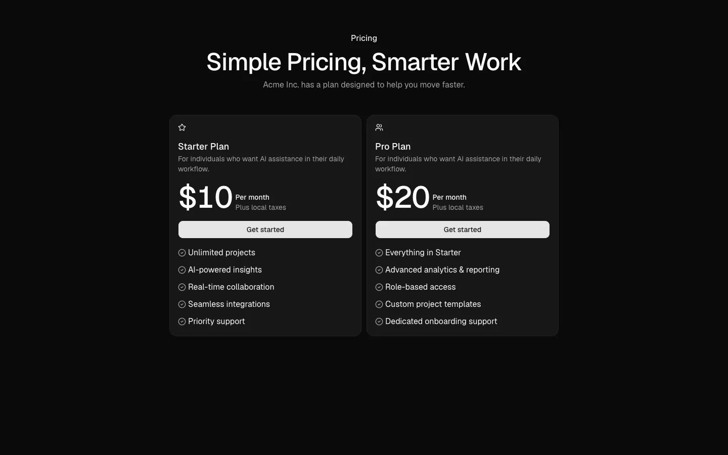
Unified card group with equal plan weight
A single grouped pricing container where all plans share the same visual treatment and hierarchy. This pattern emphasizes fairness and easy comparison, making it suitable when no plan is intentionally promoted and users are expected to evaluate options side by side.
New
In all Pro bundles
Radix UI
Base UI
8 styles
5 icon sets
Own this code forever
Build with your AI agents or bring the code into your own codebase.
Already have a license key?
SBIOTJ
Join 16,000+ builders shipping with shadcncraft
Get access to this block and the full library
Production-ready blocks and components with matching Figma and React.
Benefits
Production-ready by default
Built with shadcn/ui conventions and designed for real projects.
Built with shadcn/ui
Clean React components using Tailwind and modern shadcn patterns.
Install instantly
Add the block directly using the shadcn CLI.
Works with your theme
Compatible with shadcn themes and token-based color systems.
MCP server support
Use shadcn MCP server right from your favorite AI tools.
Frequently Asked Questions
Yes. They follow shadcn/ui structure and are built for real products.
All blocks
More Pricing
Pro
Pricing 1
Three-tier card pricing grid
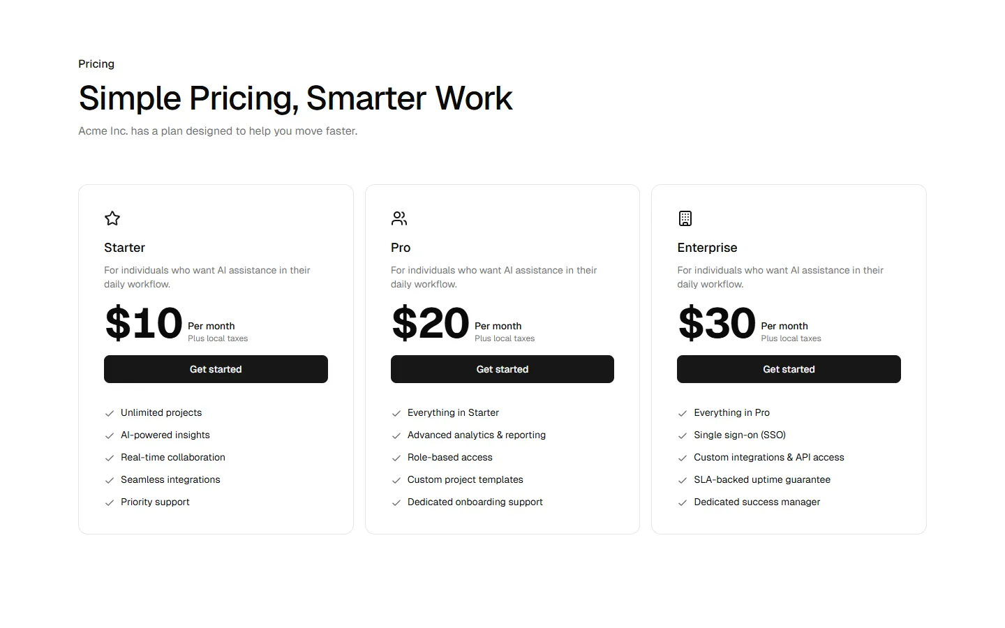
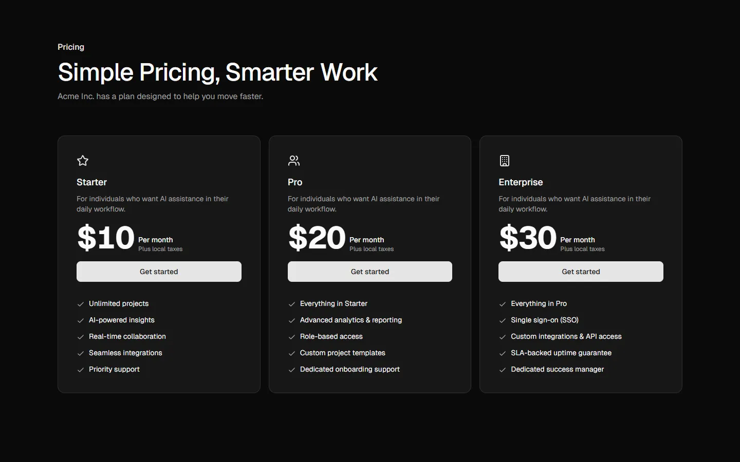
Pro
Pricing 2
Focused two-plan comparison
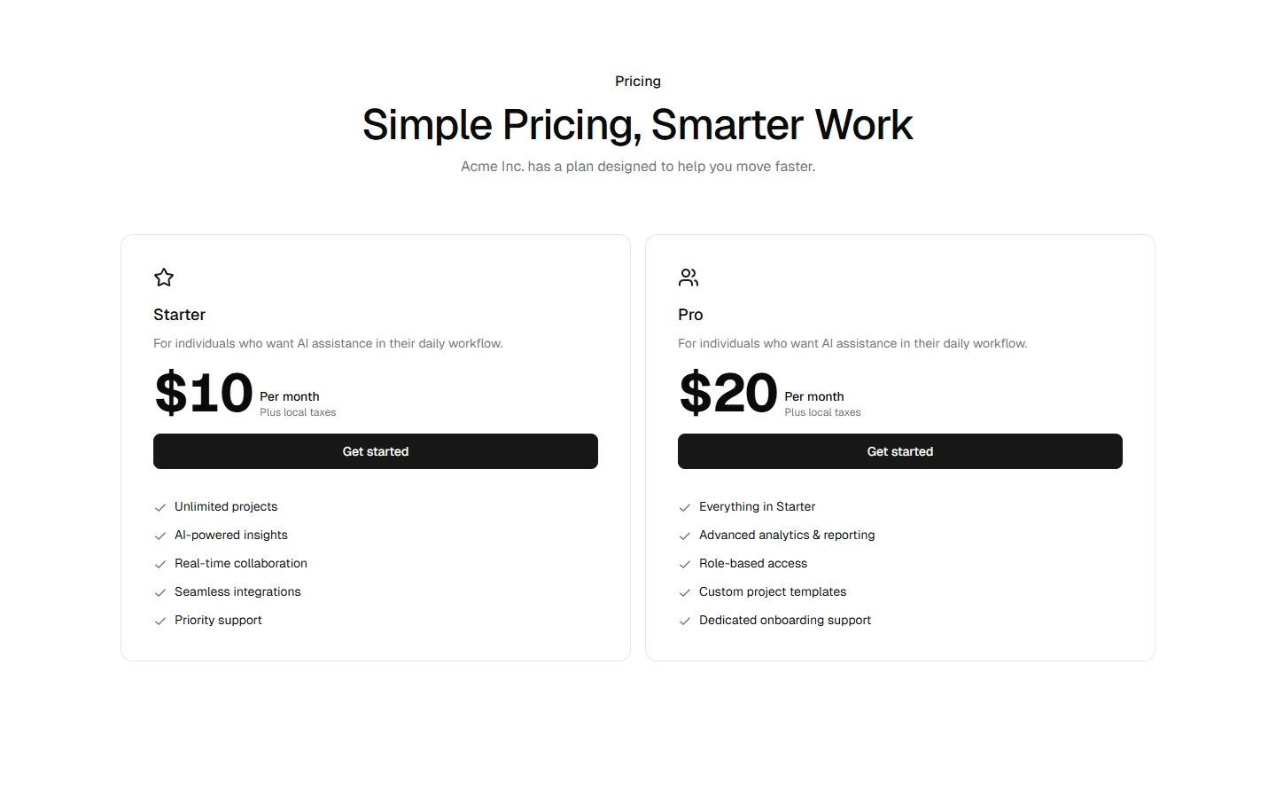
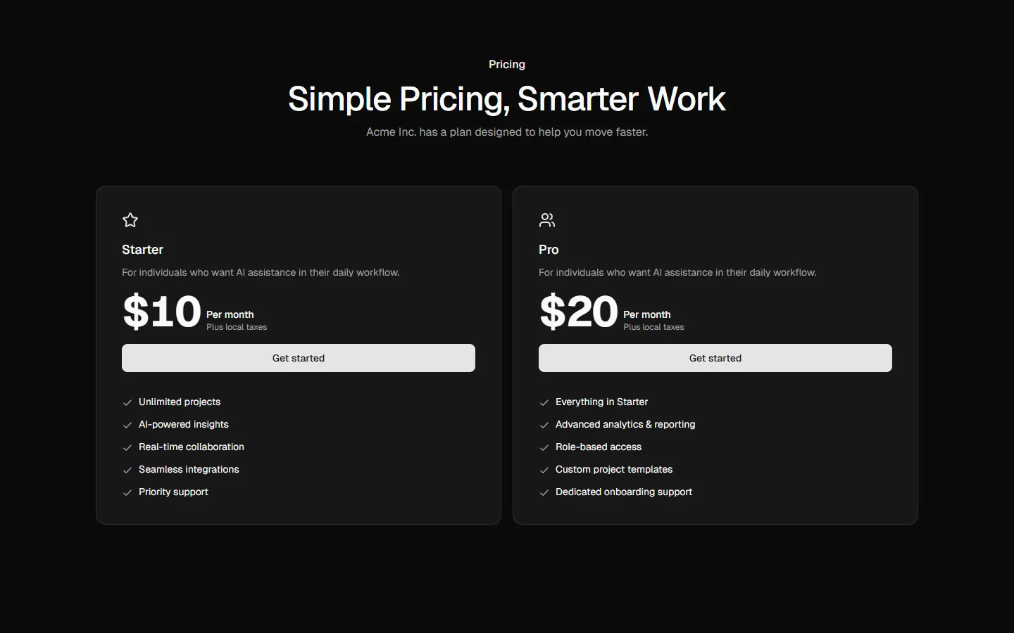
Pro
Pricing 3
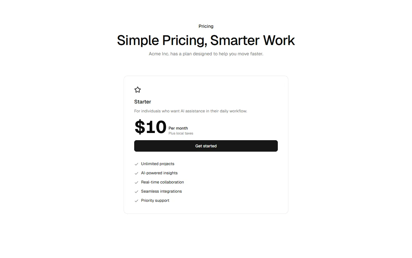
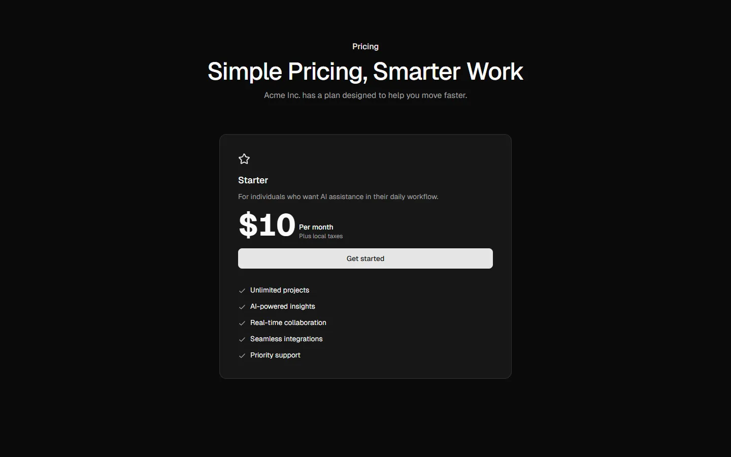
Single plan spotlight
Pro
Pricing 4
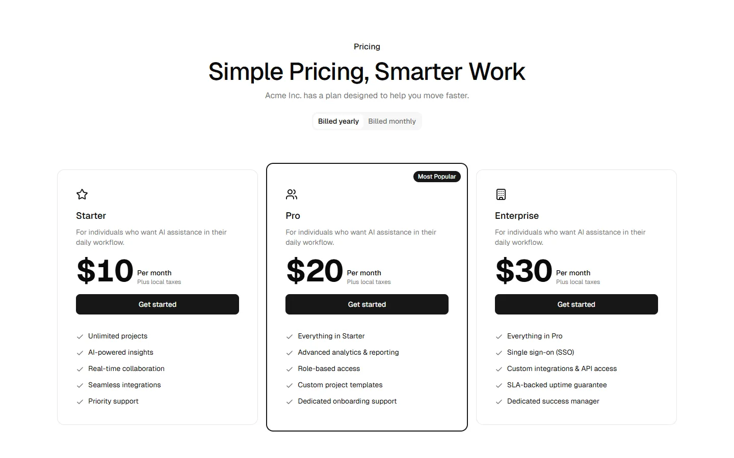
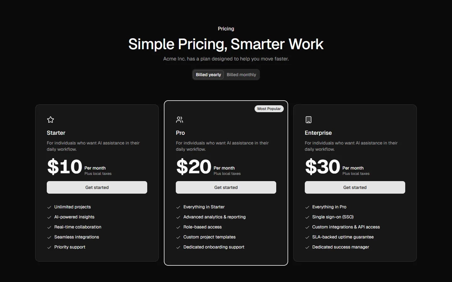
Three-plan comparison with highlighted default
Pro
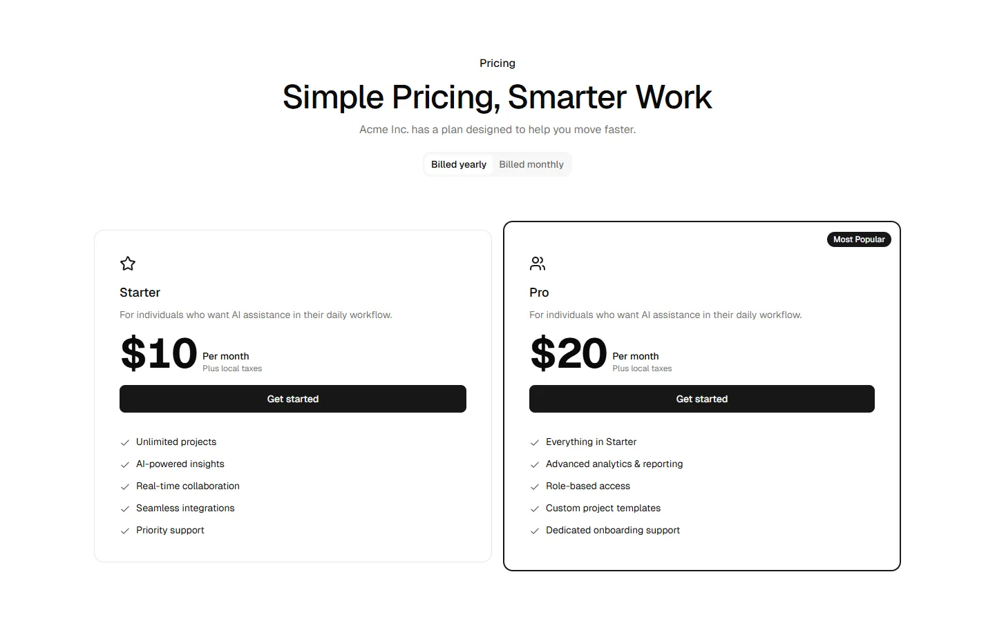
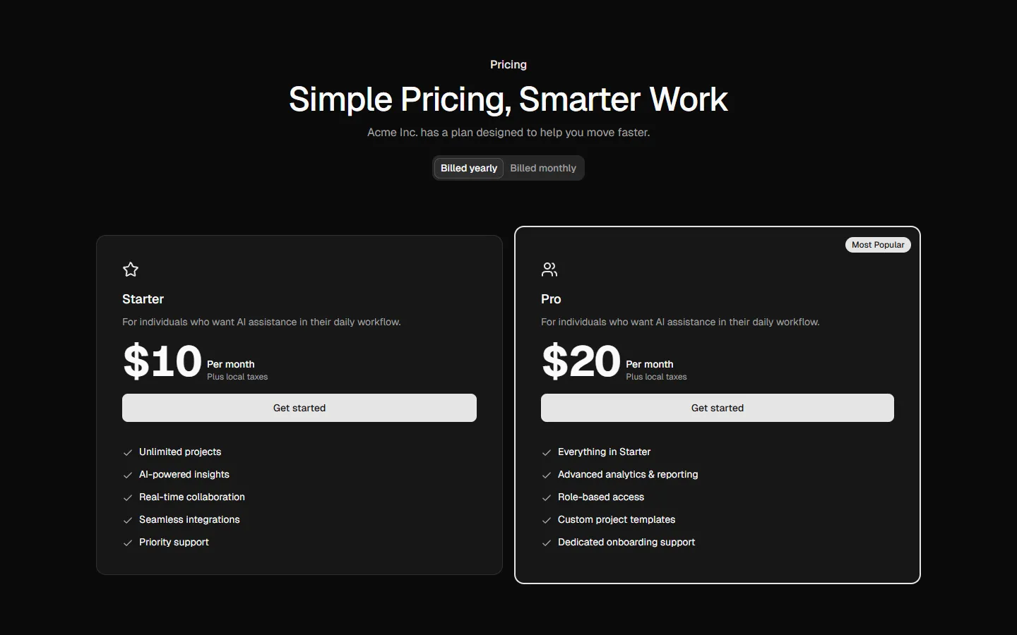
Pricing 5
Side-by-side plans with duplicated emphasis
Pro
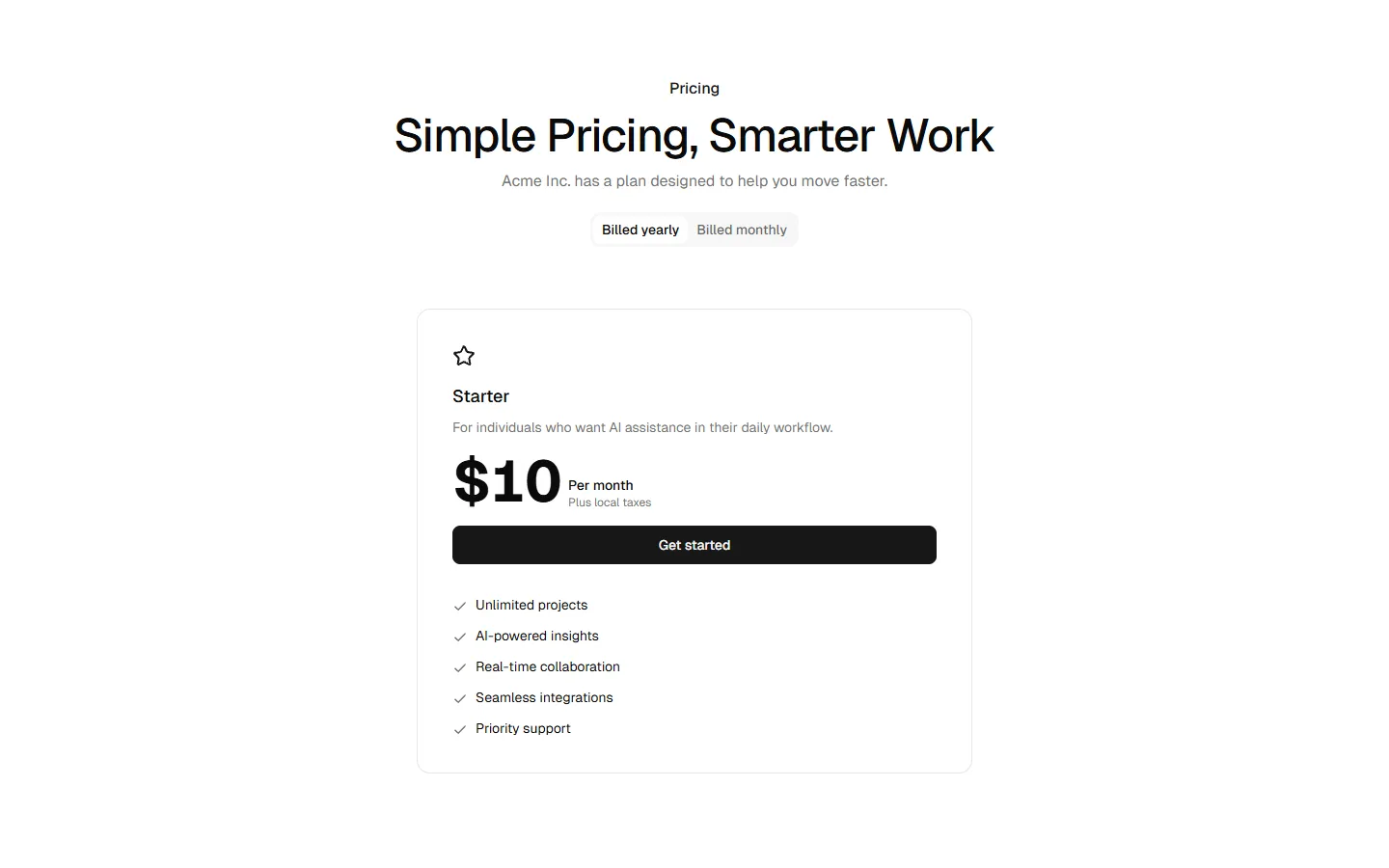
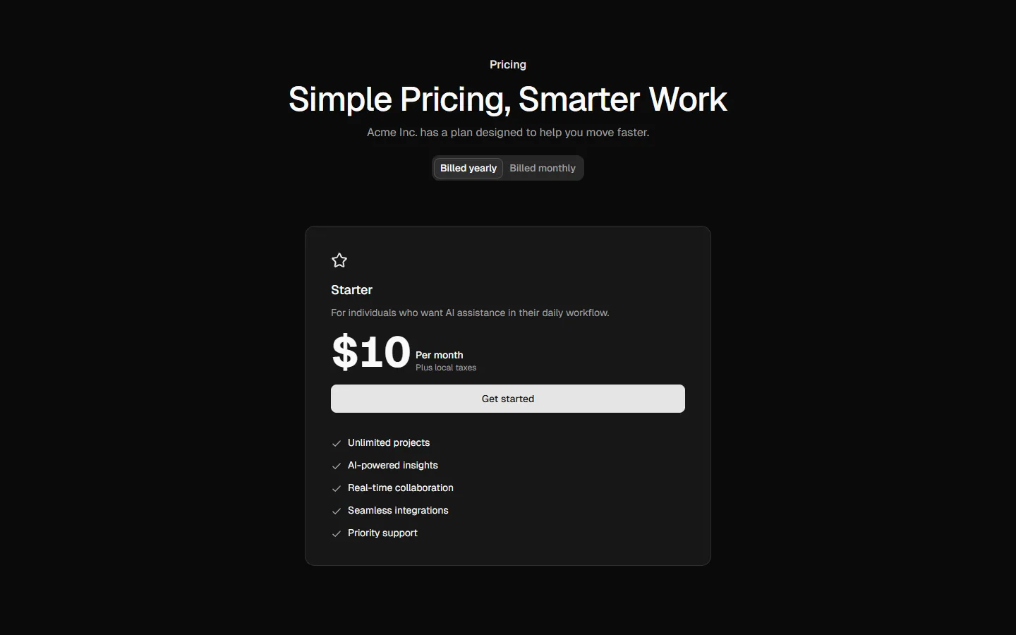
Pricing 6
Single-plan focused pricing
Pro
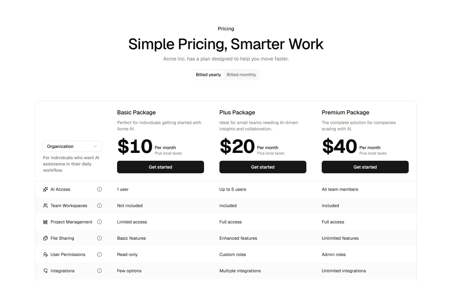
Pricing 7
Feature-comparison table pricing
Pro
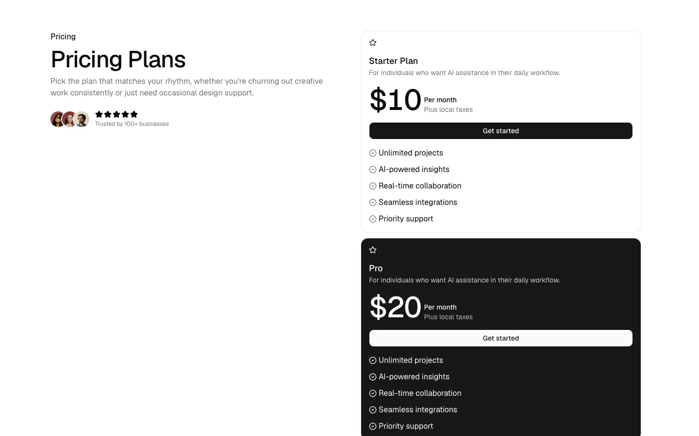
Pricing 8
Split layout with featured plan emphasis
Pro
Pricing 10
Free vs paid contrast layout