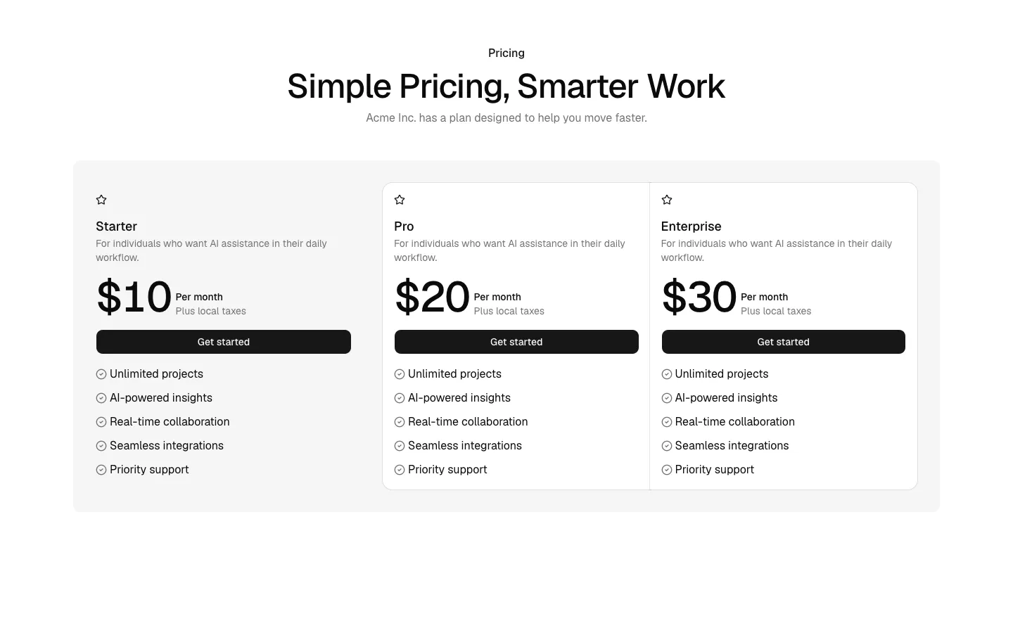
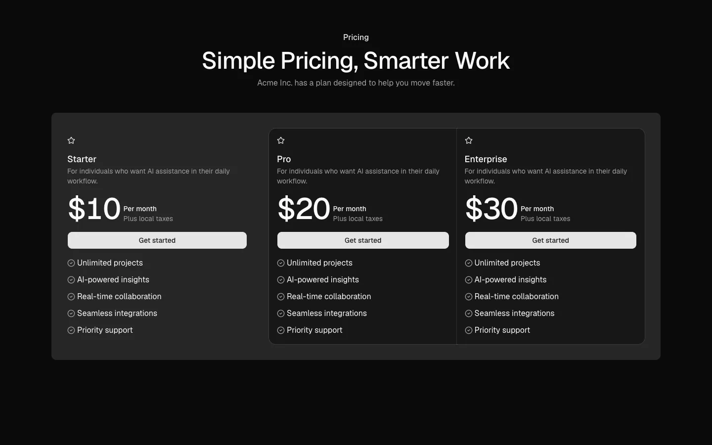
All Pricing blocks
Pricing 10
Free vs paid contrast layout
A two-option pricing pattern that pairs a neutral free tier with a strongly emphasized paid plan. The visual contrast clearly establishes an upgrade path, using color and emphasis to guide attention toward the paid option while still allowing easy side-by-side comparison.
New
In all Pro bundles
Radix UI
Base UI
8 styles
5 icon sets
Own this code forever
Build with your AI agents or bring the code into your own codebase.
Already have a license key?
SBIOTJ
Join 16,000+ builders shipping with shadcncraft
Get access to this block and the full library
Production-ready blocks and components with matching Figma and React.
Benefits
Production-ready by default
Built with shadcn/ui conventions and designed for real projects.
Built with shadcn/ui
Clean React components using Tailwind and modern shadcn patterns.
Install instantly
Add the block directly using the shadcn CLI.
Works with your theme
Compatible with shadcn themes and token-based color systems.
MCP server support
Use shadcn MCP server right from your favorite AI tools.
Frequently Asked Questions
Yes. They follow shadcn/ui structure and are built for real products.
All blocks
More Pricing
Pro
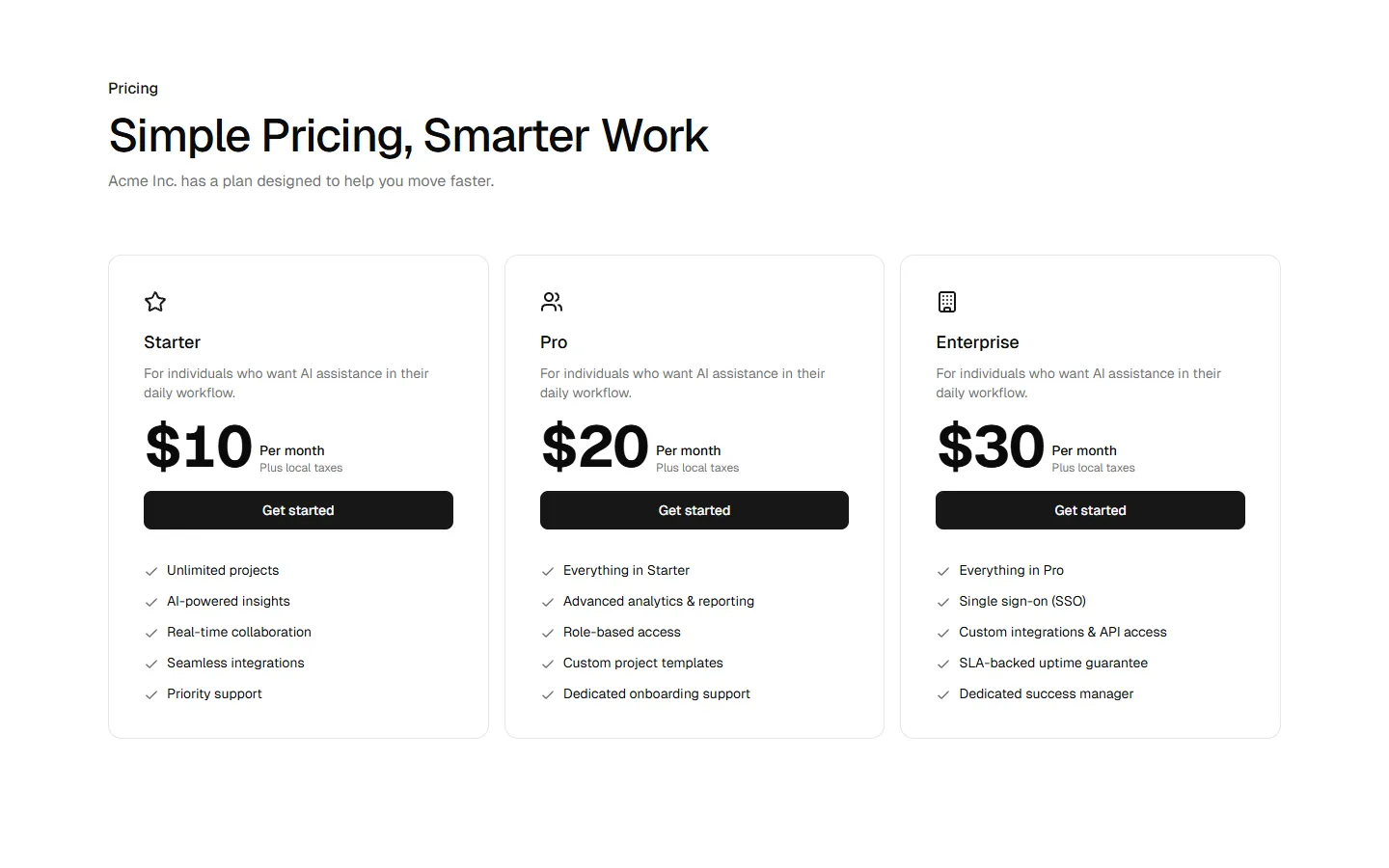
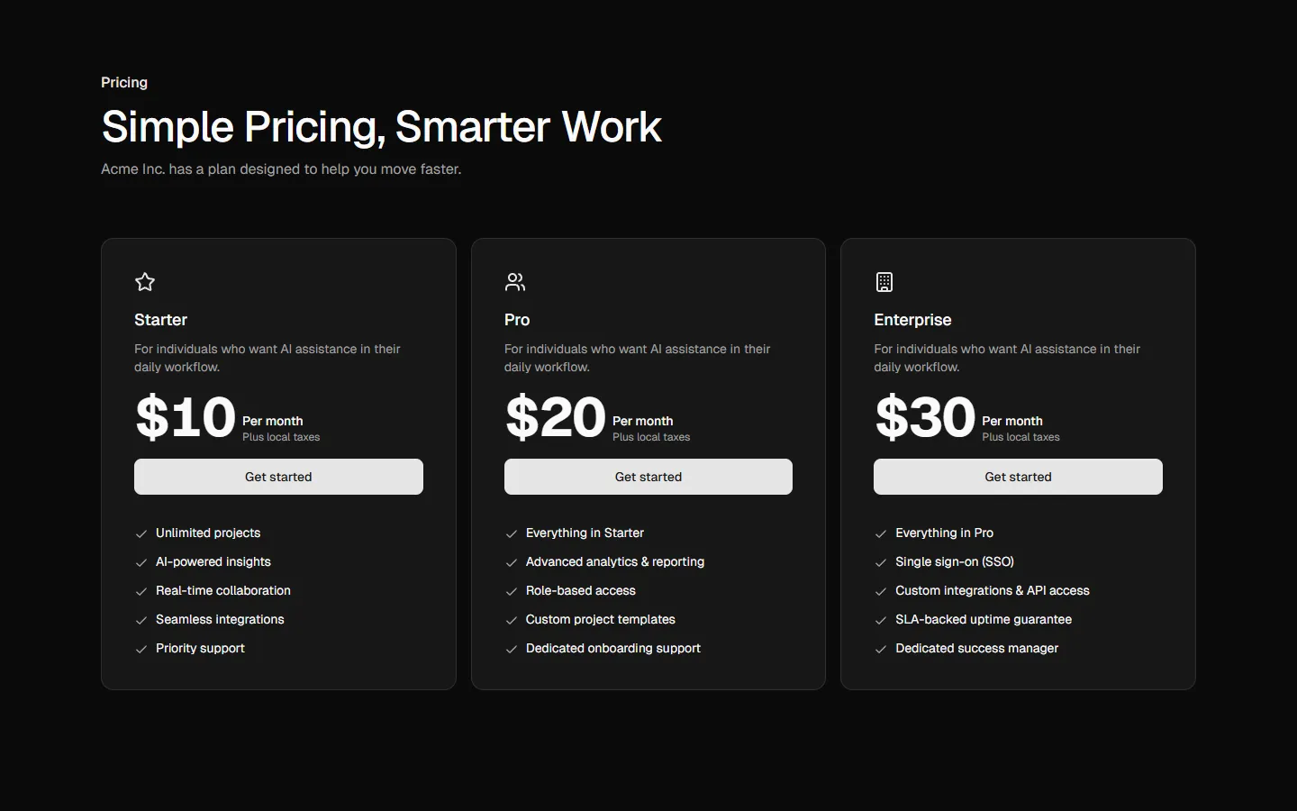
Pricing 1
Three-tier card pricing grid
Pro
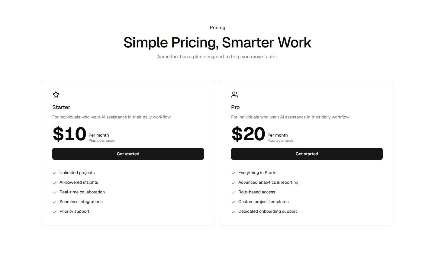
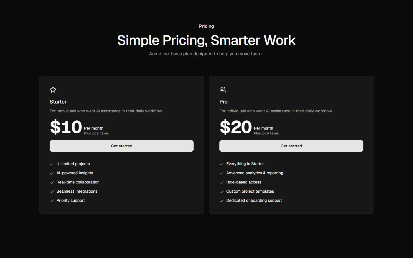
Pricing 2
Focused two-plan comparison
Pro
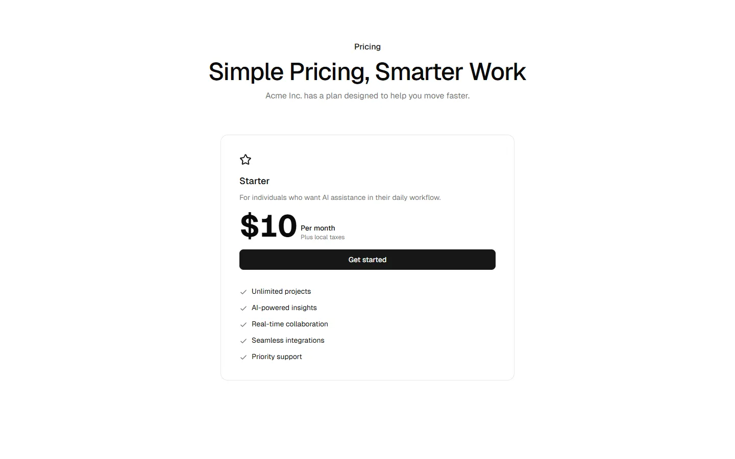
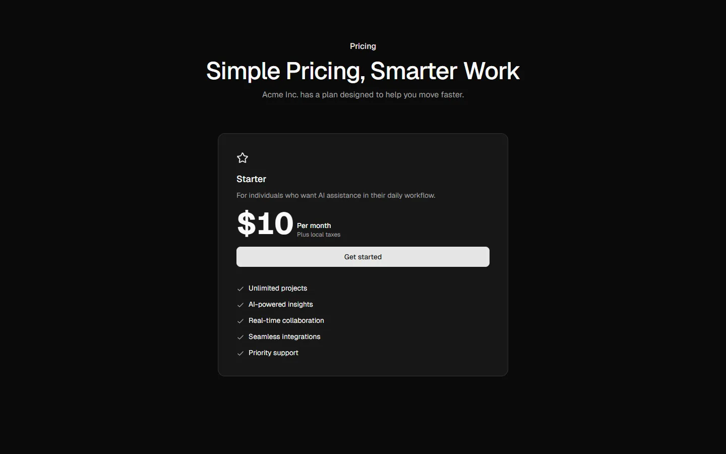
Pricing 3
Single plan spotlight
Pro
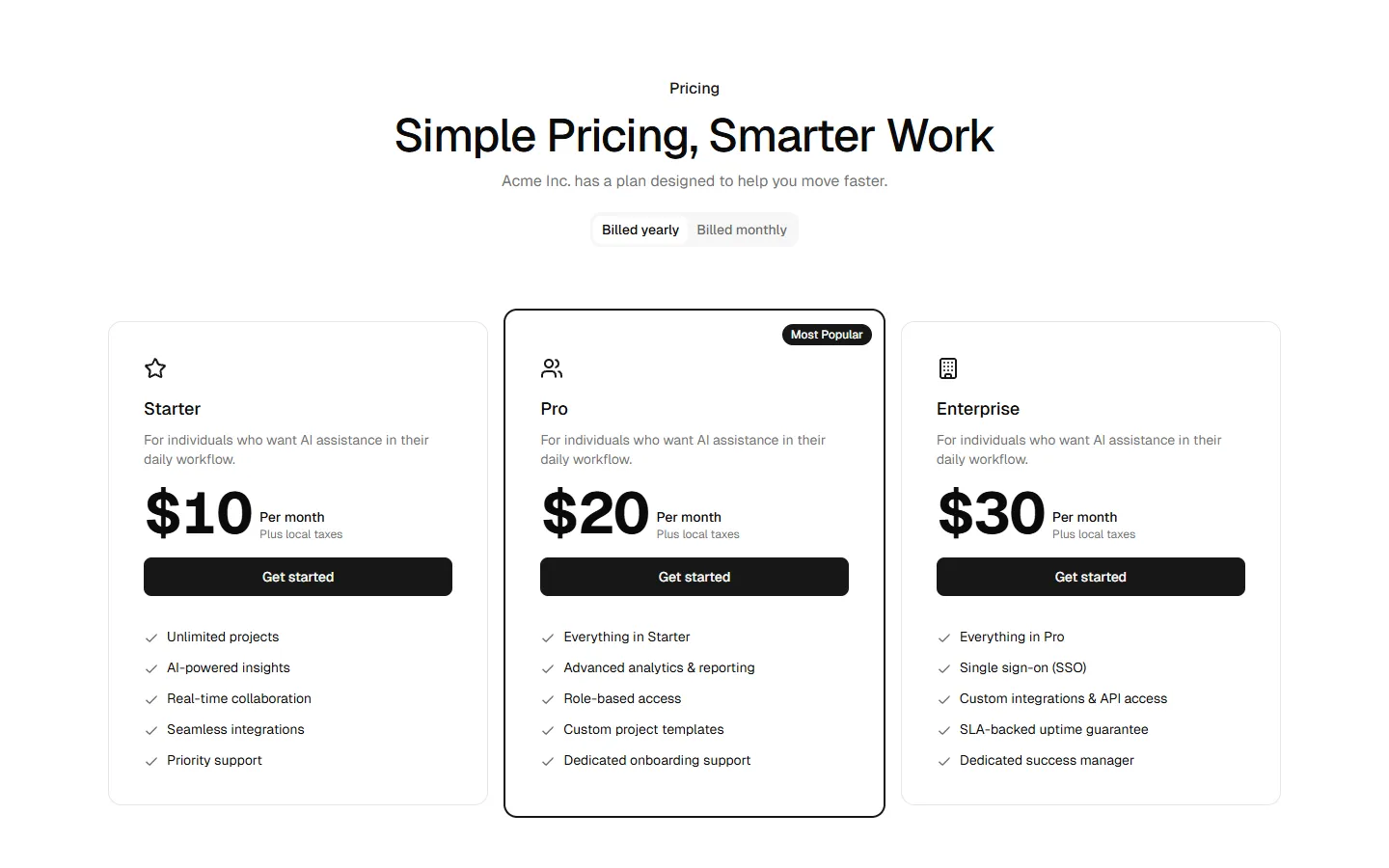
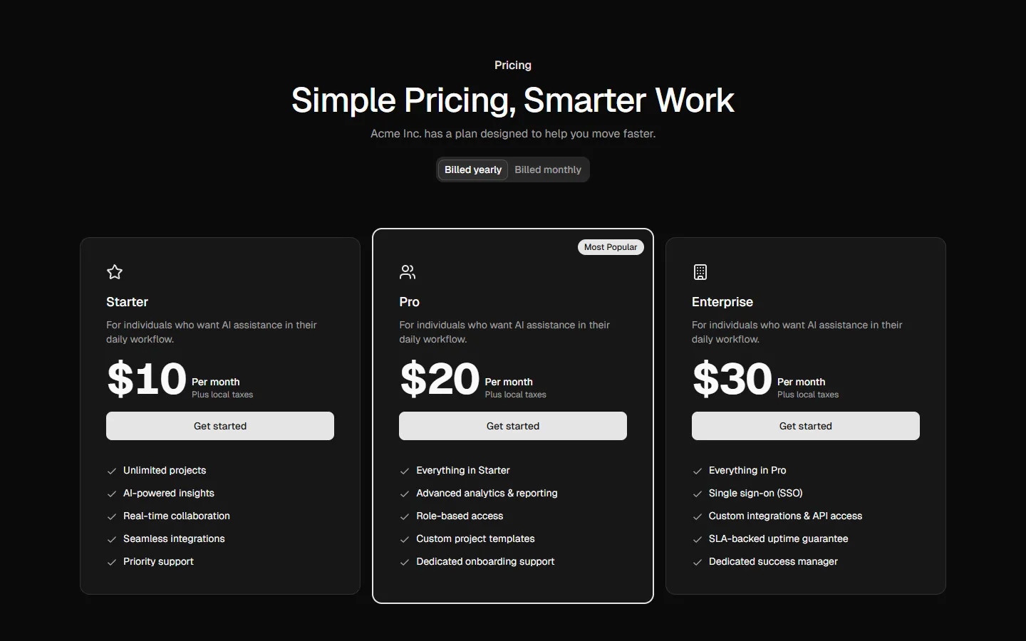
Pricing 4
Three-plan comparison with highlighted default
Pro
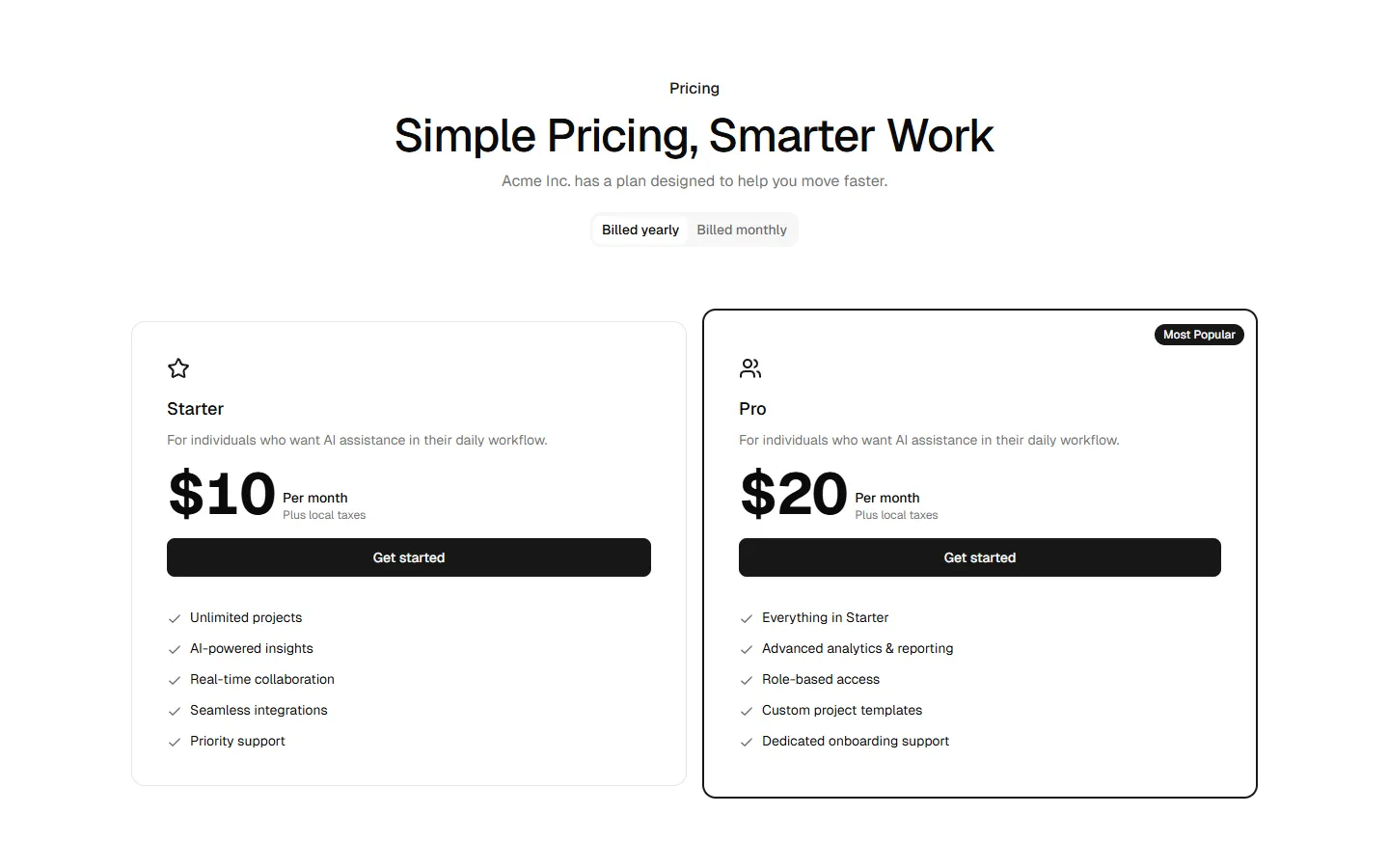
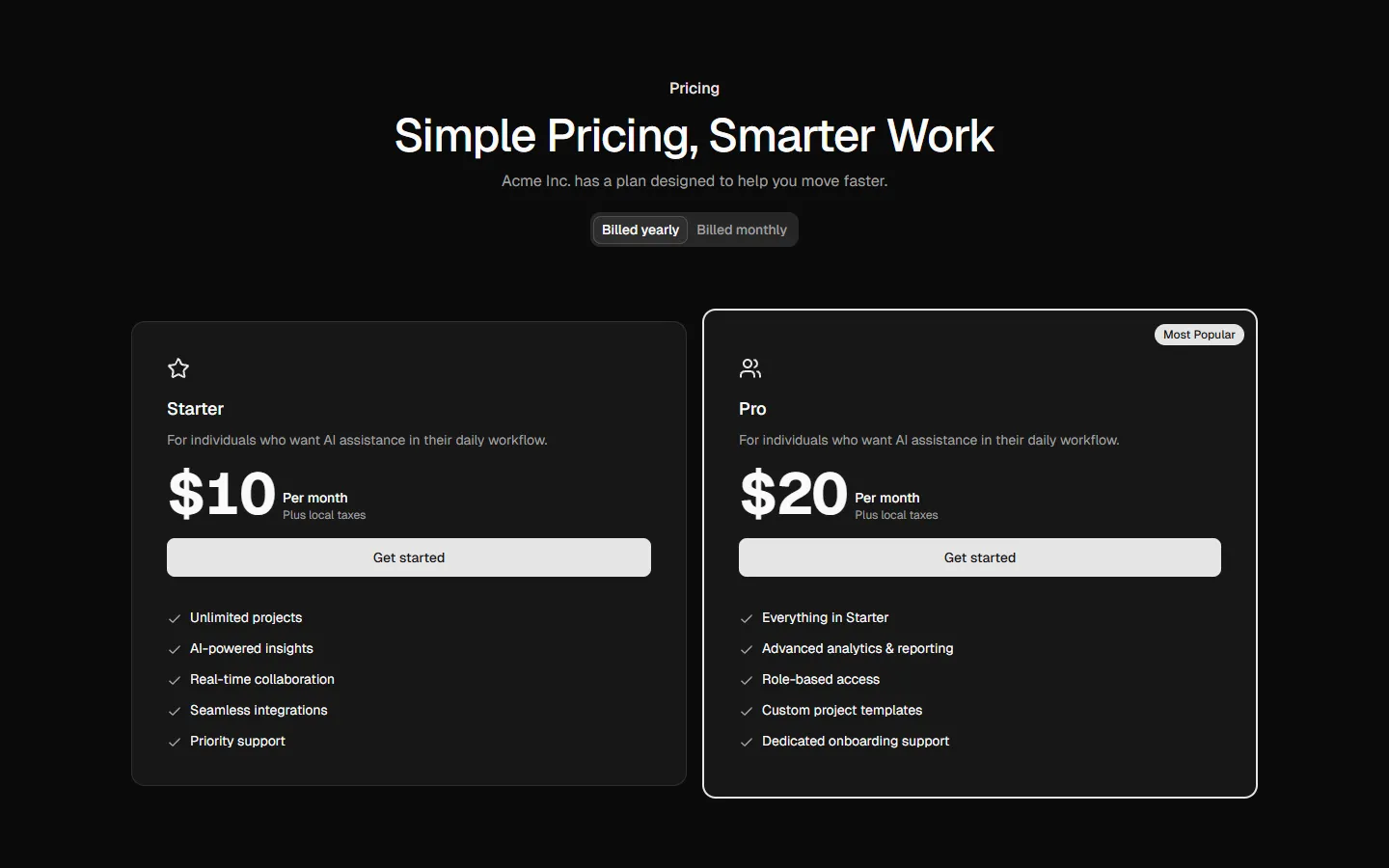
Pricing 5
Side-by-side plans with duplicated emphasis
Pro
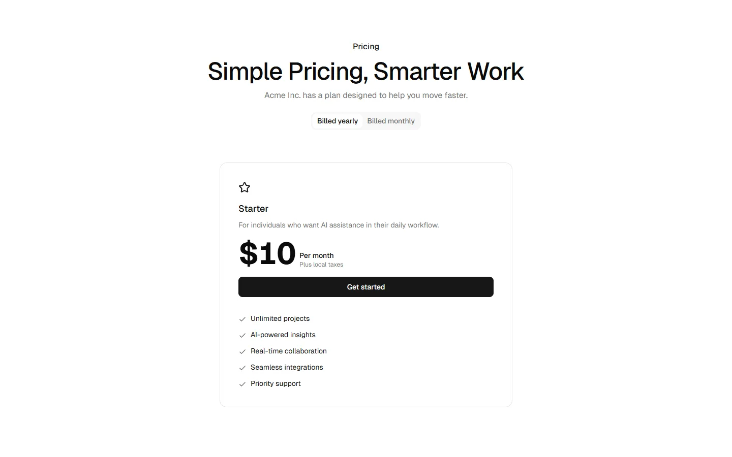
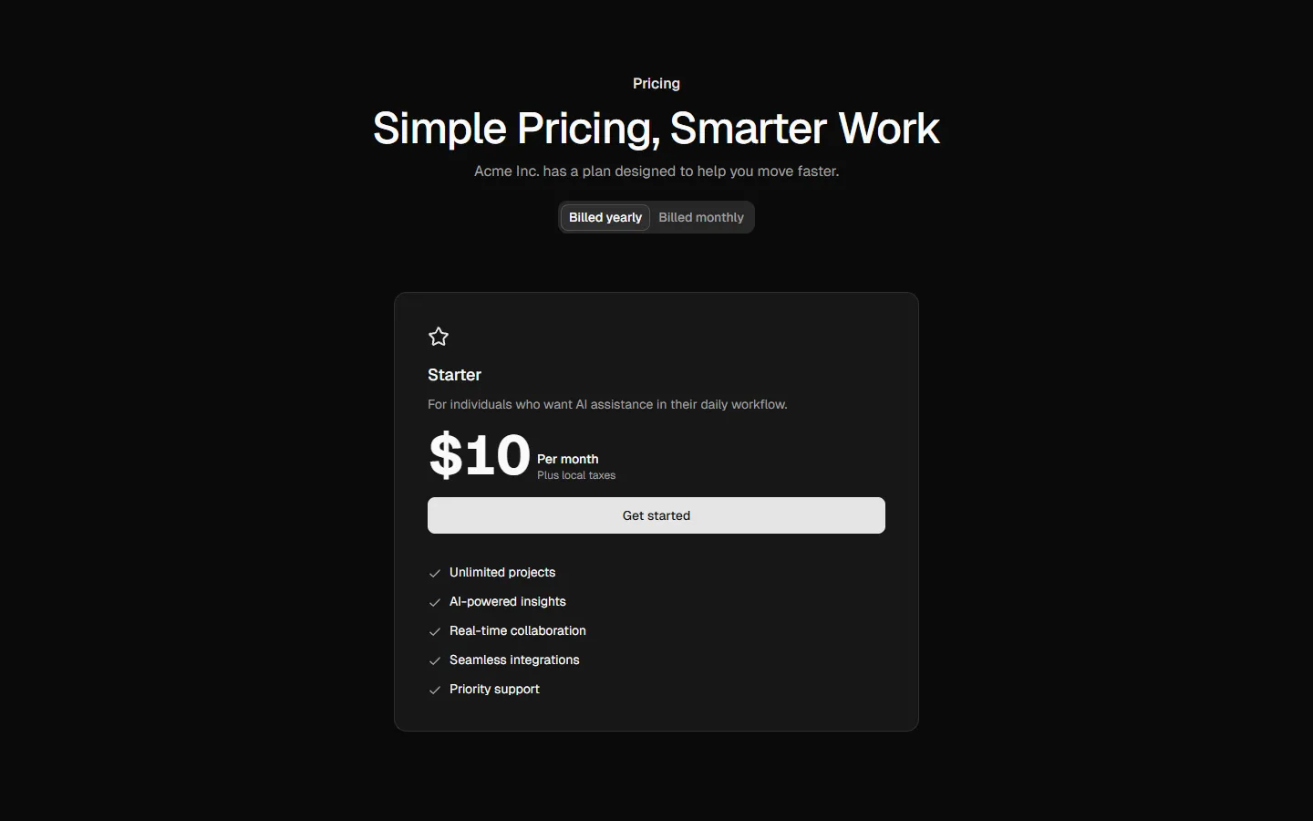
Pricing 6
Single-plan focused pricing
Pro
Pricing 7
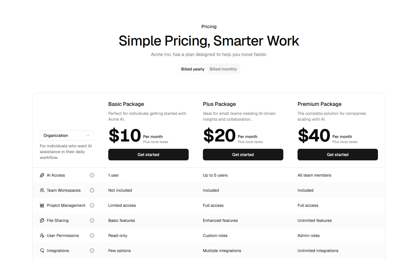
Feature-comparison table pricing
Pro
Pricing 8
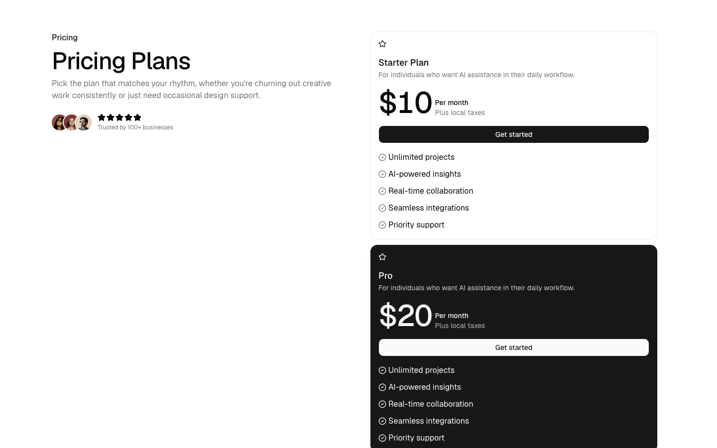
Split layout with featured plan emphasis
Pro
Pricing 9
Unified card group with equal plan weight