All blocks
Heroes
shadcn/ui Hero blocks that combine striking visuals with headings and navigation. Designed to make a strong first impression, with options for image backgrounds and guidance on maintaining text contrast for accessibility.
In Pro & Pro + React
React
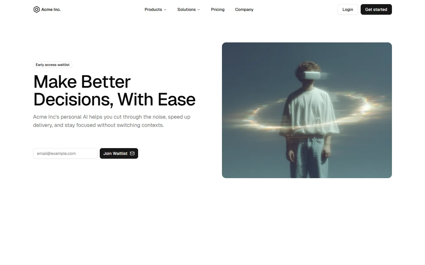
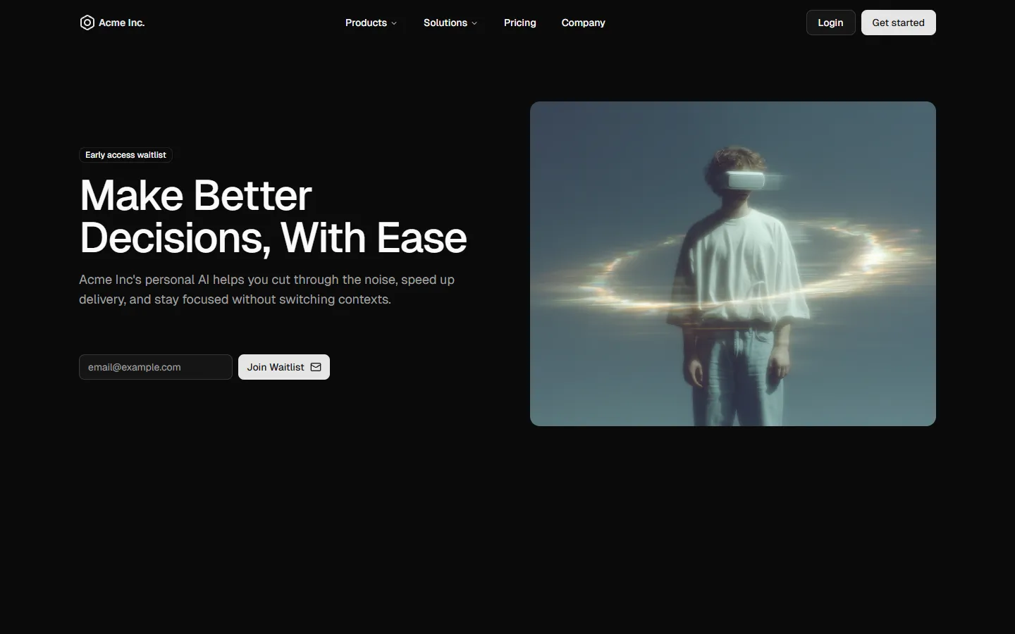
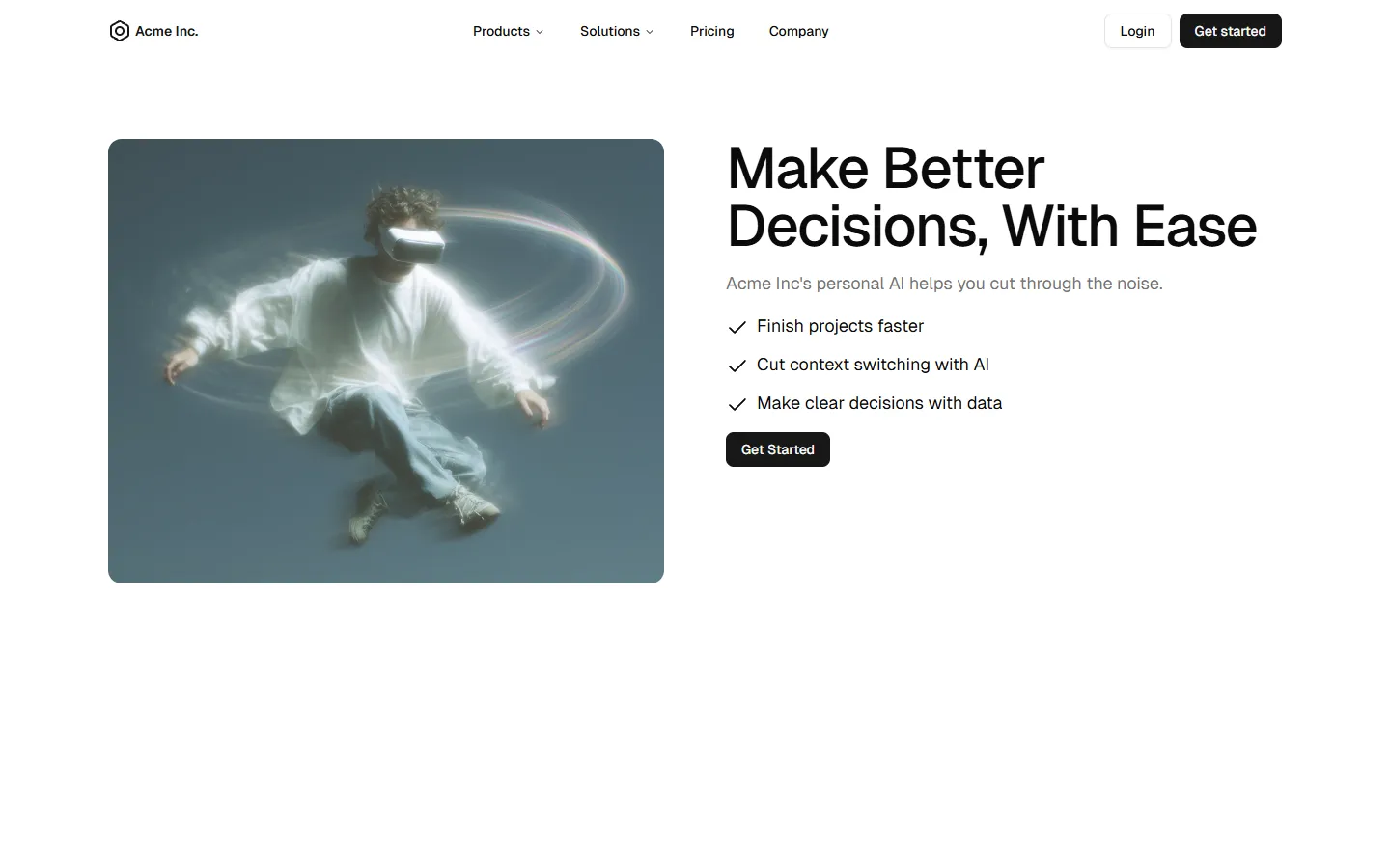
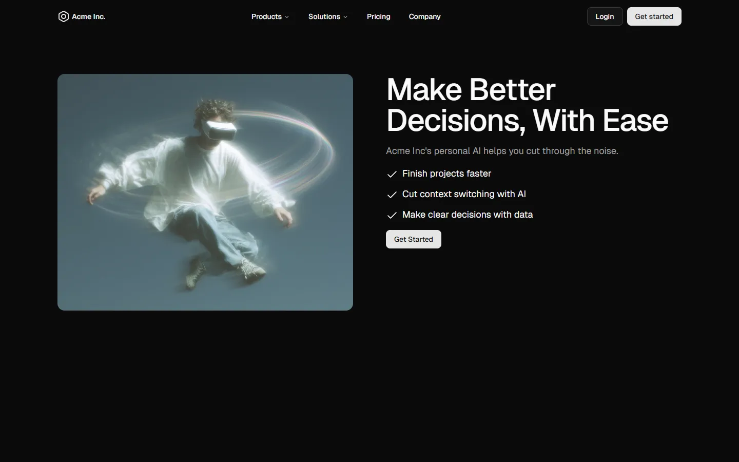
Figma
Pro
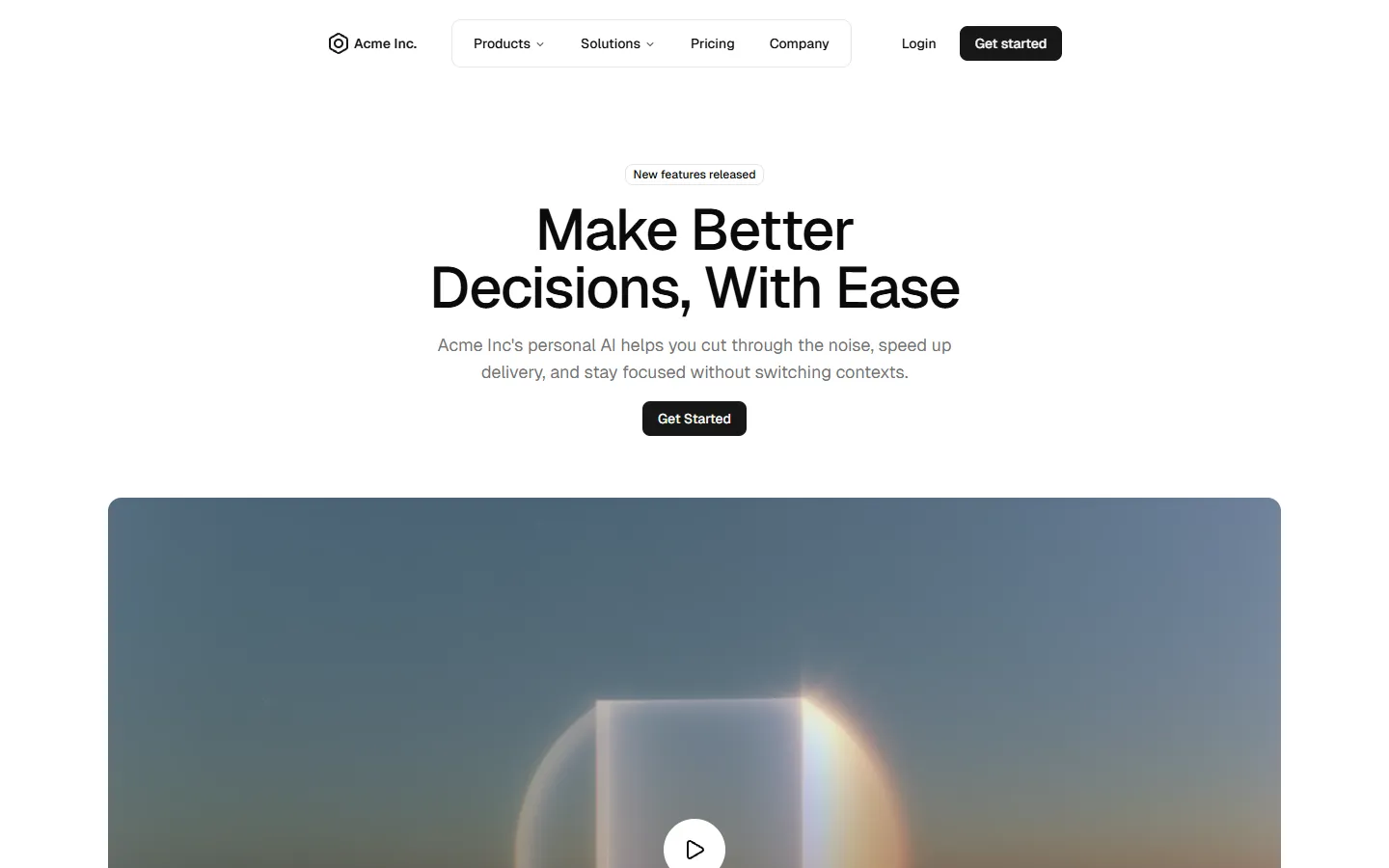
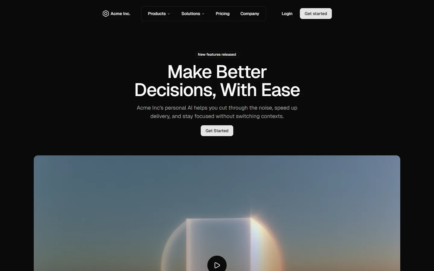
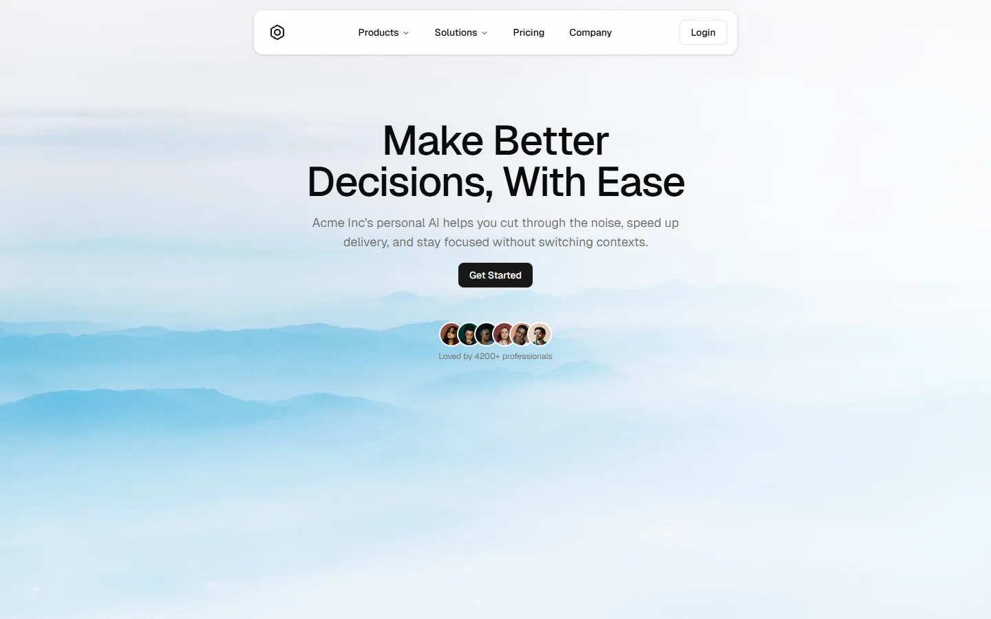
Hero 1
Centered headline with media hero
Pro
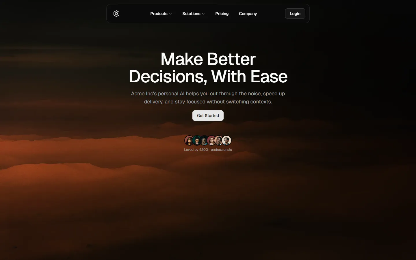
Hero 2
Full-bleed background with centered content
Pro
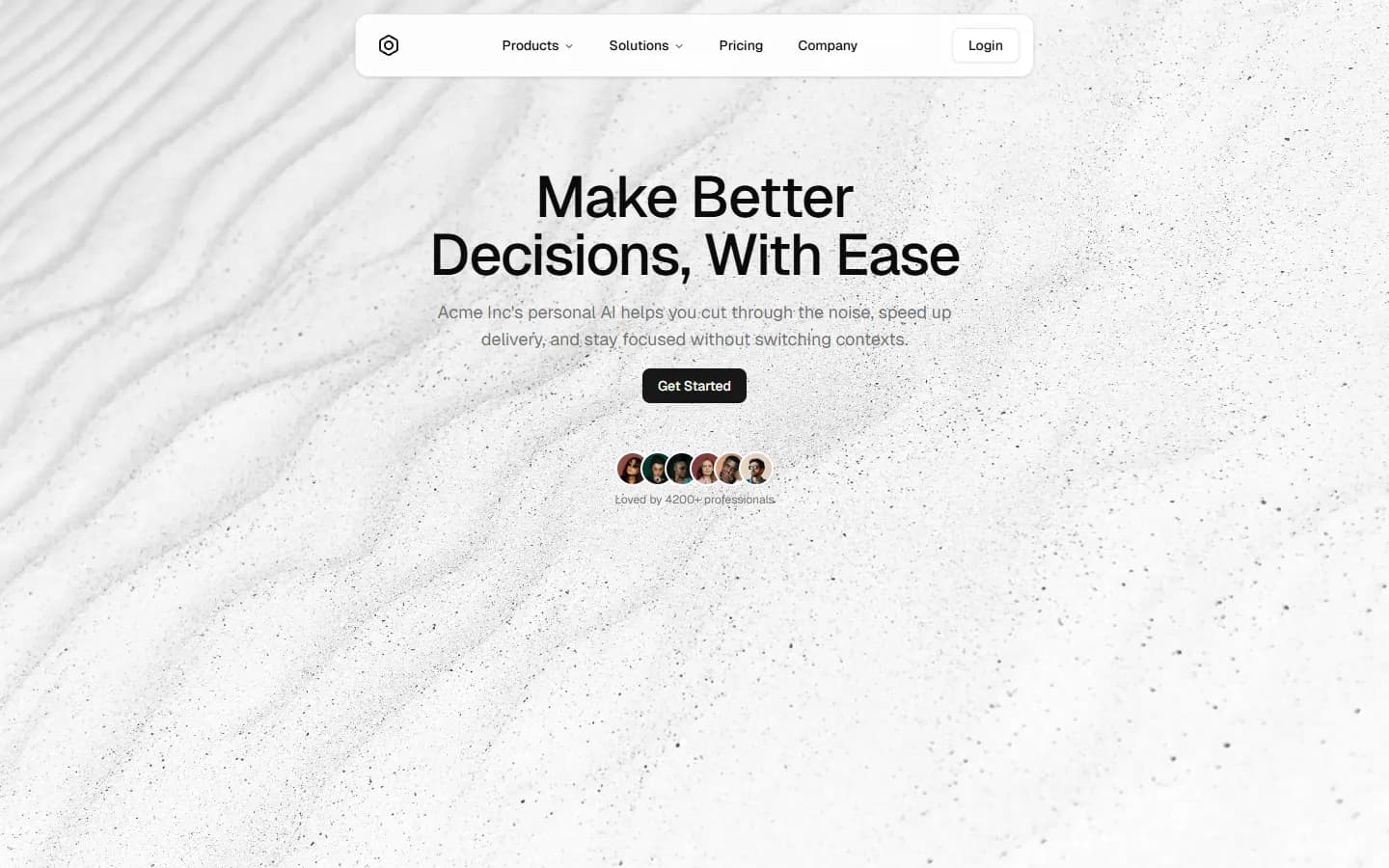
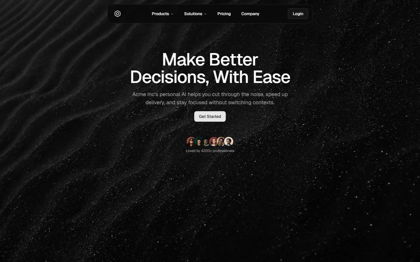
Hero 3
Light background with centered content
Pro
Hero 4
Soft gradient hero with dual CTAs and rating
Pro
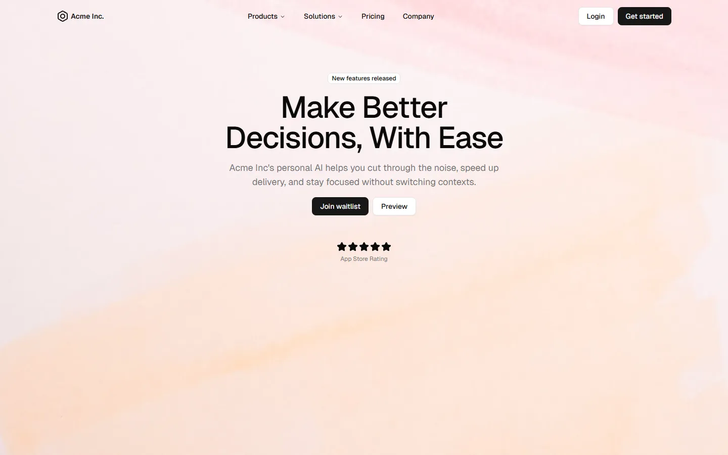
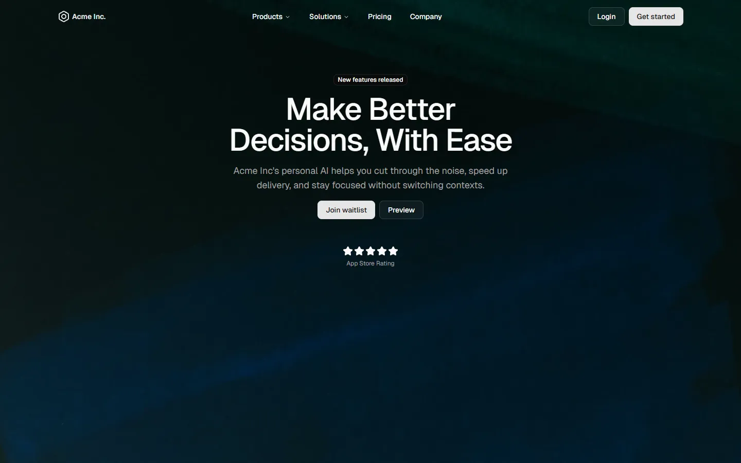
Hero 5
Split layout with waitlist capture
Pro
Hero 6
Feature-led split hero
Pro
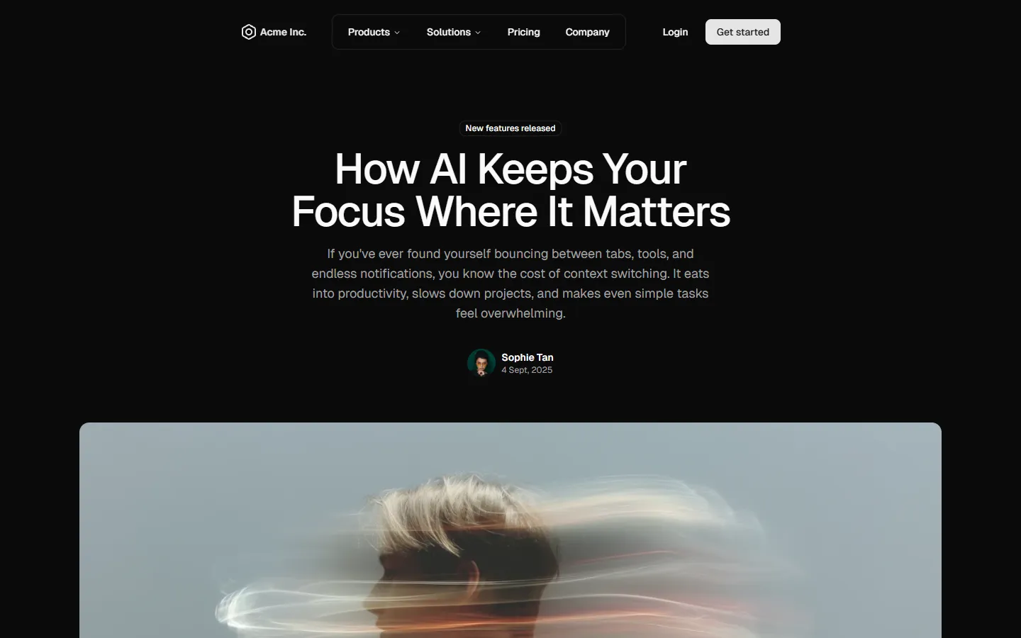
Hero 7
Editorial story hero

Pro
Hero 8
Minimal page header
Pro
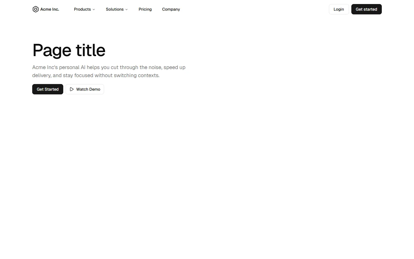
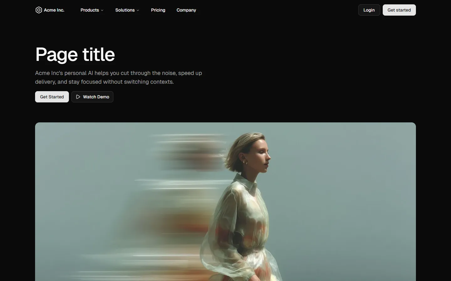
Hero 9
Page header with supporting visual
Pro
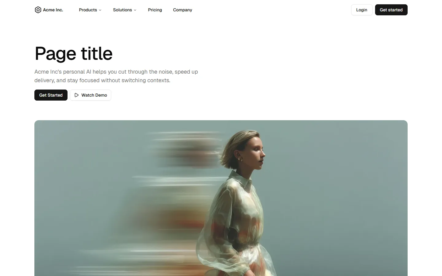
Hero 10
Full-bleed image hero


SBIOTJ
Join 9,000+ builders shipping with shadcncraft
Get access to these blocks and the full library
Production-ready blocks and components with matching Figma and React.


Benefits
Designed for your shadcn/ui project
Blocks built to work together across marketing pages and product interfaces.
Consistent layout system
Shared spacing, grids, and typography across all blocks.
Composable layouts
Combine blocks to build complete pages without layout conflicts.
Theme compatible
Works with shadcn/ui themes and token-based color systems.
Production-ready structure
Layouts designed with real content patterns and responsive behavior.
Explore all block categories
Built on official shadcn/ui components with real structure, spacing, and accessibility. No AI-generated layouts. Designed for real products in Figma and React.