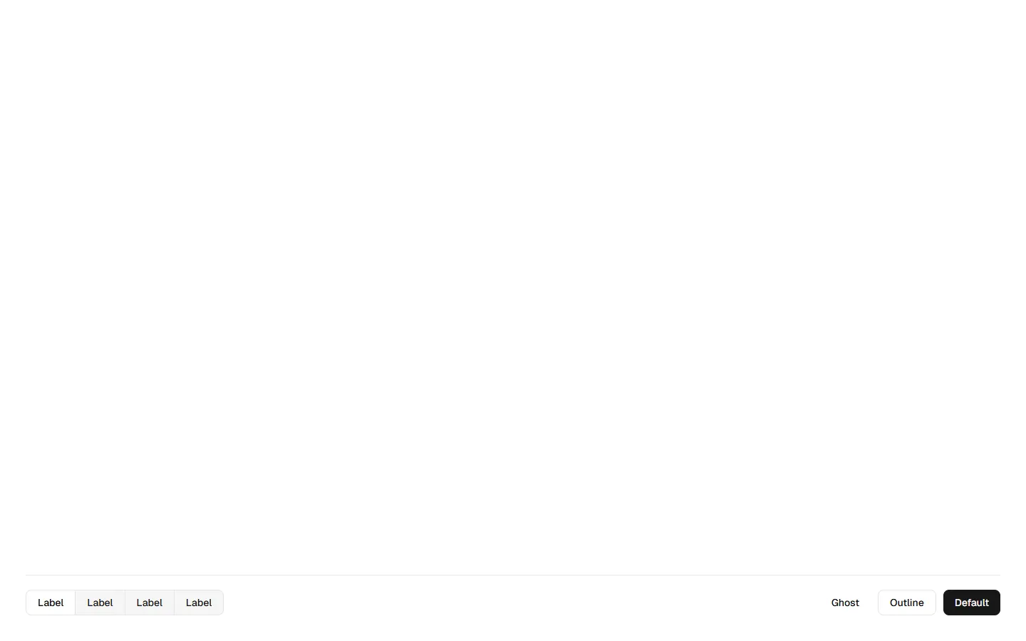
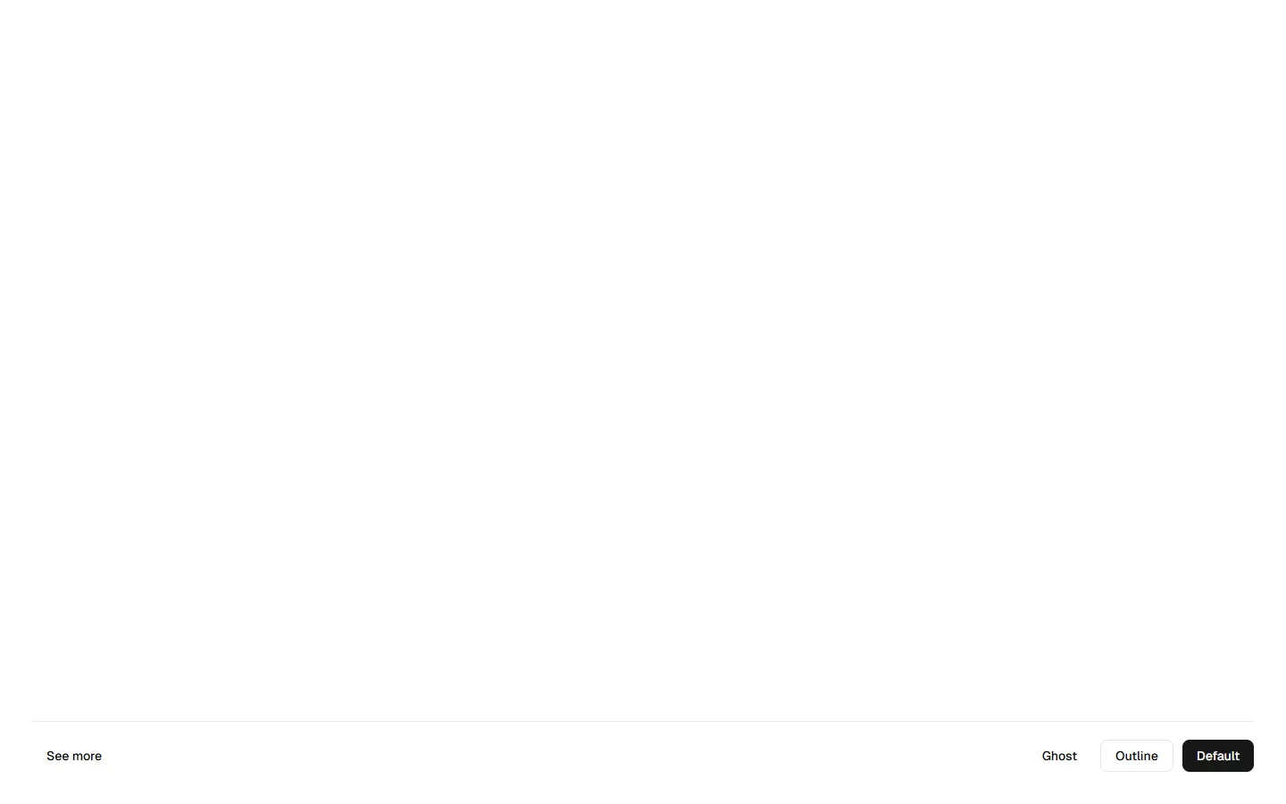
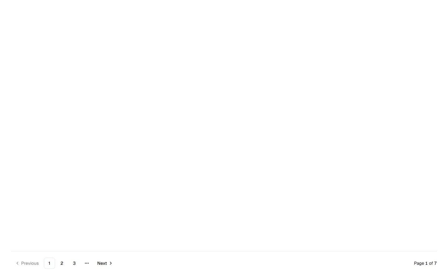
All Section Footers blocks
Section Footer 3
Utility footer with inline controls
A functional footer layout that combines secondary actions with an inline utility element. Uses a horizontal bar to group button variants on one side and a compact search input on the other, creating a balanced, tool-like feel. Scales down cleanly by stacking controls vertically on small screens. Best suited for product or admin contexts where the footer supports ongoing interaction rather than navigation or conversion.
In all Pro bundles
Radix UI
Base UI
8 styles
5 icon sets
SBIOTJ
Join 16,000+ builders shipping with shadcncraft
Get access to this block and the full library
Production-ready blocks and components with matching Figma and React.

Benefits
Production-ready by default
Built with shadcn/ui conventions and designed for real projects.
Built with shadcn/ui
Clean React components using Tailwind and modern shadcn patterns.
Install instantly
Add the block directly using the shadcn CLI.
Works with your theme
Compatible with shadcn themes and token-based color systems.
MCP server support
Use shadcn MCP server right from your favorite AI tools.
Frequently Asked Questions
Yes. They follow shadcn/ui structure and are built for real products.