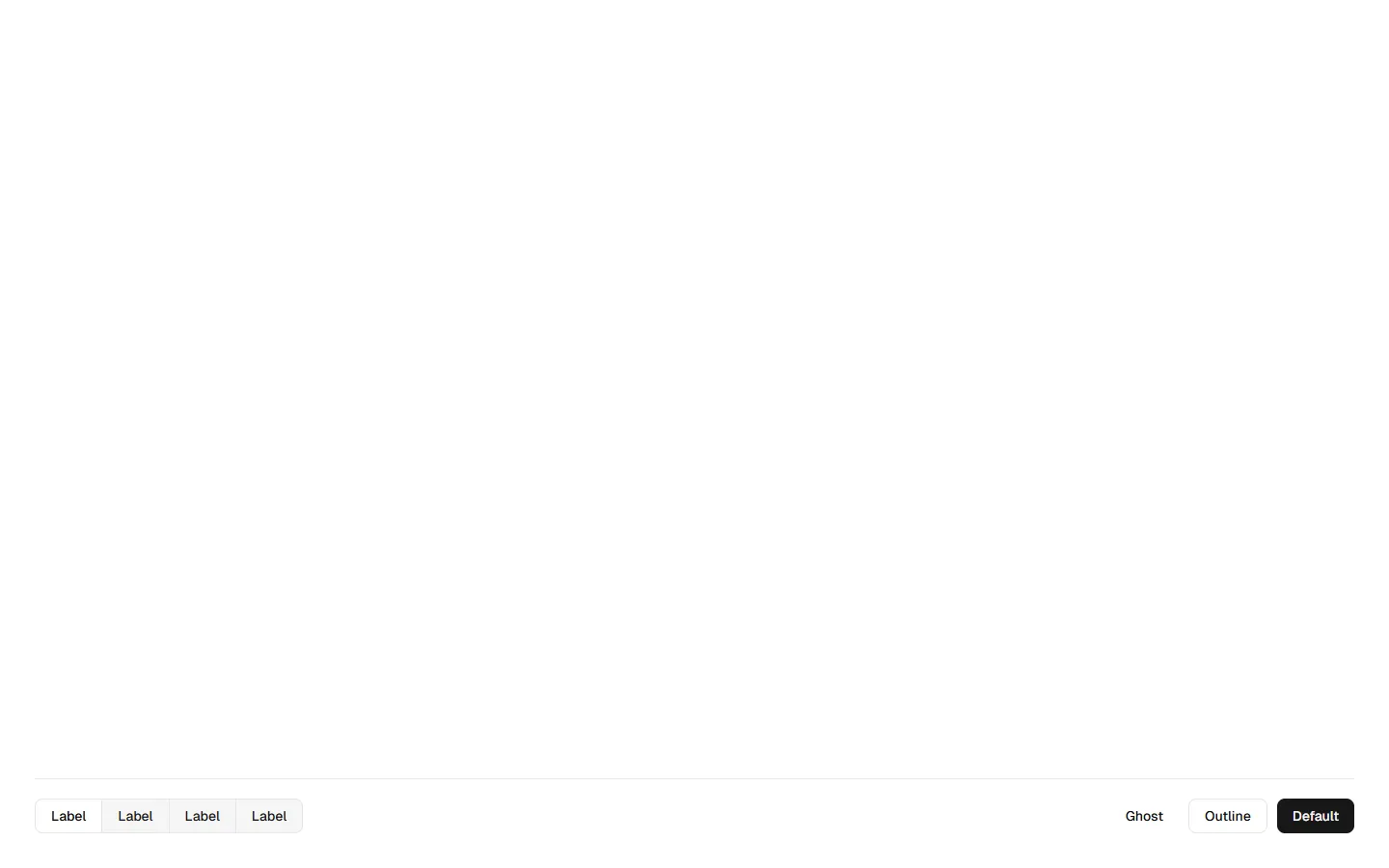
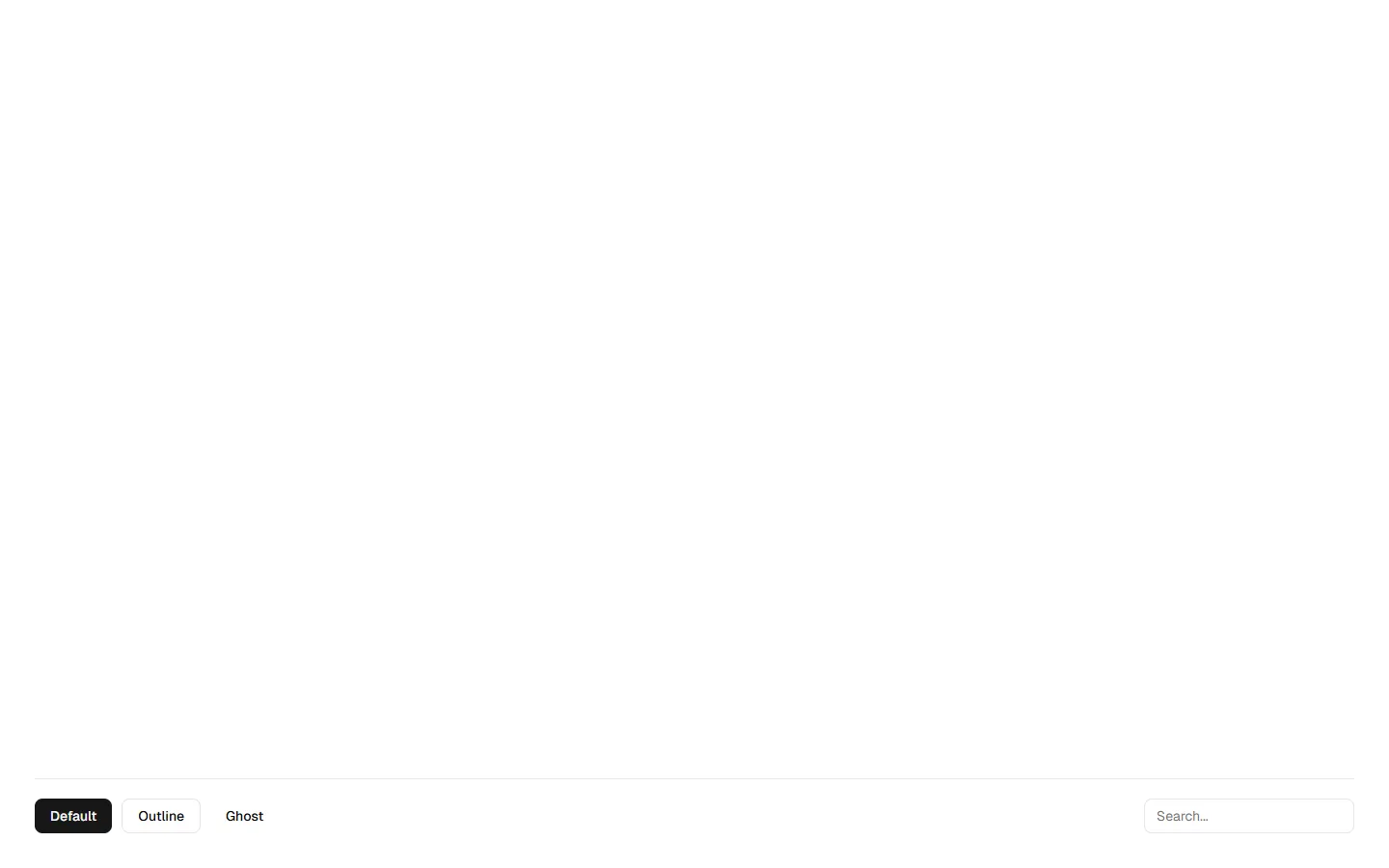
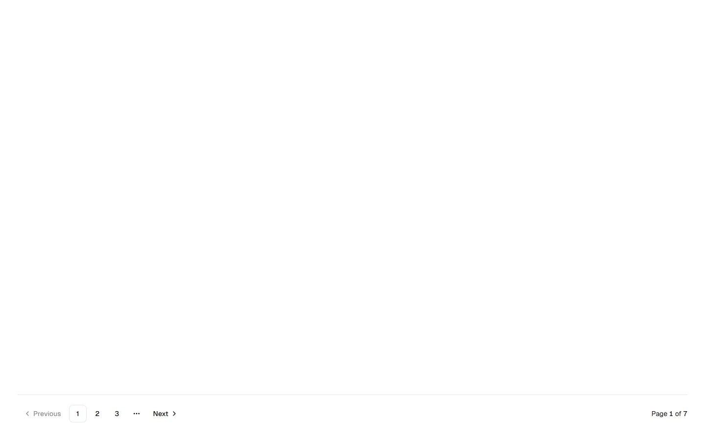
All Section Footers blocks
Section Footer 2
Single-action footer with progressive reveal
A stripped-back footer built around a single, prominent action rather than navigation. Uses a centered or edge-aligned call-to-action with minimal visual noise, designed to extend a page flow rather than close it. Adapts cleanly to smaller screens by stacking the action styles vertically. Best used when the footer's job is to prompt the next step, not provide site-wide links.
In all Pro bundles
Radix UI
Base UI
8 styles
5 icon sets
SBIOTJ
Join 16,000+ builders shipping with shadcncraft
Get access to this block and the full library
Production-ready blocks and components with matching Figma and React.


Benefits
Production-ready by default
Built with shadcn/ui conventions and designed for real projects.
Built with shadcn/ui
Clean React components using Tailwind and modern shadcn patterns.
Install instantly
Add the block directly using the shadcn CLI.
Works with your theme
Compatible with shadcn themes and token-based color systems.
MCP server support
Use shadcn MCP server right from your favorite AI tools.
Frequently Asked Questions
Yes. They follow shadcn/ui structure and are built for real products.