All Progress blocks
Progress 3
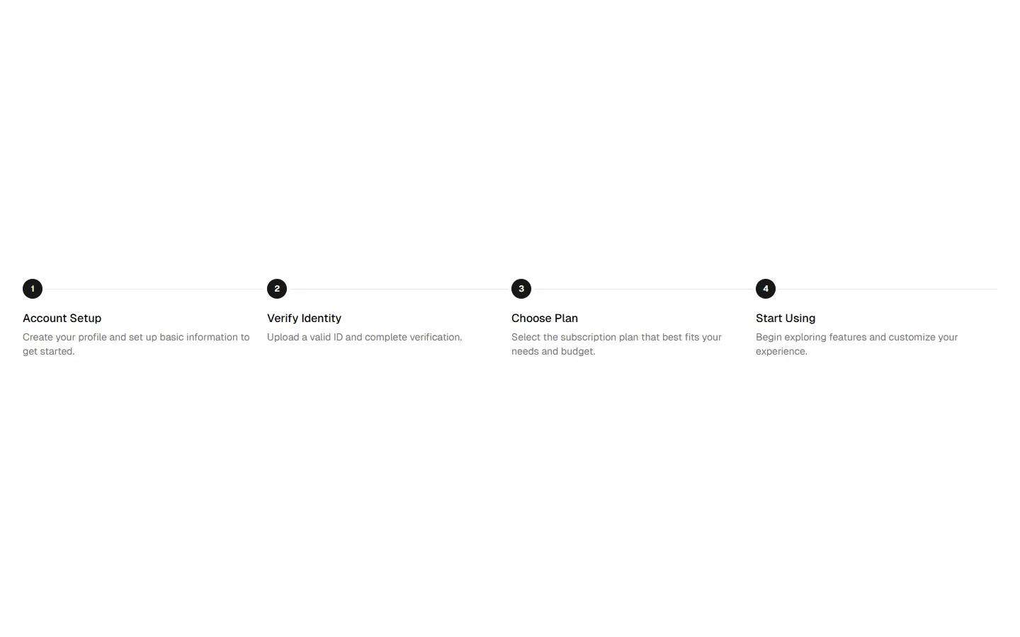
Horizontal completion tracker
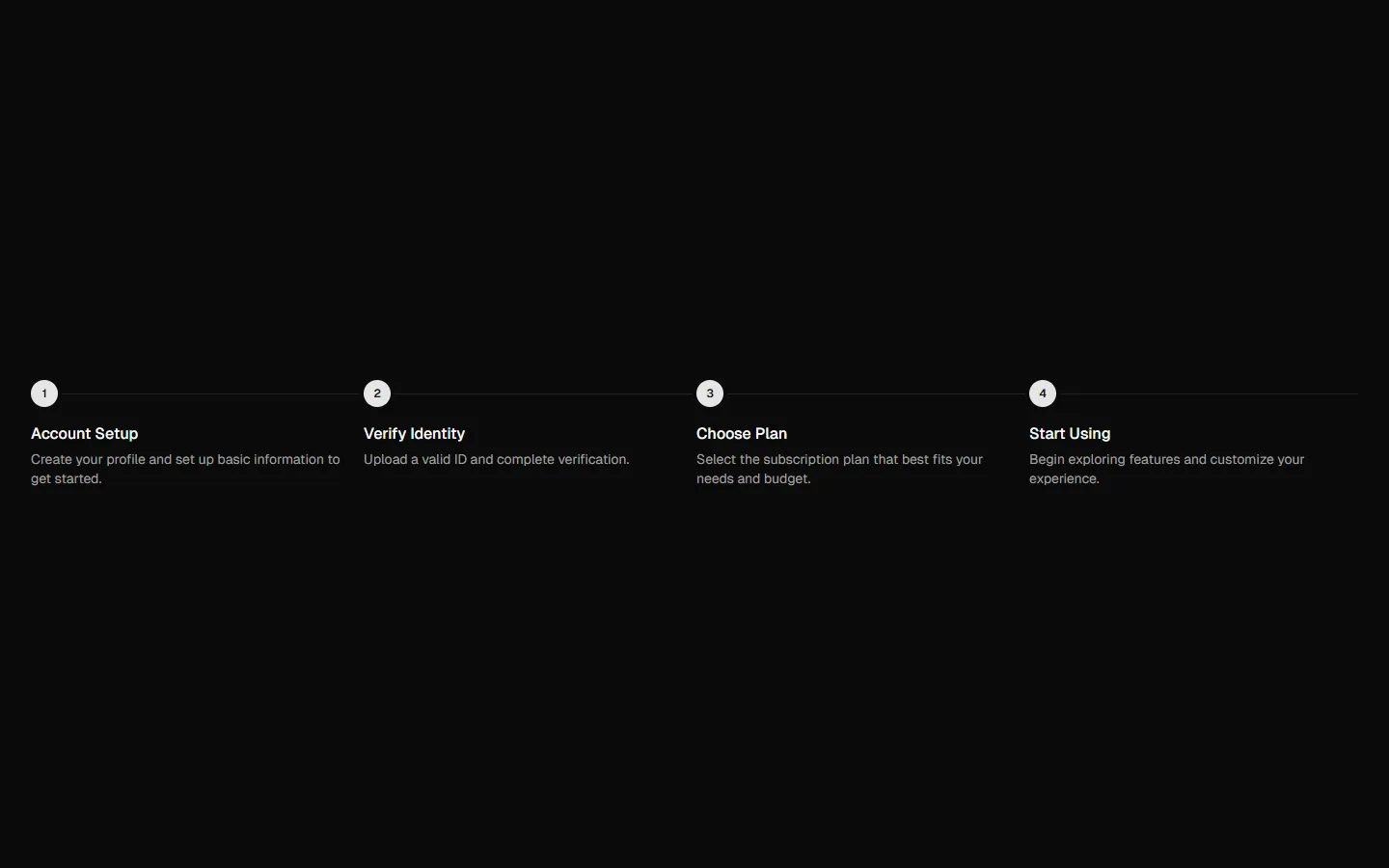
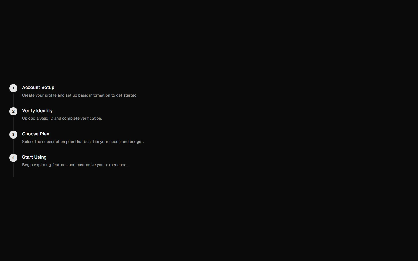
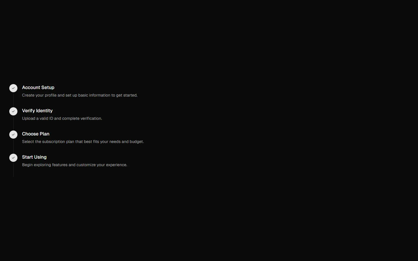
A horizontal stepper that shows progress at a glance. Steps are laid out left to right with a thin connecting line. Completed steps use filled circular check icons, while the current or pending step uses a neutral indicator. Each step includes a short title and supporting description beneath it, balancing status clarity with explanatory context. Best suited for onboarding or checkout flows where users benefit from seeing what’s done and what’s left.
In all Pro bundles
Radix UI
Base UI
8 styles
5 icon sets
Not Allowed
Get access to the full source code by upgrading to Pro Figma + React.
SBIOTJ
Join 16,000+ builders shipping with shadcncraft
Get access to this block and the full library
Production-ready blocks and components with matching Figma and React.

Benefits
Production-ready by default
Built with shadcn/ui conventions and designed for real projects.
Built with shadcn/ui
Clean React components using Tailwind and modern shadcn patterns.
Install instantly
Add the block directly using the shadcn CLI.
Works with your theme
Compatible with shadcn themes and token-based color systems.
MCP server support
Use shadcn MCP server right from your favorite AI tools.
Frequently Asked Questions
Yes. They follow shadcn/ui structure and are built for real products.