All Progress blocks
Progress 1
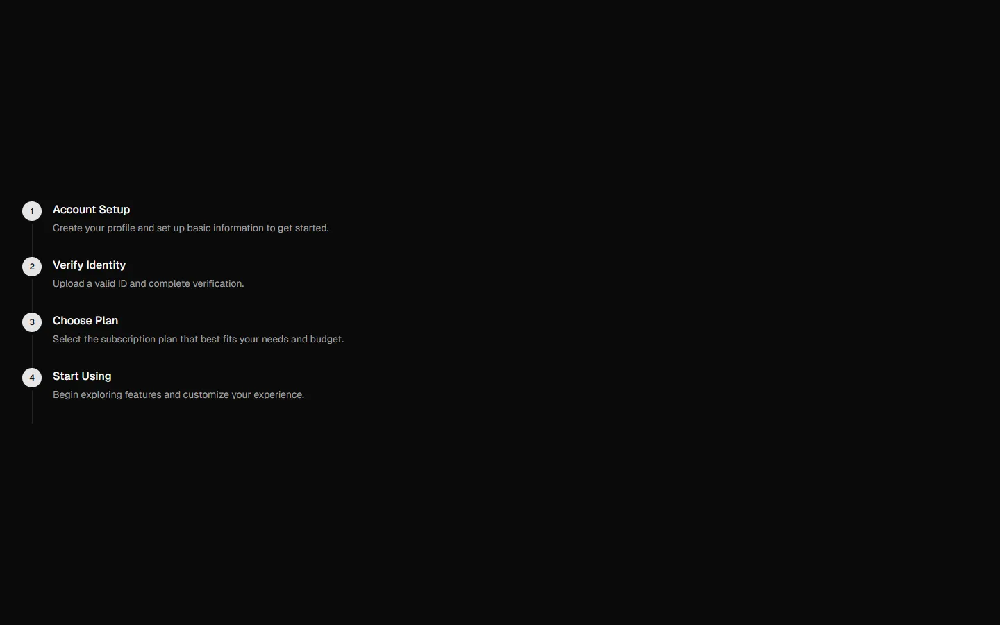
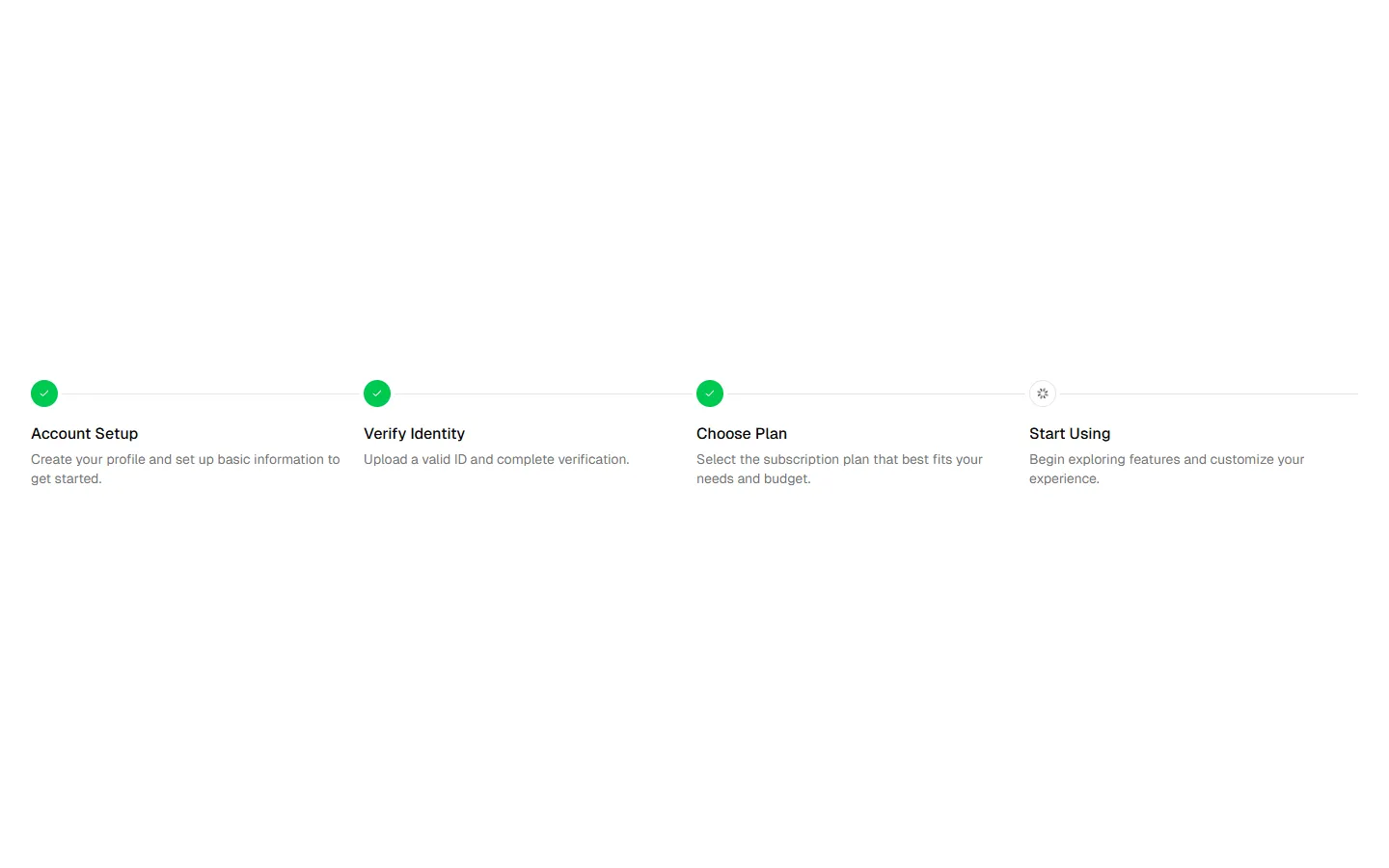
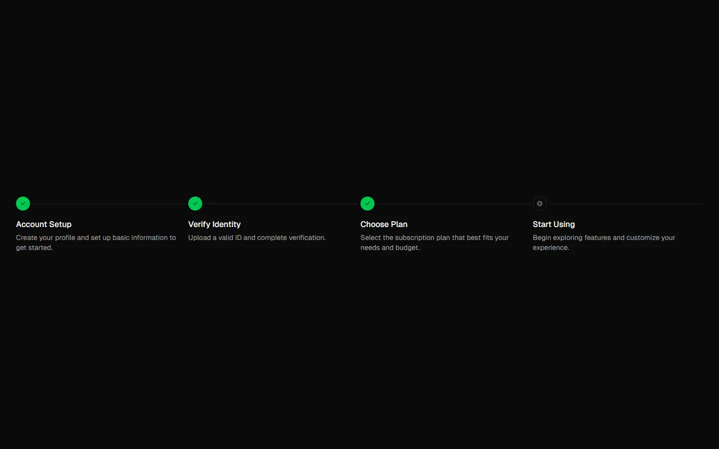
Horizontal step overview
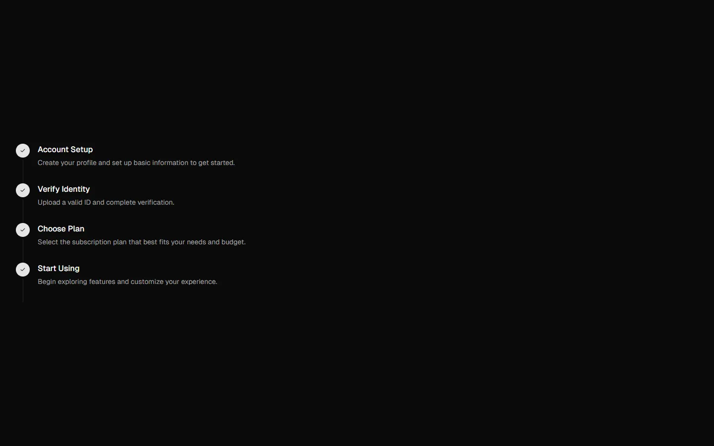
A clean, linear progress bar that spreads steps evenly across the page. Each step is anchored by a numbered marker with a short title and supporting line of text below it. The connecting line is subtle and continuous, keeping focus on sequence rather than state. It reads left to right at a glance and works well as a high-level orientation pattern rather than an active control.
In all Pro bundles
Radix UI
Base UI
8 styles
5 icon sets
Not Allowed
Get access to the full source code by upgrading to Pro Figma + React.
SBIOTJ
Join 16,000+ builders shipping with shadcncraft
Get access to this block and the full library
Production-ready blocks and components with matching Figma and React.

Benefits
Production-ready by default
Built with shadcn/ui conventions and designed for real projects.
Built with shadcn/ui
Clean React components using Tailwind and modern shadcn patterns.
Install instantly
Add the block directly using the shadcn CLI.
Works with your theme
Compatible with shadcn themes and token-based color systems.
MCP server support
Use shadcn MCP server right from your favorite AI tools.
Frequently Asked Questions
Yes. They follow shadcn/ui structure and are built for real products.