All Metrics blocks
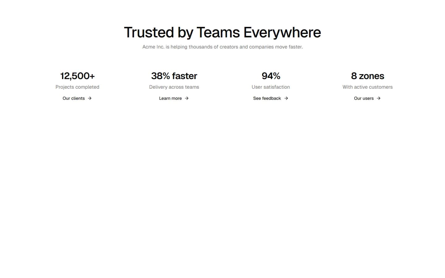
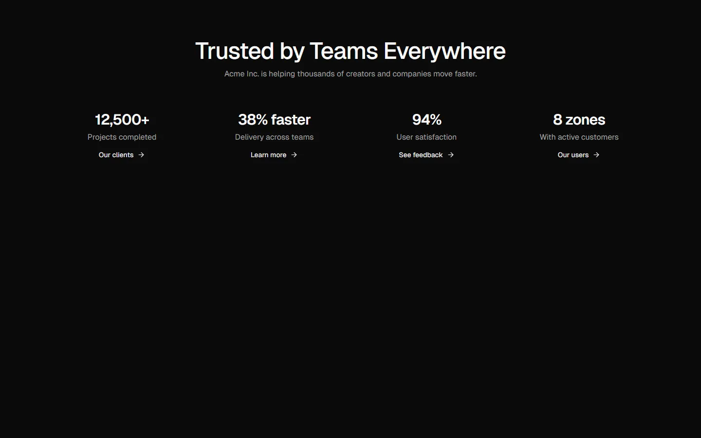
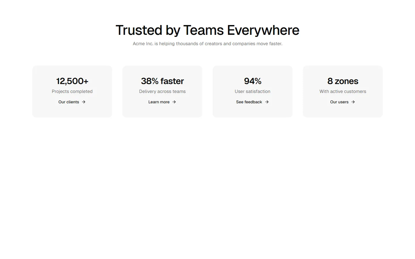
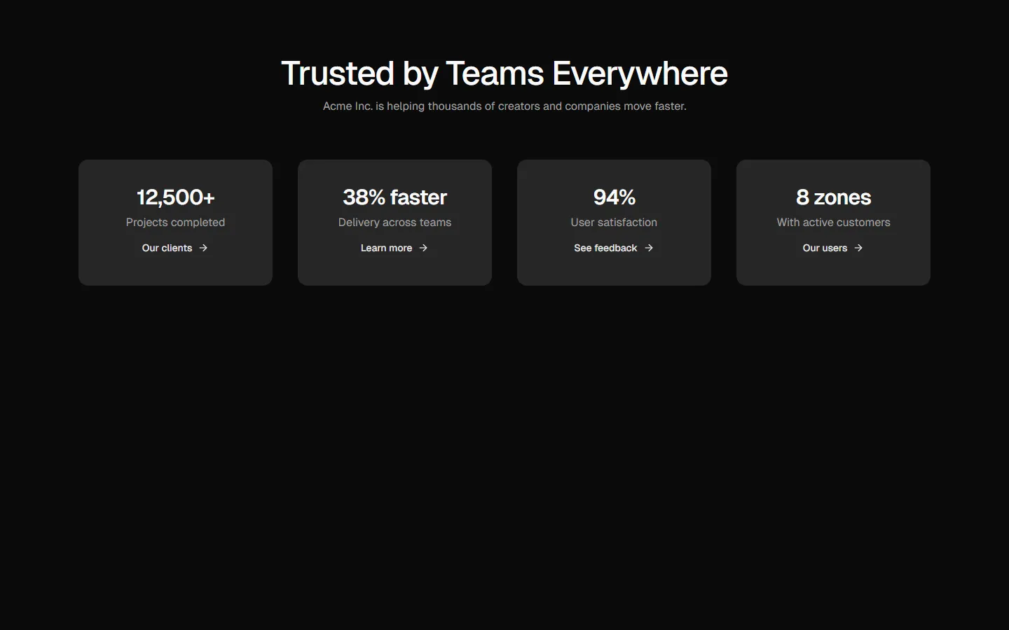
Metrics 3
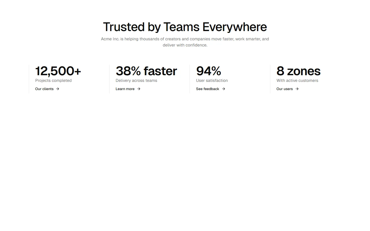
Split content with media anchor
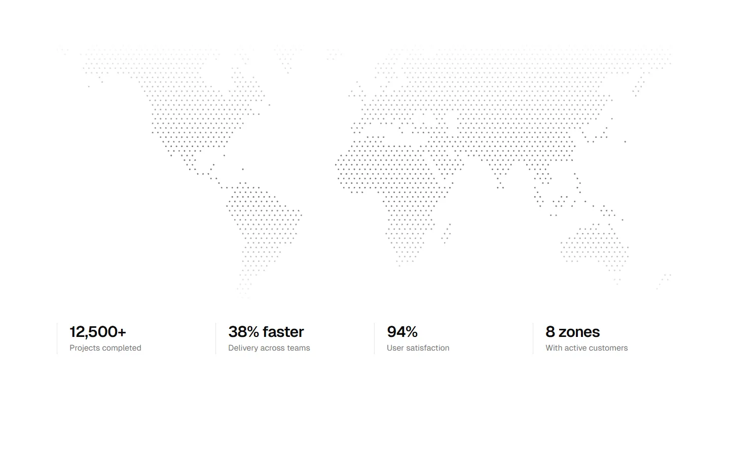
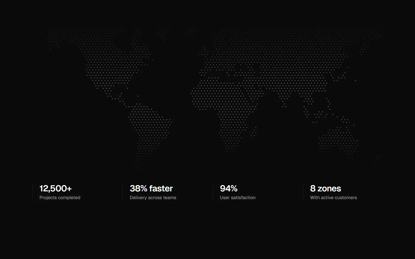
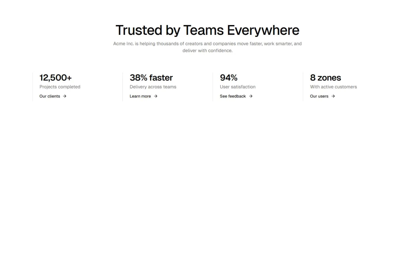
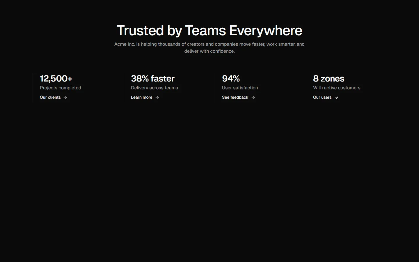
A two-column metrics layout that pairs a text-led stats group with a strong visual anchor. The pattern uses a left-aligned heading and compact metric blocks, balanced by a fixed-aspect image on the opposite side to create visual weight. On mobile, the image drops below the metrics and the stats stack vertically, preserving hierarchy and scanability.
In Pro & Pro + React
Radix UI
Base UI
8 styles
5 icon sets
Not Allowed
Get access to the full source code by upgrading to Pro + React.
SBIOTJ
Join 9,000+ builders shipping with shadcncraft
Get access to this block and the full library
Production-ready blocks and components with matching Figma and React.


Benefits
Production-ready by default
Built with shadcn/ui conventions and designed for real projects.
Built with shadcn/ui
Clean React components using Tailwind and modern shadcn patterns.
Install instantly
Add the block directly using the shadcn CLI.
Works with your theme
Compatible with shadcn themes and token-based color systems.
MCP server support
Use shadcn MCP server right from your favorite AI tools.
Frequently Asked Questions
Yes. They follow shadcn/ui structure and are built for real products.