All Heroes blocks
Hero 14
Split product hero with grainy mesh-gradient shader
A split hero that leads with the visual: a tall animated mesh-gradient shader panel on the left, airbrushed into stipple with film grain and soft paper creases, holds a portrait token card with the selected colour shown large above a list of five tokens from the panel's own palette. The two-tone headline, copy and one primary action sit at the bottom right. The panel moves below the copy on mobile. Best for design tools and product-led launches.
In all Pro bundles
Radix UI
Base UI
8 styles
5 icon sets
Own this code forever
Build with your AI agents or bring the code into your own codebase.
Already have a license key?
SBIOTJ
Join 16,000+ builders shipping with shadcncraft
Get access to this block and the full library
Production-ready blocks and components with matching Figma and React.

Benefits
Production-ready by default
Built with shadcn/ui conventions and designed for real projects.
Built with shadcn/ui
Clean React components using Tailwind and modern shadcn patterns.
Install instantly
Add the block directly using the shadcn CLI.
Works with your theme
Compatible with shadcn themes and token-based color systems.
MCP server support
Use shadcn MCP server right from your favorite AI tools.
Frequently Asked Questions
Yes. They follow shadcn/ui structure and are built for real products.
All blocks
More Heroes
Pro
Hero 26
Oversized headline with quote and logos over a warm mesh wash


Pro
Hero 25
Split hero with guest list card over grainy overlapping petals


Pro
Hero 24
Centred hero with home energy card inside a ring of soft orbs


Pro
Hero 23
Split hero with savings pots card over stepped pastel bands


Pro
Hero 22
Split hero with wind-down card under a half-disc behind fluted glass


Pro
Hero 21
Left-aligned hero with launch timeline beside a ribbon behind frosted glass


Pro
Hero 20
Split hero with code review card over stepped glass slats


Pro
Hero 19
Centered hero with live feed over frosted-glass dots


Pro
Hero 18
Sunlit water hero with forecast panel


Pro
Hero 17
Centered hero with search card over a halo


Pro
Hero 16
Glass panes hero with display headline


Pro
Hero 15
Radiance hero with roadmap card


Pro
Hero 13
Split API hero with fluted-glass shader


Pro
Hero 12
Split hero with terrain map over contour lines


Pro
Hero 11
Aurora shader hero


Pro
Hero 10
Full-bleed image hero


Pro
Hero 9
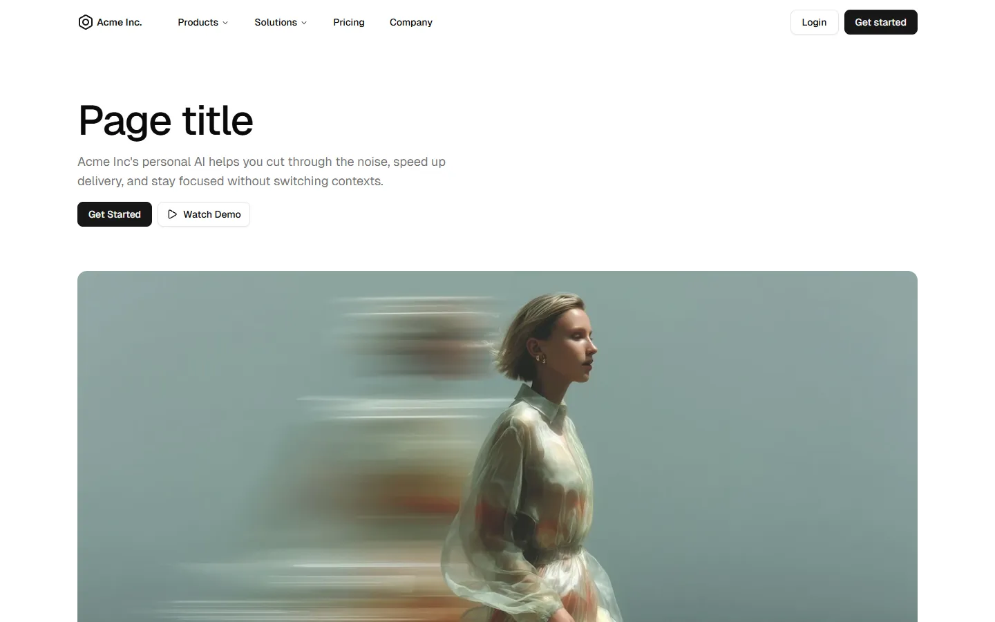
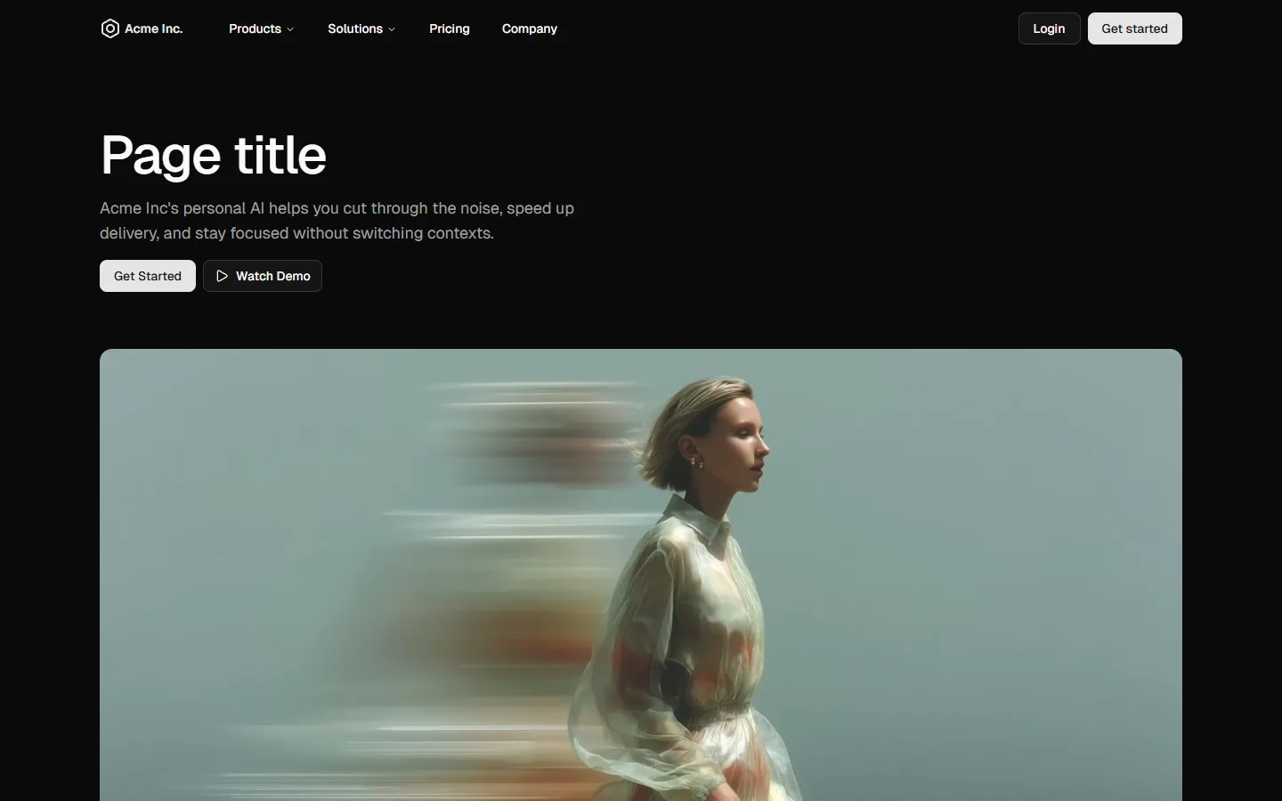
Page header with supporting visual
Pro
Hero 8
Minimal page header
Pro
Hero 7
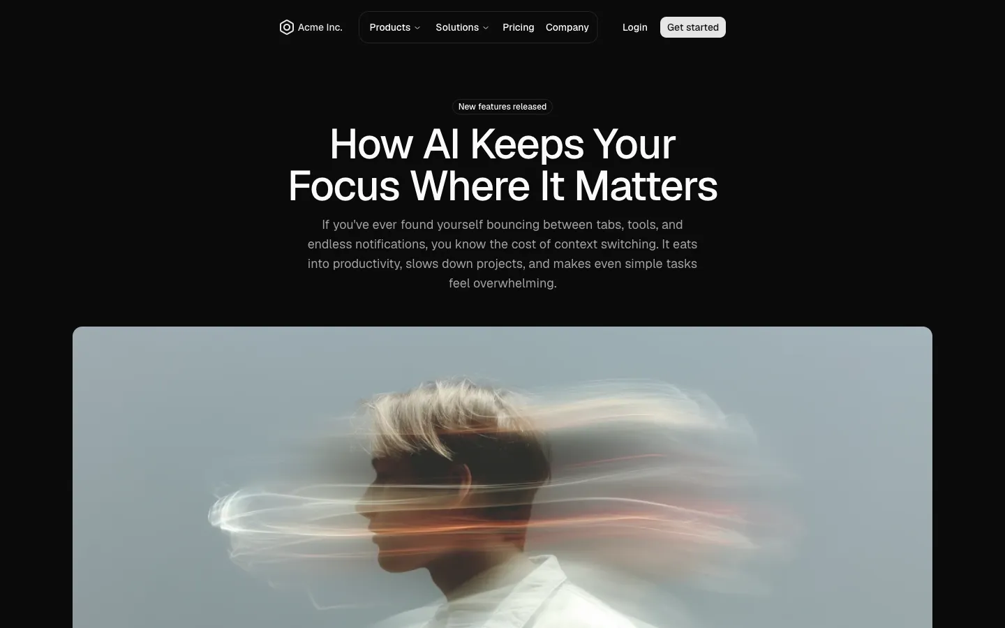
Editorial story hero

Pro
Hero 6
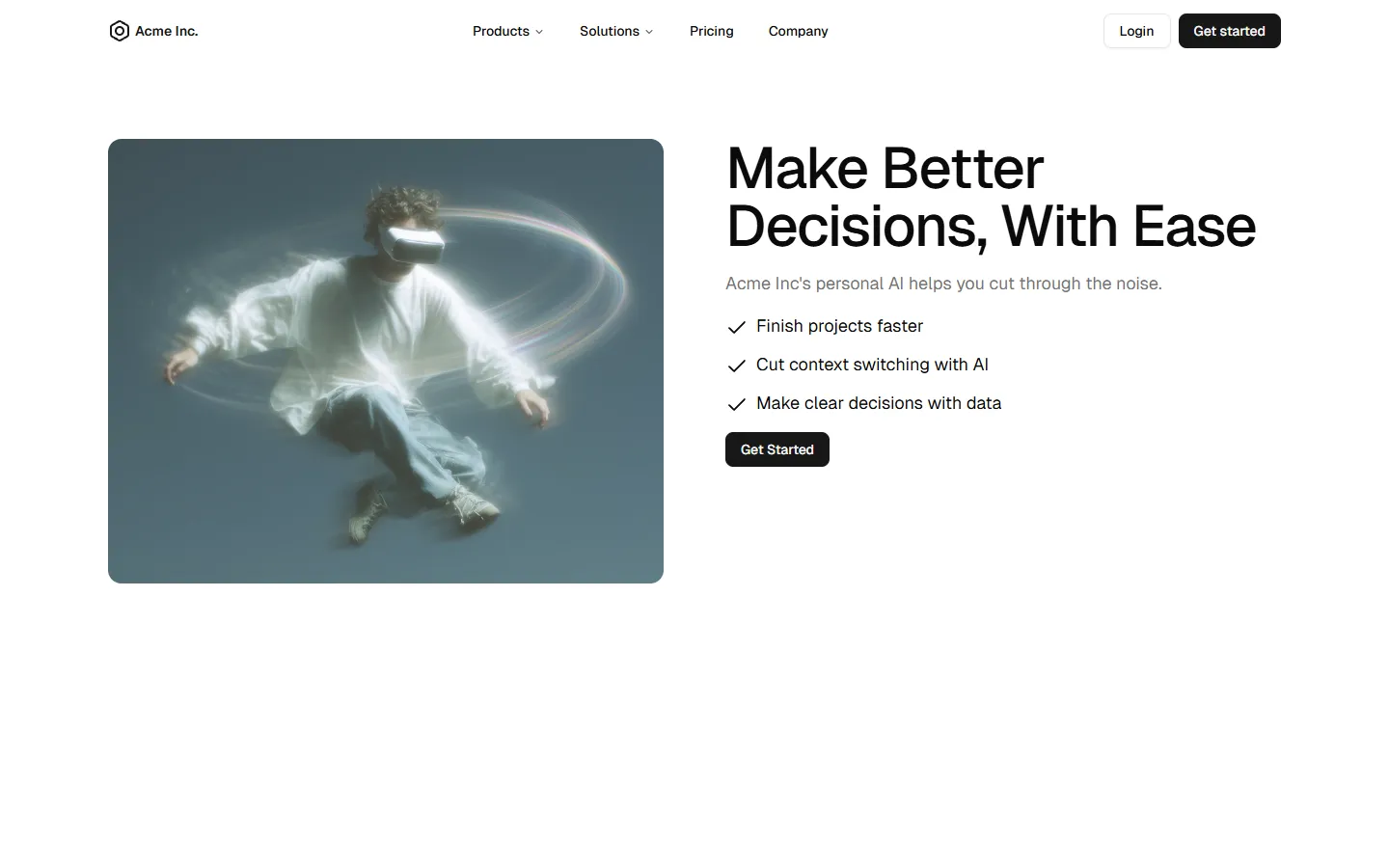
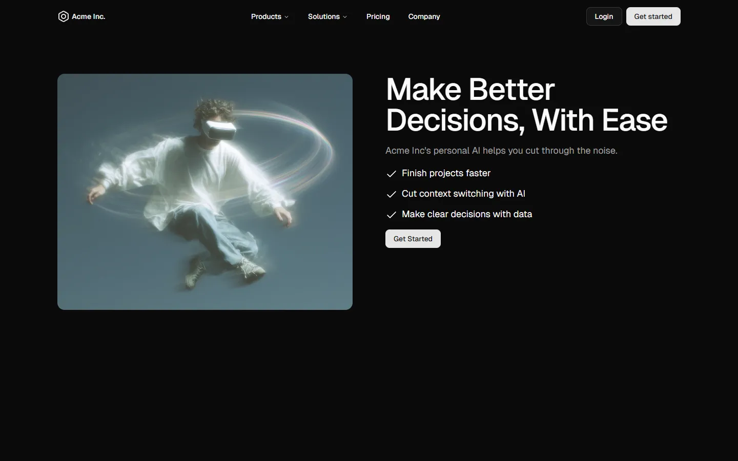
Feature-led split hero
Pro
Hero 5
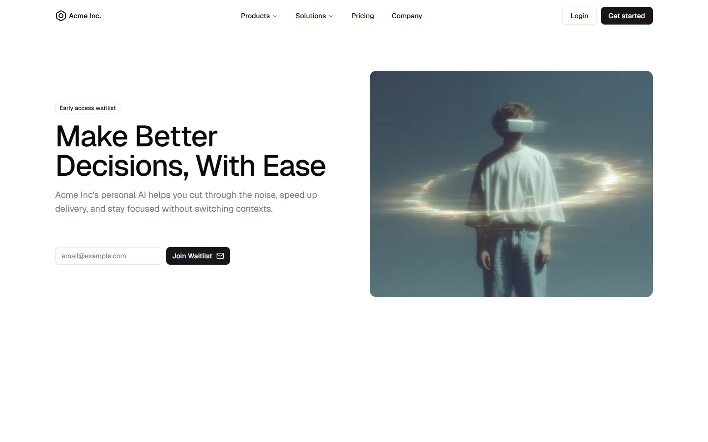
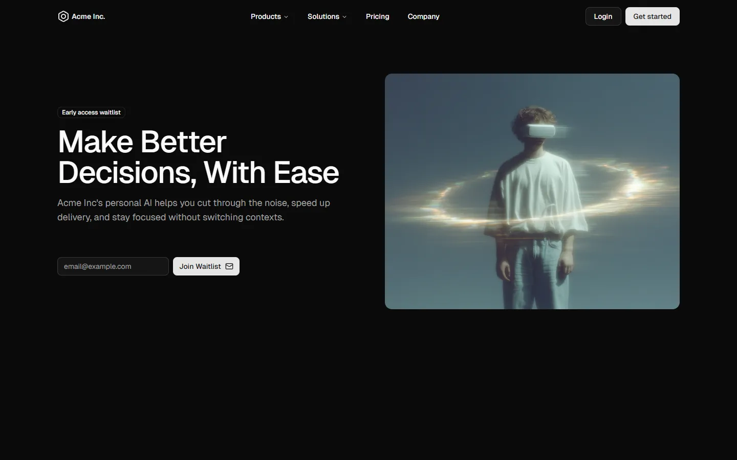
Split layout with waitlist capture
Pro
Hero 4
Soft gradient hero with dual CTAs and rating
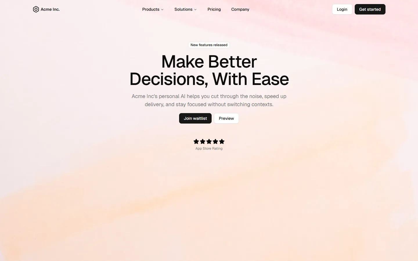
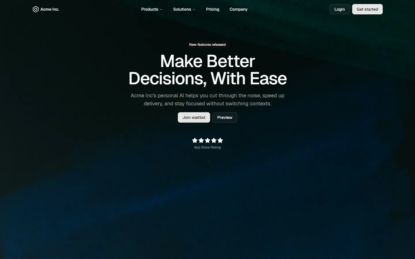
Pro
Hero 3
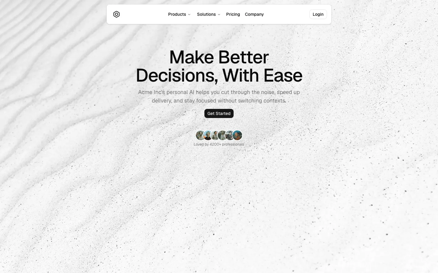
Light background with centered content
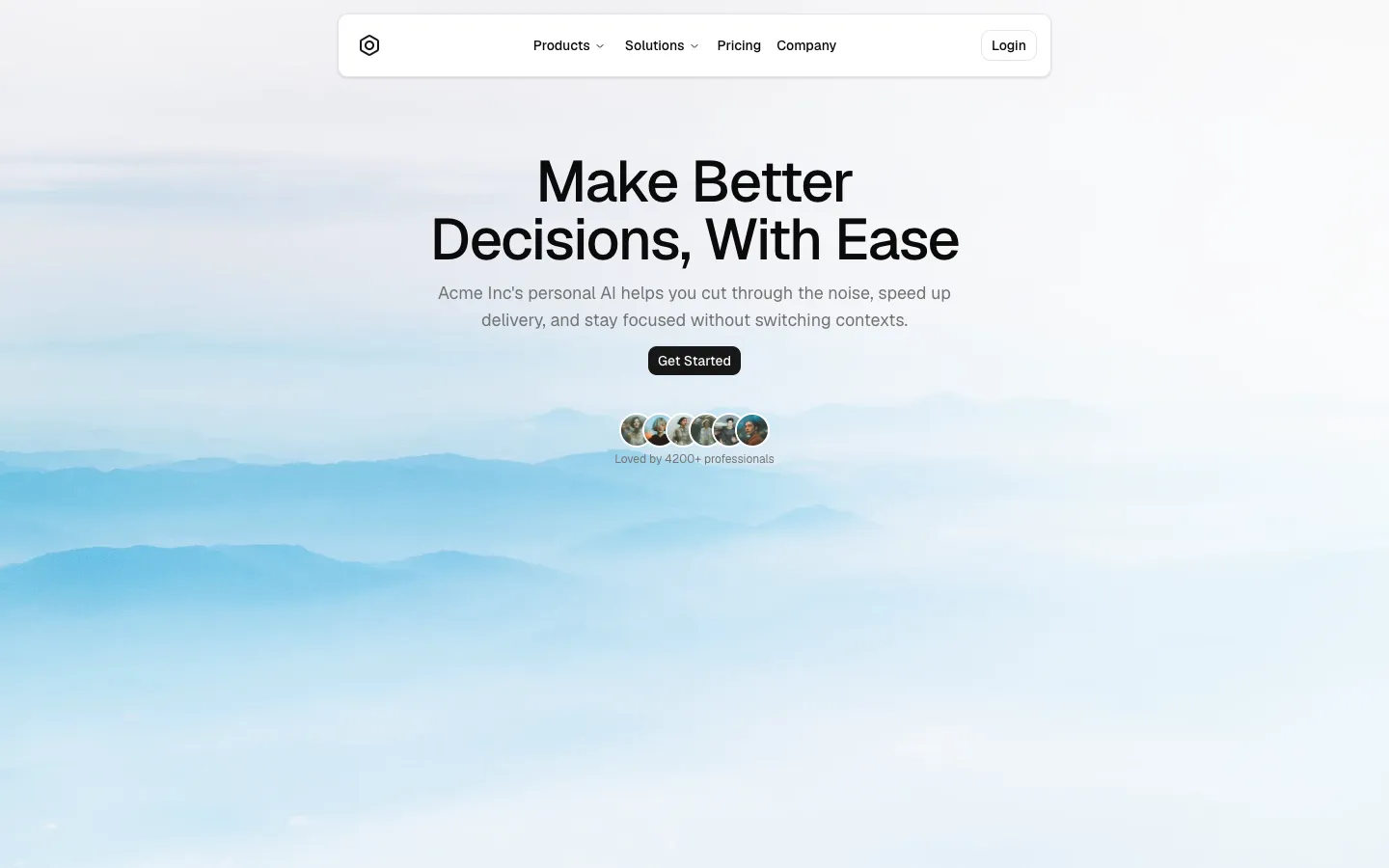
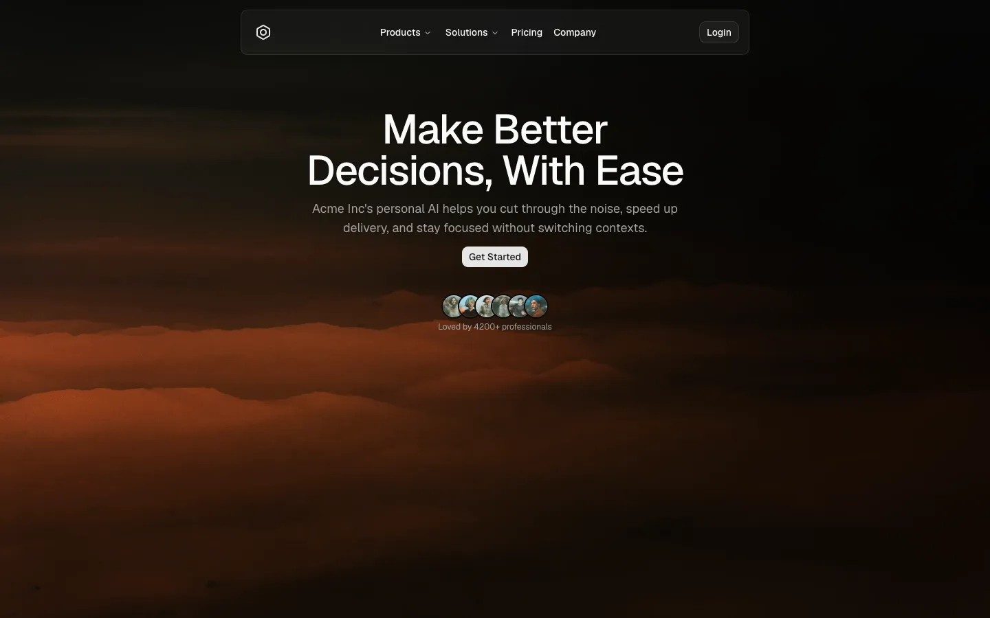
Pro
Hero 2
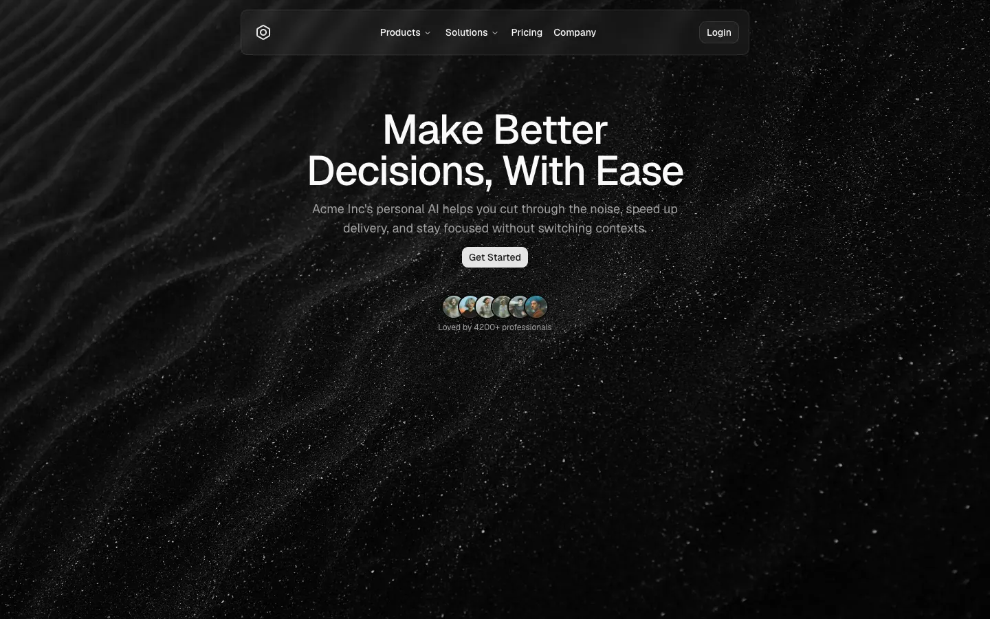
Full-bleed background with centered content
Pro
Hero 1
Centered headline with media hero