All Benefits blocks
Benefits 26
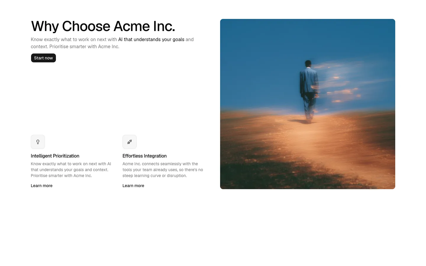
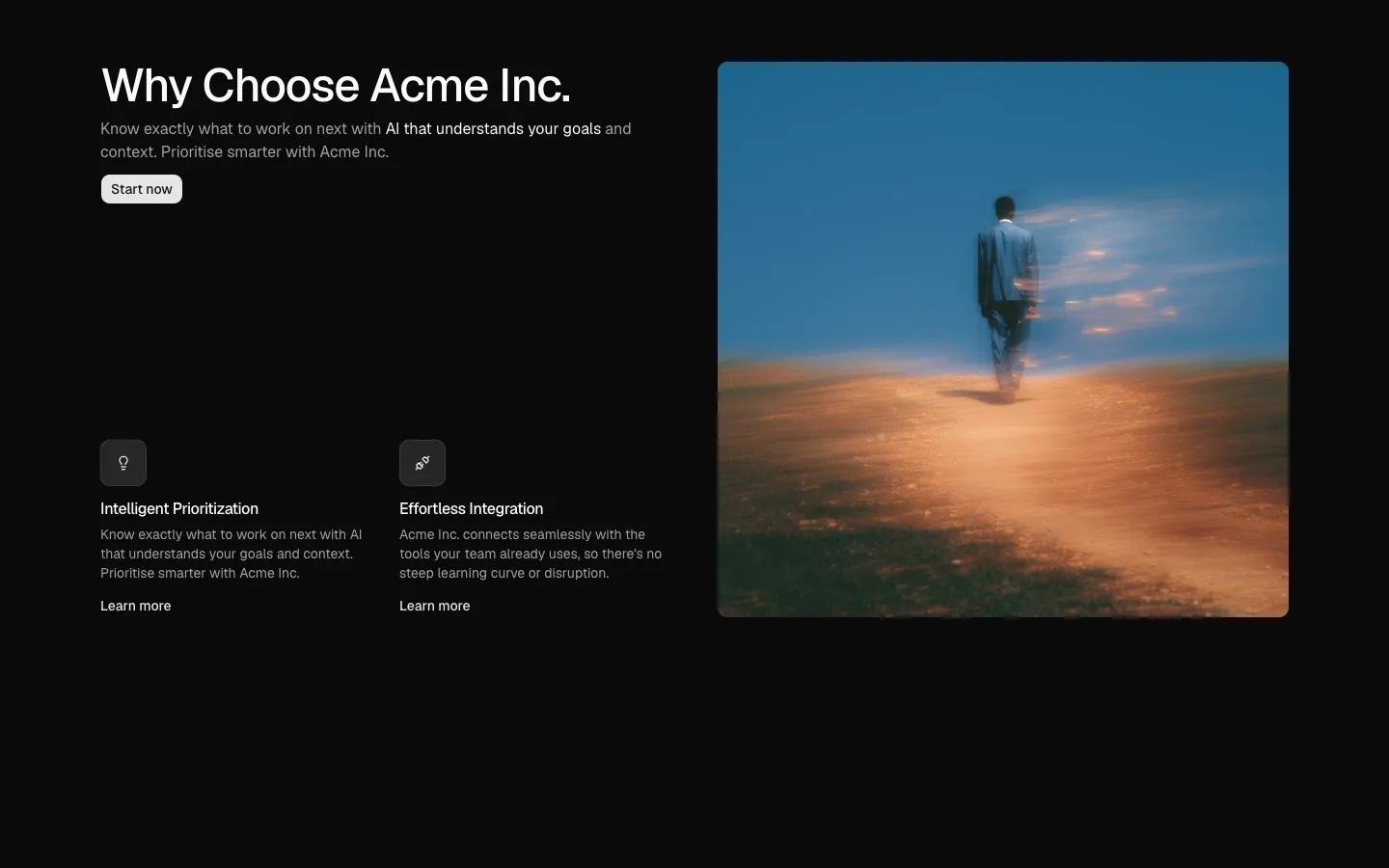
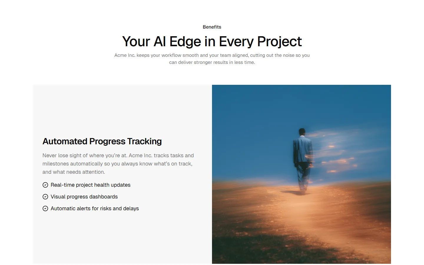
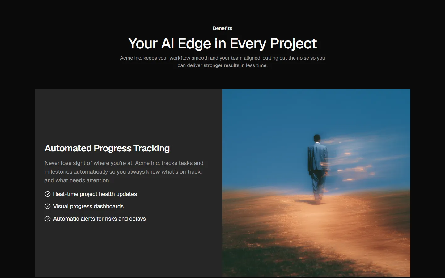
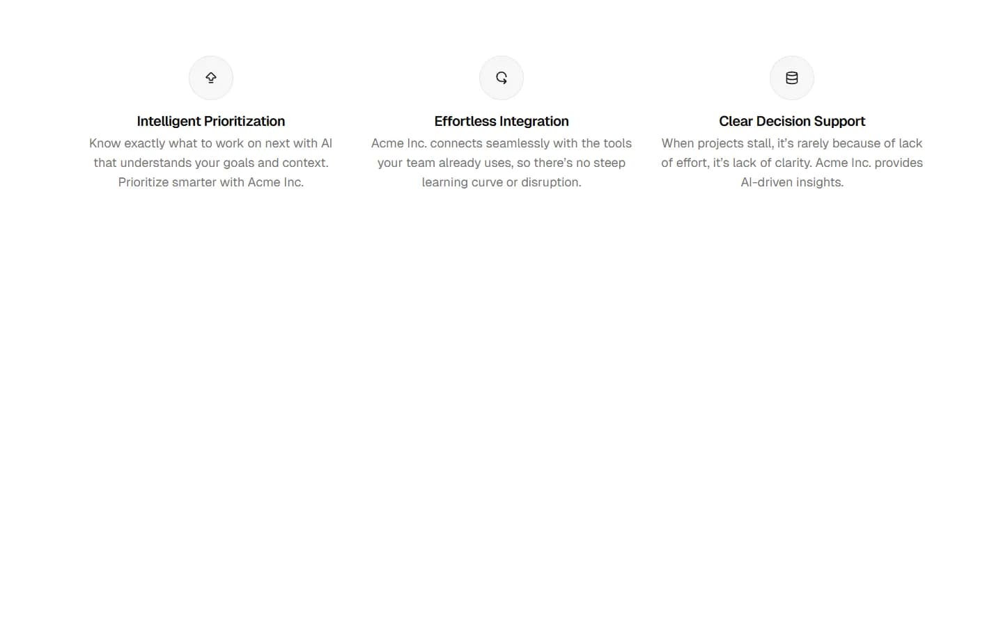
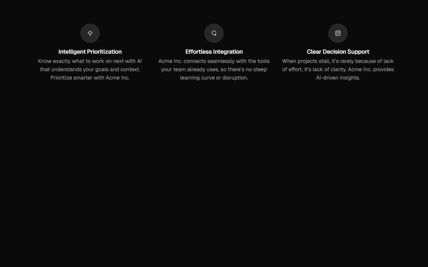
Centered heading with feature list and side image
A benefits section with a centered heading, tagline, intro copy, and a single CTA button, followed by a two-part layout: three icon-led feature stacks with Learn more links on the left and a large rounded image spanning the right two thirds. On mobile the image sits above the stacked features. Use to pitch three core advantages alongside strong brand imagery.
New
In Pro Figma & Pro Figma + React
Radix UI
Base UI
8 styles
5 icon sets
Not Allowed
Get access to the full source code by upgrading to Pro Figma + React.
SBIOTJ
Join 9,000+ builders shipping with shadcncraft
Get access to this block and the full library
Production-ready blocks and components with matching Figma and React.
Benefits
Production-ready by default
Built with shadcn/ui conventions and designed for real projects.
Built with shadcn/ui
Clean React components using Tailwind and modern shadcn patterns.
Install instantly
Add the block directly using the shadcn CLI.
Works with your theme
Compatible with shadcn themes and token-based color systems.
MCP server support
Use shadcn MCP server right from your favorite AI tools.
Frequently Asked Questions
Yes. They follow shadcn/ui structure and are built for real products.
All blocks
More Benefits
Pro
Benefits 1
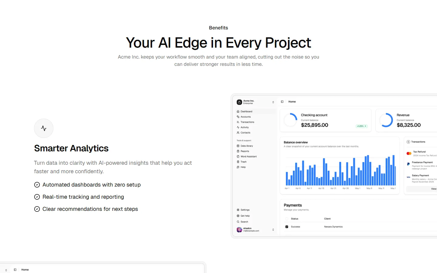
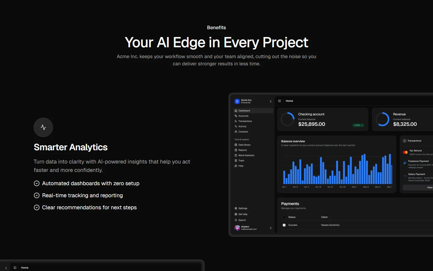
Alternating rows with text and image
Pro
Benefits 2
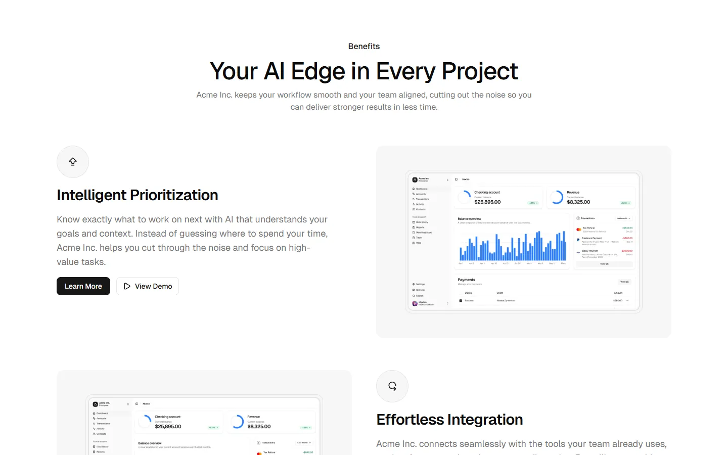
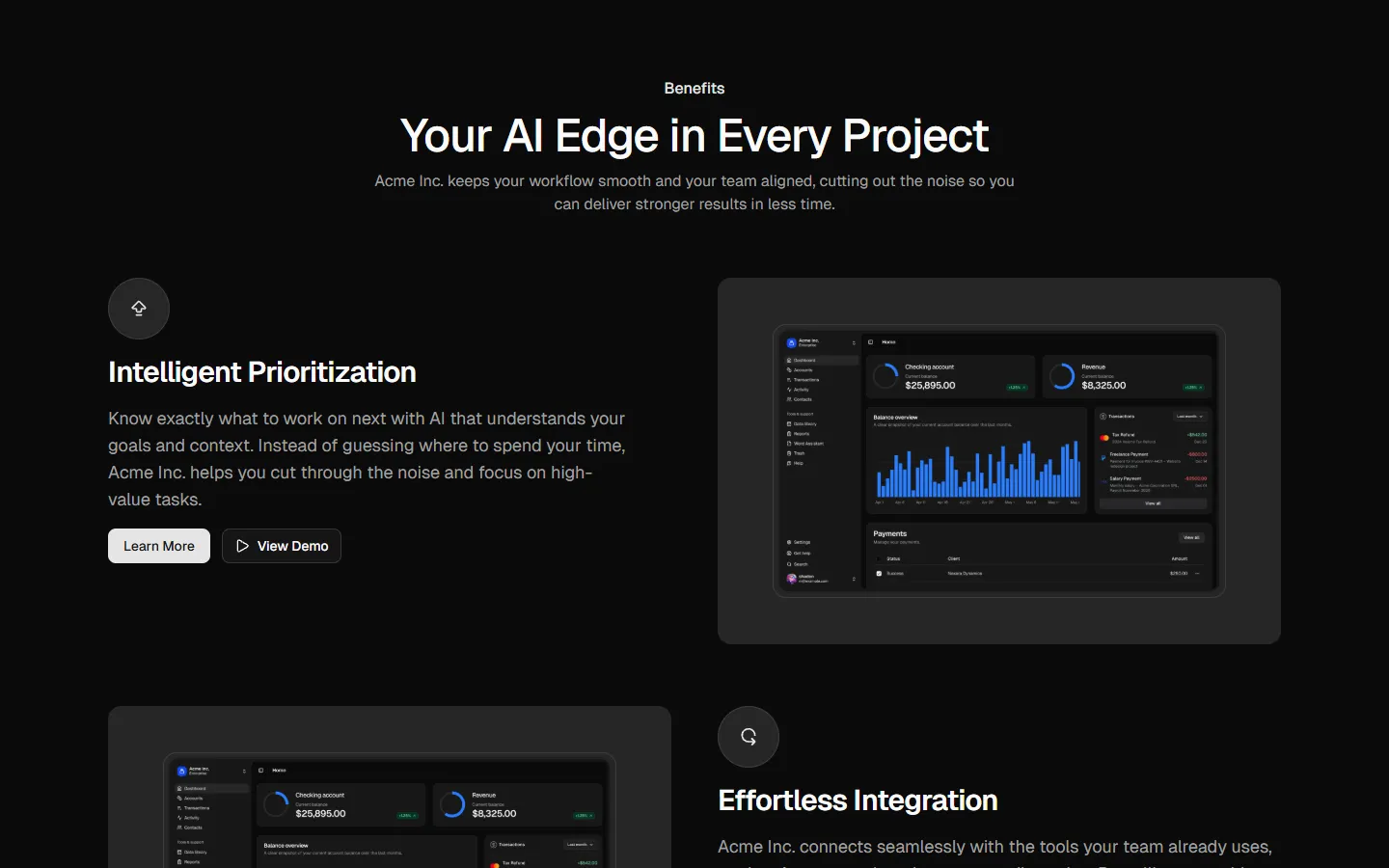
Alternating rows with actions and image
Pro
Benefits 3
Stacked sections with full-bleed media
Pro
Benefits 4
Compact icon list
Pro
Benefits 5
Icon grid
Pro
Benefits 6
Image-led cards
Pro
Benefits 7
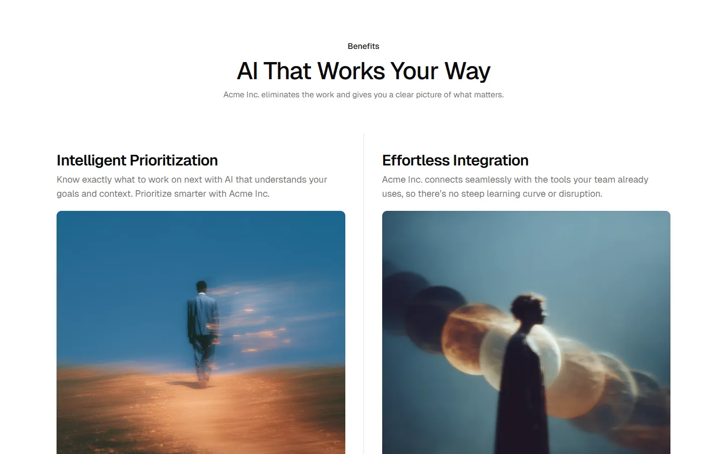
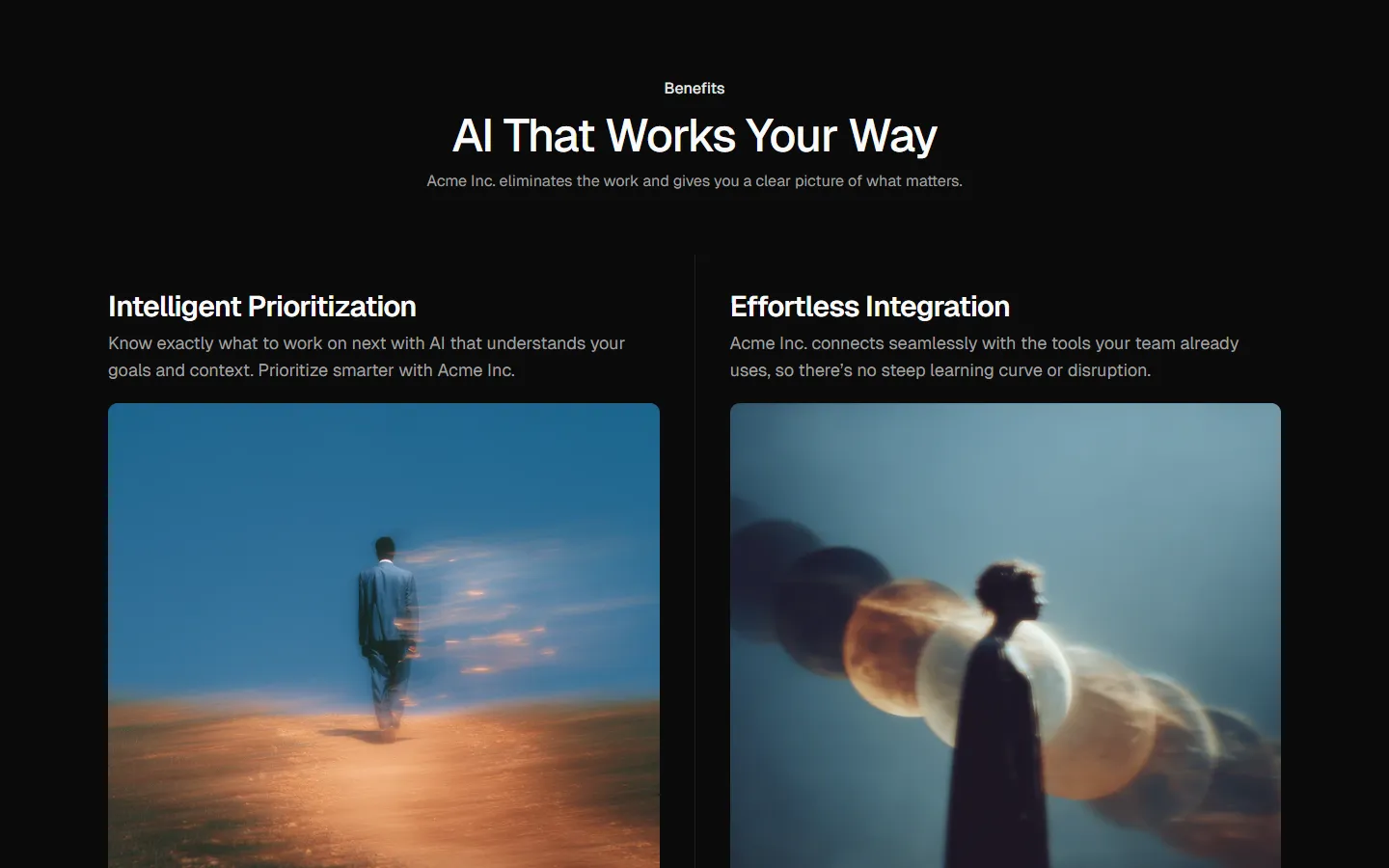
Split highlights with supporting list
Pro
Benefits 8
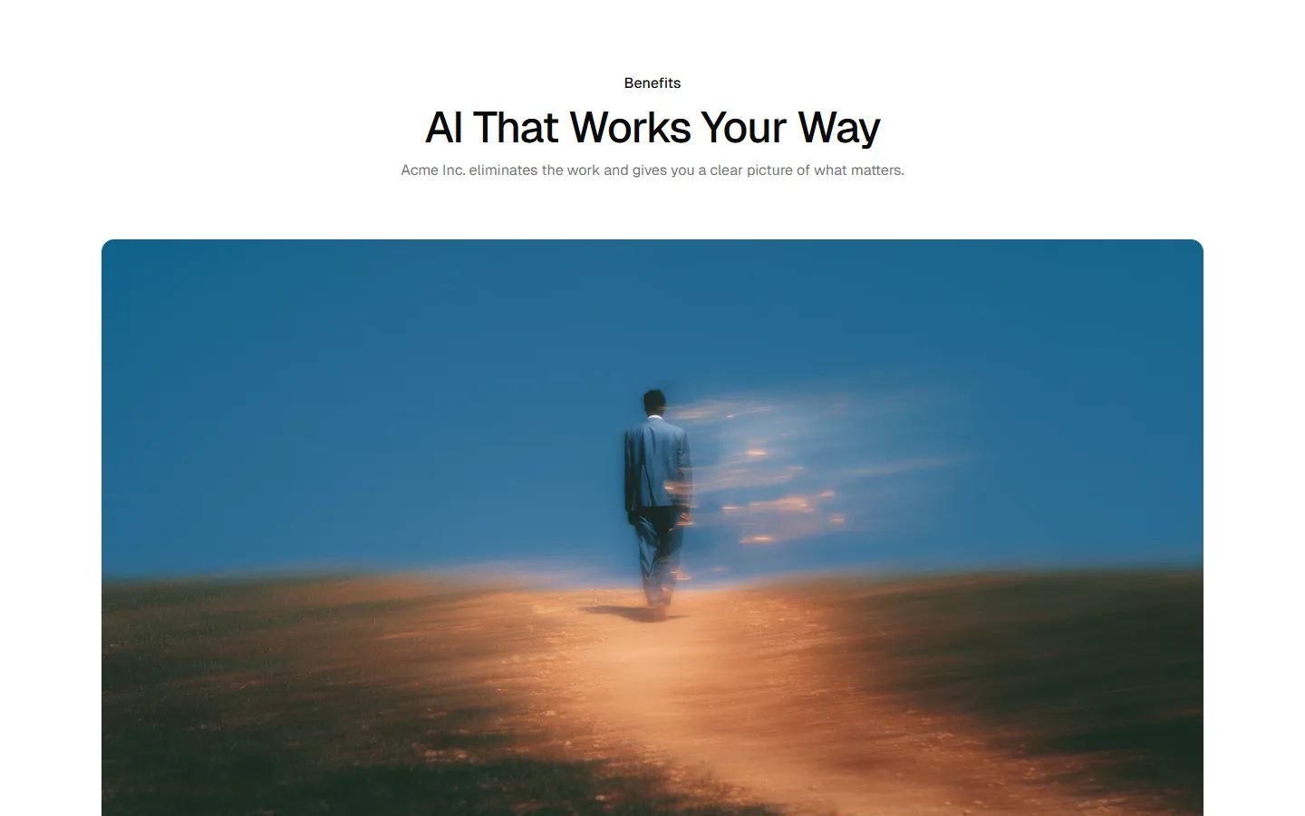
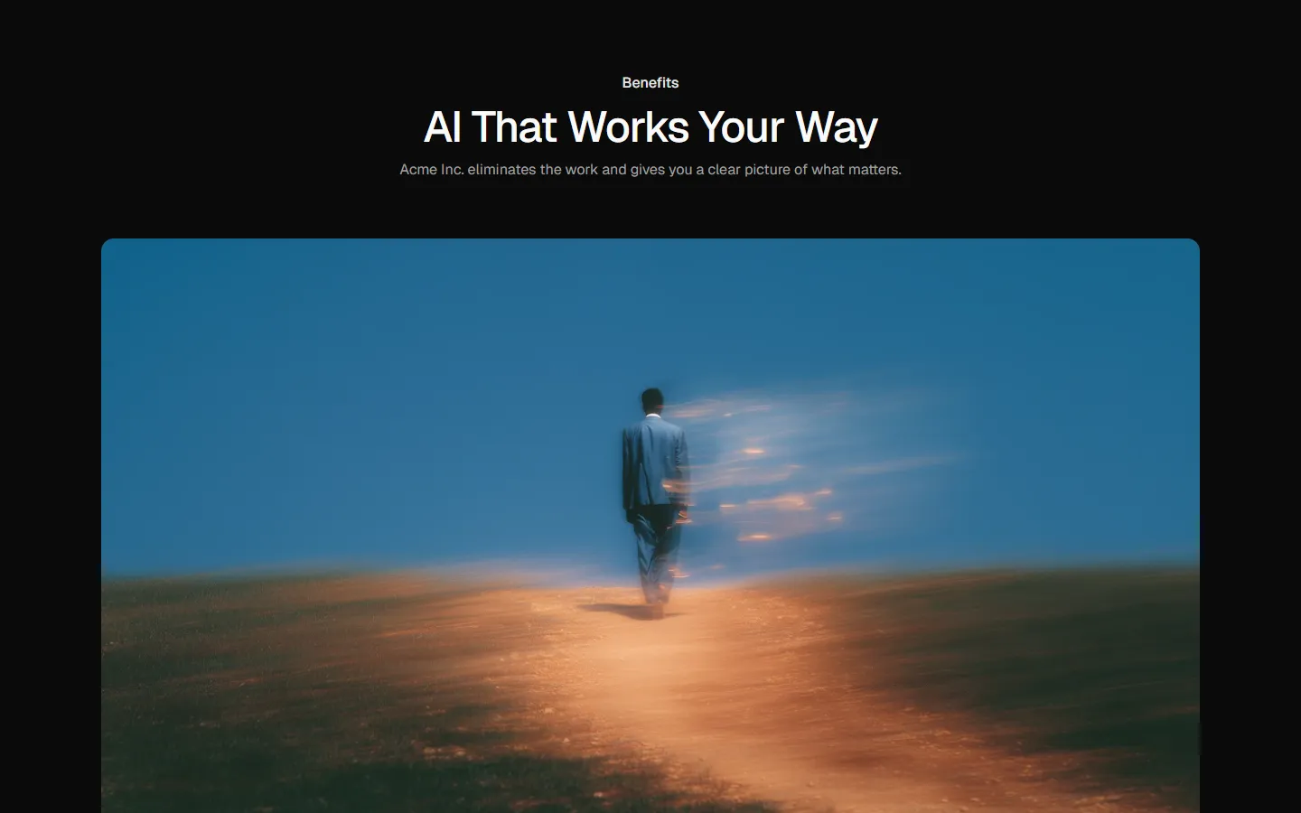
Hero media with supporting list
Pro
Benefits 9
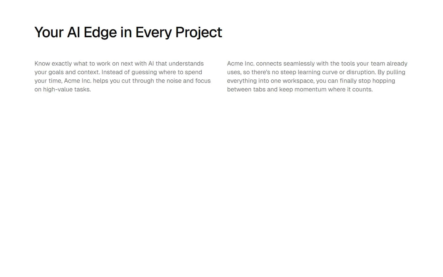
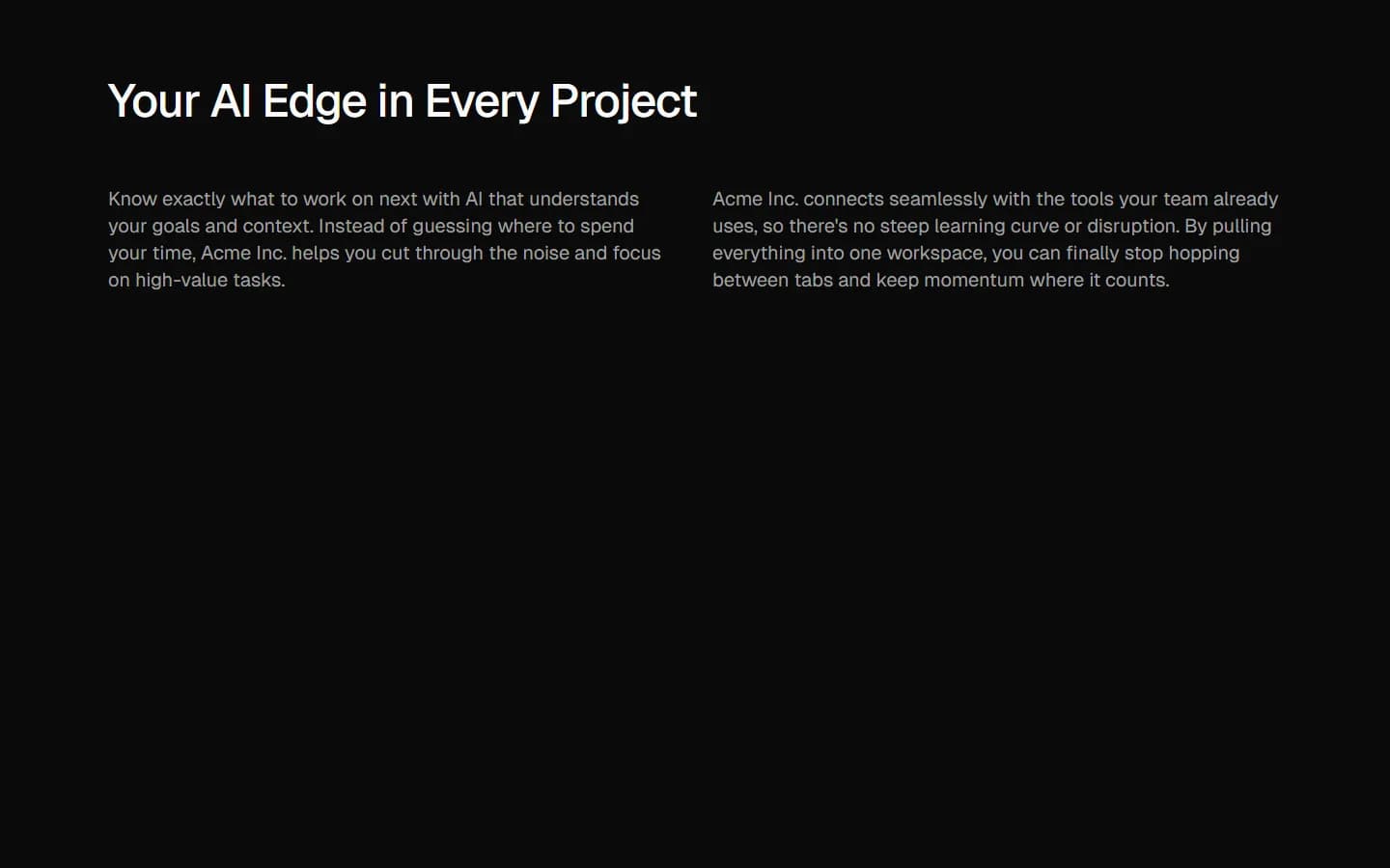
Two-column text layout
Pro
Benefits 10
Full-width media with overlay text


Pro
Benefits 11
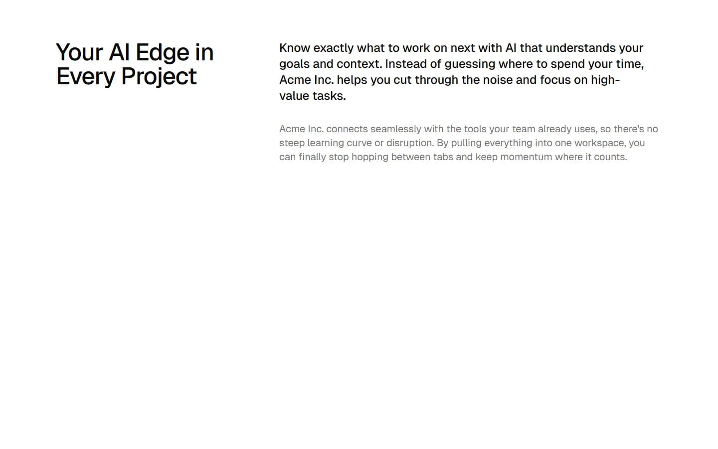
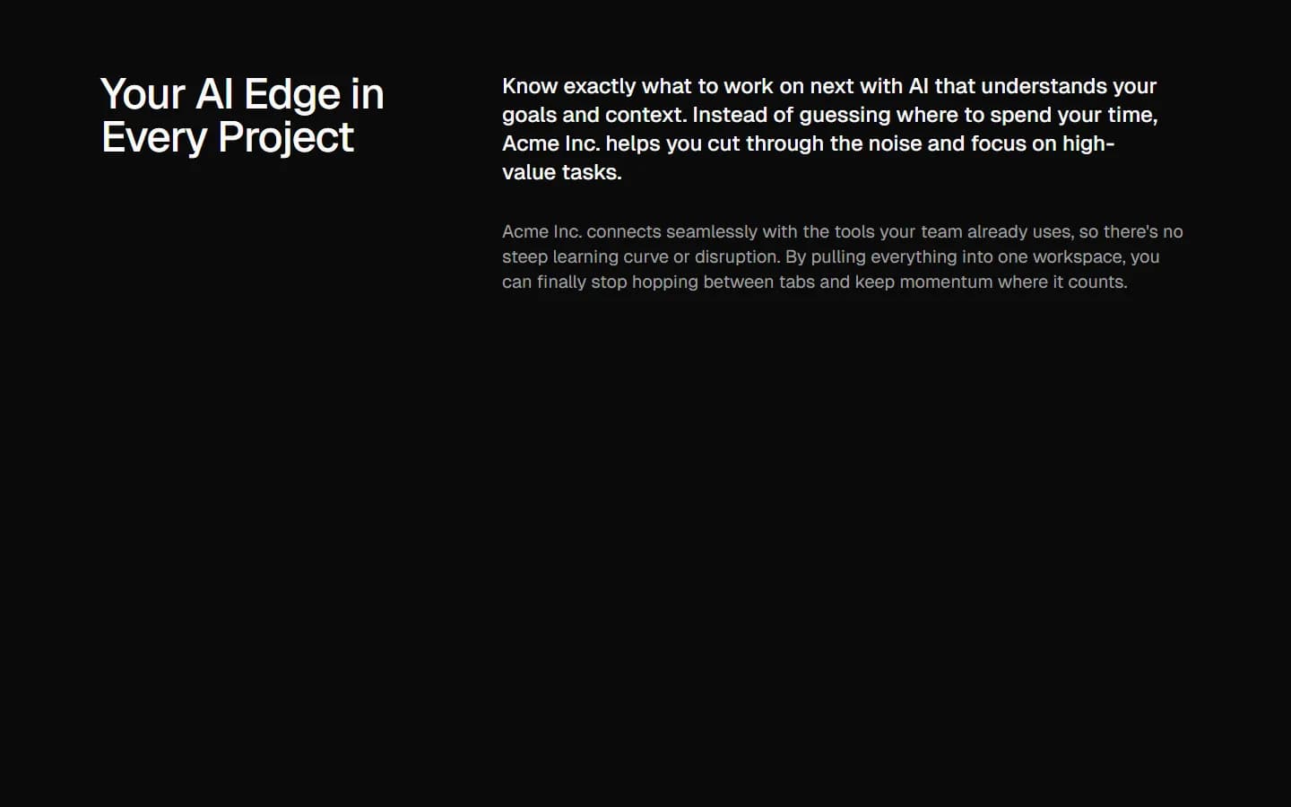
Emphasized lead with supporting column
Pro
Benefits 12
Two-column icon list
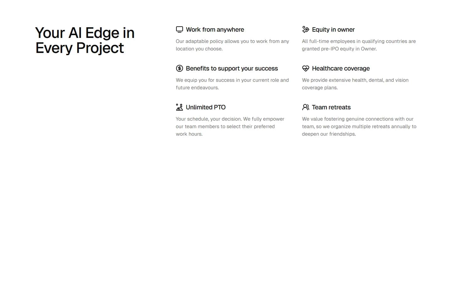
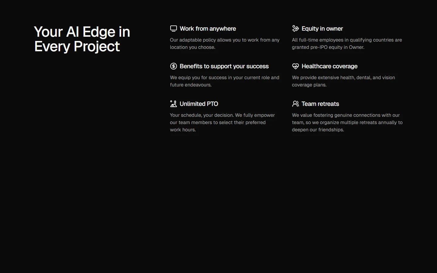
Free
Benefits 13
Card grid with section header
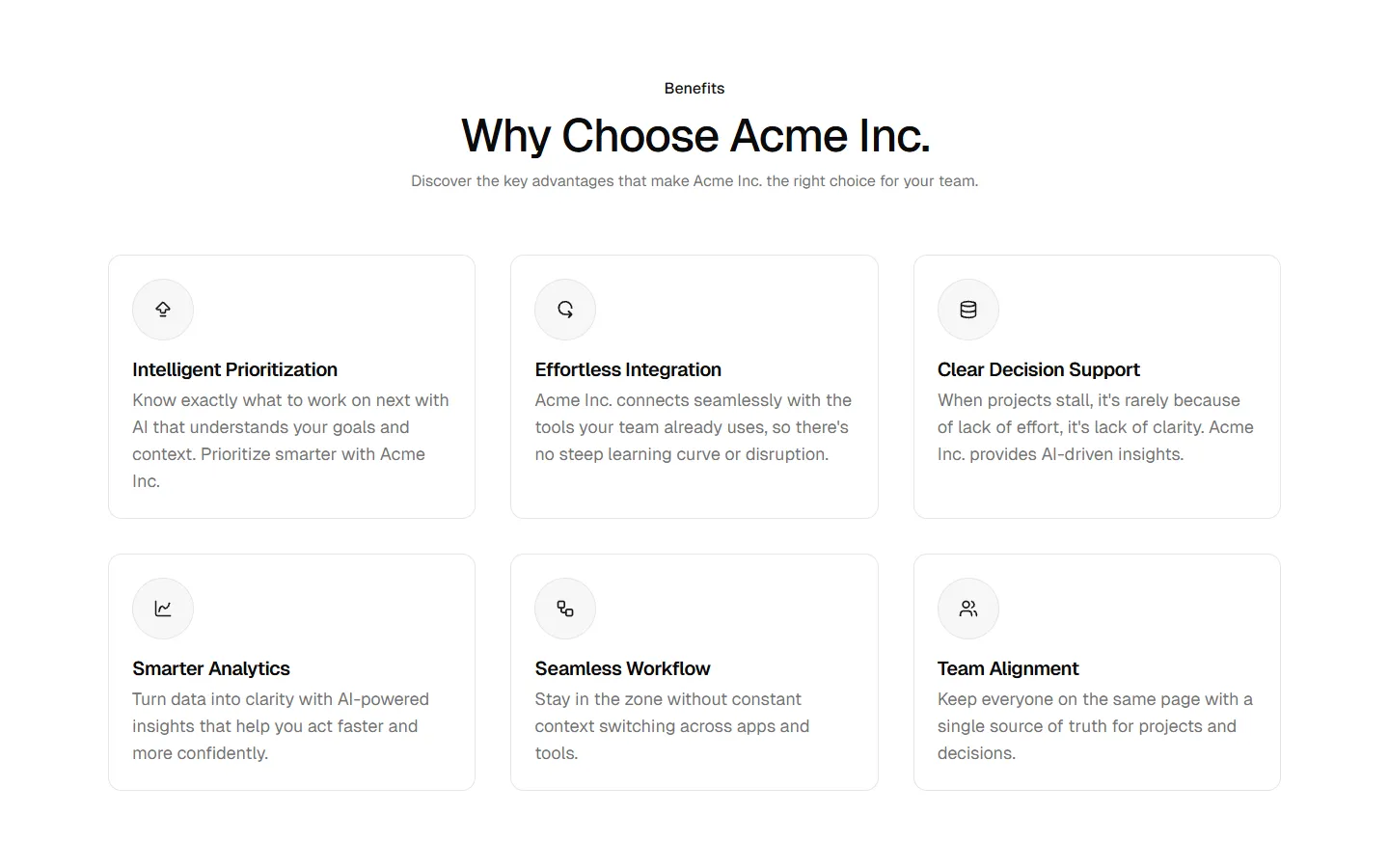
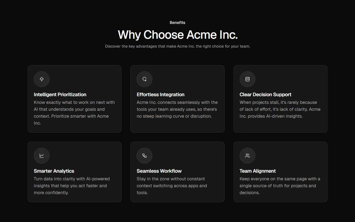
Pro
Benefits 14
Centered heading, product showcase and three feature stacks
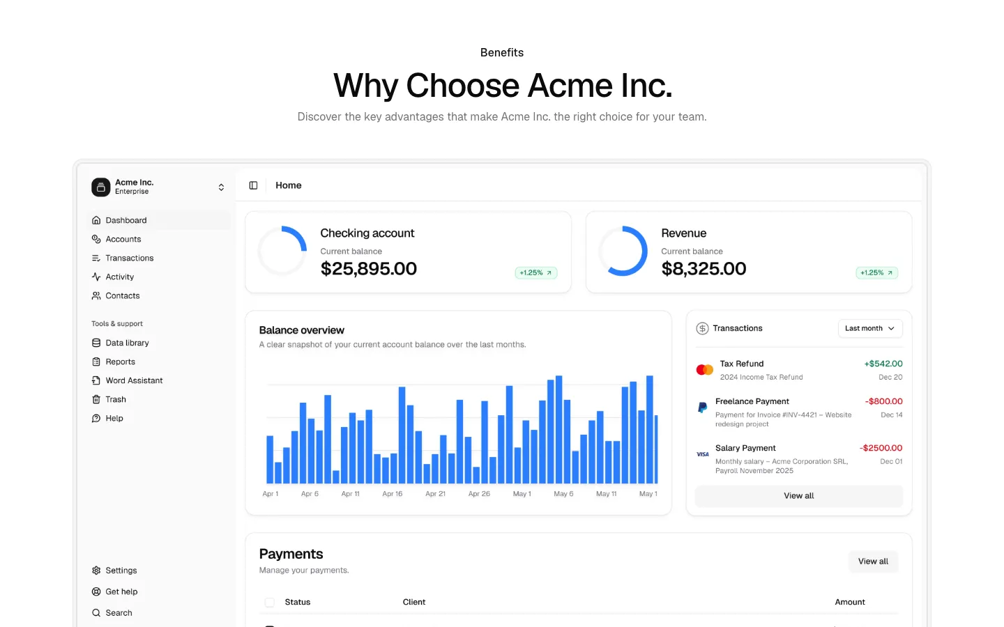
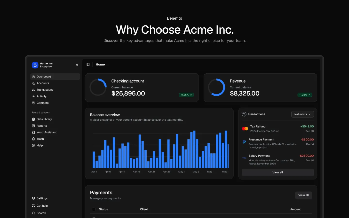
Pro
Benefits 15
Command menu mockup with 2x2 benefits grid
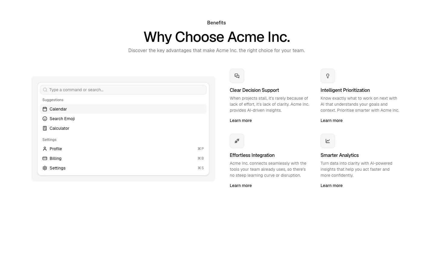
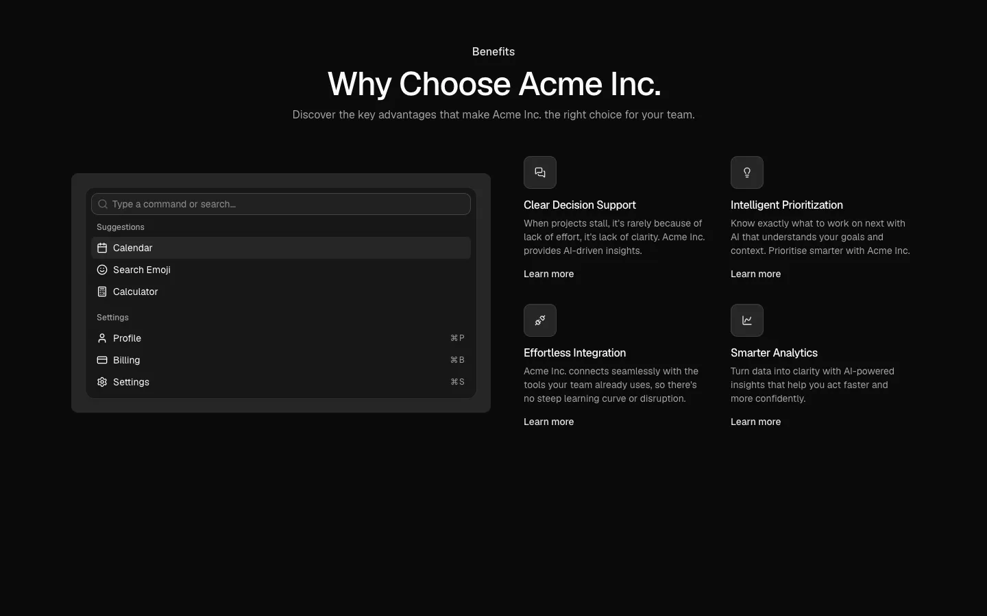
Pro
Benefits 16
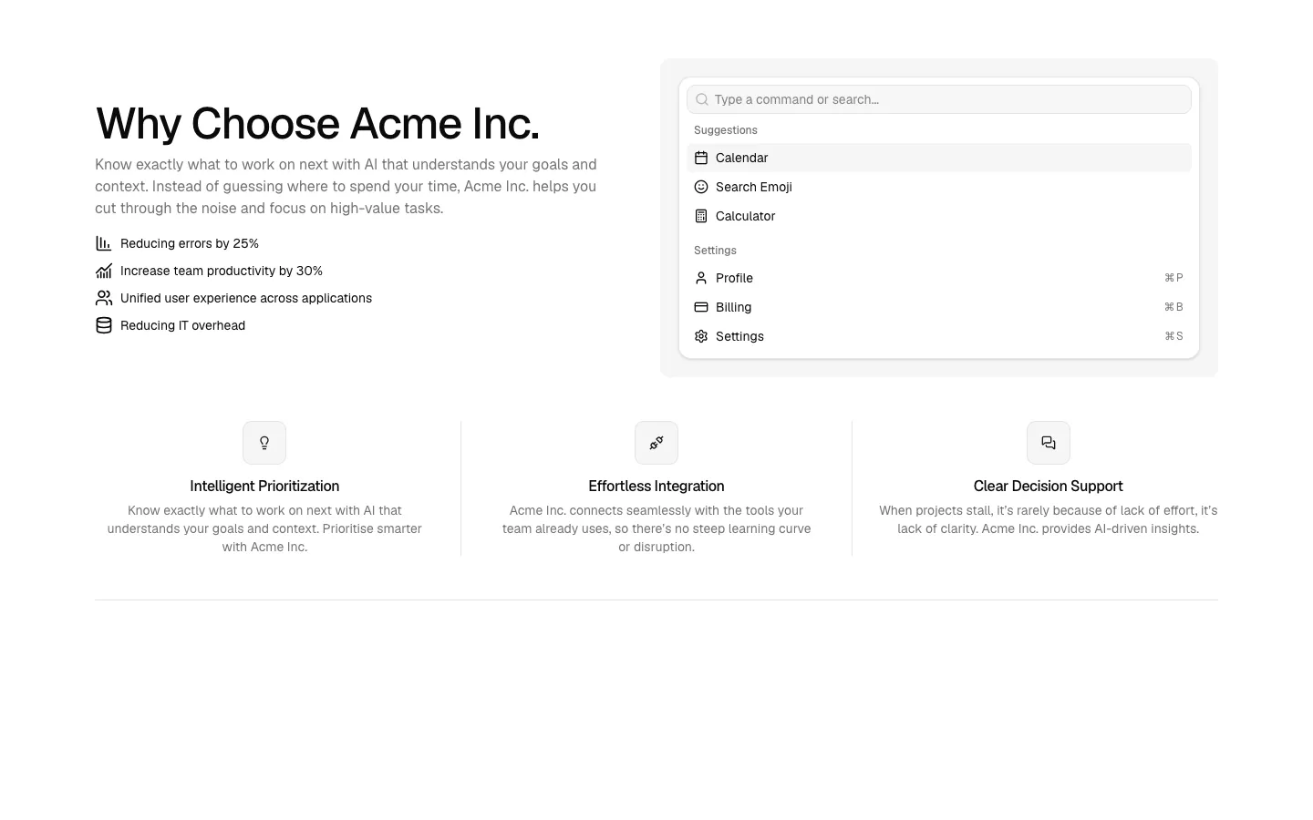
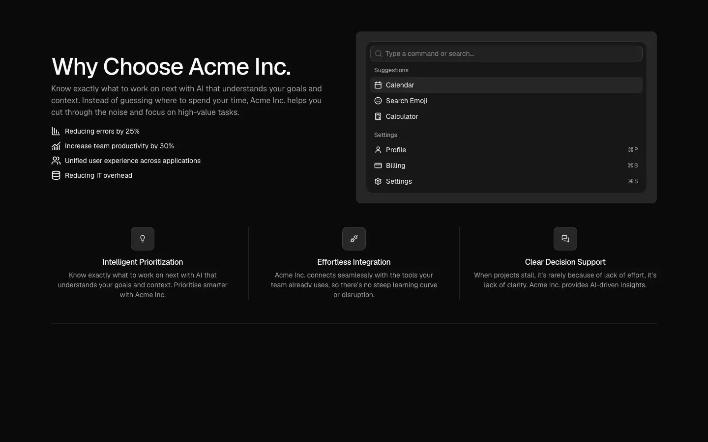
Split intro with command menu mockup and three-up feature row
Pro
Benefits 17
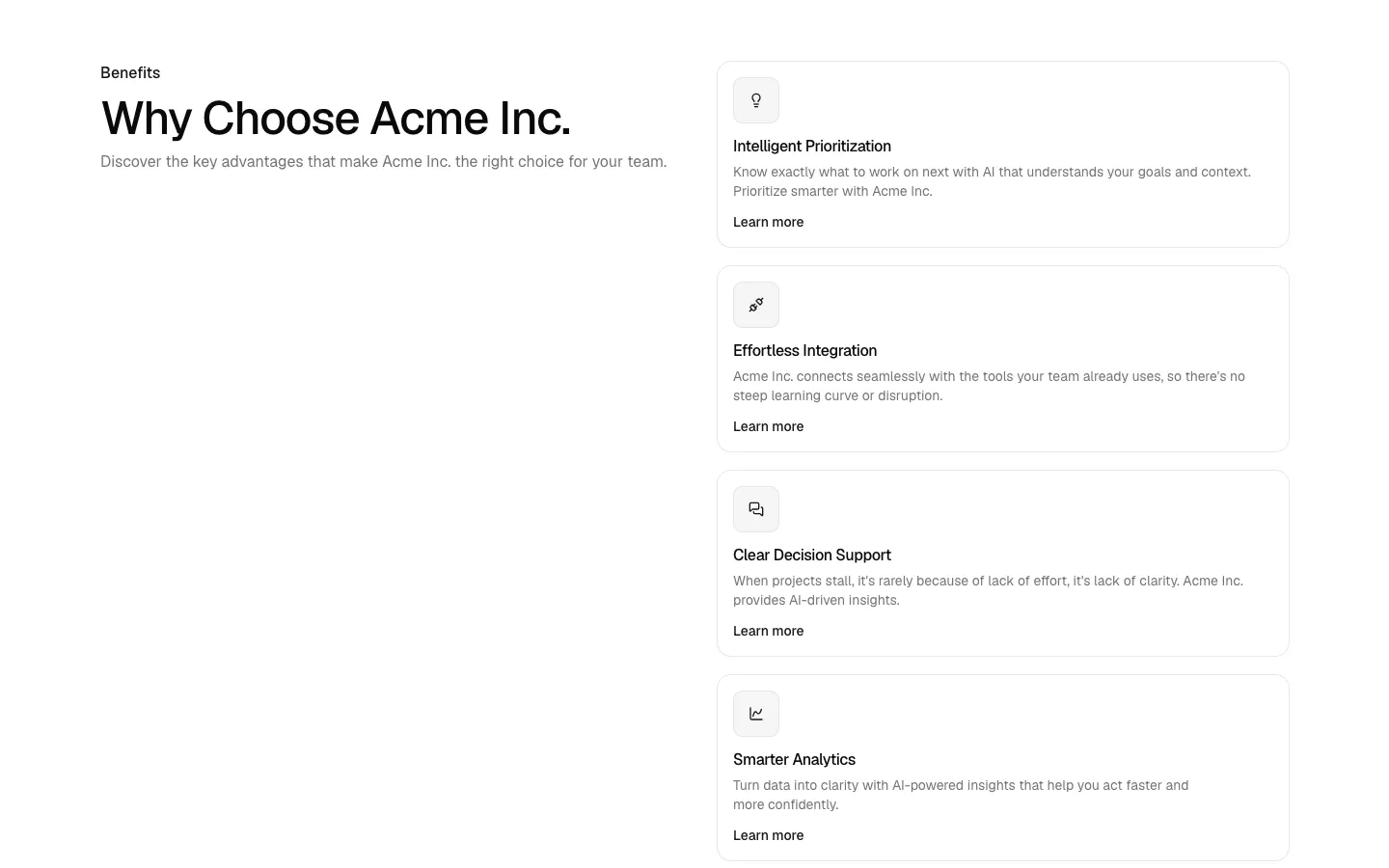
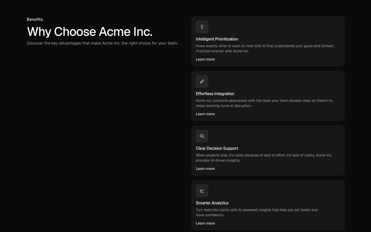
Split heading with stacked benefit cards
Pro
Benefits 18
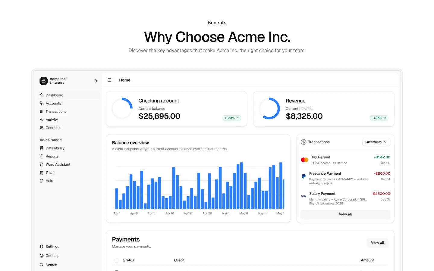
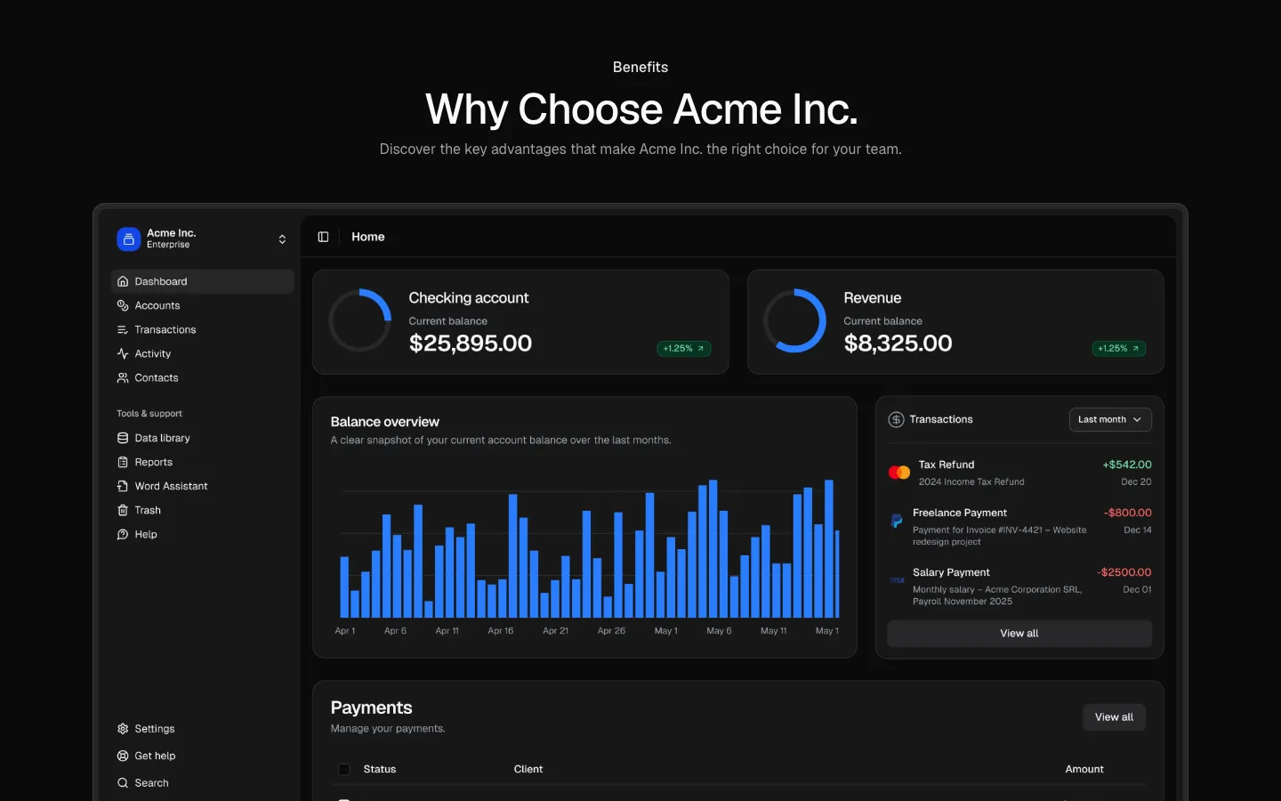
Product showcase with feature tabs
Pro
Benefits 19
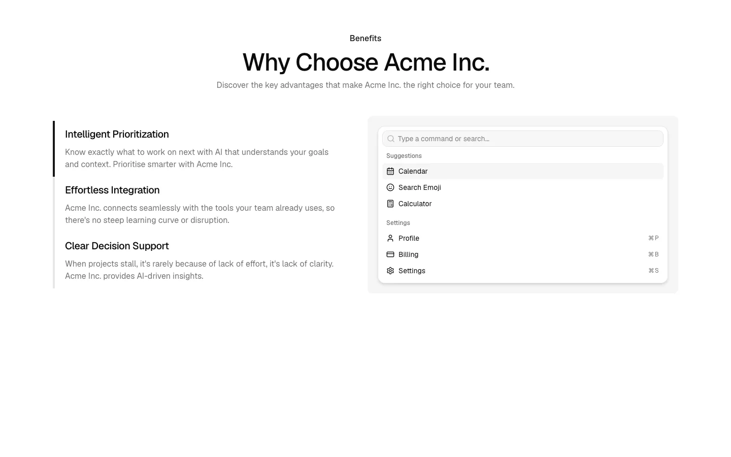
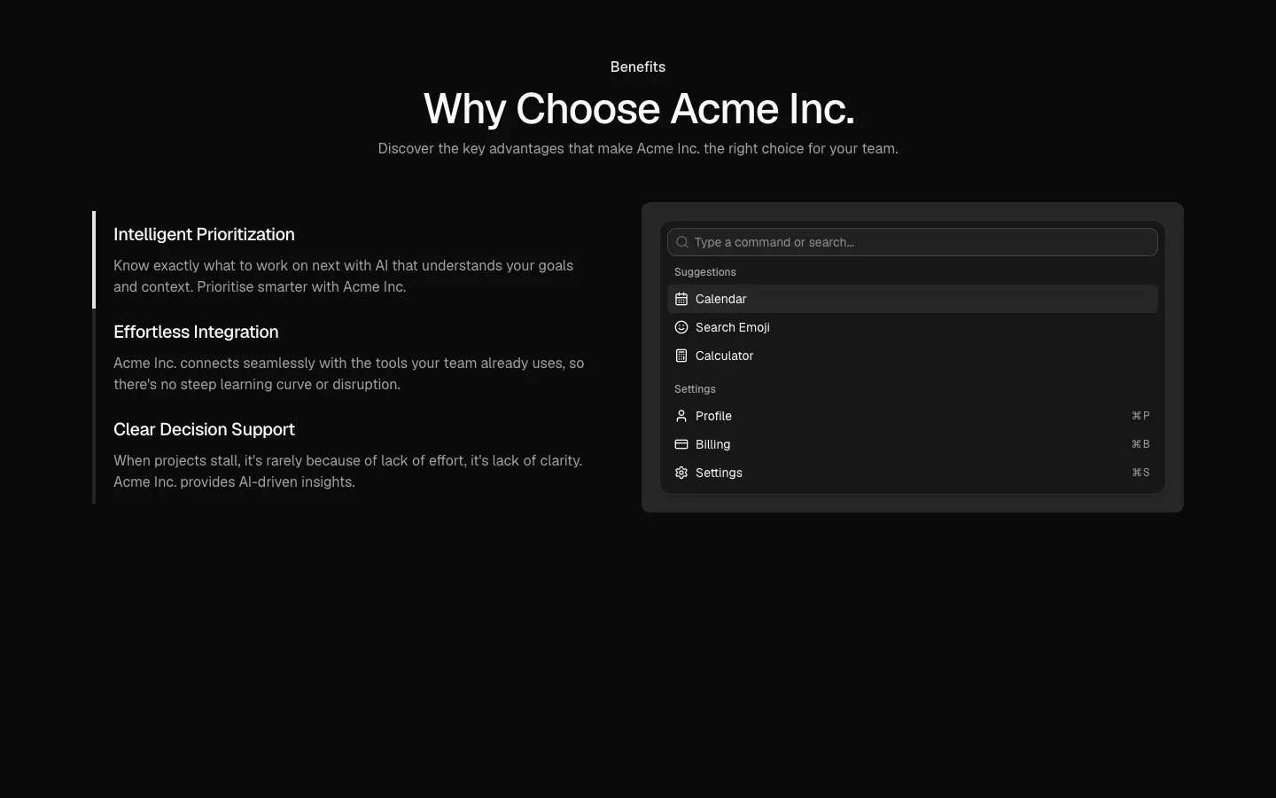
Feature list with accent bars and command menu mockup
Pro
Benefits 20
Centered heading with bottom-bleed product showcase
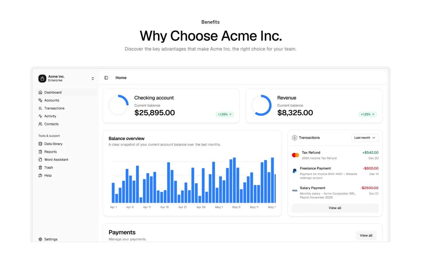
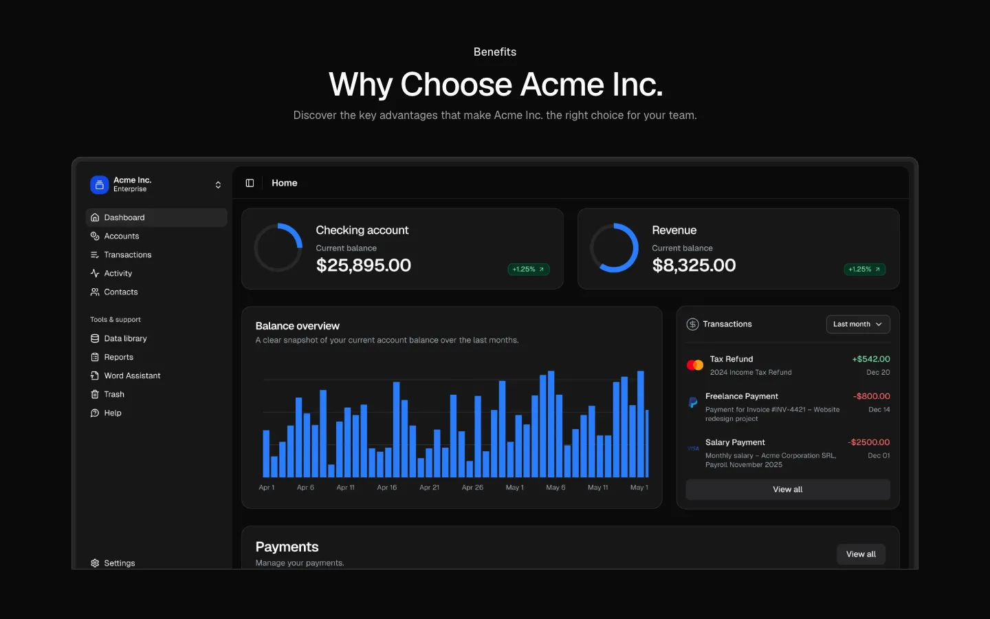
Pro
Benefits 21
Centered heading with 2x2 benefit card grid
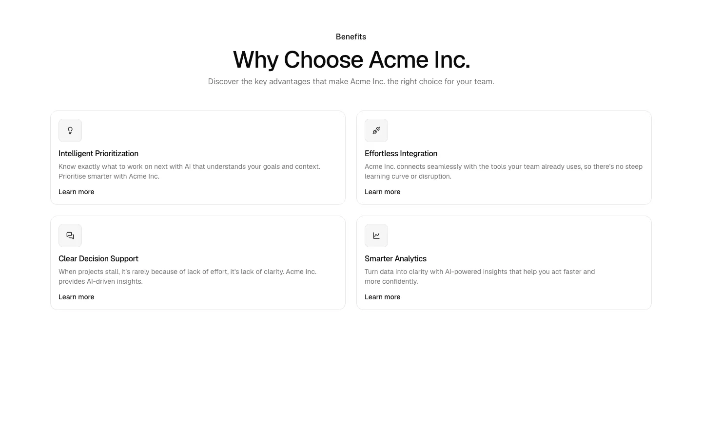
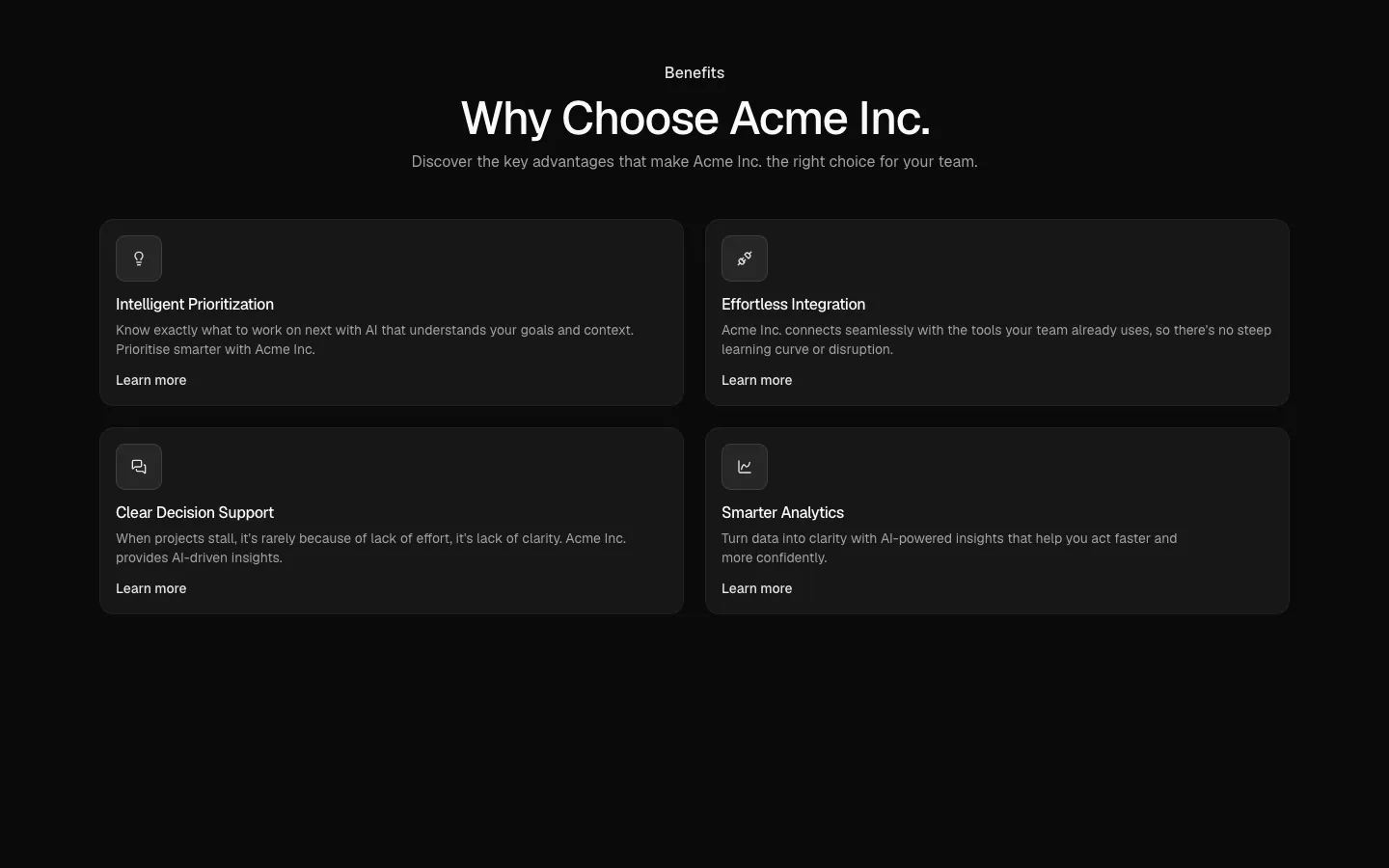
Pro
Benefits 22
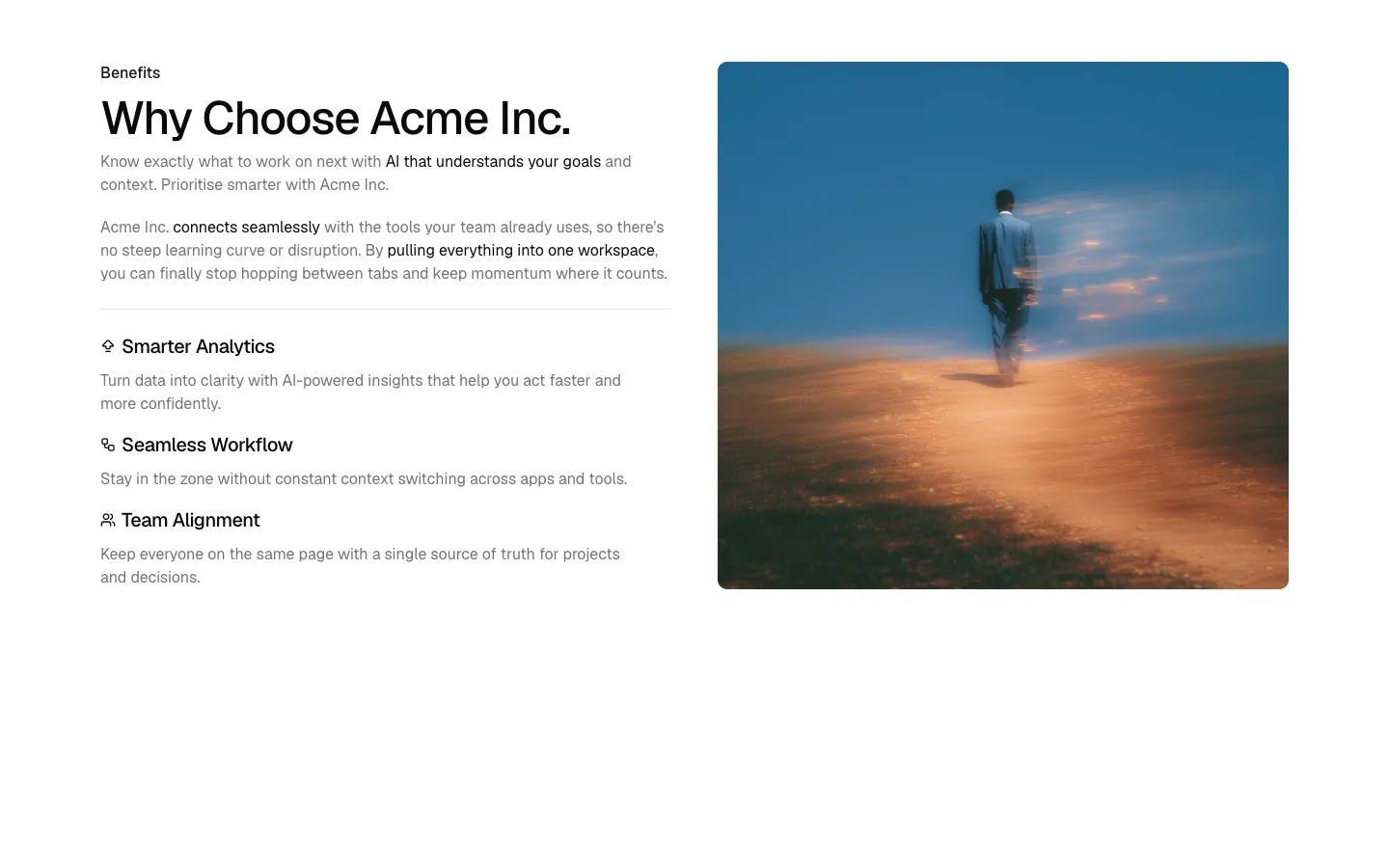
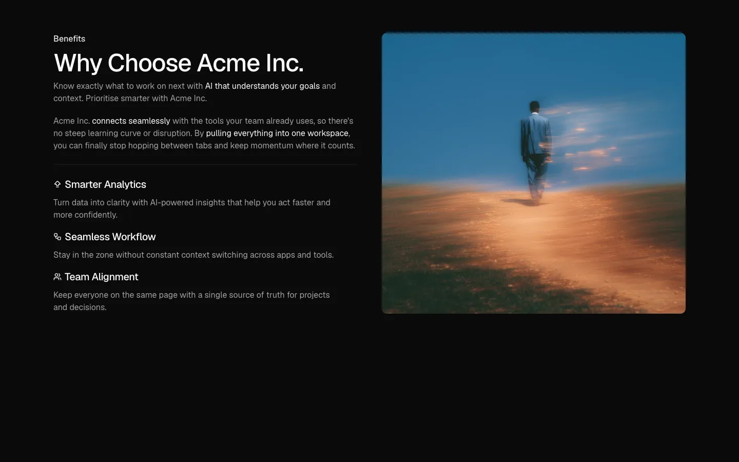
Split section with narrative copy, benefit list, and full-height image
Pro
Benefits 23
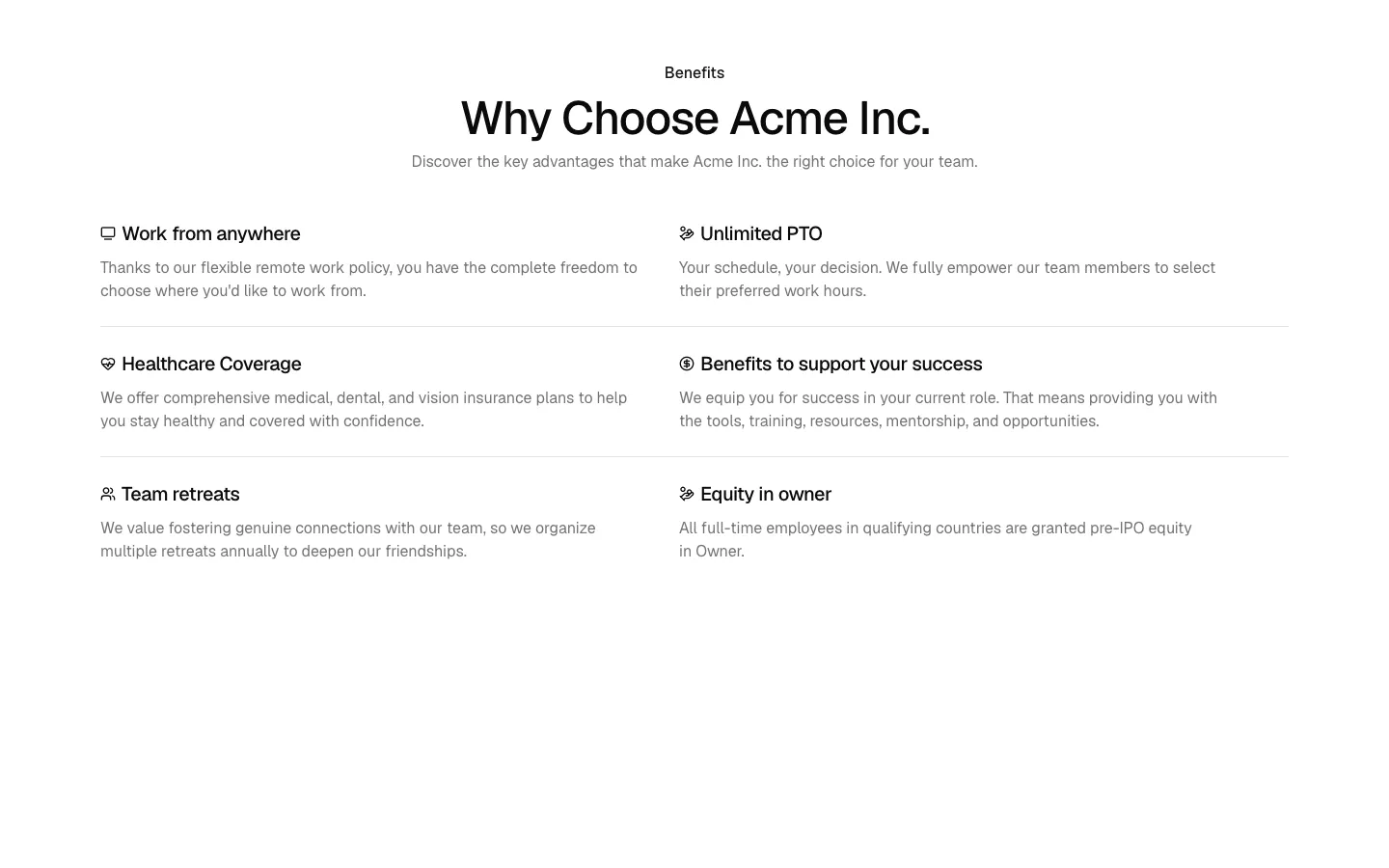
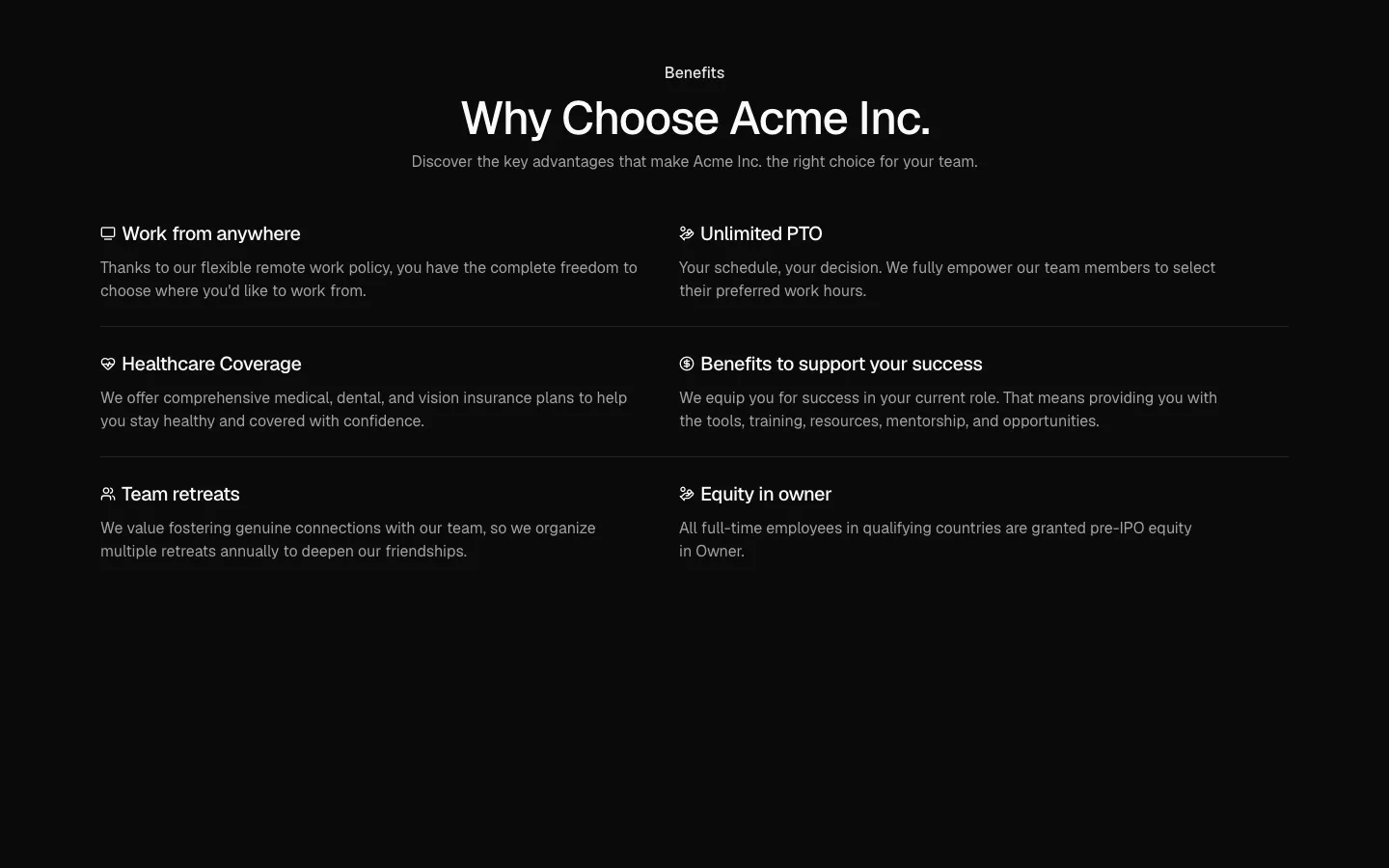
Centered heading with three-row benefits grid
Pro
Benefits 24
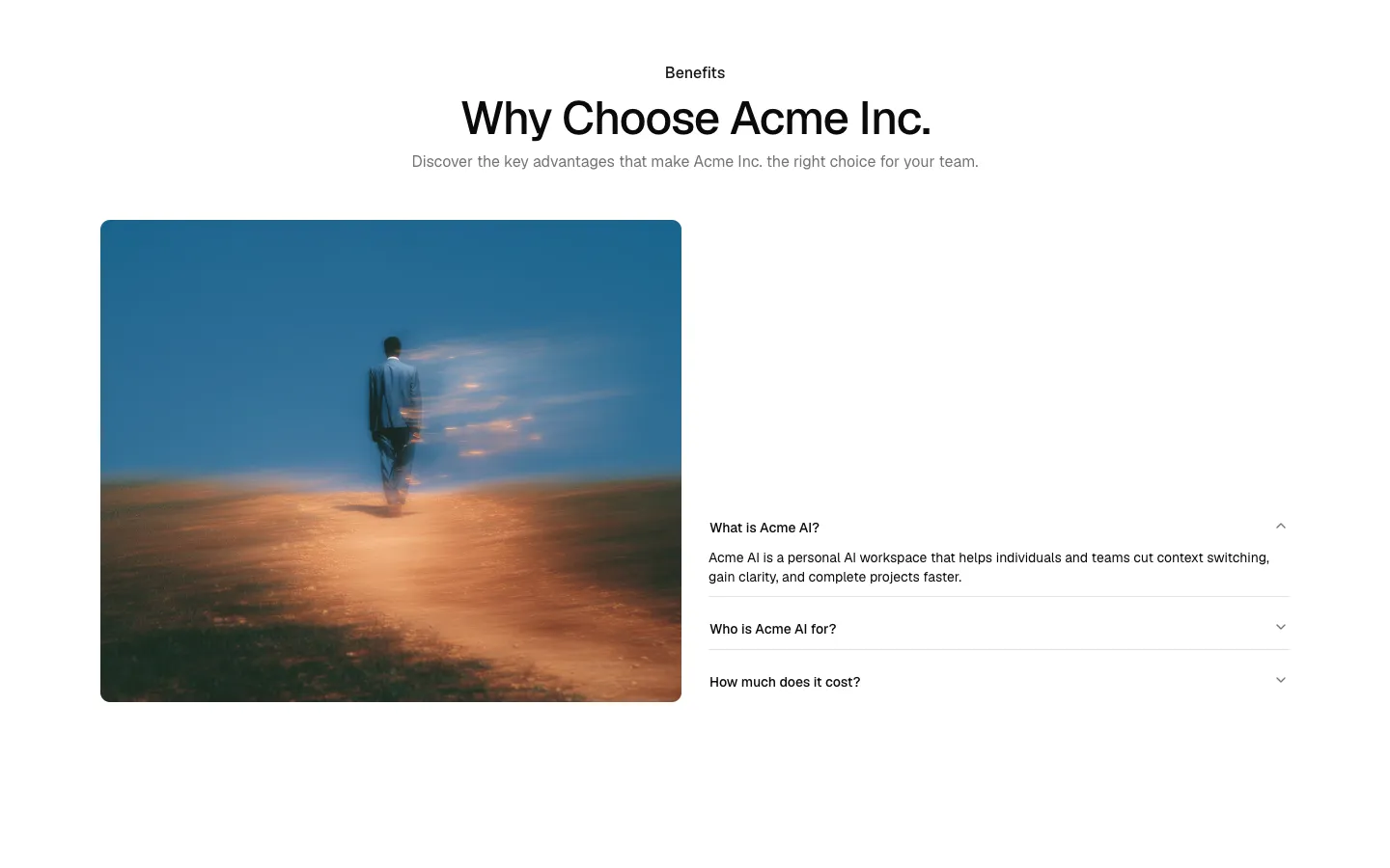
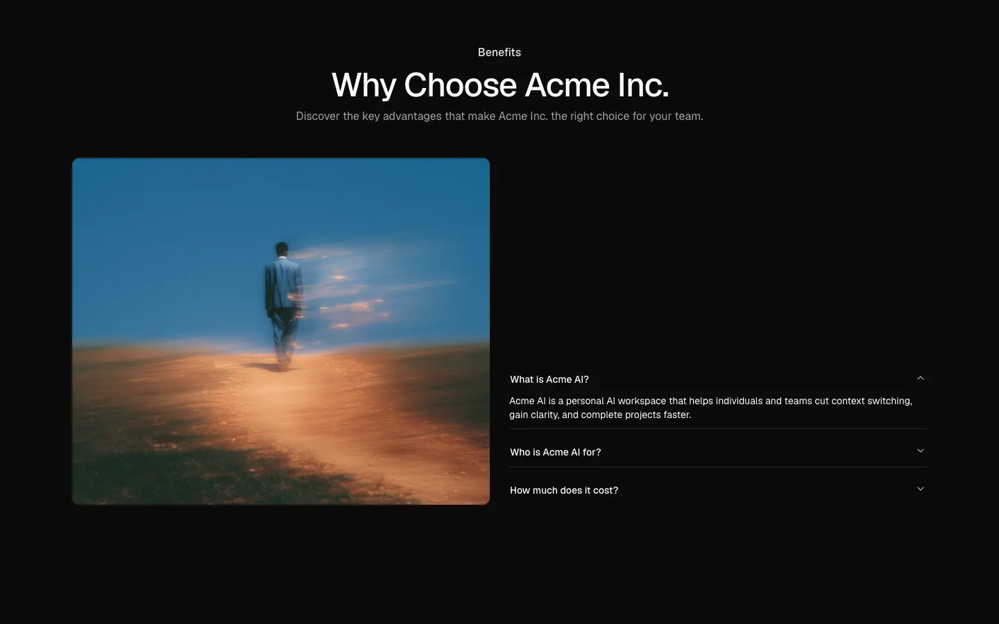
Centered heading with image and FAQ accordion
Pro
Benefits 25
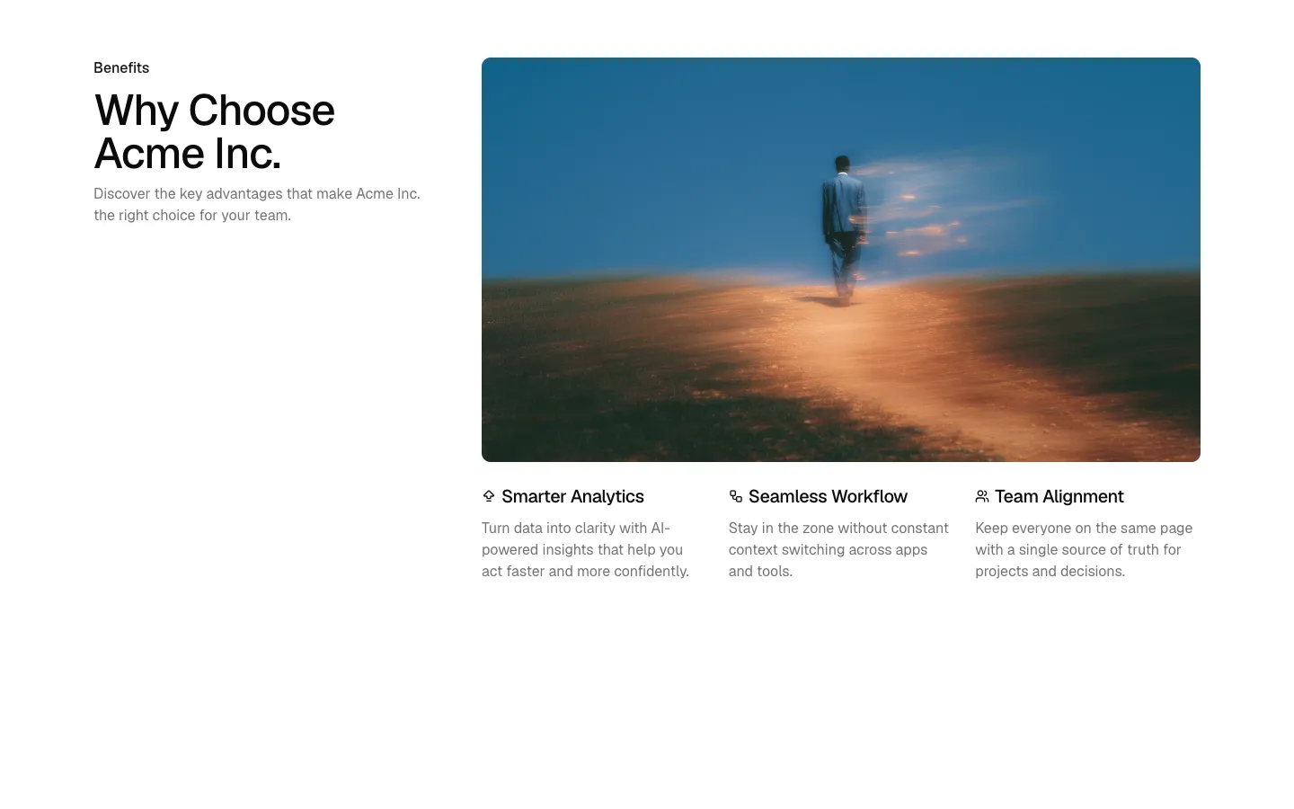
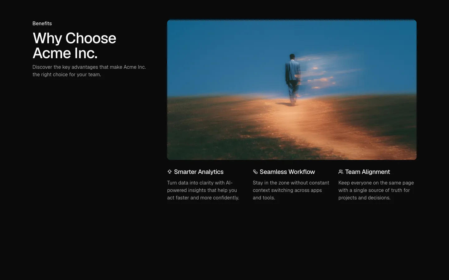
Offset heading with feature image and three sub features
Pro
Benefits 27
Split heading and feature pair with full-height image