All Product List blocks
Product List 1
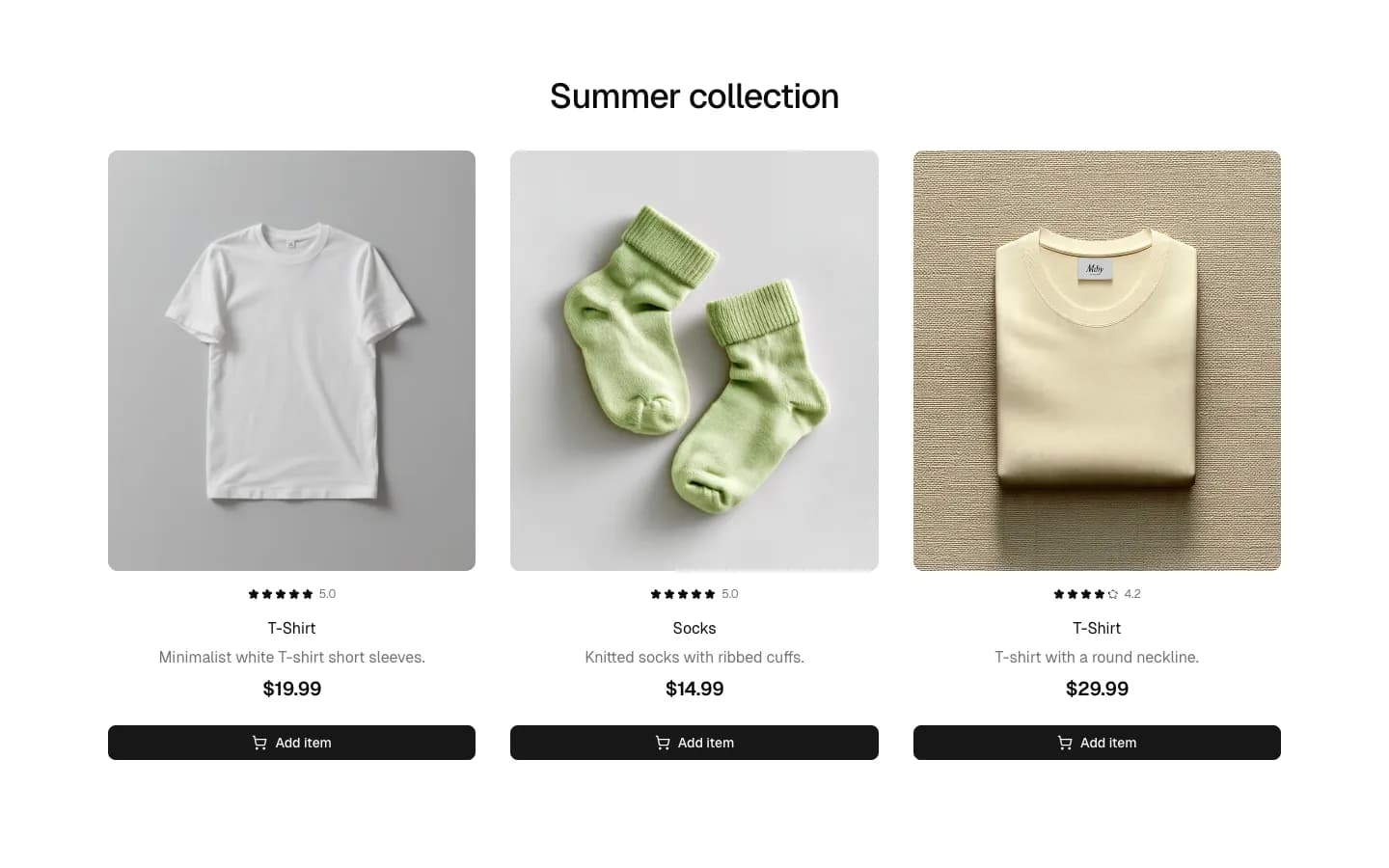
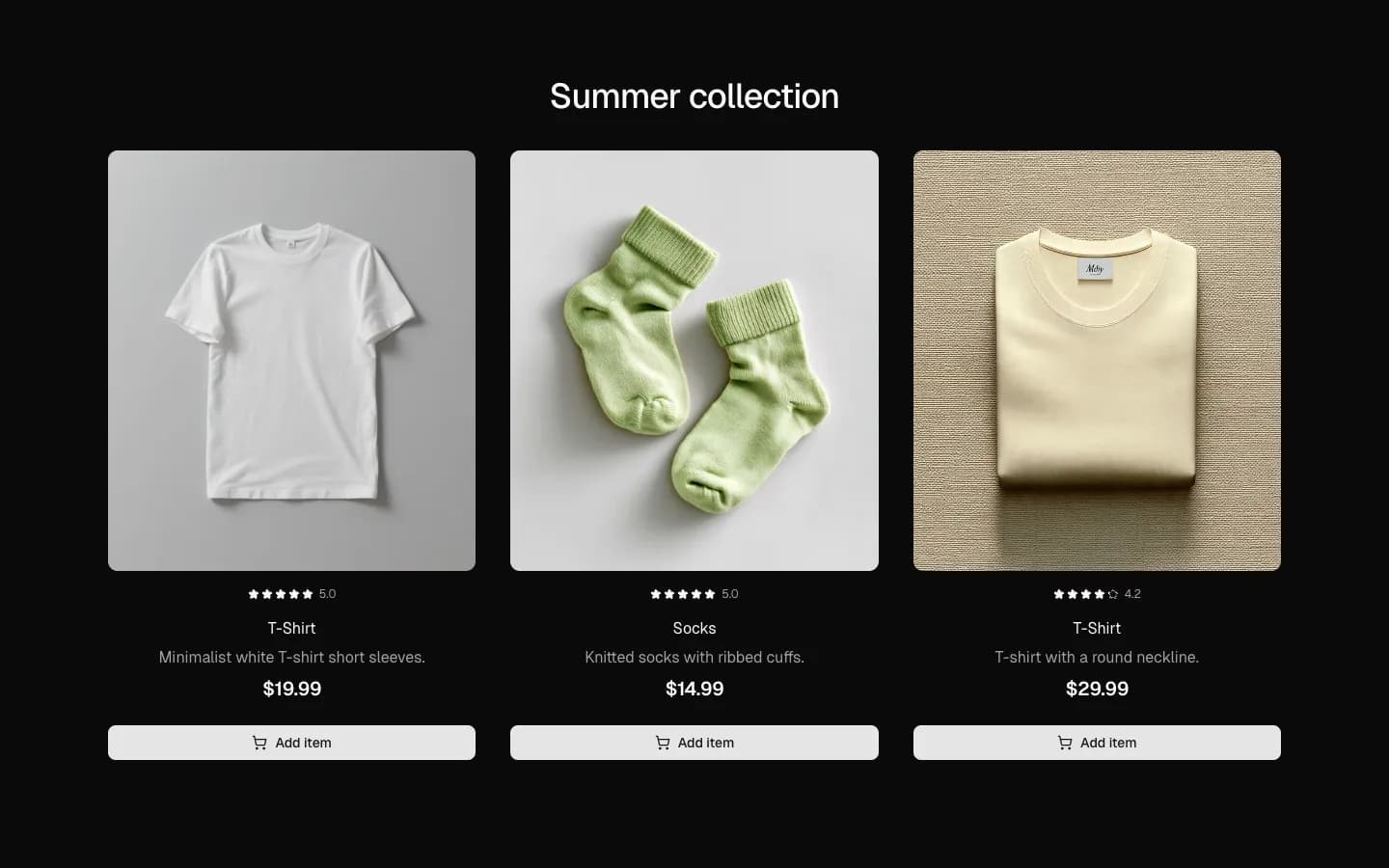
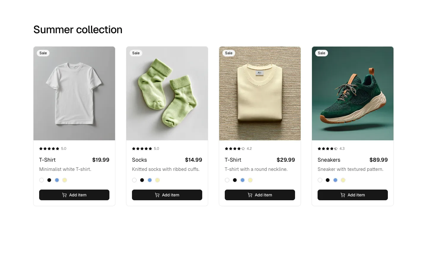
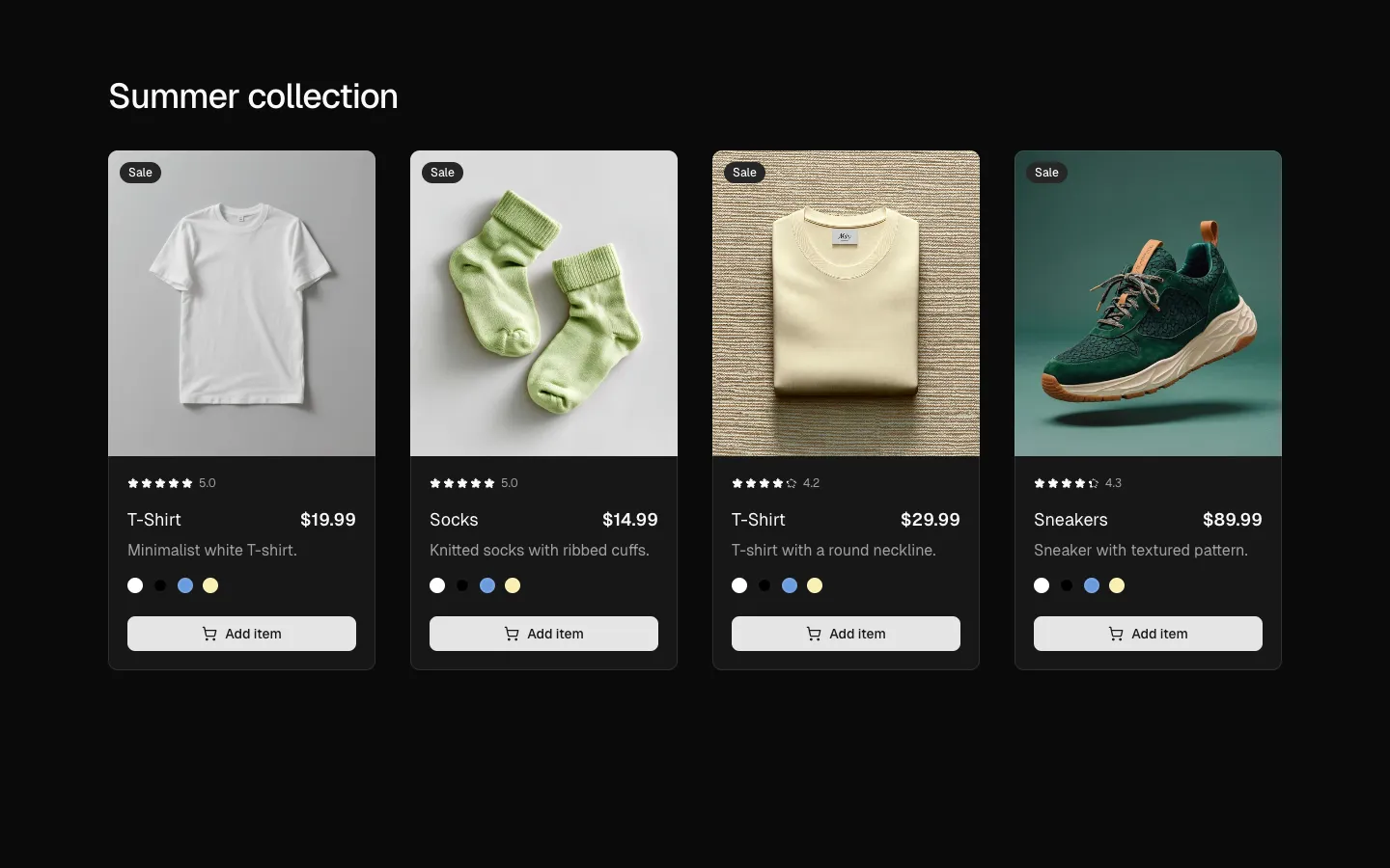
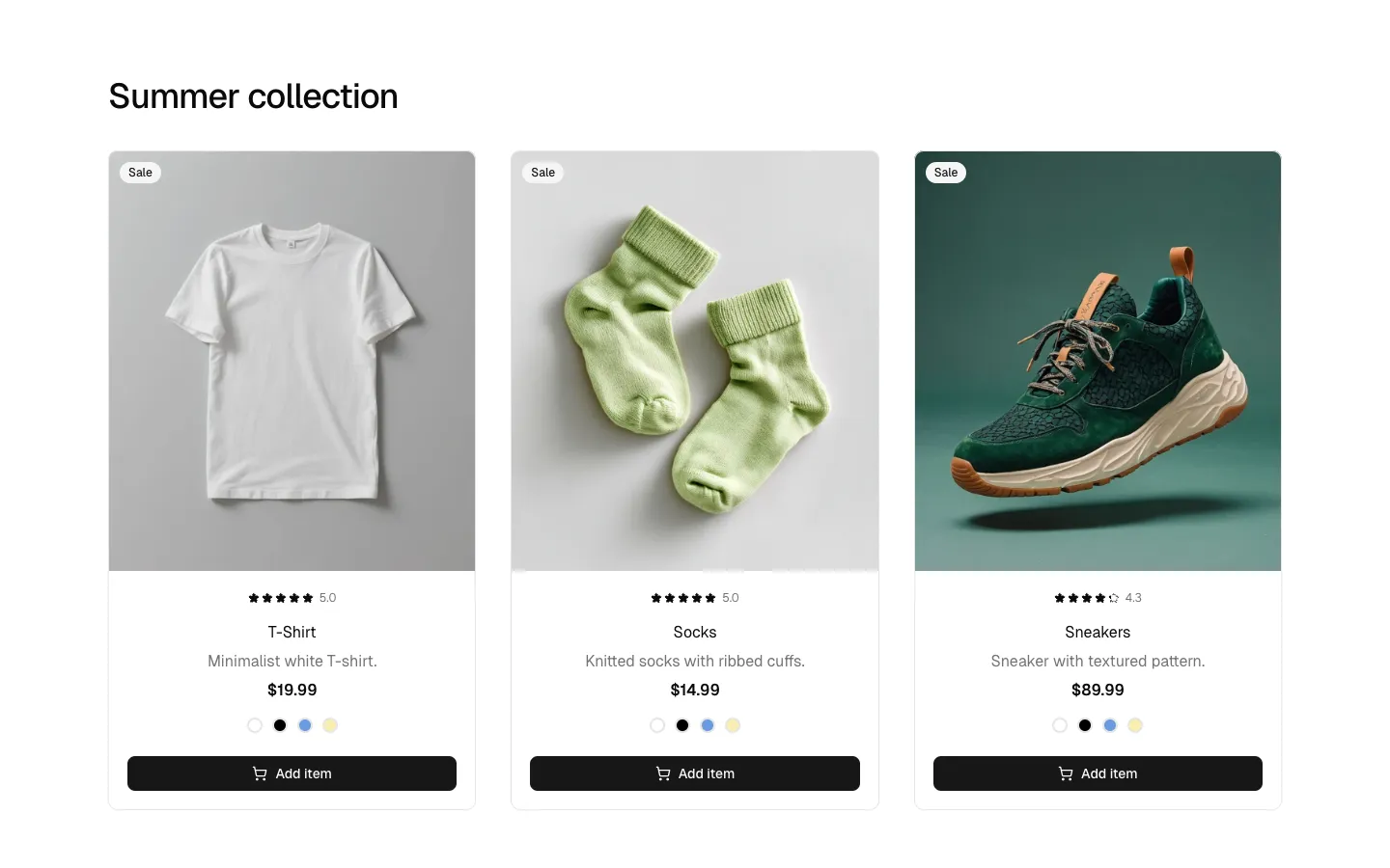
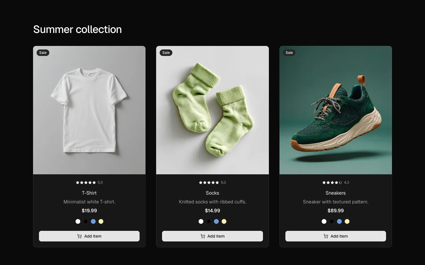
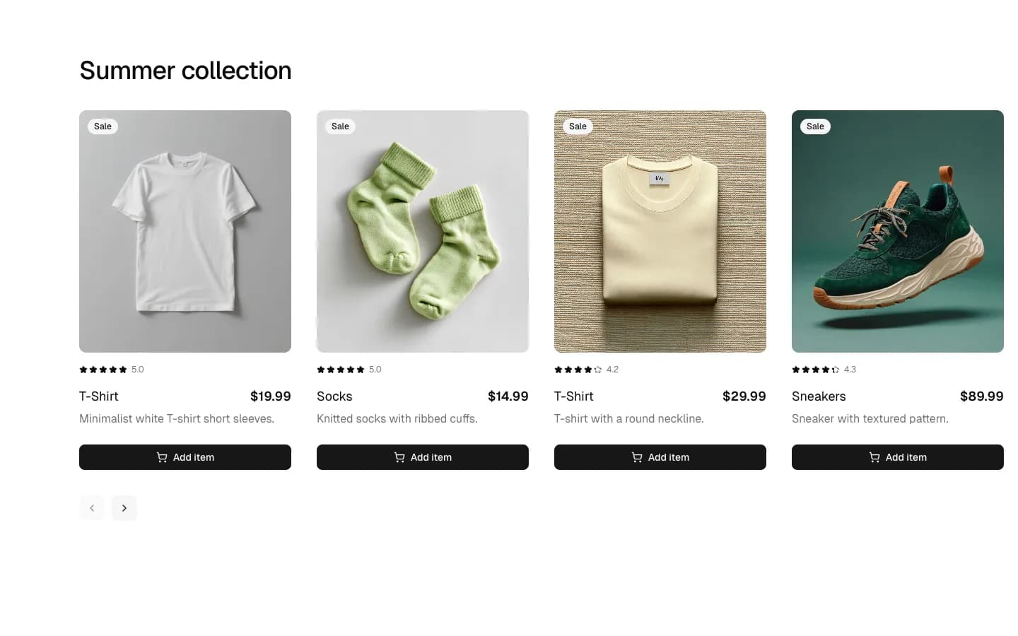
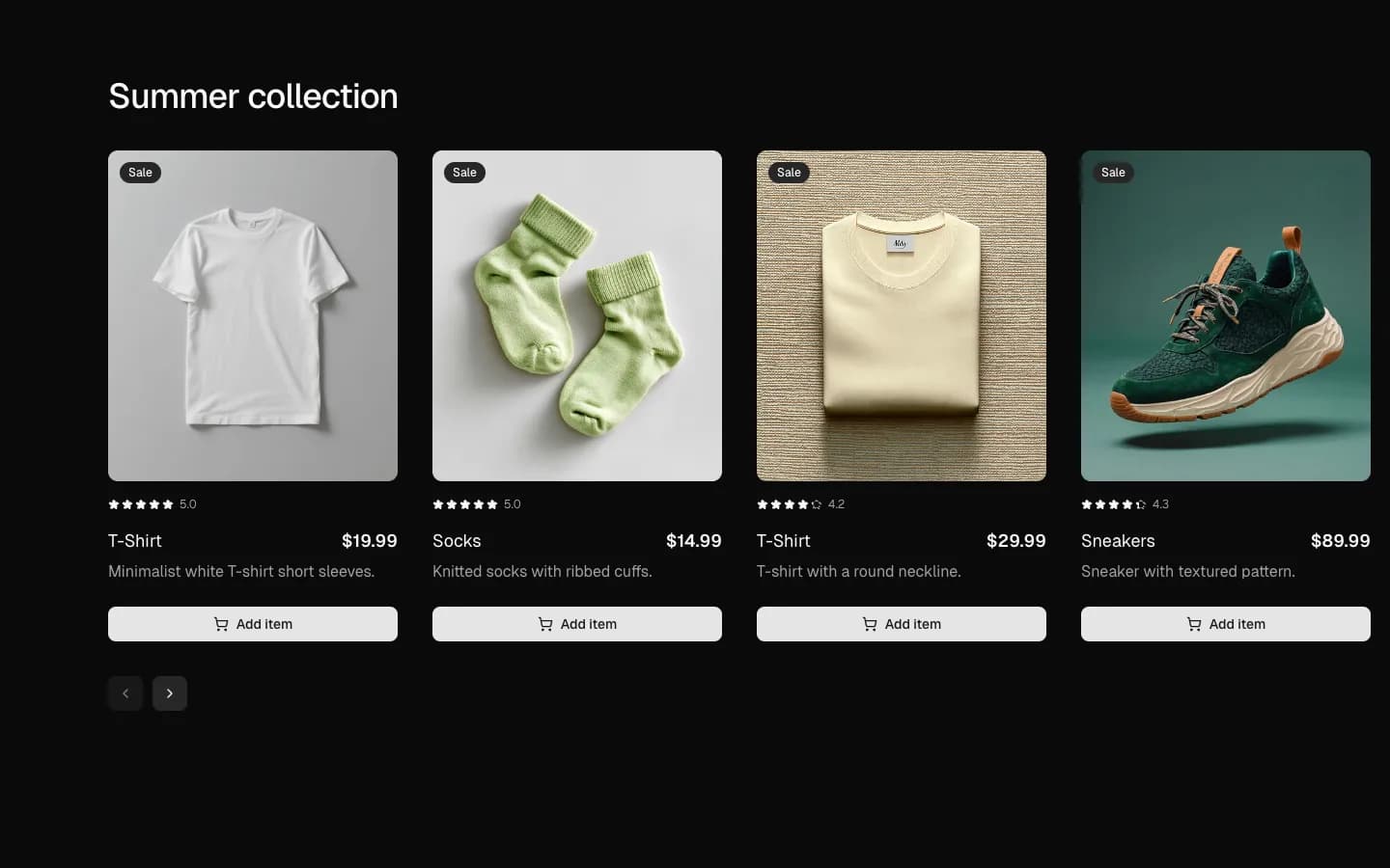
Product grid with header & action cards
A clean e-commerce section featuring a left-aligned collection header and a four-column product grid. Each card includes a badge, high-quality product imagery, star ratings, pricing, and a brief description. The layout is finalized with a primary button for each product, designed to streamline the shopping experience through a clear and repetitive visual structure.
In Pro Figma & Pro Figma + React
Radix UI
Base UI
8 styles
5 icon sets
Not Allowed
Get access to the full source code by upgrading to Pro Figma + React.
SBIOTJ
Join 9,000+ builders shipping with shadcncraft
Get access to this block and the full library
Production-ready blocks and components with matching Figma and React.


Benefits
Production-ready by default
Built with shadcn/ui conventions and designed for real projects.
Built with shadcn/ui
Clean React components using Tailwind and modern shadcn patterns.
Install instantly
Add the block directly using the shadcn CLI.
Works with your theme
Compatible with shadcn themes and token-based color systems.
MCP server support
Use shadcn MCP server right from your favorite AI tools.
Frequently Asked Questions
Yes. They follow shadcn/ui structure and are built for real products.