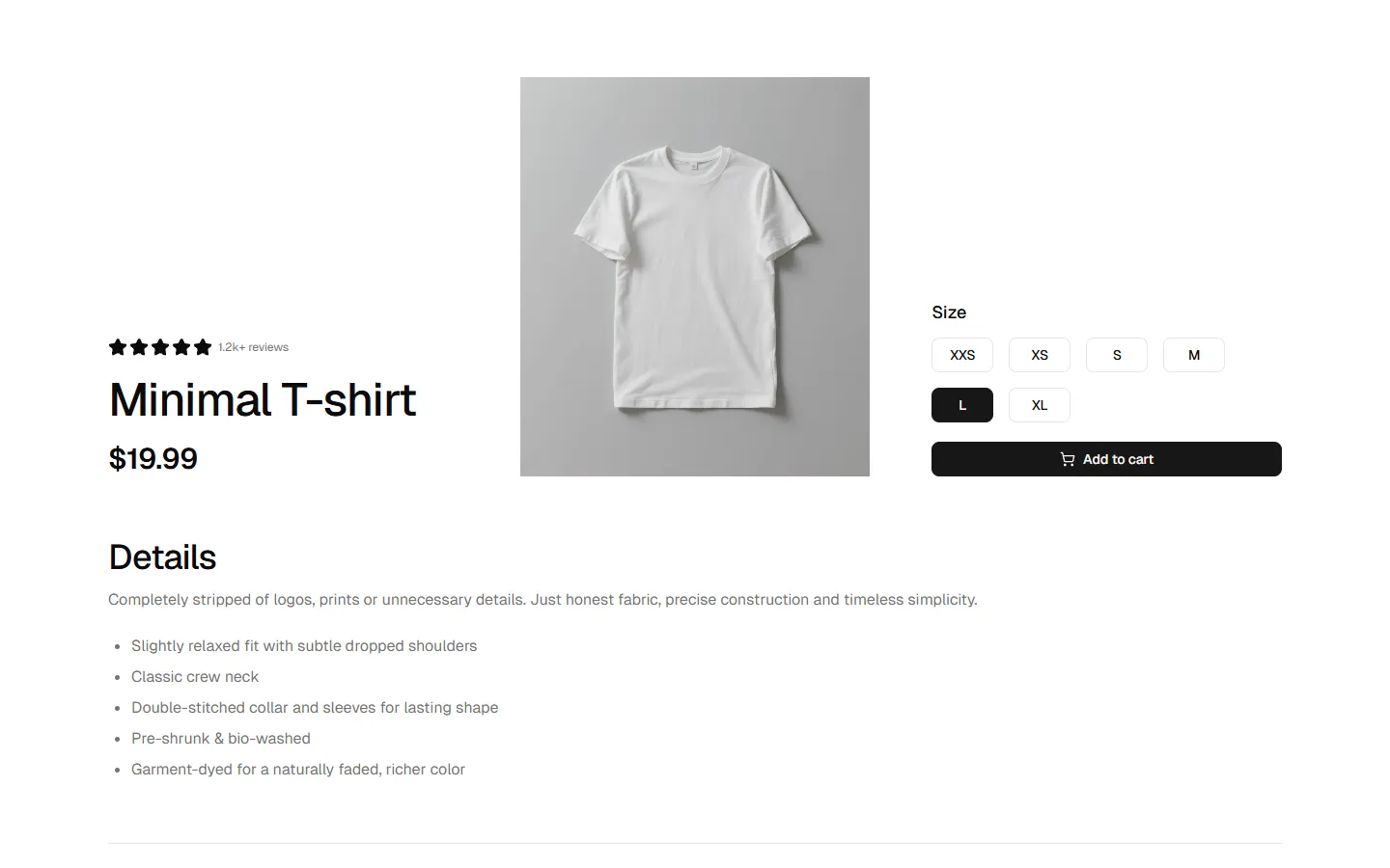
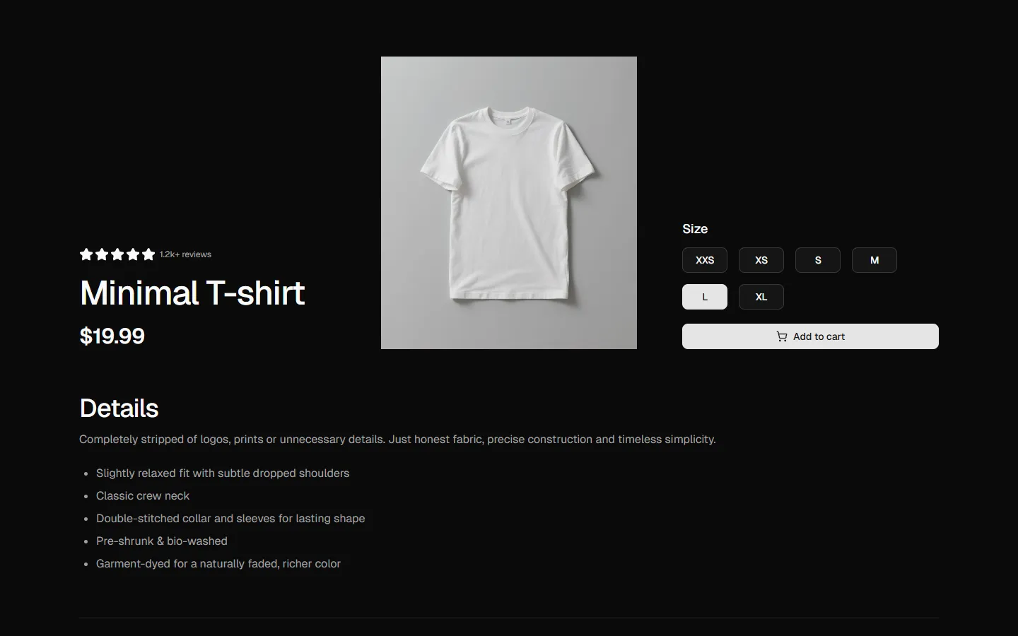
All Product Details blocks
Product Details 4
Product detail page with vertical thumbnail gallery
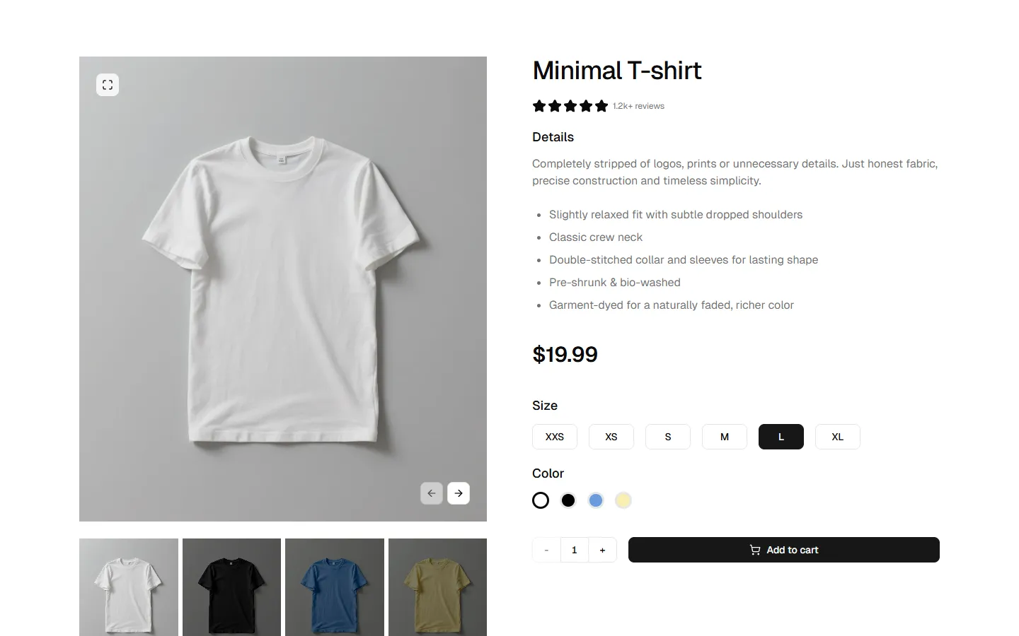
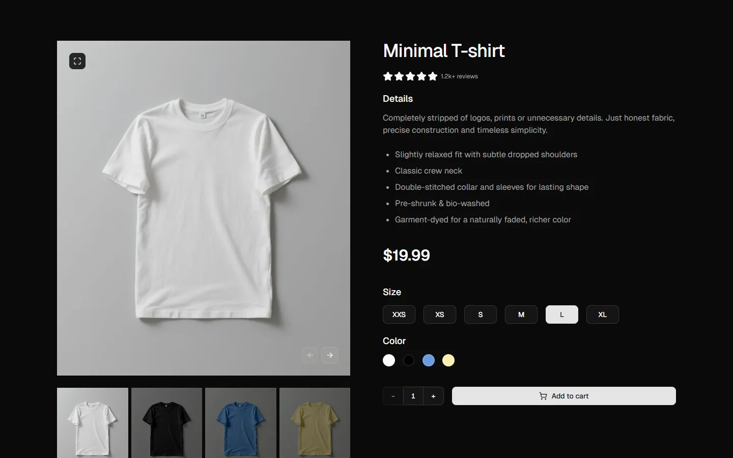
A streamlined product section featuring a multi-image navigation system. The layout includes a vertical column of clickable thumbnails on the left, which updates the large primary image in the center. The right side is dedicated to product information, including a detailed list, price, size selection tiles, and color swatches. This design is ideal for products that require viewing from multiple angles or in different colors.
In all Pro bundles
Radix UI
Base UI
8 styles
5 icon sets
Not Allowed
Get access to the full source code by upgrading to Pro Figma + React.
SBIOTJ
Join 16,000+ builders shipping with shadcncraft
Get access to this block and the full library
Production-ready blocks and components with matching Figma and React.

Benefits
Production-ready by default
Built with shadcn/ui conventions and designed for real projects.
Built with shadcn/ui
Clean React components using Tailwind and modern shadcn patterns.
Install instantly
Add the block directly using the shadcn CLI.
Works with your theme
Compatible with shadcn themes and token-based color systems.
MCP server support
Use shadcn MCP server right from your favorite AI tools.
Frequently Asked Questions
Yes. They follow shadcn/ui structure and are built for real products.
All blocks
More Product Details
Pro
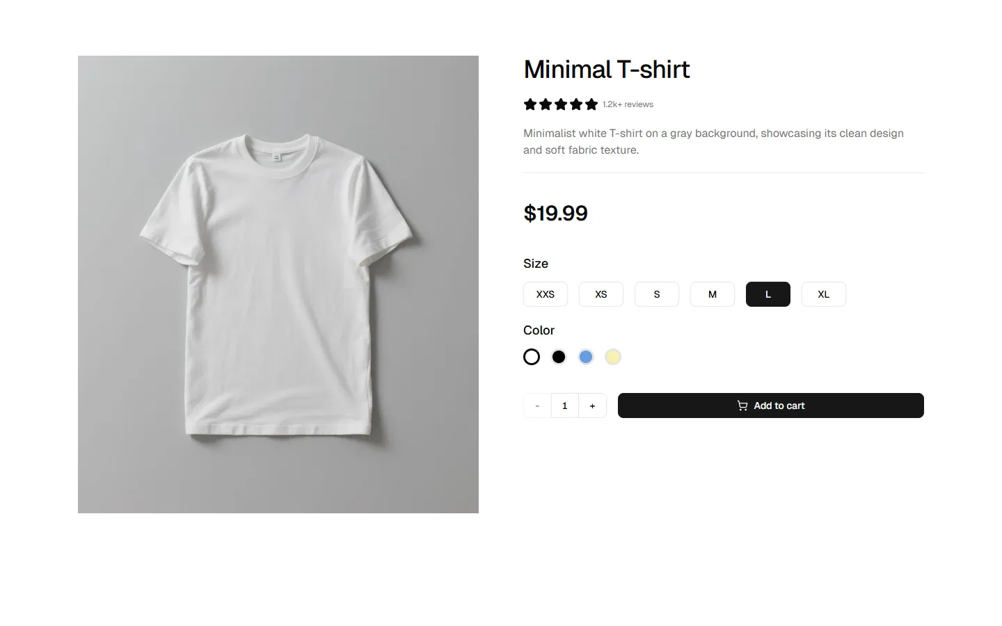
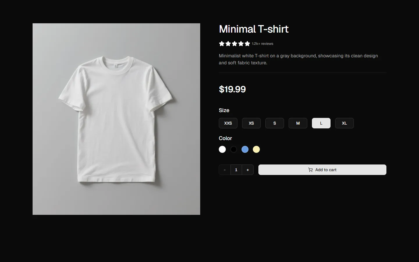
Product Details 1
Product overview with configuration
Pro
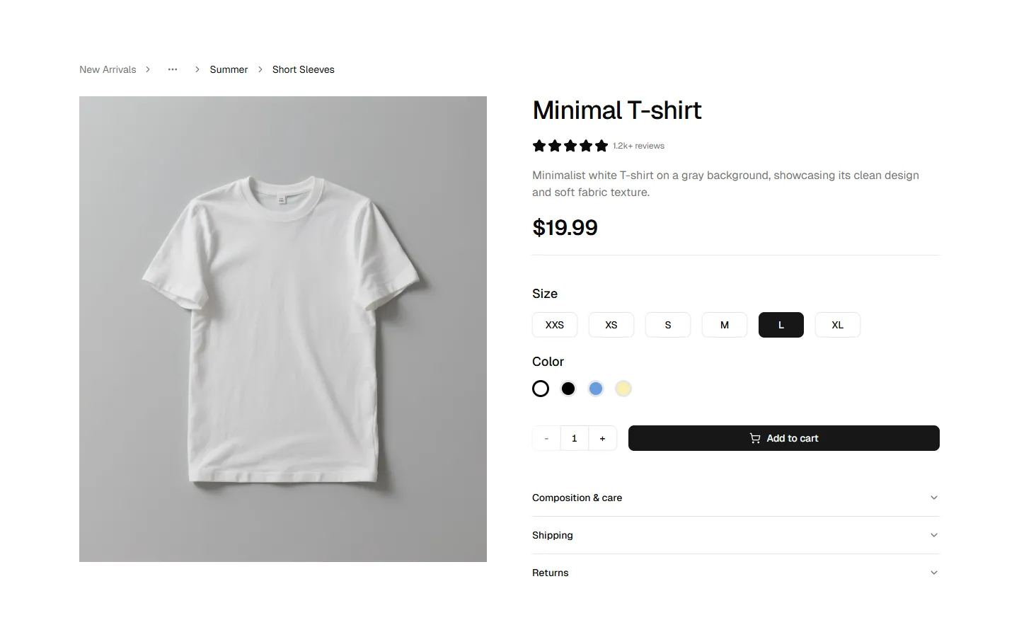
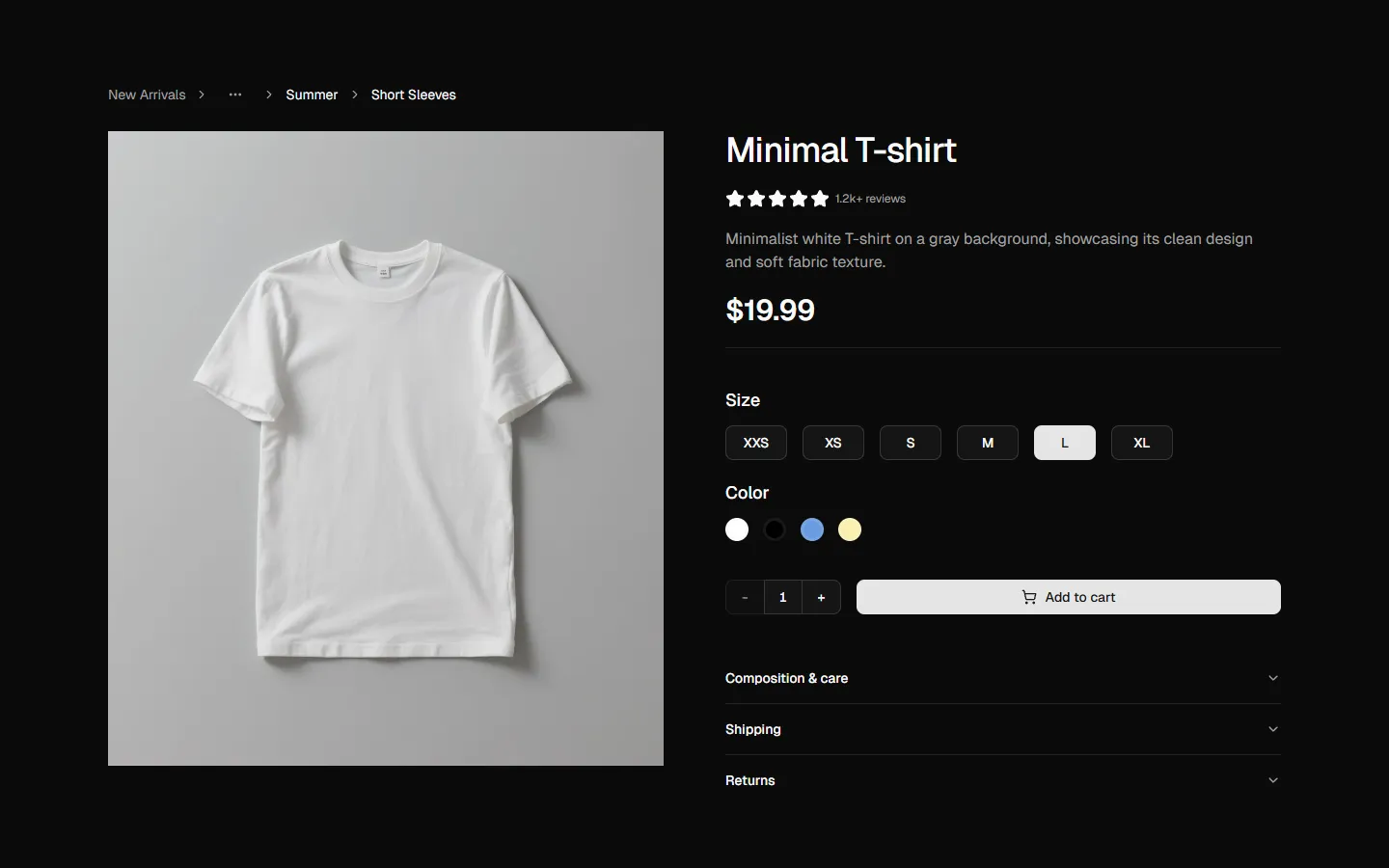
Product Details 2
Product page with breadcrumbs and accordion
Pro
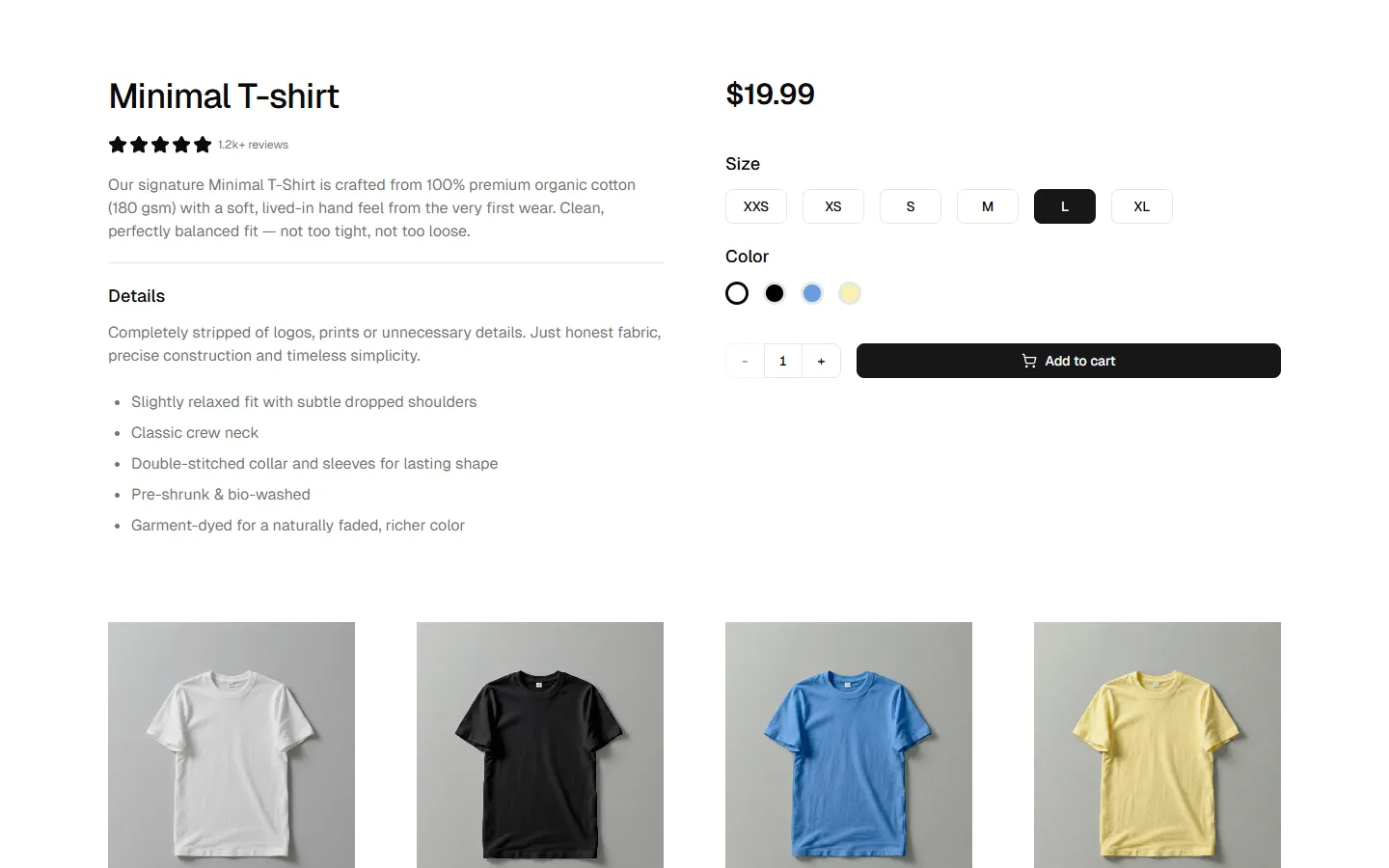
Product Details 3
Detailed product view with specifications and gallery
Pro
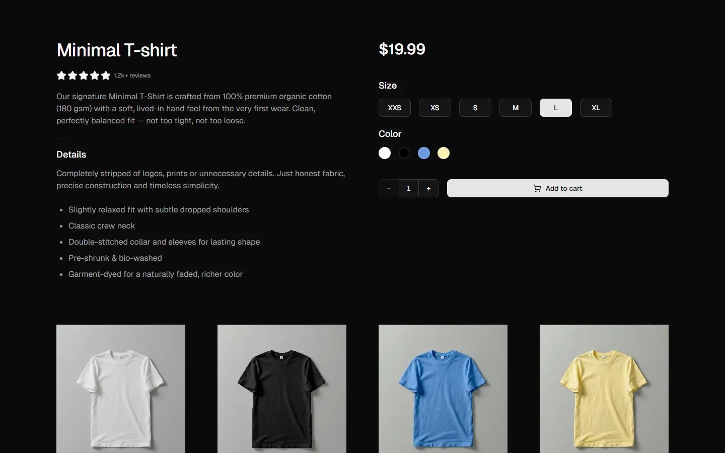
Product Details 5
Product page with bottom gallery and navigation arrows
Pro
Product Details 6
Product page with centered hero and multi-column FAQ grid