All Checkout blocks
Checkout 2
Modular checkout with summary and overview sidebars
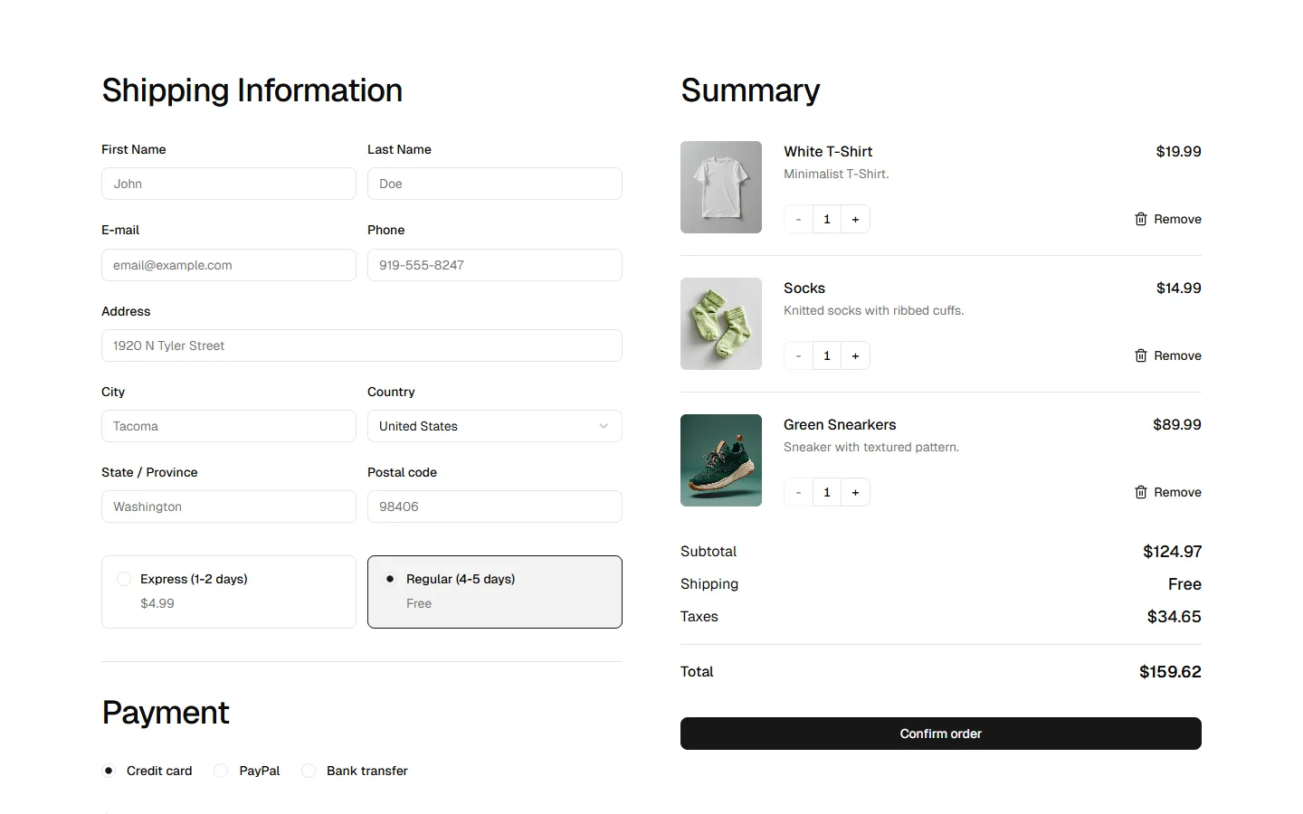
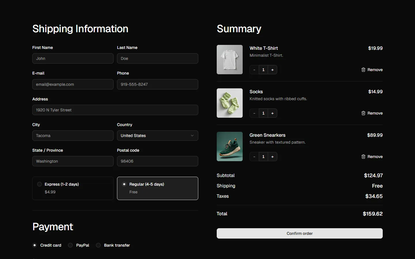
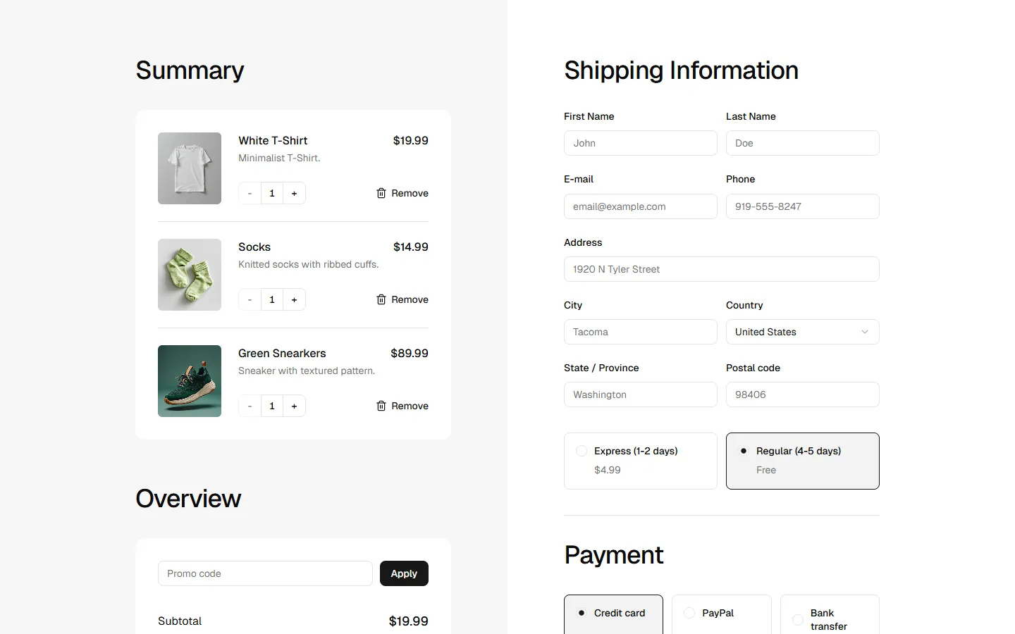
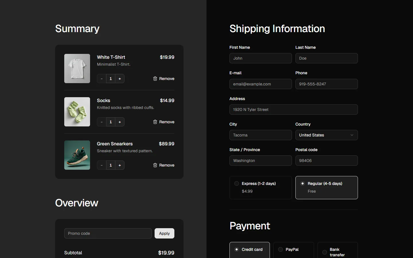
Checkout interface that uses a multi-card layout to prioritize order transparency. It features a "Summary" of items and an "Overview" of costs (including a promo code field) on the left side, while the more extensive "Shipping Information" and "Payment" forms are grouped in a primary card on the right. This arrangement allows users to keep their order details constantly in sight while navigating through the data entry process.
In Pro & Pro + React
Radix UI
Base UI
8 styles
5 icon sets
Not Allowed
Get access to the full source code by upgrading to Pro + React.
SBIOTJ
Join 9,000+ builders shipping with shadcncraft
Get access to this block and the full library
Production-ready blocks and components with matching Figma and React.


Benefits
Production-ready by default
Built with shadcn/ui conventions and designed for real projects.
Built with shadcn/ui
Clean React components using Tailwind and modern shadcn patterns.
Install instantly
Add the block directly using the shadcn CLI.
Works with your theme
Compatible with shadcn themes and token-based color systems.
MCP server support
Use shadcn MCP server right from your favorite AI tools.
Frequently Asked Questions
Yes. They follow shadcn/ui structure and are built for real products.