All Multistep blocks
Multistep 1
Split onboarding layout
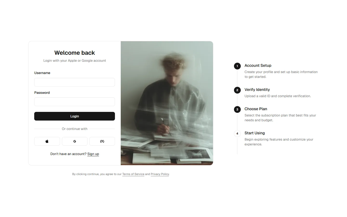
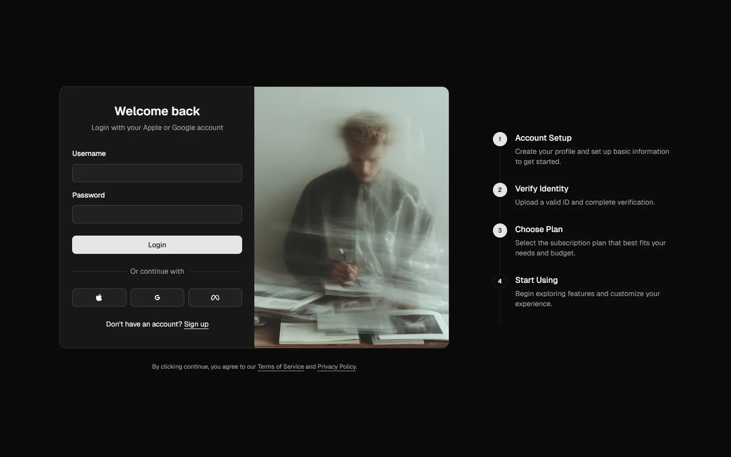
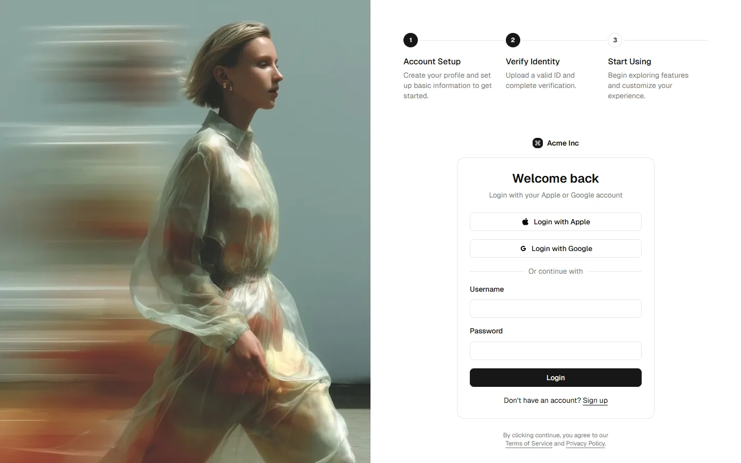
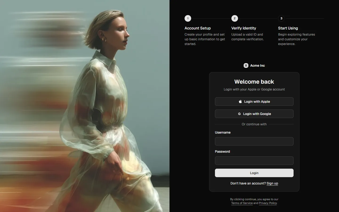
A wide, two-column layout that pairs the active step with clear progress context. The left column contains a centered card with soft elevation and rounded corners, acting as the focus area for the current step. The right column shows a vertical step list with numbered markers, current step emphasized and future steps visually muted. Spacing is generous and calm, with strong alignment between columns so the flow reads left to right. The structure sets expectations early, reduces uncertainty, and keeps users oriented without overwhelming them.
In Pro & Pro + React
Radix UI
Base UI
8 styles
5 icon sets
Not Allowed
Get access to the full source code by upgrading to Pro + React.
SBIOTJ
Join 9,000+ builders shipping with shadcncraft
Get access to this block and the full library
Production-ready blocks and components with matching Figma and React.


Benefits
Production-ready by default
Built with shadcn/ui conventions and designed for real projects.
Built with shadcn/ui
Clean React components using Tailwind and modern shadcn patterns.
Install instantly
Add the block directly using the shadcn CLI.
Works with your theme
Compatible with shadcn themes and token-based color systems.
MCP server support
Use shadcn MCP server right from your favorite AI tools.
Frequently Asked Questions
Yes. They follow shadcn/ui structure and are built for real products.